10 Common Framer Mistakes And How to Avoid Them
Last Updated on:
Author:
Framerbite
Framerbite

Framer is one of the best tools out there for designing and building modern websites. It helps you create beautiful, interactive designs without writing code. But like any other tool, it’s easy to make mistakes, especially when you're just starting with it. These mistakes can create messy designs, poor performance, or frustrated users.
In this blog, we’ll discuss 10 common mistakes designers make in Framer and how you can avoid them. These tips will help you make better, smoother, and faster websites if you're new to Framer or have been using it for a long time.
1. Overusing Animations

Framer makes it easy to add animations and motion effects, but using too many can overwhelm visitors and slow your site. Excessive animations can also distract users from important content.
Test your site speed with Framer performance tools or Google Lighthouse to ensure animations aren’t hurting page load times.
How to avoid it:
Use subtle, purposeful animations like fades, slides, and button transitions.
Animate only elements that enhance user experience.
Avoid heavy effects on every page. Focus on clarity and performance.
2. Poor Component Structure

The component structure looks poor if you do not use reusable components and build everything from scratch. Sometimes, a single layout is faster, but as it grows quickly becomes messy. You’ll waste time making repetitive edits and risk breaking your design.
Good component structure also improves Framer website optimization, making it easier to update pages without breaking layouts.
How to avoid it:
Break your site into small, reusable components like buttons, headers, and image cards.
Name components clearly and organize them in folders.
Create a Framer design system or style guide to maintain consistency across your website.
3. Ignoring Responsiveness

A common Framer mistake is only designing for desktop and forgetting about mobile devices. If your site looks great on a big screen but falls apart on a phone, you're losing a huge segment of your audience. There are tools in Framer that can help you fix this, so use them.
How to avoid it:
Use Framer auto-layout and breakpoints to adjust your designs for tablets and phones.
Test pages on multiple devices using Framer’s preview and QR code sharing.
Adjust fonts, spacing, and images to fit smaller screens.
4. Not Using Variables and Icons

Another common Framer error is manually setting fonts and colors. If you do everything manually, your design will be inconsistent and difficult to maintain.
How to avoid it:
Set up global variables for things like colors, fonts, and spacing. These tokens can then be used across your whole site to keep everything in sync. Your branding will be consistent everywhere if you use Framer to create a design system or style guide.
5. Overcomplicating Interactions
It is also common for designers to add interactions that confuse users rather than guide them. Framer’s powerful interaction tools can inspire complex animations or multi-step behaviors. It can be more damaging than beneficial if they aren't easy to use.
How to avoid it:
Use global variables for colors, fonts, and spacing.
Implement design tokens for consistent brand identity across pages.
Build a style guide in Framer for future updates.
6. Forgetting About SEO and Metadata
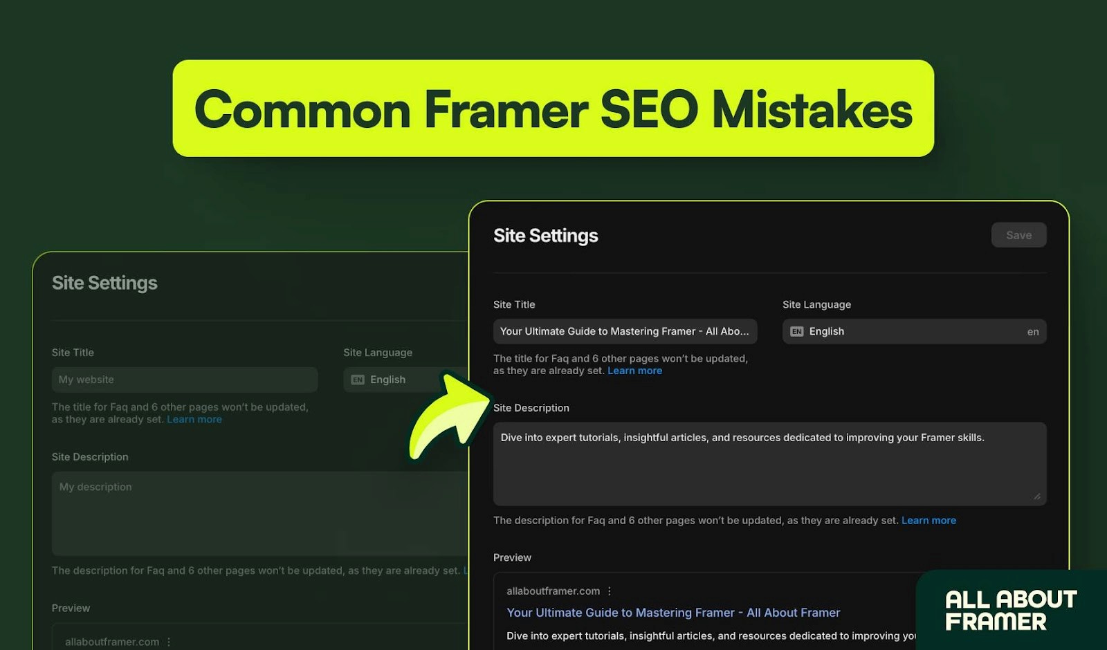
Framers often forget to include page titles, descriptions, and alt text on their pages. Google can't understand your site, no matter how good it looks, so you won't get traffic. As a result, accessibility suffers from indexing.
Framer gives you a solid SEO foundation, but you still need to follow best practices to get the best results. Also you can follow some easy and effective ways to improve SEO on Framer.
How to avoid it:
Add SEO titles, meta descriptions, and alt tags for each page and image.
Include keywords naturally in headings and descriptions.
Use descriptive URLs that reflect page content.
7. Ignoring Performance Optimization
The performance of your Framer site is affected by the use of heavy media files. Sites that are slow, especially on mobile, with large images and autoplay videos, tend to lose visitors.
How to avoid it:
Compress images using WebP or optimized formats.
Avoid autoplay videos unless necessary.
Limit heavy animations and test site speed using Google Lighthouse or Framer’s performance checker.
8. Skip Backups

Beginners often edit Framer pages without saving versions, risking lost work or broken designs. Proper version control prevents mistakes and reduces frustration during design iterations.
How to avoid it:
Use Framer version history before major changes.
Save duplicate pages with clear labels like ''Homepage v1.3 – Added Footer.''
Treat major updates as checkpoints to revert easily if needed.
9. Not Testing on Real Devices

If you are only checking your site on a desktop, you are missing other real devices. Real-world use often reveals hidden problems that look perfect in the editor. You might notice that the buttons are too small or that the layout spacing is not right.
How to avoid it:
Open your Framer site on mobile, tablet, and desktop using share links or QR codes.
Navigate the site like a real user and test all interactions.
Get feedback from colleagues or friends to catch hidden issues.
10. Neglecting Community Resources

Framer has a huge community full of ready-to-use templates, components, and tips. If you ignore them, you’re making life harder than it needs to be.
How to avoid it:
You'll find ideas, solutions, and components in the Framer community quite easily. Ask questions, get feedback, and stay up to date with new features in Framer's community chat or forums.
Conclusion
You should enjoy designing in Framer, not get frustrated. You will build faster, cleaner, and more user-friendly websites if you avoid these common mistakes. Good design is not just about how things look, but also how they work for real people on real devices.
Do not hesitate to explore Framer's community. It is a great place to find ideas and support. Each project you take on will make you better. Stay curious, experiment a lot, and you will get better.
FAQs - Framer Mistakes and Best Practices
1. What are the most common Framer mistakes beginners make?
Overusing animations, ignoring mobile responsiveness, poor component structure, skipping SEO settings, and neglecting performance optimization are the most frequent issues.
2. How can I make my Framer website faster?
Optimize images, limit heavy animations, compress media files, and test performance with Framer speed tools or Google Lighthouse.
3. Is Framer suitable for beginners?
Framer is beginner-friendly, but learning best practices for responsive design, SEO, and component reuse is essential to avoid mistakes.
4. How do I test my Framer site on real devices?
Use share links or QR codes to open your site on mobile and tablet devices. Navigate your pages as a user would to check interactions, buttons, and layout.
5. Where can I find templates or components to avoid design mistakes?
Visit the Framer community and template marketplace for ready-to-use components, layouts, and inspiration. Leveraging these resources saves time and reduces errors.
Have you faced any other Framer mistakes? Feel free to share them in the comments - your experiences may help someone else. Good luck with your designs.
Framer is one of the best tools out there for designing and building modern websites. It helps you create beautiful, interactive designs without writing code. But like any other tool, it’s easy to make mistakes, especially when you're just starting with it. These mistakes can create messy designs, poor performance, or frustrated users.
In this blog, we’ll discuss 10 common mistakes designers make in Framer and how you can avoid them. These tips will help you make better, smoother, and faster websites if you're new to Framer or have been using it for a long time.
1. Overusing Animations
Framer makes it easy to add animations and motion effects, but using too many can overwhelm visitors and slow your site. Excessive animations can also distract users from important content.
Test your site speed with Framer performance tools or Google Lighthouse to ensure animations aren’t hurting page load times.
How to avoid it:
Use subtle, purposeful animations like fades, slides, and button transitions.
Animate only elements that enhance user experience.
Avoid heavy effects on every page. Focus on clarity and performance.
2. Poor Component Structure
The component structure looks poor if you do not use reusable components and build everything from scratch. Sometimes, a single layout is faster, but as it grows quickly becomes messy. You’ll waste time making repetitive edits and risk breaking your design.
Good component structure also improves Framer website optimization, making it easier to update pages without breaking layouts.
How to avoid it:
Break your site into small, reusable components like buttons, headers, and image cards.
Name components clearly and organize them in folders.
Create a Framer design system or style guide to maintain consistency across your website.
3. Ignoring Responsiveness
A common Framer mistake is only designing for desktop and forgetting about mobile devices. If your site looks great on a big screen but falls apart on a phone, you're losing a huge segment of your audience. There are tools in Framer that can help you fix this, so use them.
How to avoid it:
Use Framer auto-layout and breakpoints to adjust your designs for tablets and phones.
Test pages on multiple devices using Framer’s preview and QR code sharing.
Adjust fonts, spacing, and images to fit smaller screens.
4. Not Using Variables and Icons
Another common Framer error is manually setting fonts and colors. If you do everything manually, your design will be inconsistent and difficult to maintain.
How to avoid it:
Set up global variables for things like colors, fonts, and spacing. These tokens can then be used across your whole site to keep everything in sync. Your branding will be consistent everywhere if you use Framer to create a design system or style guide.
5. Overcomplicating Interactions
It is also common for designers to add interactions that confuse users rather than guide them. Framer’s powerful interaction tools can inspire complex animations or multi-step behaviors. It can be more damaging than beneficial if they aren't easy to use.
How to avoid it:
Use global variables for colors, fonts, and spacing.
Implement design tokens for consistent brand identity across pages.
Build a style guide in Framer for future updates.
6. Forgetting About SEO and Metadata
Framers often forget to include page titles, descriptions, and alt text on their pages. Google can't understand your site, no matter how good it looks, so you won't get traffic. As a result, accessibility suffers from indexing.
Framer gives you a solid SEO foundation, but you still need to follow best practices to get the best results. Also you can follow some easy and effective ways to improve SEO on Framer.
How to avoid it:
Add SEO titles, meta descriptions, and alt tags for each page and image.
Include keywords naturally in headings and descriptions.
Use descriptive URLs that reflect page content.
7. Ignoring Performance Optimization
The performance of your Framer site is affected by the use of heavy media files. Sites that are slow, especially on mobile, with large images and autoplay videos, tend to lose visitors.
How to avoid it:
Compress images using WebP or optimized formats.
Avoid autoplay videos unless necessary.
Limit heavy animations and test site speed using Google Lighthouse or Framer’s performance checker.
8. Skip Backups
Beginners often edit Framer pages without saving versions, risking lost work or broken designs. Proper version control prevents mistakes and reduces frustration during design iterations.
How to avoid it:
Use Framer version history before major changes.
Save duplicate pages with clear labels like ''Homepage v1.3 – Added Footer.''
Treat major updates as checkpoints to revert easily if needed.
9. Not Testing on Real Devices
If you are only checking your site on a desktop, you are missing other real devices. Real-world use often reveals hidden problems that look perfect in the editor. You might notice that the buttons are too small or that the layout spacing is not right.
How to avoid it:
Open your Framer site on mobile, tablet, and desktop using share links or QR codes.
Navigate the site like a real user and test all interactions.
Get feedback from colleagues or friends to catch hidden issues.
10. Neglecting Community Resources
Framer has a huge community full of ready-to-use templates, components, and tips. If you ignore them, you’re making life harder than it needs to be.
How to avoid it:
You'll find ideas, solutions, and components in the Framer community quite easily. Ask questions, get feedback, and stay up to date with new features in Framer's community chat or forums.
Conclusion
You should enjoy designing in Framer, not get frustrated. You will build faster, cleaner, and more user-friendly websites if you avoid these common mistakes. Good design is not just about how things look, but also how they work for real people on real devices.
Do not hesitate to explore Framer's community. It is a great place to find ideas and support. Each project you take on will make you better. Stay curious, experiment a lot, and you will get better.
FAQs - Framer Mistakes and Best Practices
1. What are the most common Framer mistakes beginners make?
Overusing animations, ignoring mobile responsiveness, poor component structure, skipping SEO settings, and neglecting performance optimization are the most frequent issues.
2. How can I make my Framer website faster?
Optimize images, limit heavy animations, compress media files, and test performance with Framer speed tools or Google Lighthouse.
3. Is Framer suitable for beginners?
Framer is beginner-friendly, but learning best practices for responsive design, SEO, and component reuse is essential to avoid mistakes.
4. How do I test my Framer site on real devices?
Use share links or QR codes to open your site on mobile and tablet devices. Navigate your pages as a user would to check interactions, buttons, and layout.
5. Where can I find templates or components to avoid design mistakes?
Visit the Framer community and template marketplace for ready-to-use components, layouts, and inspiration. Leveraging these resources saves time and reduces errors.
Have you faced any other Framer mistakes? Feel free to share them in the comments - your experiences may help someone else. Good luck with your designs.


Read more articles

Feb 28, 2026
Best Framer Templates with Parallax Scrolling
Feb 28, 2026
Best Framer Templates with Parallax Scrolling

Feb 22, 2026
Framer Canvas: Design Without Limits
Feb 22, 2026
Framer Canvas: Design Without Limits

Feb 19, 2026
Best Companies Specializing in Framer Website Templates in 2026
Feb 19, 2026
Best Companies Specializing in Framer Website Templates in 2026
Get exclusive 10% discount on your next purchase.
We will send the discount code immediately in your inbox.

Templates
Copyright © 2026 FramerBite, A Part of Creetfy LLC. All Rights Reserved
Follow us on Twitter
Get exclusive 10% discount on your next purchase.
We will send the discount code immediately in your inbox.
Templates
Copyright © 2026 FramerBite, A Part of Creetfy LLC. All Rights Reserved
Follow us on Twitter
Get exclusive 10% discount on your next purchase.
We will send the discount code immediately in your inbox.
Templates
Copyright © 2026 FramerBite, A Part of Creetfy LLC. All Rights Reserved
Follow us on Twitter
Get exclusive 10% discount on your next purchase.
We will send the discount code immediately in your inbox.
Templates
Copyright © 2026 FramerBite, A Part of Creetfy LLC. All Rights Reserved
Follow us on Twitter