20+ Best One Page Website Design Inspiration
Last Updated on:
Author:
Framerbite
Framerbite

In today’s digital landscape, one page website design is more than just a trend- it’s a powerful way to tell a story, showcase work, and guide users through a smooth browsing experience. Whether you're building a personal portfolio, a product showcase, or a brand story, a single-page website offers a sleek, focused layout that delivers impact.
In this guide, we’ll explore 20+ best one page website design inspiration examples - from modern single-page websites to responsive one-page websites built with tools like Webflow. Discover inspiring one-page website examples, learn what makes them work, and get ideas for your own website portfolio design.
Why One Page Website Design Inspiration Trend in 2026
1. AI-Powered Design Tools
From Framer one page inspiration templates to Figma website portfolio designs, AI is speeding up workflows like never before. Tools now assist in generating layouts, copy, and even color palettes. Designers are using AI features in platforms like Webflow and Figma to save time and boost creativity, perfect for fast-tracking your next single-page website project.
2. Dark Mode Support
Dark mode isn't just a trend, it's a feature users expect. Many one-page websites now include a toggle between light and dark themes to improve accessibility and visual comfort, especially on mobile devices.
3. Accessibility-First Design
Inclusivity is no longer optional. Following WCAG guidelines ensures your single-page website is usable by everyone, including those with visual or motor impairments. Accessible designs also tend to rank better on search engines.
4. High Performance & Speed Optimization
People expect websites to load instantly. In 2026, single page websites are using image compression, lazy loading, and lightweight code to ensure smooth and speedy performance especially on mobile.
5. Micro-Interactions & Animations
From hover effects to scroll-triggered elements, micro-interactions are everywhere. These subtle animations make the browsing experience fun and interactive without overwhelming users.
6. Personalized Experiences
Adding interactive components like live chat, chatbot prompts, or localized messages can make your website portfolio design feel personal. In a single-page website, this is especially useful to keep visitors engaged and lead them to take action.
7. Video Headers & Backgrounds
Eye-catching hero sections now include autoplay videos or moving elements to make a strong first impression. This trend is particularly popular in portfolio website design, inspiration and creative agency sites.
8. Scroll-Triggered Storytelling
Instead of clicking between pages, users now scroll to explore content. More one page website designs are using scroll animations, parallax effects, and dynamic text to tell a story, great for portfolio websites or product showcases.
Want to see one page website design inspiration or some smashing one-page website examples? Keep reading because we are gonna explore 20+ most inspiring one page website design examples to help you out.
1. Actor’s Portfolio

This one page portfolio website bursts with personality. Using bright blocks of blue, yellow, red, and white, it immediately grabs your attention. Right beside a portrait, it introduces “Seth Hampton: Actor, Producer, Third Thing,” setting a playful yet professional tone.
Designed by Adam Fox, the site matches the energy of theater and improve, with bold colors and clean lines that feel lively but polished. It’s easy to navigate through sections like About, Gallery, Press, and Contact, guiding visitors smoothly from one part to the next. By the time you reach “Contact,” you already know what Seth brings to the table and feel ready to get in touch.
2. Ribalta
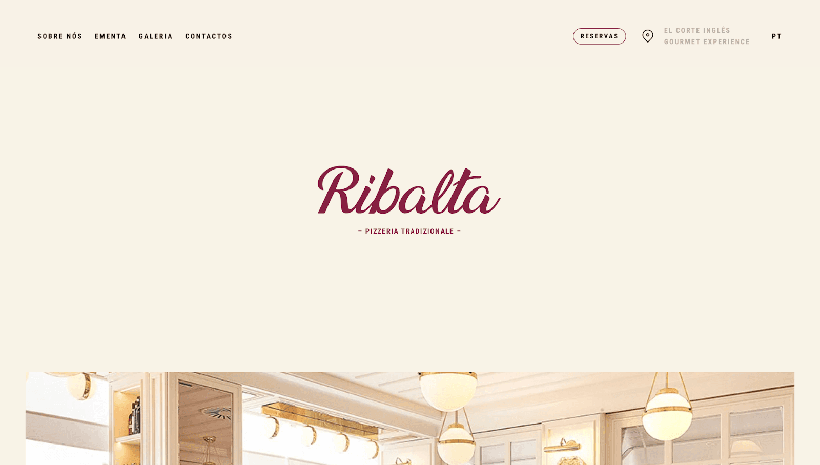
Step into Ribalta’s website and you almost smell the fresh pizza. With a warm cream background and smooth scrolling effects, this site feels like a cozy Italian bistro.
The menu sits neatly in the corner while gorgeous photos of food and the restaurant fill the screen.
Everything from the font choice to the color scheme screams authentic dining experience. Plus, they’ve made it super easy to browse their meal gallery and check out the menu all on one page that perfect for hungry visitors who want to decide fast.
3. Atoms

The Atoms app website is clean and welcoming, with lots of white space and soft cream tones that feel cozy yet modern. Inspired by James Clear’s Atomic Habits book, this site uses simple language and interactive visuals to explain how users can build new habits step by step.
Playful boulder illustrations act like building blocks throughout the page, reinforcing the idea that tiny changes add up to big results. The design is inviting without being overwhelming, making it easy to focus on creating your first habit.
4. Bogart

Not every community needs a huge website, sometimes a simple landing page says it all. Bogart’s site is perfect for an athletic community that wants to share its energy and spirit without overwhelming visitors.
The bright colors and bold fonts immediately give off a vibe of enthusiasm and teamwork. The words ''passionate, determined, and supportive'' aren’t just buzzwords and they invite you to feel what it’s like to be part of this group.
Right from the start, you know exactly what to do next: either get in touch or check out their social links up top. This one page website design is straightforward, inviting, and full of life.
5. Mariana
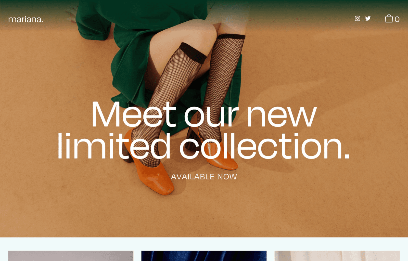
If you sell a few special products, Mariana shows how a simple one page website design can work as a professional online store. The homepage highlights exclusivity with an exciting headline, then dives into product details and tells your story as a maker. This helps customers connect with your brand and understand what makes your items unique.
Though product pages and checkouts exist behind the scenes, everything important is right on the homepage, making it simple for visitors to learn about your business without feeling overwhelmed. Mariana is perfect if you want a polished look but don’t have time for a large online store yet.
6. Randi
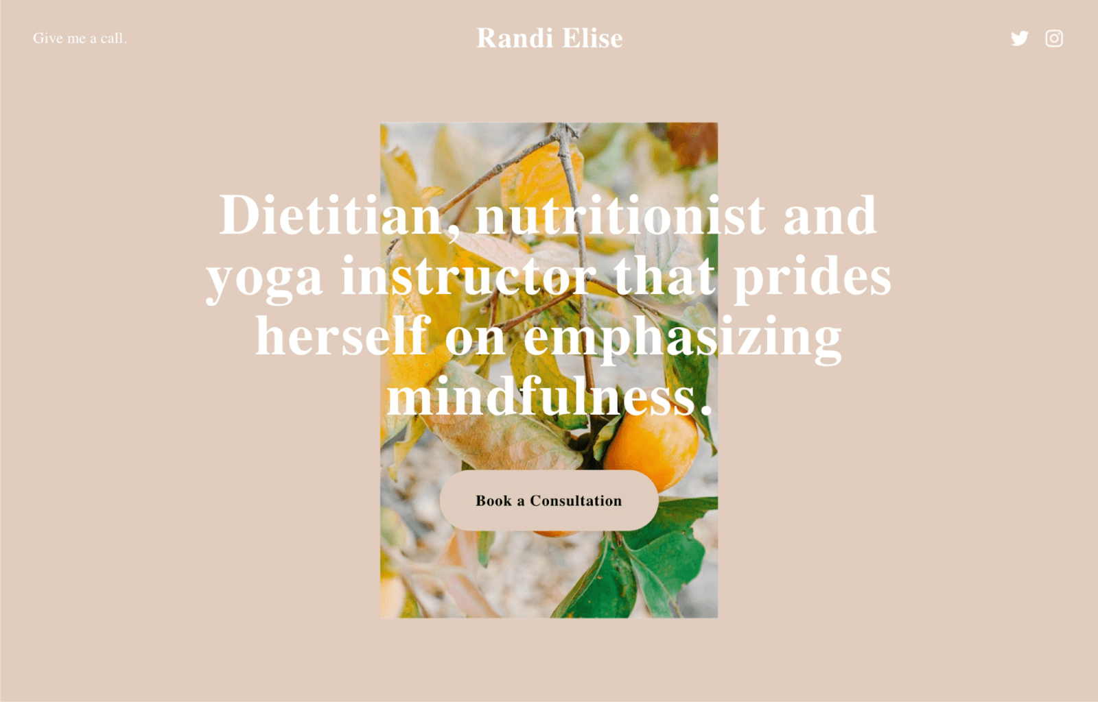
Just getting started online as a coach, consultant, or freelancer? Randi’s simple one page website design offers a quick snapshot of what you do and invites visitors to book a consultation right away. No long pages or confusing menus- just clear info and one main action to take.
For those wanting more details, social media links are easy to find, so visitors can learn more about you elsewhere online. Randi is perfect if you want something fast that gets straight to the point while building your brand step by step.
7. Cook Collective

Cook Collective nails what a page one website should do right away. When you land there, bold letters greet you with a simple message: ''Shared kitchen by food industry people, for food industry people.'' It’s honest and direct, instantly telling you what this is about and setting the tone for the whole page.
Navigation is smooth thanks to a sticky menu that sticks to the top as you scroll, so you never lose your place. The site uses just orange and black, keeping everything clean and professional. The copy stays clear and straightforward, and the ''Book a Tour'' button is placed where it’s impossible to miss, gently pushing visitors to take action.
8. Neverland

Neverland Agency’s page one website feels like stepping into a storybook. It’s not just a website- it’s an experience. Through beautiful images, smooth animations, and even a custom cursor that fits their brand, the site pulls you in and takes you on a journey through their work and team.
Instead of forcing you to click around, the site encourages you to scroll through the story in order, using a smart side menu if you want to jump ahead. The whole design shows off their creativity while staying easy to use, a great example of how one page can feel deep and engaging.
9. CRE8TIVE REVOLUTIONS
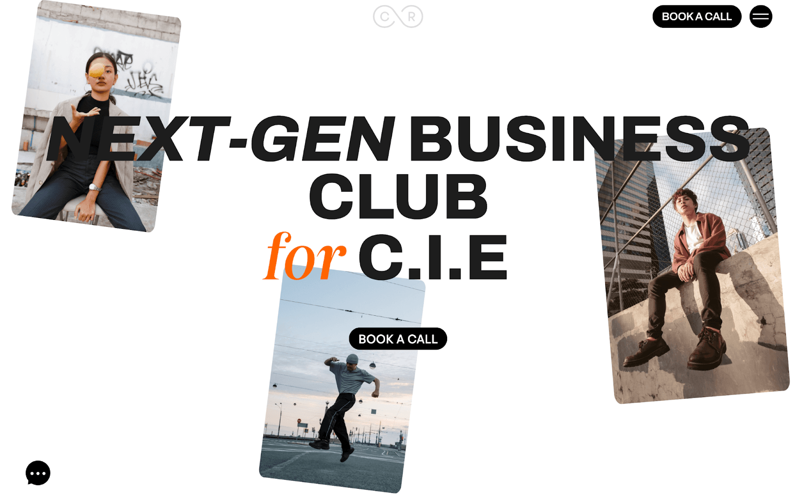
With a crisp white background, bold black text, and pops of orange as accents, this one page website design inspiration keeps the focus on clean design and smart layout. There’s just one main call-to-action button inviting visitors to book a call, while the page is divided into clear sections like solutions, about, testimonials, and programs.
Despite having plenty of content, the structure is carefully planned so visitors don’t feel overwhelmed. Text-heavy sections are broken down with button lists, making the information easy to digest. Minimal use of photos and images keeps the design uncluttered and navigation smooth throughout the site.
10. Microinteractions.co
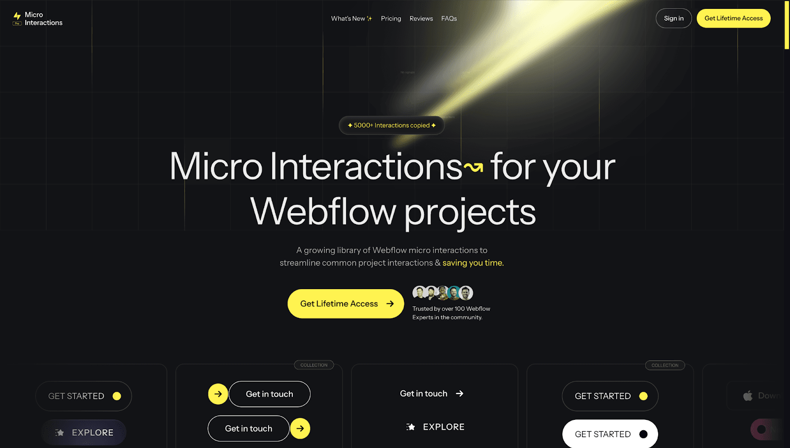
Microinteractions.co grabs your attention immediately with its sleek black-and-yellow design — it looks like it belongs in a sci-fi movie. This site offers ready-to-use interactive elements created by Hafiz Manzoor from Ireland.
Right from the start, you see a bright call-to-action button asking you to ''Get Lifetime Access.'' As you scroll down, you get hands-on examples of buttons and animations you can use on your own site, plus glowing reviews from happy customers. The site cleverly shows how their micro-interactions work in real life by using them throughout the page. It’s a smart way to build trust and spark excitement.
11. We Ain’t Plastic
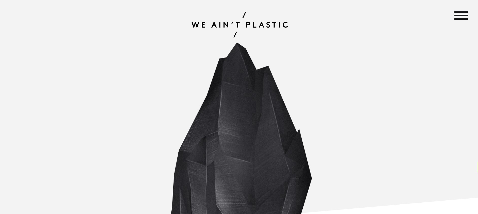
We Ain’t Plastic is one of the best one page websites that keeps things simple but powerful with full-screen visuals that grab your attention right away. The black-and-white color scheme sets a sleek, professional tone that matches the creative work shown throughout the site. Check out our simple guide to the Framer Black and White Template and see how this clean, modern design can improve your website.
Icons highlight the artist’s strengths and services quickly, so visitors understand what’s on offer without hunting for details. The ''Work'' section lets you explore projects interactively by clicking to expand them on the same page, making browsing feel fresh and engaging instead of stuck in a boring list.
12. Artone Studio

Artone Studio’s site is fun and interactive a creative playground that shows off their work without making you leave the page. Sliders and pop-ups of this website design one page let you dive into project details smoothly, while a carousel gallery displays high-quality images of their services in action.
Animations and design touches reflect their expertise, making browsing enjoyable and dynamic. The copy clearly explains why their services matter, so potential clients don’t have to guess what’s in it for them. It’s an inviting way to showcase creativity and professionalism at once.
13. ACID

ACID’s is a best one page website design examples, feels fresh and futuristic with a cheerful periwinkle background paired with crisp white text. This event site for Amsterdam Chemistry Innovation Day is designed to excite students and professionals alike.
Creative Mules gave it smooth animations like scroll-triggered effects and tiny hover movements that make the page feel alive without overwhelming you. It’s clear, modern, and energetic that perfect for an event all about innovation and connection.
14. Screen Studio

Screen Studio is a perfect one page website design example of a SaaS landing page that keeps things sleek and simple. The black, minimal design feels professional and talks directly to people who want quick results. The headline ''Beautiful screen recordings in minutes'' tells you exactly what they offer and there’s a big button to try it for free right away.
Scrolling down, you’ll find a video showing the software in action, which helps visitors understand the product without reading paragraphs of text. The page also covers everything you need pricing, features, and testimonials, all laid out clearly. Visuals match the brand perfectly and keep things interesting from start to finish.
15. Flayks

Flayks is anything but ordinary- a bold, artistic website that feels more like an experience than a typical portfolio. Bright colors, fast-moving visuals, and interactive features like carousel videos invite you to explore in new ways, dragging, scrolling sideways, and diving deep into content.
The design best practices for one page website design intentionally breaks rules to match the artist’s unique style, making every visit feel exciting and personal. Even details like showing where the artist is located add a human touch that connects visitors with who’s behind the work.
16. DesignCraft

DesignCraft’s website feels vibrant and creative right away and bright colors popping against a deep purple background. The text ''We design beautiful products, faster'' stands out next to playful circles that look hand-drawn, giving the site a warm human touch.
Jennifer Janosi leads this creative service brand with confidence. She mixes fun visuals with serious proof of her skills, like a gallery of her best work and client testimonials. At the bottom, she reminds visitors she’s been crafting designs since 2009. It all adds up to someone who’s talented yet approachable.
17. Fayette

Planning a big celebration like a milestone birthday or engagement party? Fayette keeps everything your guests need on a single page: what’s happening, where it’ll be, and how to RSVP. This means no more juggling texts or emails to answer simple questions, everyone gets all the details at once.
The clean and simple layout also lets you add extras like a dress code or FAQ without cluttering the page, for best practices for one-page website design. Fayette’s design keeps your event looking organized and polished while making it easy for guests to say ''Yes!'' and show up ready to celebrate.
18. Pillowtalk
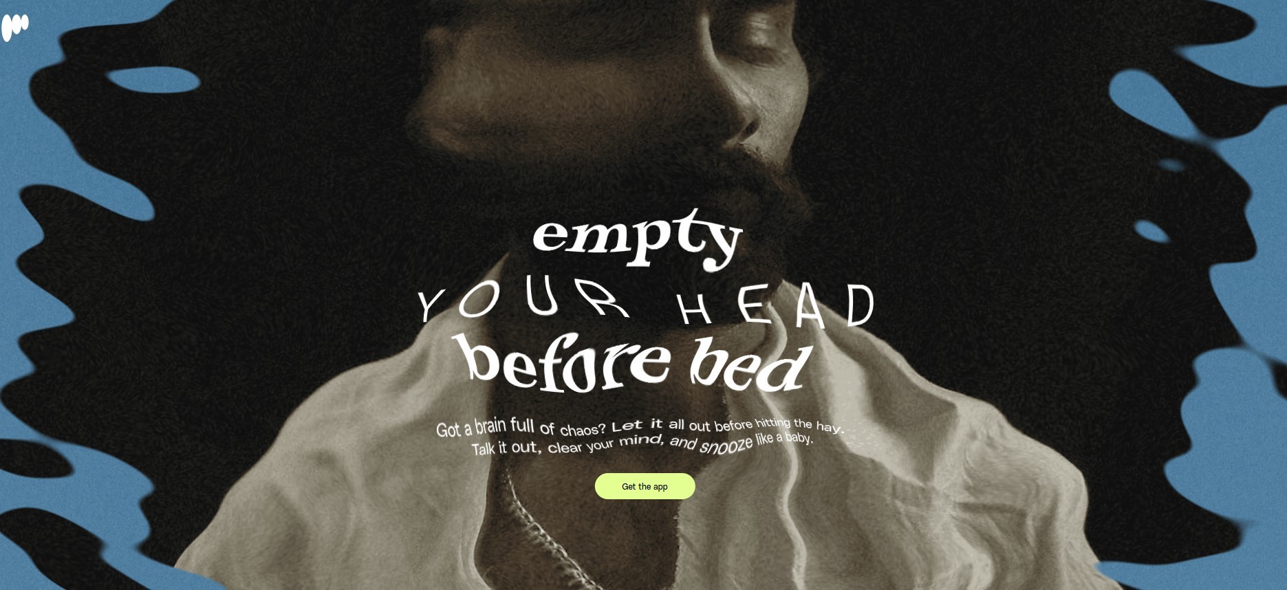
Pillowtalk is one of the best one page websites that helps you create a calm and inviting space with soft pastel colors and gentle animations that match its private journaling app perfectly. The hero section uses shimmering text and changing photos that immediately evoke relaxation and privacy, exactly what the brand promises.
Scrolling down reveals app features illustrated with clean visuals, along with a rolling carousel of user testimonials that build trust and show how real people are enjoying the app already. Every element works together to create a peaceful experience that gently encourages visitors to sign up for the beta launch.
19. Devoe

If your work lives mainly on other platforms like Instagram or Vimeo, a simple one-page portfolio website design like Devoe can introduce you professionally without extra hassle. It shares your key skills and experience while linking out to where people can see your full work.
This approach is great if you don’t have tons of content yet but still want a polished online presence that quickly tells clients or employers who you are and how to reach you. Devoe keeps things minimal but effective.
20. Upstate Laundromat

Curtailed design proves that simplicity can be powerful. Even for something as everyday as laundry services, the site communicates its message clearly and stylishly without overdoing it. The use of blue, grey-blue, white, and carmine colors blends smoothly together, creating a calming and cohesive look that feels both fresh and trustworthy.
At the top, a carefully chosen photo with a soft, blurred background symbolizes cleanliness and care. The layout is thoughtfully arranged with well-placed text blocks, icons, buttons, and logo, making it easy to move through the page. This design suggests that even routine tasks like laundry can be handled with care and attention, turning chores into something more positive.
21. HoneyBee

HoneyBee is a one-page website design best practices that is a great example of how different design elements like colors, textures, shapes, fonts, and icons can work together seamlessly. It shows how a simple, focused site can grab attention, promote a product, and clearly express the brand’s personality all at once.
The color scheme ties everything together, inspired by the natural tones associated with honey. The minimalist and charming design straightforwardly delivers an important message: our well-being is deeply connected to the health of the environment. This site proves that clean design can carry meaningful stories while staying visually appealing.
22. ONCE - Writebook

ONCE - Writebook is designed with writers in mind, so it’s packed with clear, useful information without fluff. It’s text-heavy but in a good way and everything is laid out straightforwardly so authors can quickly understand how this service helps them publish their books online.
Supporting visuals like screenshots back up the text, making everything easier to grasp. There’s even an FAQ section for common questions, helping visitors feel confident. The simple design focuses on what matters and includes a sticky call-to-action that gently reminds users to take the next step.
23. Cryptochange
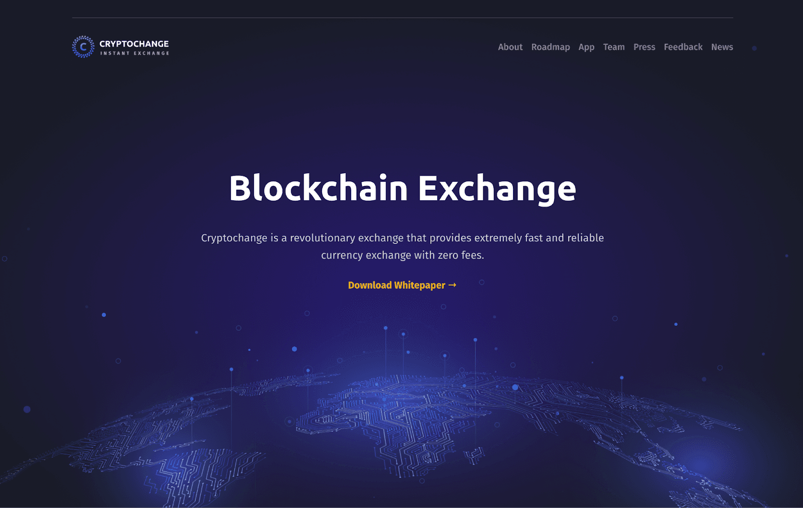
This unique page one website design uses colors in a smart way to instantly show it’s about finance and cryptocurrency. The dark background with light text makes everything easy to read, putting the focus on the words instead of distracting visuals. By using different shades for headings and body text, the site keeps everything clear and organized.
Adding tables and graphs helps break down numbers, making the information look neat and easier to grasp. This tidy layout is especially useful when dealing with complex financial data, so visitors can quickly understand what they’re seeing.
Why Do People Keep Choosing One Page Websites?
Beautiful, modern, and clean.
Work perfectly for portfolios, resumes, launches, and personal brands.
Let your creativity shine, especially if you’re using tools like Webflow.
Help visitors understand you quickly and take action.
In a world full of noise, one page website design ideas offer simplicity with purpose. So if you’re tired of over-complicated websites that leave users frustrated, maybe it’s time to go the one-page route. You’ll love how it feels, and your visitors will too.
How to Create Your Own One Page Website- Pro Tips
Creating a page one website design is a smart, efficient way to present your content in a clean, scrollable layout, especially if you’re showcasing a portfolio, launching a product, or building a personal brand. The good news? You don’t need to be a coding expert to make it happen.
Follow these steps to build a visually engaging and functional single-page website:
Plan Your Content Strategy
Start by identifying the goal of your site. Is it a website portfolio design, a landing page for a product, or a personal introduction? Once you know your purpose, decide what key sections you’ll need, typically:
Hero section)
About or story
Services or skills
Portfolio or gallery
Testimonials or reviews
Contact form or CTA
Pro Tips: Keep your content focused and to the point. In a one-page website, less is often more.
Choose the Right Design Tool
Platforms like Framer, Webflow, and Figma offer incredible flexibility for one page website design. If you’re aiming for Framer one-page inspiration, you’ll find many cloneable templates that require no code.
For designers, Framer portfolio website templates are great for wireframing and collaborating before development. If you're not designing from scratch, choose a free one-page website template that matches your brand.
Pro Tips: Look for responsive one page website templates to ensure your site looks great on all devices.
Design the Layout Thoughtfully
Organize each section in a logical order that smoothly guides the visitor down the page. Use consistent typography, spacing, and color schemes to keep the visual flow clean and professional.
In tools like Figma, you can prototype the layout before going live. In Framer, you can animate scroll effects and build with pixel-perfect control.
Pro Tips: Take inspiration from other inspiring one-page website examples to see what’s working in your niche.
Incorporate Smooth Scrolling & Navigation
Even though it's a single-page website, users still need to navigate easily. Use anchor links or sticky navigation bars to let visitors jump to specific sections.
Pro Tips: Add smooth scroll effects to create a seamless user journey from top to bottom, a hallmark of the best single-page websites.
Add Visual Interactions and Animations
Add subtle animations and scroll-triggered effects to make your modern single-page website feel dynamic and engaging. Hover effects, fade-ins, and parallax backgrounds are great ways to bring your content to life.
Pro Tips: Don’t overdo it. Use micro-interactions to highlight important areas without overwhelming your user.
Include a Strong Call-to-Action (CTA)
Your one page website design ideas should end with a clear action, whether it’s “Contact Me,” “Download Now,” or “Buy Today.” Make your CTA button bold, visible, and action-oriented.
Pro Tips: Repeating your CTA in multiple spots increases the chances of conversion.
Optimize for SEO and Speed
Use relevant keywords like examples of one page website design or portfolio website design inspiration in your headings and body content. Compress images and enable lazy loading to make sure your page loads quickly. Also you can learn about Framer Website's SEO Ranking.
Pro Tips: A fast, SEO-friendly website ranks better on Google and offers a smoother experience for your visitors.
Make It Mobile-Responsive
A responsive one-page website adapts perfectly to any screen size. Use mobile-first design practices to make sure your layout, images, and text all scale properly.
Pro Tips: Test your site on multiple devices to ensure nothing breaks or overlaps.
By following these steps, you can confidently create a stunning one-page website that’s modern, fast, and built for engagement. Whether you’re building a single-page website design for your portfolio or business, the key is clarity, creativity, and a seamless scroll.
Conclusion
A well-executed one page website design proves that simplicity can be powerful. Whether you're crafting a personal portfolio, launching a new product, or telling a brand story, a single-page website offers a streamlined, engaging experience for visitors. The inspiring one page website examples shared here show how thoughtful layouts, responsive design, and strong storytelling can create memorable digital experiences.
Feeling inspired? Explore our one page website design inspiration, try tools like Framer, Figma, or Webflow, and start building your own website portfolio design that’s sleek, smart, and striking.
In today’s digital landscape, one page website design is more than just a trend- it’s a powerful way to tell a story, showcase work, and guide users through a smooth browsing experience. Whether you're building a personal portfolio, a product showcase, or a brand story, a single-page website offers a sleek, focused layout that delivers impact.
In this guide, we’ll explore 20+ best one page website design inspiration examples - from modern single-page websites to responsive one-page websites built with tools like Webflow. Discover inspiring one-page website examples, learn what makes them work, and get ideas for your own website portfolio design.
Why One Page Website Design Inspiration Trend in 2026
1. AI-Powered Design Tools
From Framer one page inspiration templates to Figma website portfolio designs, AI is speeding up workflows like never before. Tools now assist in generating layouts, copy, and even color palettes. Designers are using AI features in platforms like Webflow and Figma to save time and boost creativity, perfect for fast-tracking your next single-page website project.
2. Dark Mode Support
Dark mode isn't just a trend, it's a feature users expect. Many one-page websites now include a toggle between light and dark themes to improve accessibility and visual comfort, especially on mobile devices.
3. Accessibility-First Design
Inclusivity is no longer optional. Following WCAG guidelines ensures your single-page website is usable by everyone, including those with visual or motor impairments. Accessible designs also tend to rank better on search engines.
4. High Performance & Speed Optimization
People expect websites to load instantly. In 2026, single page websites are using image compression, lazy loading, and lightweight code to ensure smooth and speedy performance especially on mobile.
5. Micro-Interactions & Animations
From hover effects to scroll-triggered elements, micro-interactions are everywhere. These subtle animations make the browsing experience fun and interactive without overwhelming users.
6. Personalized Experiences
Adding interactive components like live chat, chatbot prompts, or localized messages can make your website portfolio design feel personal. In a single-page website, this is especially useful to keep visitors engaged and lead them to take action.
7. Video Headers & Backgrounds
Eye-catching hero sections now include autoplay videos or moving elements to make a strong first impression. This trend is particularly popular in portfolio website design, inspiration and creative agency sites.
8. Scroll-Triggered Storytelling
Instead of clicking between pages, users now scroll to explore content. More one page website designs are using scroll animations, parallax effects, and dynamic text to tell a story, great for portfolio websites or product showcases.
Want to see one page website design inspiration or some smashing one-page website examples? Keep reading because we are gonna explore 20+ most inspiring one page website design examples to help you out.
1. Actor’s Portfolio
This one page portfolio website bursts with personality. Using bright blocks of blue, yellow, red, and white, it immediately grabs your attention. Right beside a portrait, it introduces “Seth Hampton: Actor, Producer, Third Thing,” setting a playful yet professional tone.
Designed by Adam Fox, the site matches the energy of theater and improve, with bold colors and clean lines that feel lively but polished. It’s easy to navigate through sections like About, Gallery, Press, and Contact, guiding visitors smoothly from one part to the next. By the time you reach “Contact,” you already know what Seth brings to the table and feel ready to get in touch.
2. Ribalta
Step into Ribalta’s website and you almost smell the fresh pizza. With a warm cream background and smooth scrolling effects, this site feels like a cozy Italian bistro.
The menu sits neatly in the corner while gorgeous photos of food and the restaurant fill the screen.
Everything from the font choice to the color scheme screams authentic dining experience. Plus, they’ve made it super easy to browse their meal gallery and check out the menu all on one page that perfect for hungry visitors who want to decide fast.
3. Atoms
The Atoms app website is clean and welcoming, with lots of white space and soft cream tones that feel cozy yet modern. Inspired by James Clear’s Atomic Habits book, this site uses simple language and interactive visuals to explain how users can build new habits step by step.
Playful boulder illustrations act like building blocks throughout the page, reinforcing the idea that tiny changes add up to big results. The design is inviting without being overwhelming, making it easy to focus on creating your first habit.
4. Bogart
Not every community needs a huge website, sometimes a simple landing page says it all. Bogart’s site is perfect for an athletic community that wants to share its energy and spirit without overwhelming visitors.
The bright colors and bold fonts immediately give off a vibe of enthusiasm and teamwork. The words ''passionate, determined, and supportive'' aren’t just buzzwords and they invite you to feel what it’s like to be part of this group.
Right from the start, you know exactly what to do next: either get in touch or check out their social links up top. This one page website design is straightforward, inviting, and full of life.
5. Mariana
If you sell a few special products, Mariana shows how a simple one page website design can work as a professional online store. The homepage highlights exclusivity with an exciting headline, then dives into product details and tells your story as a maker. This helps customers connect with your brand and understand what makes your items unique.
Though product pages and checkouts exist behind the scenes, everything important is right on the homepage, making it simple for visitors to learn about your business without feeling overwhelmed. Mariana is perfect if you want a polished look but don’t have time for a large online store yet.
6. Randi
Just getting started online as a coach, consultant, or freelancer? Randi’s simple one page website design offers a quick snapshot of what you do and invites visitors to book a consultation right away. No long pages or confusing menus- just clear info and one main action to take.
For those wanting more details, social media links are easy to find, so visitors can learn more about you elsewhere online. Randi is perfect if you want something fast that gets straight to the point while building your brand step by step.
7. Cook Collective
Cook Collective nails what a page one website should do right away. When you land there, bold letters greet you with a simple message: ''Shared kitchen by food industry people, for food industry people.'' It’s honest and direct, instantly telling you what this is about and setting the tone for the whole page.
Navigation is smooth thanks to a sticky menu that sticks to the top as you scroll, so you never lose your place. The site uses just orange and black, keeping everything clean and professional. The copy stays clear and straightforward, and the ''Book a Tour'' button is placed where it’s impossible to miss, gently pushing visitors to take action.
8. Neverland
Neverland Agency’s page one website feels like stepping into a storybook. It’s not just a website- it’s an experience. Through beautiful images, smooth animations, and even a custom cursor that fits their brand, the site pulls you in and takes you on a journey through their work and team.
Instead of forcing you to click around, the site encourages you to scroll through the story in order, using a smart side menu if you want to jump ahead. The whole design shows off their creativity while staying easy to use, a great example of how one page can feel deep and engaging.
9. CRE8TIVE REVOLUTIONS
With a crisp white background, bold black text, and pops of orange as accents, this one page website design inspiration keeps the focus on clean design and smart layout. There’s just one main call-to-action button inviting visitors to book a call, while the page is divided into clear sections like solutions, about, testimonials, and programs.
Despite having plenty of content, the structure is carefully planned so visitors don’t feel overwhelmed. Text-heavy sections are broken down with button lists, making the information easy to digest. Minimal use of photos and images keeps the design uncluttered and navigation smooth throughout the site.
10. Microinteractions.co
Microinteractions.co grabs your attention immediately with its sleek black-and-yellow design — it looks like it belongs in a sci-fi movie. This site offers ready-to-use interactive elements created by Hafiz Manzoor from Ireland.
Right from the start, you see a bright call-to-action button asking you to ''Get Lifetime Access.'' As you scroll down, you get hands-on examples of buttons and animations you can use on your own site, plus glowing reviews from happy customers. The site cleverly shows how their micro-interactions work in real life by using them throughout the page. It’s a smart way to build trust and spark excitement.
11. We Ain’t Plastic
We Ain’t Plastic is one of the best one page websites that keeps things simple but powerful with full-screen visuals that grab your attention right away. The black-and-white color scheme sets a sleek, professional tone that matches the creative work shown throughout the site. Check out our simple guide to the Framer Black and White Template and see how this clean, modern design can improve your website.
Icons highlight the artist’s strengths and services quickly, so visitors understand what’s on offer without hunting for details. The ''Work'' section lets you explore projects interactively by clicking to expand them on the same page, making browsing feel fresh and engaging instead of stuck in a boring list.
12. Artone Studio
Artone Studio’s site is fun and interactive a creative playground that shows off their work without making you leave the page. Sliders and pop-ups of this website design one page let you dive into project details smoothly, while a carousel gallery displays high-quality images of their services in action.
Animations and design touches reflect their expertise, making browsing enjoyable and dynamic. The copy clearly explains why their services matter, so potential clients don’t have to guess what’s in it for them. It’s an inviting way to showcase creativity and professionalism at once.
13. ACID
ACID’s is a best one page website design examples, feels fresh and futuristic with a cheerful periwinkle background paired with crisp white text. This event site for Amsterdam Chemistry Innovation Day is designed to excite students and professionals alike.
Creative Mules gave it smooth animations like scroll-triggered effects and tiny hover movements that make the page feel alive without overwhelming you. It’s clear, modern, and energetic that perfect for an event all about innovation and connection.
14. Screen Studio
Screen Studio is a perfect one page website design example of a SaaS landing page that keeps things sleek and simple. The black, minimal design feels professional and talks directly to people who want quick results. The headline ''Beautiful screen recordings in minutes'' tells you exactly what they offer and there’s a big button to try it for free right away.
Scrolling down, you’ll find a video showing the software in action, which helps visitors understand the product without reading paragraphs of text. The page also covers everything you need pricing, features, and testimonials, all laid out clearly. Visuals match the brand perfectly and keep things interesting from start to finish.
15. Flayks
Flayks is anything but ordinary- a bold, artistic website that feels more like an experience than a typical portfolio. Bright colors, fast-moving visuals, and interactive features like carousel videos invite you to explore in new ways, dragging, scrolling sideways, and diving deep into content.
The design best practices for one page website design intentionally breaks rules to match the artist’s unique style, making every visit feel exciting and personal. Even details like showing where the artist is located add a human touch that connects visitors with who’s behind the work.
16. DesignCraft
DesignCraft’s website feels vibrant and creative right away and bright colors popping against a deep purple background. The text ''We design beautiful products, faster'' stands out next to playful circles that look hand-drawn, giving the site a warm human touch.
Jennifer Janosi leads this creative service brand with confidence. She mixes fun visuals with serious proof of her skills, like a gallery of her best work and client testimonials. At the bottom, she reminds visitors she’s been crafting designs since 2009. It all adds up to someone who’s talented yet approachable.
17. Fayette
Planning a big celebration like a milestone birthday or engagement party? Fayette keeps everything your guests need on a single page: what’s happening, where it’ll be, and how to RSVP. This means no more juggling texts or emails to answer simple questions, everyone gets all the details at once.
The clean and simple layout also lets you add extras like a dress code or FAQ without cluttering the page, for best practices for one-page website design. Fayette’s design keeps your event looking organized and polished while making it easy for guests to say ''Yes!'' and show up ready to celebrate.
18. Pillowtalk
Pillowtalk is one of the best one page websites that helps you create a calm and inviting space with soft pastel colors and gentle animations that match its private journaling app perfectly. The hero section uses shimmering text and changing photos that immediately evoke relaxation and privacy, exactly what the brand promises.
Scrolling down reveals app features illustrated with clean visuals, along with a rolling carousel of user testimonials that build trust and show how real people are enjoying the app already. Every element works together to create a peaceful experience that gently encourages visitors to sign up for the beta launch.
19. Devoe
If your work lives mainly on other platforms like Instagram or Vimeo, a simple one-page portfolio website design like Devoe can introduce you professionally without extra hassle. It shares your key skills and experience while linking out to where people can see your full work.
This approach is great if you don’t have tons of content yet but still want a polished online presence that quickly tells clients or employers who you are and how to reach you. Devoe keeps things minimal but effective.
20. Upstate Laundromat
Curtailed design proves that simplicity can be powerful. Even for something as everyday as laundry services, the site communicates its message clearly and stylishly without overdoing it. The use of blue, grey-blue, white, and carmine colors blends smoothly together, creating a calming and cohesive look that feels both fresh and trustworthy.
At the top, a carefully chosen photo with a soft, blurred background symbolizes cleanliness and care. The layout is thoughtfully arranged with well-placed text blocks, icons, buttons, and logo, making it easy to move through the page. This design suggests that even routine tasks like laundry can be handled with care and attention, turning chores into something more positive.
21. HoneyBee
HoneyBee is a one-page website design best practices that is a great example of how different design elements like colors, textures, shapes, fonts, and icons can work together seamlessly. It shows how a simple, focused site can grab attention, promote a product, and clearly express the brand’s personality all at once.
The color scheme ties everything together, inspired by the natural tones associated with honey. The minimalist and charming design straightforwardly delivers an important message: our well-being is deeply connected to the health of the environment. This site proves that clean design can carry meaningful stories while staying visually appealing.
22. ONCE - Writebook
ONCE - Writebook is designed with writers in mind, so it’s packed with clear, useful information without fluff. It’s text-heavy but in a good way and everything is laid out straightforwardly so authors can quickly understand how this service helps them publish their books online.
Supporting visuals like screenshots back up the text, making everything easier to grasp. There’s even an FAQ section for common questions, helping visitors feel confident. The simple design focuses on what matters and includes a sticky call-to-action that gently reminds users to take the next step.
23. Cryptochange
This unique page one website design uses colors in a smart way to instantly show it’s about finance and cryptocurrency. The dark background with light text makes everything easy to read, putting the focus on the words instead of distracting visuals. By using different shades for headings and body text, the site keeps everything clear and organized.
Adding tables and graphs helps break down numbers, making the information look neat and easier to grasp. This tidy layout is especially useful when dealing with complex financial data, so visitors can quickly understand what they’re seeing.
Why Do People Keep Choosing One Page Websites?
Beautiful, modern, and clean.
Work perfectly for portfolios, resumes, launches, and personal brands.
Let your creativity shine, especially if you’re using tools like Webflow.
Help visitors understand you quickly and take action.
In a world full of noise, one page website design ideas offer simplicity with purpose. So if you’re tired of over-complicated websites that leave users frustrated, maybe it’s time to go the one-page route. You’ll love how it feels, and your visitors will too.
How to Create Your Own One Page Website- Pro Tips
Creating a page one website design is a smart, efficient way to present your content in a clean, scrollable layout, especially if you’re showcasing a portfolio, launching a product, or building a personal brand. The good news? You don’t need to be a coding expert to make it happen.
Follow these steps to build a visually engaging and functional single-page website:
Plan Your Content Strategy
Start by identifying the goal of your site. Is it a website portfolio design, a landing page for a product, or a personal introduction? Once you know your purpose, decide what key sections you’ll need, typically:
Hero section)
About or story
Services or skills
Portfolio or gallery
Testimonials or reviews
Contact form or CTA
Pro Tips: Keep your content focused and to the point. In a one-page website, less is often more.
Choose the Right Design Tool
Platforms like Framer, Webflow, and Figma offer incredible flexibility for one page website design. If you’re aiming for Framer one-page inspiration, you’ll find many cloneable templates that require no code.
For designers, Framer portfolio website templates are great for wireframing and collaborating before development. If you're not designing from scratch, choose a free one-page website template that matches your brand.
Pro Tips: Look for responsive one page website templates to ensure your site looks great on all devices.
Design the Layout Thoughtfully
Organize each section in a logical order that smoothly guides the visitor down the page. Use consistent typography, spacing, and color schemes to keep the visual flow clean and professional.
In tools like Figma, you can prototype the layout before going live. In Framer, you can animate scroll effects and build with pixel-perfect control.
Pro Tips: Take inspiration from other inspiring one-page website examples to see what’s working in your niche.
Incorporate Smooth Scrolling & Navigation
Even though it's a single-page website, users still need to navigate easily. Use anchor links or sticky navigation bars to let visitors jump to specific sections.
Pro Tips: Add smooth scroll effects to create a seamless user journey from top to bottom, a hallmark of the best single-page websites.
Add Visual Interactions and Animations
Add subtle animations and scroll-triggered effects to make your modern single-page website feel dynamic and engaging. Hover effects, fade-ins, and parallax backgrounds are great ways to bring your content to life.
Pro Tips: Don’t overdo it. Use micro-interactions to highlight important areas without overwhelming your user.
Include a Strong Call-to-Action (CTA)
Your one page website design ideas should end with a clear action, whether it’s “Contact Me,” “Download Now,” or “Buy Today.” Make your CTA button bold, visible, and action-oriented.
Pro Tips: Repeating your CTA in multiple spots increases the chances of conversion.
Optimize for SEO and Speed
Use relevant keywords like examples of one page website design or portfolio website design inspiration in your headings and body content. Compress images and enable lazy loading to make sure your page loads quickly. Also you can learn about Framer Website's SEO Ranking.
Pro Tips: A fast, SEO-friendly website ranks better on Google and offers a smoother experience for your visitors.
Make It Mobile-Responsive
A responsive one-page website adapts perfectly to any screen size. Use mobile-first design practices to make sure your layout, images, and text all scale properly.
Pro Tips: Test your site on multiple devices to ensure nothing breaks or overlaps.
By following these steps, you can confidently create a stunning one-page website that’s modern, fast, and built for engagement. Whether you’re building a single-page website design for your portfolio or business, the key is clarity, creativity, and a seamless scroll.
Conclusion
A well-executed one page website design proves that simplicity can be powerful. Whether you're crafting a personal portfolio, launching a new product, or telling a brand story, a single-page website offers a streamlined, engaging experience for visitors. The inspiring one page website examples shared here show how thoughtful layouts, responsive design, and strong storytelling can create memorable digital experiences.
Feeling inspired? Explore our one page website design inspiration, try tools like Framer, Figma, or Webflow, and start building your own website portfolio design that’s sleek, smart, and striking.

Read more articles

Feb 28, 2026
Best Framer Templates with Parallax Scrolling
Feb 28, 2026
Best Framer Templates with Parallax Scrolling

Feb 22, 2026
Framer Canvas: Design Without Limits
Feb 22, 2026
Framer Canvas: Design Without Limits
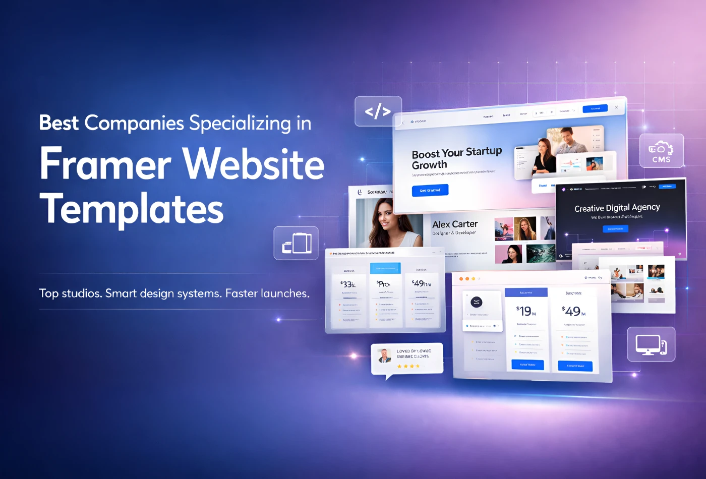
Feb 19, 2026
Best Companies Specializing in Framer Website Templates in 2026
Feb 19, 2026
Best Companies Specializing in Framer Website Templates in 2026
Find perfect template for your website & get 50% discount coupon

Templates
Copyright © 2026 FramerBite, A Part of Creetfy LLC. All Rights Reserved
Follow us on Twitter
Find perfect template for your website & get 50% discount coupon
Templates
Copyright © 2026 FramerBite, A Part of Creetfy LLC. All Rights Reserved
Follow us on Twitter
Find perfect template for your website & get 50% discount coupon
Templates
Copyright © 2026 FramerBite, A Part of Creetfy LLC. All Rights Reserved
Follow us on Twitter
Find perfect template for your website & get 50% discount coupon
Templates
Copyright © 2026 FramerBite, A Part of Creetfy LLC. All Rights Reserved
Follow us on Twitter