Top 35+ SaaS Website Design Inspiration
Last Updated on:
Author:
Framerbite
Framerbite

In 2026, standing out online is essential, and your SaaS website can make or break first impressions. The top SaaS website designs combine clean visuals with intuitive features, helping visitors quickly understand your product and take action.
This article showcases over 35 of the best SaaS websites, offering practical ideas for anyone building or updating a site. From B2B SaaS websites to creative landing pages, these examples demonstrate how design and user experience can drive sign-ups and engagement.
You’ll find SaaS UX examples with clear messaging, smart layouts, and engaging visuals that guide users smoothly through the content. Each site shows how top companies use design to connect with their audience and achieve results.
Explore these top SaaS websites of 2026 for inspiration and learn how to create a site that not only looks great but works effectively for your business.
What Makes a Great SaaS Website Design?
A great SaaS website design does more than look good. It communicates value, builds trust, and encourages visitors to take action.Below are main features of SaaS website design:
Clear and Strong Value Proposition
The top SaaS website examples immediately show what the product does and why it matters. For example, Copilot’s homepage clearly states its value: "Run a modern service-based business." Visitors instantly understand the benefit.
Simple and Easy Navigation
The best SaaS websites use simple menus and layouts. Users can quickly find what they need, making the experience smooth and enjoyable. Clear navigation is a core part of effective SaaS UX.
Mobile-Friendly and Responsive Design
Most users visit websites on mobile devices. Leading SaaS websites adapt perfectly to all screen sizes, keeping the experience consistent. Responsive design also helps with SEO and user engagement.
Smart Visual Hierarchy
Good SaaS website design guides users with the right use of fonts, colors, and spacing. Important information and calls to action are easy to spot, helping visitors understand the product quickly.
Engaging Visuals and Interactive Elements
Animations, videos, and interactive components make a site more engaging. For instance, Spline’s homepage lets users explore 3D designs in real-time, showing what the product can do.
Build Trust with Users
Top SaaS websites use testimonials, case studies, and security badges to show reliability. These trust signals make visitors feel confident about the product.
Fast Loading and Performance
Speed matters. The best SaaS websites load quickly, keeping users engaged. Optimized images, clean code, and reliable hosting improve performance and UX.
Useful and Relevant Content
Content that solves user problems keeps people on the site longer. Tutorials, guides, and insights position SaaS companies as helpful and trustworthy, encouraging visitors to explore further.
Test and Improve Continuously
Leading SaaS websites regularly test layouts, buttons, and features. A/B testing helps refine design and improve conversion rates.
In short, the best SaaS website designs combine clarity, usability, responsiveness, trust, speed, and helpful content. By studying top SaaS website examples, businesses can create sites that attract visitors and turn them into loyal customers.
If you want to design a fantastic SaaS website that will stand out in this digital landscape, exploring some examples can provide invaluable insights in your journey. In this article, we’ve collected the top 35+ SaaS website designs to inspire you.
So, let’s get started!
1. Copilot

Copilot helps service providers manage communication, payments, and reporting through branded client portals. Its homepage immediately shows the value of the product, making it clear why visitors should use it.
The navigation menu is simple, covering key sections like features, use cases, pricing, and resources. Blog articles are well-structured with tables of contents, making them easy to read. The pricing page uses whitespace effectively, so visitors can easily compare plans.
Why Copilot is a great SaaS website example?
Clear messaging that communicates value instantly
Simple navigation covering all main sections
Well-structured blog content for easy reading
Clean pricing page with clear plan comparison
2. Webflow

Webflow is a no-code website builder designed specifically for designers and developers. The site features strong branding and an intuitive navigation bar that links to multiple landing pages tailored for different audiences. Their blog acts as a media arm focused on SEO content, attracting designers/developers organically. Pricing is complex but well organized.
Why Webflow is a good SaaS website?
Strong brand focus targeting ideal customers precisely
Intuitive navbar linking to diverse landing pages for multiple audiences
SEO-driven blog content attracts organic traffic effectively
Complex pricing handled with clear organization
3. Framer

Framer is a web design tool for custom site creation without coding. The site includes demo videos explaining product features and competitive differentiators, along with social proof and templates. Its design has a high-quality “Apple-like” feel. Navbar covers use cases, pricing, resources, and integrations clearly.
Why Framer is a good SaaS website?
High-quality design evokes premium brand perception
Clear demo videos help users understand product value quickly
Comprehensive navbar supports diverse user needs effectively
4. Beehiiv

Beehiiv is a newsletter platform for marketers and creators that emphasizes growth. Its homepage feels modern with a slight Web3 aesthetic through its color palette and design. The value proposition is clear. The navbar explains product features clearly, and the pricing page is easy to understand.
Why Beehiiv is a good SaaS website?
Modern, clean design aligned with marketing and creator audiences
Clear value proposition displayed prominently on the homepage
Well-organized navbar and straightforward pricing page enhance user experience
5. Lattice

Lattice clearly lays out its multiple services like compensation tracking and performance analytics, right on the homepage. It balances showing many features without clutter, using concise copy and clear CTAs like ''Free Demo.'' The site’s structure helps HR professionals quickly find relevant solutions, making it a great example among best B2B SaaS websites.
Why Lattice is a good SaaS website?
Copy-driven approach fits the HR target audience perfectly without distractions
Detailed navbar categorizes extensive industry-specific content well
Pricing page includes a chatbot helping users get personalized help instantly
Presents multiple services cleanly, avoiding information overload
Uses use cases that speak directly to different customer needs
6. Proof

Proof’s website instantly connects with visitors by demonstrating how its tools boost conversion rates through real-time personalization and social proof badges. The homepage is designed to communicate the value of their products, Experiences and Pulse, without overwhelming visitors with technical jargon. This direct approach makes it easy for potential customers to understand how Proof can impact their bottom line.
Why Proof is a good SaaS website?
Personalized user experience immediately makes the visitor feel valued and understood
Simplifies complex ideas like social proof into relatable benefits
Uses clear, action-oriented messaging to show product value quickly
7. Loom

Loom uses videos extensively, from hero videos to GIFs, to convey product functionality without heavy text reliance. This strategy makes the site dynamic and accessible, helping visitors quickly grasp how Loom’s video chat tool can improve communication.
Why Loom is a good SaaS website?
Video-driven content grabs and holds visitor attention instantly
Minimal text keeps messaging clear and focused on benefits
Dynamic media enhances overall user engagement naturally
8. Jasper

Jasper is a fantastic AI copywriting tool; their homepage uses bold headlines and demo videos, plus strong social proof from reviews to build credibility fast; the navbar covers essentials, but dropdown menus blend visually, reducing clarity; pricing slider allows pay-per-use flexibility.
Why Jasper is a good SaaS website?
Bold demos show product benefits right away
Social proof from multiple sources builds trust
Flexible slider-based pricing fits diverse user needs
Navbar covers info well despite minor readability issues
9. Apollo.io
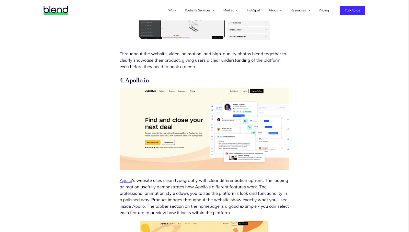
Apollo’s homepage features clean typography and looping animations that demonstrate product features clearly. The mega menu is intuitive with icons and text, supporting easy navigation without feeling overwhelming.
Why Apollo is a good SaaS website?
Professional animations show functionality clearly
Effective separation of features helps users understand the platform
Mega menu simplifies navigation with clear icons and text
Consistent visual style gives a polished feel
10. Canva

Canva’s website showcases its design power with vibrant visuals and real-time template previews. It caters to all skill levels with a simple interface, clear CTAs, and smooth onboarding across devices.
Why Canva is a good SaaS website?
Website reflects product quality
Real-time previews reduce uncertainty
Clear CTAs encourage action
Seamless onboarding experience
Balances creativity with simplicity
11. Figma

Figma website immerses visitors in its collaborative features through interactive visuals. Navigation uses unique illustrations to represent products creatively, making exploration engaging.
Why Figma is a good SaaS website?
Interactive visuals showcase collaboration naturally
Creative navigation adds personality
Focus on benefits when showing individual products
Cohesive brand storytelling through design elements
13. OpenAI
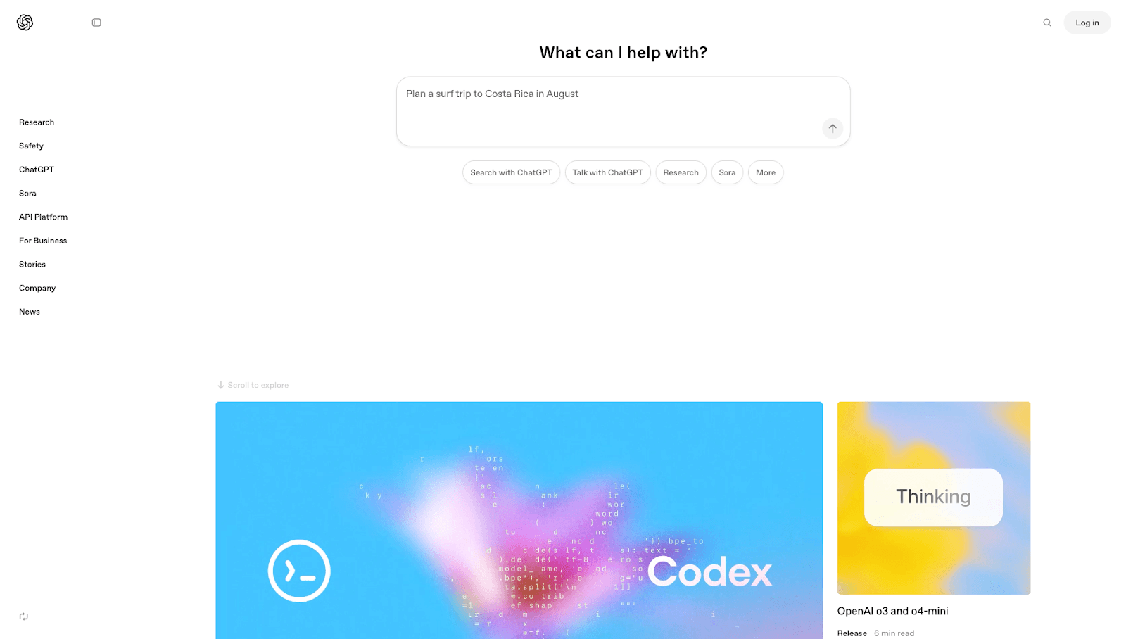
OpenAI’s website uses a minimalist design that makes advanced AI technology approachable and easy to understand. The clean layout guides visitors smoothly through sections like research, products, and business solutions. Interactive demos let users experience the technology firsthand before exploring further. Calls-to-action are well placed for developers, enterprises, and curious visitors, offering API access and insights.
Why OpenAI is a good SaaS website?
Minimalist design simplifies complex AI concepts
Intuitive navigation across research and product areas
Interactive demos engage users early
Clear, jargon-free educational content
Well-targeted CTAs for different user groups
13. Spotify

Spotify’s homepage draws users in with trending playlists and personalized mixes. The site balances visual richness with subtle premium upgrade prompts, making music discovery easy and enjoyable.
Why Spotify is a good SaaS website?
Instant engagement through playlists
Personalized user experience
Subtle premium promotion
Visually appealing album art
Smooth navigation for browsing
14. HubSpot

HubSpot’s website serves as a comprehensive hub for marketing, sales, customer service, and CRM tools. It offers clear navigation by user needs and industries, a rich library of educational resources, and a clean design with bold headlines and strategic CTAs. Social proof and free tools build trust and prove value upfront.
Why Hubspot is a good SaaS website?
Clear all-in-one CRM platform message
Intuitive navigation based on user roles
Extensive educational resources
Balanced design with whitespace and visuals
Strong trust signals with testimonials and free tools
15. Kajabi
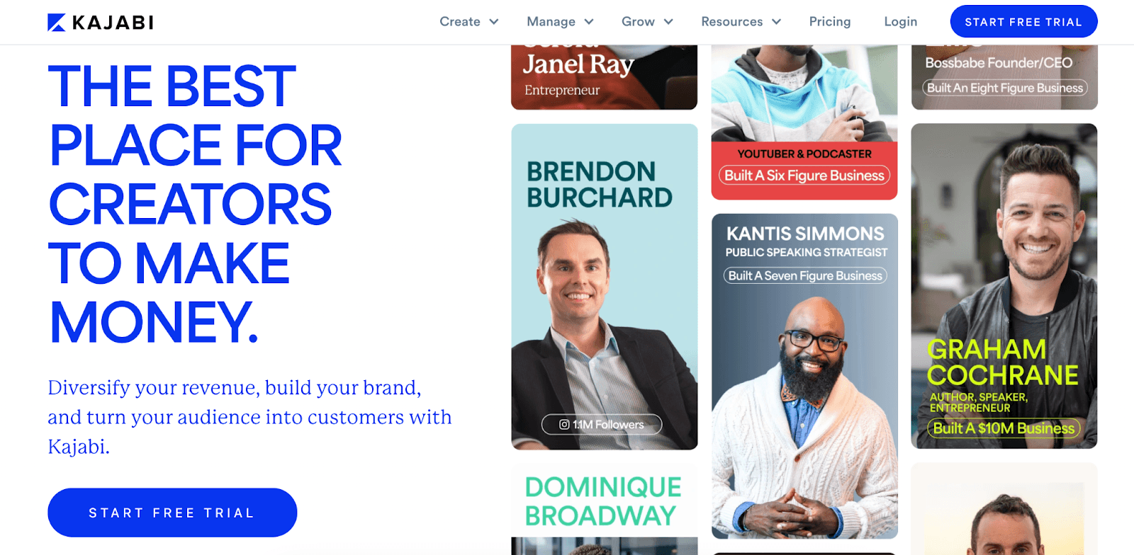
Kajabi’s homepage breaks the mold by focusing on its users rather than the company itself. By showcasing creator success stories, high revenue figures, and glowing testimonials, Kajabi builds instant credibility and motivates visitors with real-world examples. This people-first approach makes it a powerful source of SaaS website inspiration for brands wanting to connect emotionally with their audience.
Why Kajabi is a good SaaS website?
Highlights customer success stories that resonate with visitors
Uses social proof effectively to build trust
Avoids self-promotion in favor of user achievements, making the site feel authentic
16. Slack

Slack is a messaging platform widely used by teams globally for communication and collaboration. Their website uses straightforward design elements focusing on efficiency without excessive graphics or info overload. The footer is particularly well-designed, offering numerous useful links in a simple layout.
Why Slack is a good SaaS website?
Simple, clean design reduces cognitive load for visitors
Focused content highlights core product benefits clearly
Footer provides excellent inspiration for organizing extensive links accessible
17. Spline

Spline is a 3D design tool with a fun and interactive homepage showcasing its capabilities live. The navbar is minimal with key links only, features, community, Twitter, and documentation hosted on Notion-style pages suitable for early-stage products.
Why Spline is a best SaaS website?
Interactive homepage demonstrates product strengths effectively
Minimalist navbar avoids clutter and focuses on essentials
Notion-style documentation offers inspiration for early-stage SaaS websites
18. AirOps

AirOps helps founders and marketers build AI-driven workflows, focusing on content creation and SEO. The website is built on Webflow and features a simple, straightforward design that makes navigation easy. The navbar includes links to features, use cases, pricing, and resources. The footer reinforces the navigation with a clear call-to-action (CTA). Pricing is simple and plan-based on task volume, making it transparent for users.
Why AirOps is a good SaaS website?
Clean, minimal design focused on usability
Navbar covers all essential sections without clutter
Footer includes strong CTA and important links
A simple pricing layout helps users quickly understand options
The blog follows SaaS best practices, supporting content marketing
19. ClickUp

ClickUp is a project management tool with many landing pages targeting SEO. Its content-rich navbar categorizes features, use cases, and resources clearly. The blog includes CTAs and tables of contents for better navigation. The footer has competitor comparison pages that rank well on Google. Pricing is straightforward with simple tiers.
Why ClickUp is a good SaaS website?
SEO-driven landing pages increase organic traffic
Clear navbar categorization improves usability
Blog designed to engage readers and promote conversion
Competitor comparison pages enhance search visibility
Transparent pricing tiers simplify decision-making
20. SellX
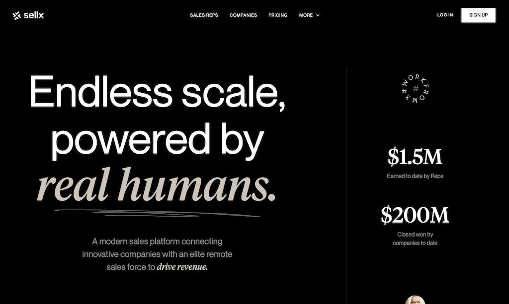
SellX helps businesses build sales teams with bold typography dominating the homepage alongside strong social proof logos that engage visitors immediately. Navigation bar keeps things simple, focusing on one audience type.
Why SellX is a good SaaS website?
Bold design grabs attention instantly while maintaining professionalism
Simple navbar focuses on core audience needs without distractions
Transparent pricing builds trust despite premium costs by emphasizing ROI
21. Dropbox

Dropbox provides cloud storage solutions for individuals and businesses. Known for its excellent design team, Dropbox uses bold typography and large images on the homepage to make an impact. Navbar includes sections like ‘Why Dropbox’, feature sets, pricing, support, and more.
Why Dropbox is a good SaaS website?
Visual hierarchy uses large imagery and fonts to focus attention
Intuitive navbar organizes varied content without clutter
Strong brand recognition leveraged through cohesive design
22. Streak
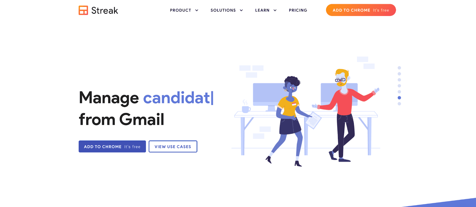
Streak’s homepage uses on-brand isometric illustrations paired with subtle animations and bold typography, creating a visually unified experience. Their consistent use of blue across icons, buttons, and text blocks strengthens brand recognition while keeping the site lively and approachable.
Why Steak is a good SaaS website?
Strong visual consistency supports brand identity
Animation adds energy without overwhelming visitors
Clear typography improves readability and user experience
23. Slidebean

Slidebean’s site uses ample white space punctuated by bright splashes of blue and coral pink to draw attention to CTAs and key sections. This clean approach allows users’ eyes to rest while guiding them naturally towards important information and actions.
Why Slidebean is a good SaaS website?
White space reduces cognitive load for visitors
Strategic color highlights focus user attention effectively
Minimalist design promotes quick understanding of value propositions
24. Zentail

Zentail opens with a bold statistic about sales growth to hook visitors immediately, followed by brand logos and client testimonials to reinforce credibility. Its unique ''Let’s Talk'' CTA uses casual language that lowers barriers for initiating contact.
Why Zentail is a good SaaS website?
Strong statistics grab attention right away
Brand recognition supports trust-building efforts
Friendly CTA encourages more user interaction
25. User Interviews
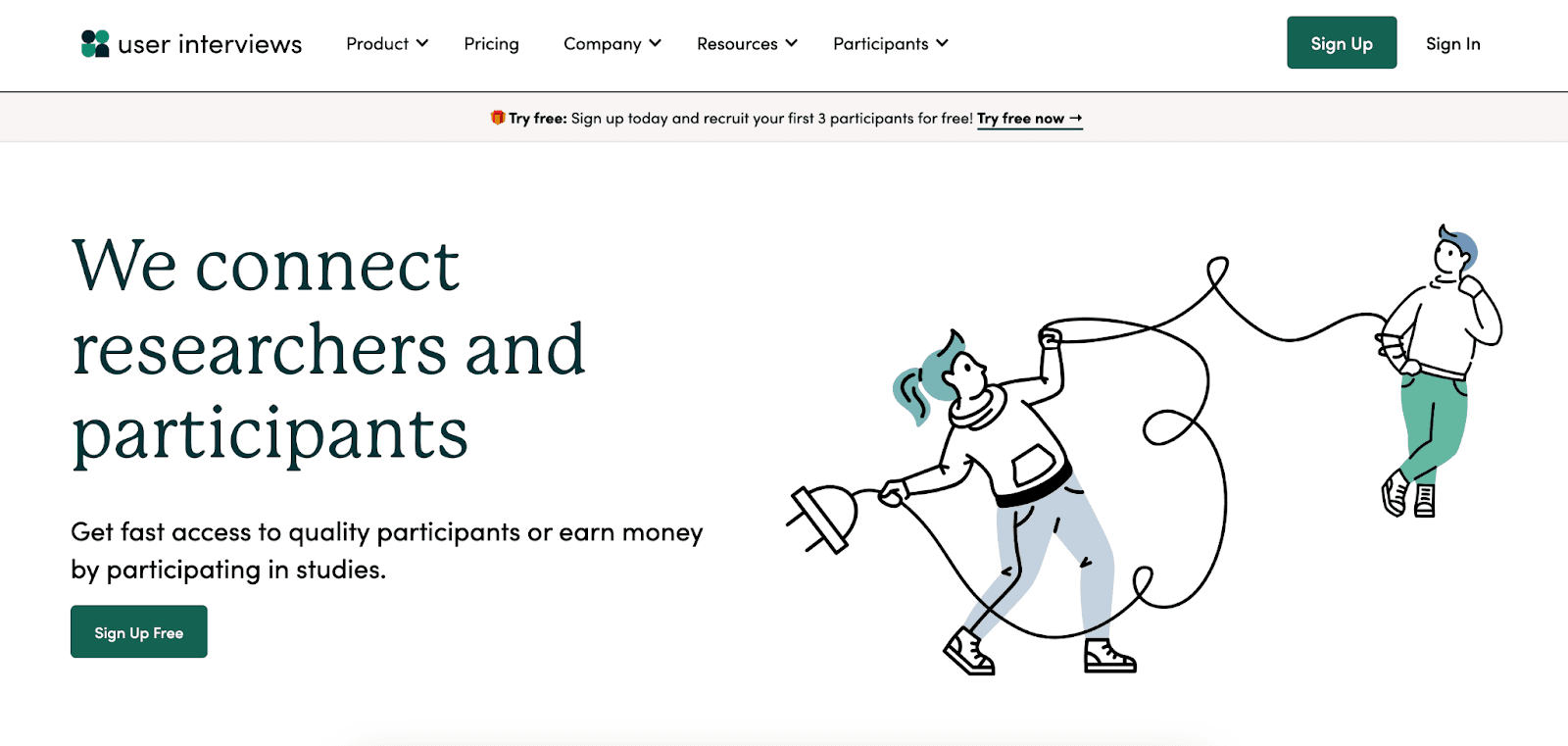
User Interviews’ website design is clean, playful, and filled with whimsical illustrations alongside numerous testimonials that build social proof. Their ''Sign up for free'' CTAs are clear and repeated strategically throughout the site to encourage conversions.
Why User Interview is a good SaaS website?
Whimsical visuals make the site approachable and friendly
Frequent CTAs reduce friction in the signup process
Testimonials add credibility while supporting clean design
26. Databox

Databox’s homepage clearly states what the product does right away, supported by social proof and a simple, static hero image that showcases the platform without distraction. Navigation through the product and pricing pages remains clear with useful features like a sticky pricing bar.
Why Databox is a good SaaS website?
Clear, straightforward messaging avoids confusion
Balanced visual design with a static hero image
Strategic use of social proof builds trust
Sticky pricing bar enhances user comparison and decision-making
Consistent, easy-to-understand calls to action
27. Appcues
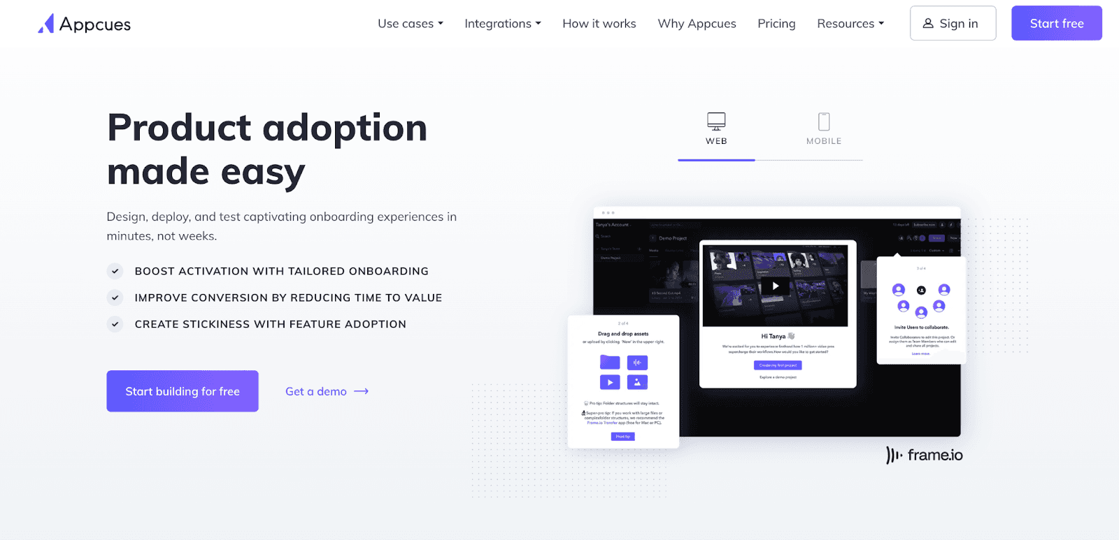
Appcues offers a succinct value proposition backed by data points and testimonials right on its homepage. The use of animation keeps the visitor engaged longer, which can improve conversion rates. Their prominent “Start for Free” CTA makes it easy for users to take action immediately.
Why Appcues is a good SaaS website?
Clear communication focused on customer benefits
Social proof enhances credibility and trustworthiness
Interactive elements increase user engagement time
28. Segment

Segment is a leading real-time customer data platform for developers and data analysts. The homepage is easy to navigate, emphasizing its primary CTA: booking a demo. The navbar offers extensive dropdowns covering products, pricing, use cases, and learning resources. However, dropdown menus don’t have visible arrows on the desktop, which might confuse some users.
Why Segment is a good SaaS website?
Clear focus on demo booking encourages user engagement
Comprehensive navbar provides all necessary information
Well-structured content aimed at a technical user base
Dropdowns organize complex info but could improve usability
29. Homerun

Homerun simplifies recruitment workflows; their site balances bold colors with whitespace for easy scanning; navbar includes an educational ''Learn'' resource hub clearly labeled; pricing toggles monthly/annual plans plus includes FAQs addressing concerns.
Why Homerun is a good SaaS website?
Visual balance improves user focus
Clear resource hub labeling aids navigation
Pricing toggles enhance choice visibility
FAQ section reduces buying friction
30. Whimsical

Whimsical website greets visitors with a bold color splash and quirky background elements, immediately reflecting the playful and creative nature of their visual communication tools. They use colorful templates and engaging animations that encourage exploration, making complex concepts like mind maps and flowcharts feel approachable.
Why Whimsical is a good SaaS website?
Bold, colorful design grabs attention instantly
Interactive demos and animations illustrate product power intuitively
Engaging visuals reduce intimidation around complex workflows
31. Equiem

Equiem combines solid design fundamentals with strategic video use and varied backgrounds for clear section distinctions. The site supports easy exploration and optimized conversion paths for demo requests.
Why Equiem is a good SaaS website?
Strong content and visual harmony convey a message clearly
Strategic video placement enhances engagement
Varied backgrounds improve readability and focus
Conversion paths designed for effectiveness
32. Nauto

Nauto grabs attention with a video preview of futuristic driving technology right on its homepage, followed by data-backed statements showing value delivered to over 800 brands, mixing diverse design elements that together increase trust and conversions.
Why Nauto is a good SaaS website?
Video content immediately engages visitors visually
Data-backed testimonials boost credibility significantly
Balanced design mixes visuals and copy for clarity
33. Gemnote
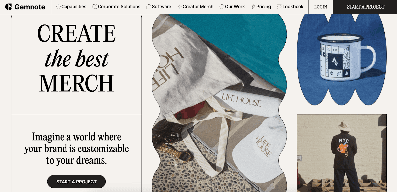
Gemnote’s homepage features striking hero images that vividly showcase custom merchandise products customers can order easily through their platform. The use of both filled and ghost buttons smartly increases click-through rates by providing clear options.
Why Gemnote is a good SaaS website?
Visual storytelling grabs attention immediately
Dual-button design encourages more interaction choices
Product-focused imagery clarifies offering at a glance
34. Attentive

Attentive offers SMS marketing tools for brands connecting with customers via text messages. Their colorful and clean website stands out visually. Navbar includes product features, case studies, resources, and more; drop downs open on click rather than hover which supports accessibility.
Why Attentive is a good SaaS website?
Vibrant design grabs attention while maintaining clarity
Accessibility-focused dropdown interaction accommodates all users
Well-organized content supports buyer education
35. Coherence

Coherence helps developers ship code; their beta landing page is simple yet attractive without complex navigation or pricing info, typical of early-stage SaaS products focusing on capturing early interest.
Why Coherence is a good SaaS website?
Clean beta landing page keeps focus on product promise
Minimalism avoids unnecessary complexity during early product stages
36. Tranch

Tranch offers expense financing using playful colors to soften the serious topic of money management. Its simple navbar provides info about features and use cases but lacks blog or pricing pages publicly available, instead focusing on lead capture through CTAs. Their FAQ page categorizes questions well.
Why Tranch is a good SaaS website?
Playful design makes finance approachable to users
FAQ page effectively addresses user concerns in categories for easy navigation
Focused CTAs help qualify leads before providing detailed info
37. Ghost

Ghost evolved from a CMS alternative to a full media and newsletter platform. Its site uses a clean navbar with dropdowns separating use cases and resources. The blog includes a ‘Start here’ guide for new users. Pricing is presented in clear tiers with an interactive slider to demonstrate cost changes as usage increases.
Why Ghost is a good SaaS website?
Simple, clean navbar with well-organized dropdowns
Helpful blog structure that guides users effectively
Pricing page with interactive slider offers transparent cost visualization
Clear messaging aids quick understanding of product offerings
Common Design Trends in 2026
In 2026, SaaS website design continues to evolve, embracing trends that enhance user experience, accessibility, and personalization. Drawing inspiration from the best SaaS websites, here's an overview of the most prominent design trends shaping the industry:
1. Minimalist Design with Bold Typography
Simplicity remains paramount. Clean layouts with ample white space and bold typography help convey messages clearly without overwhelming users. This approach, seen in effective SaaS website examples, ensures content is digestible and navigation is intuitive.
2. AI-Driven Personalization
Artificial Intelligence enables websites to adapt content in real-time based on user behavior, preferences, and location. Such personalization enhances user engagement and satisfaction, a hallmark of top SaaS websites.
3. Dark Mode and High-Contrast Themes
Dark mode has transitioned from a novelty to a standard feature, offering reduced eye strain and improved battery life. High-contrast color schemes also enhance readability, catering to accessibility needs.
4. Microinteractions and Subtle Animations
Small animations, like button hovers or loading indicators, provide feedback and guide users through tasks seamlessly. These microinteractions, prevalent in the most popular SaaS website designs, enrich the user experience without causing distractions.
5. Asymmetrical and Dynamic Layouts
Breaking away from traditional grid systems, asymmetrical layouts introduce visual interest and guide users' attention strategically. This trend adds a modern flair to SaaS landing pages, making them stand out.
6. 3D Elements and Immersive Experiences
Incorporating 3D graphics and interactive elements offers users a more engaging experience. From product demonstrations to immersive storytelling, these features are becoming staples in SaaS website inspiration.
7. Voice User Interface (VUI) Integration
With the rise of voice-activated devices, integrating VUI allows users to navigate websites using voice commands, enhancing accessibility and user convenience.
8. Inclusive and Accessible Design
Designing with accessibility in mind ensures that websites are usable by everyone, including those with disabilities. Features like screen reader compatibility, keyboard navigation, and customizable interfaces are becoming standard in best B2B SaaS websites.
9. Data-Driven Storytelling
Utilizing real-time data visualizations and interactive infographics helps convey complex information effectively. This approach not only informs but also engages users, a strategy seen in many top SaaS websites.
10. Bold and Expressive Typography
Typography is taking center stage, with designers using bold, expressive fonts to convey brand personality and guide user attention. This trend adds character to SaaS landing pages and enhances readability.
By embracing these design trends, SaaS companies can create websites that are not only visually appealing but also user-centric and accessible. For more insights and examples, explore our curated SaaS websites list, showcasing the best SaaS web design inspiration.
Tips to Captivate and Convert Your SaaS Website Audience
Captivating and converting visitors on your SaaS website requires more than just a sleek design; it demands a strategic approach that aligns with user expectations and behaviors. Drawing from the most effective SaaS website examples and best practices in 2026, here are actionable tips to enhance your website's performance:
1. Craft a Clear and Compelling Value Proposition
Your homepage should immediately communicate the unique value your SaaS product offers. Utilize concise headlines and subheadings that address your audience's pain points and how your solution resolves them. Incorporate persuasive call-to-action (CTA) buttons like “Start Free Trial” or “Schedule a Demo” to guide users toward conversion.
2. Leverage Social Proof to Build Trust
Displaying testimonials, client reviews, and recognizable logos of existing customers can significantly enhance credibility. Highlighting success stories and case studies demonstrates real-world applications of your product, fostering trust among potential users.
3. Implement Intuitive Navigation and User Experience
Ensure your website's layout is clean and navigation is intuitive. Users should effortlessly find information about your product features, pricing, and support. A seamless user experience reduces friction and keeps visitors engaged.
4. Utilize Engaging Visuals and Interactive Elements
Incorporate high-quality images, videos, and interactive elements that showcase your product in action. These visuals can effectively communicate complex features and benefits, making your offering more tangible and appealing.
5. Optimize for Mobile Responsiveness
With a significant number of users accessing websites via mobile devices, ensure your SaaS website is fully responsive. A mobile-optimized site provides a consistent and accessible experience across all devices, which is crucial for user retention and conversion.
6. Incorporate Clear and Strategic CTAs
Place CTAs strategically throughout your website to guide users toward desired actions. Whether it's signing up for a newsletter, starting a free trial, or contacting sales, clear CTAs facilitate user engagement and drive conversions.
7. Provide Valuable and Relevant Content
Offer informative content such as blogs, guides, and FAQs that address common questions and challenges faced by your target audience. This not only positions your brand as an industry authority but also aids in SEO efforts, attracting more organic traffic.
8. Regularly Update and Test Website Elements
Continuously monitor and test different aspects of your website, including headlines, images, and CTAs, to determine what resonates best with your audience. A/B testing can provide insights into user preferences, allowing for data-driven optimizations.
By implementing these strategies, inspired by the best SaaS web design inspiration and effective SaaS website examples, you can create a compelling SaaS landing page that not only attracts visitors but also converts them into loyal customers.
Conclusion
Designing a SaaS website that captivates your audience in 2026 involves more than just aesthetics; it's about creating an experience that resonates with users and drives conversions. The most popular SaaS website designs seamlessly blend visual appeal with user-centric functionality, ensuring that visitors not only understand the product's value but are also guided effortlessly toward conversion.
By examining the best SaaS websites inspiration discussed above, you can see how clear messaging, intuitive navigation, and strategic use of visuals can elevate user experience. Effective SaaS website examples demonstrate that prioritizing user needs and showcasing product benefits transparently can significantly boost engagement and trust.
In 2026, standing out online is essential, and your SaaS website can make or break first impressions. The top SaaS website designs combine clean visuals with intuitive features, helping visitors quickly understand your product and take action.
This article showcases over 35 of the best SaaS websites, offering practical ideas for anyone building or updating a site. From B2B SaaS websites to creative landing pages, these examples demonstrate how design and user experience can drive sign-ups and engagement.
You’ll find SaaS UX examples with clear messaging, smart layouts, and engaging visuals that guide users smoothly through the content. Each site shows how top companies use design to connect with their audience and achieve results.
Explore these top SaaS websites of 2026 for inspiration and learn how to create a site that not only looks great but works effectively for your business.
What Makes a Great SaaS Website Design?
A great SaaS website design does more than look good. It communicates value, builds trust, and encourages visitors to take action.Below are main features of SaaS website design:
Clear and Strong Value Proposition
The top SaaS website examples immediately show what the product does and why it matters. For example, Copilot’s homepage clearly states its value: "Run a modern service-based business." Visitors instantly understand the benefit.
Simple and Easy Navigation
The best SaaS websites use simple menus and layouts. Users can quickly find what they need, making the experience smooth and enjoyable. Clear navigation is a core part of effective SaaS UX.
Mobile-Friendly and Responsive Design
Most users visit websites on mobile devices. Leading SaaS websites adapt perfectly to all screen sizes, keeping the experience consistent. Responsive design also helps with SEO and user engagement.
Smart Visual Hierarchy
Good SaaS website design guides users with the right use of fonts, colors, and spacing. Important information and calls to action are easy to spot, helping visitors understand the product quickly.
Engaging Visuals and Interactive Elements
Animations, videos, and interactive components make a site more engaging. For instance, Spline’s homepage lets users explore 3D designs in real-time, showing what the product can do.
Build Trust with Users
Top SaaS websites use testimonials, case studies, and security badges to show reliability. These trust signals make visitors feel confident about the product.
Fast Loading and Performance
Speed matters. The best SaaS websites load quickly, keeping users engaged. Optimized images, clean code, and reliable hosting improve performance and UX.
Useful and Relevant Content
Content that solves user problems keeps people on the site longer. Tutorials, guides, and insights position SaaS companies as helpful and trustworthy, encouraging visitors to explore further.
Test and Improve Continuously
Leading SaaS websites regularly test layouts, buttons, and features. A/B testing helps refine design and improve conversion rates.
In short, the best SaaS website designs combine clarity, usability, responsiveness, trust, speed, and helpful content. By studying top SaaS website examples, businesses can create sites that attract visitors and turn them into loyal customers.
If you want to design a fantastic SaaS website that will stand out in this digital landscape, exploring some examples can provide invaluable insights in your journey. In this article, we’ve collected the top 35+ SaaS website designs to inspire you.
So, let’s get started!
1. Copilot
Copilot helps service providers manage communication, payments, and reporting through branded client portals. Its homepage immediately shows the value of the product, making it clear why visitors should use it.
The navigation menu is simple, covering key sections like features, use cases, pricing, and resources. Blog articles are well-structured with tables of contents, making them easy to read. The pricing page uses whitespace effectively, so visitors can easily compare plans.
Why Copilot is a great SaaS website example?
Clear messaging that communicates value instantly
Simple navigation covering all main sections
Well-structured blog content for easy reading
Clean pricing page with clear plan comparison
2. Webflow
Webflow is a no-code website builder designed specifically for designers and developers. The site features strong branding and an intuitive navigation bar that links to multiple landing pages tailored for different audiences. Their blog acts as a media arm focused on SEO content, attracting designers/developers organically. Pricing is complex but well organized.
Why Webflow is a good SaaS website?
Strong brand focus targeting ideal customers precisely
Intuitive navbar linking to diverse landing pages for multiple audiences
SEO-driven blog content attracts organic traffic effectively
Complex pricing handled with clear organization
3. Framer
Framer is a web design tool for custom site creation without coding. The site includes demo videos explaining product features and competitive differentiators, along with social proof and templates. Its design has a high-quality “Apple-like” feel. Navbar covers use cases, pricing, resources, and integrations clearly.
Why Framer is a good SaaS website?
High-quality design evokes premium brand perception
Clear demo videos help users understand product value quickly
Comprehensive navbar supports diverse user needs effectively
4. Beehiiv
Beehiiv is a newsletter platform for marketers and creators that emphasizes growth. Its homepage feels modern with a slight Web3 aesthetic through its color palette and design. The value proposition is clear. The navbar explains product features clearly, and the pricing page is easy to understand.
Why Beehiiv is a good SaaS website?
Modern, clean design aligned with marketing and creator audiences
Clear value proposition displayed prominently on the homepage
Well-organized navbar and straightforward pricing page enhance user experience
5. Lattice
Lattice clearly lays out its multiple services like compensation tracking and performance analytics, right on the homepage. It balances showing many features without clutter, using concise copy and clear CTAs like ''Free Demo.'' The site’s structure helps HR professionals quickly find relevant solutions, making it a great example among best B2B SaaS websites.
Why Lattice is a good SaaS website?
Copy-driven approach fits the HR target audience perfectly without distractions
Detailed navbar categorizes extensive industry-specific content well
Pricing page includes a chatbot helping users get personalized help instantly
Presents multiple services cleanly, avoiding information overload
Uses use cases that speak directly to different customer needs
6. Proof
Proof’s website instantly connects with visitors by demonstrating how its tools boost conversion rates through real-time personalization and social proof badges. The homepage is designed to communicate the value of their products, Experiences and Pulse, without overwhelming visitors with technical jargon. This direct approach makes it easy for potential customers to understand how Proof can impact their bottom line.
Why Proof is a good SaaS website?
Personalized user experience immediately makes the visitor feel valued and understood
Simplifies complex ideas like social proof into relatable benefits
Uses clear, action-oriented messaging to show product value quickly
7. Loom
Loom uses videos extensively, from hero videos to GIFs, to convey product functionality without heavy text reliance. This strategy makes the site dynamic and accessible, helping visitors quickly grasp how Loom’s video chat tool can improve communication.
Why Loom is a good SaaS website?
Video-driven content grabs and holds visitor attention instantly
Minimal text keeps messaging clear and focused on benefits
Dynamic media enhances overall user engagement naturally
8. Jasper
Jasper is a fantastic AI copywriting tool; their homepage uses bold headlines and demo videos, plus strong social proof from reviews to build credibility fast; the navbar covers essentials, but dropdown menus blend visually, reducing clarity; pricing slider allows pay-per-use flexibility.
Why Jasper is a good SaaS website?
Bold demos show product benefits right away
Social proof from multiple sources builds trust
Flexible slider-based pricing fits diverse user needs
Navbar covers info well despite minor readability issues
9. Apollo.io
Apollo’s homepage features clean typography and looping animations that demonstrate product features clearly. The mega menu is intuitive with icons and text, supporting easy navigation without feeling overwhelming.
Why Apollo is a good SaaS website?
Professional animations show functionality clearly
Effective separation of features helps users understand the platform
Mega menu simplifies navigation with clear icons and text
Consistent visual style gives a polished feel
10. Canva
Canva’s website showcases its design power with vibrant visuals and real-time template previews. It caters to all skill levels with a simple interface, clear CTAs, and smooth onboarding across devices.
Why Canva is a good SaaS website?
Website reflects product quality
Real-time previews reduce uncertainty
Clear CTAs encourage action
Seamless onboarding experience
Balances creativity with simplicity
11. Figma
Figma website immerses visitors in its collaborative features through interactive visuals. Navigation uses unique illustrations to represent products creatively, making exploration engaging.
Why Figma is a good SaaS website?
Interactive visuals showcase collaboration naturally
Creative navigation adds personality
Focus on benefits when showing individual products
Cohesive brand storytelling through design elements
13. OpenAI
OpenAI’s website uses a minimalist design that makes advanced AI technology approachable and easy to understand. The clean layout guides visitors smoothly through sections like research, products, and business solutions. Interactive demos let users experience the technology firsthand before exploring further. Calls-to-action are well placed for developers, enterprises, and curious visitors, offering API access and insights.
Why OpenAI is a good SaaS website?
Minimalist design simplifies complex AI concepts
Intuitive navigation across research and product areas
Interactive demos engage users early
Clear, jargon-free educational content
Well-targeted CTAs for different user groups
13. Spotify
Spotify’s homepage draws users in with trending playlists and personalized mixes. The site balances visual richness with subtle premium upgrade prompts, making music discovery easy and enjoyable.
Why Spotify is a good SaaS website?
Instant engagement through playlists
Personalized user experience
Subtle premium promotion
Visually appealing album art
Smooth navigation for browsing
14. HubSpot
HubSpot’s website serves as a comprehensive hub for marketing, sales, customer service, and CRM tools. It offers clear navigation by user needs and industries, a rich library of educational resources, and a clean design with bold headlines and strategic CTAs. Social proof and free tools build trust and prove value upfront.
Why Hubspot is a good SaaS website?
Clear all-in-one CRM platform message
Intuitive navigation based on user roles
Extensive educational resources
Balanced design with whitespace and visuals
Strong trust signals with testimonials and free tools
15. Kajabi
Kajabi’s homepage breaks the mold by focusing on its users rather than the company itself. By showcasing creator success stories, high revenue figures, and glowing testimonials, Kajabi builds instant credibility and motivates visitors with real-world examples. This people-first approach makes it a powerful source of SaaS website inspiration for brands wanting to connect emotionally with their audience.
Why Kajabi is a good SaaS website?
Highlights customer success stories that resonate with visitors
Uses social proof effectively to build trust
Avoids self-promotion in favor of user achievements, making the site feel authentic
16. Slack
Slack is a messaging platform widely used by teams globally for communication and collaboration. Their website uses straightforward design elements focusing on efficiency without excessive graphics or info overload. The footer is particularly well-designed, offering numerous useful links in a simple layout.
Why Slack is a good SaaS website?
Simple, clean design reduces cognitive load for visitors
Focused content highlights core product benefits clearly
Footer provides excellent inspiration for organizing extensive links accessible
17. Spline
Spline is a 3D design tool with a fun and interactive homepage showcasing its capabilities live. The navbar is minimal with key links only, features, community, Twitter, and documentation hosted on Notion-style pages suitable for early-stage products.
Why Spline is a best SaaS website?
Interactive homepage demonstrates product strengths effectively
Minimalist navbar avoids clutter and focuses on essentials
Notion-style documentation offers inspiration for early-stage SaaS websites
18. AirOps
AirOps helps founders and marketers build AI-driven workflows, focusing on content creation and SEO. The website is built on Webflow and features a simple, straightforward design that makes navigation easy. The navbar includes links to features, use cases, pricing, and resources. The footer reinforces the navigation with a clear call-to-action (CTA). Pricing is simple and plan-based on task volume, making it transparent for users.
Why AirOps is a good SaaS website?
Clean, minimal design focused on usability
Navbar covers all essential sections without clutter
Footer includes strong CTA and important links
A simple pricing layout helps users quickly understand options
The blog follows SaaS best practices, supporting content marketing
19. ClickUp
ClickUp is a project management tool with many landing pages targeting SEO. Its content-rich navbar categorizes features, use cases, and resources clearly. The blog includes CTAs and tables of contents for better navigation. The footer has competitor comparison pages that rank well on Google. Pricing is straightforward with simple tiers.
Why ClickUp is a good SaaS website?
SEO-driven landing pages increase organic traffic
Clear navbar categorization improves usability
Blog designed to engage readers and promote conversion
Competitor comparison pages enhance search visibility
Transparent pricing tiers simplify decision-making
20. SellX
SellX helps businesses build sales teams with bold typography dominating the homepage alongside strong social proof logos that engage visitors immediately. Navigation bar keeps things simple, focusing on one audience type.
Why SellX is a good SaaS website?
Bold design grabs attention instantly while maintaining professionalism
Simple navbar focuses on core audience needs without distractions
Transparent pricing builds trust despite premium costs by emphasizing ROI
21. Dropbox
Dropbox provides cloud storage solutions for individuals and businesses. Known for its excellent design team, Dropbox uses bold typography and large images on the homepage to make an impact. Navbar includes sections like ‘Why Dropbox’, feature sets, pricing, support, and more.
Why Dropbox is a good SaaS website?
Visual hierarchy uses large imagery and fonts to focus attention
Intuitive navbar organizes varied content without clutter
Strong brand recognition leveraged through cohesive design
22. Streak
Streak’s homepage uses on-brand isometric illustrations paired with subtle animations and bold typography, creating a visually unified experience. Their consistent use of blue across icons, buttons, and text blocks strengthens brand recognition while keeping the site lively and approachable.
Why Steak is a good SaaS website?
Strong visual consistency supports brand identity
Animation adds energy without overwhelming visitors
Clear typography improves readability and user experience
23. Slidebean
Slidebean’s site uses ample white space punctuated by bright splashes of blue and coral pink to draw attention to CTAs and key sections. This clean approach allows users’ eyes to rest while guiding them naturally towards important information and actions.
Why Slidebean is a good SaaS website?
White space reduces cognitive load for visitors
Strategic color highlights focus user attention effectively
Minimalist design promotes quick understanding of value propositions
24. Zentail
Zentail opens with a bold statistic about sales growth to hook visitors immediately, followed by brand logos and client testimonials to reinforce credibility. Its unique ''Let’s Talk'' CTA uses casual language that lowers barriers for initiating contact.
Why Zentail is a good SaaS website?
Strong statistics grab attention right away
Brand recognition supports trust-building efforts
Friendly CTA encourages more user interaction
25. User Interviews
User Interviews’ website design is clean, playful, and filled with whimsical illustrations alongside numerous testimonials that build social proof. Their ''Sign up for free'' CTAs are clear and repeated strategically throughout the site to encourage conversions.
Why User Interview is a good SaaS website?
Whimsical visuals make the site approachable and friendly
Frequent CTAs reduce friction in the signup process
Testimonials add credibility while supporting clean design
26. Databox
Databox’s homepage clearly states what the product does right away, supported by social proof and a simple, static hero image that showcases the platform without distraction. Navigation through the product and pricing pages remains clear with useful features like a sticky pricing bar.
Why Databox is a good SaaS website?
Clear, straightforward messaging avoids confusion
Balanced visual design with a static hero image
Strategic use of social proof builds trust
Sticky pricing bar enhances user comparison and decision-making
Consistent, easy-to-understand calls to action
27. Appcues
Appcues offers a succinct value proposition backed by data points and testimonials right on its homepage. The use of animation keeps the visitor engaged longer, which can improve conversion rates. Their prominent “Start for Free” CTA makes it easy for users to take action immediately.
Why Appcues is a good SaaS website?
Clear communication focused on customer benefits
Social proof enhances credibility and trustworthiness
Interactive elements increase user engagement time
28. Segment
Segment is a leading real-time customer data platform for developers and data analysts. The homepage is easy to navigate, emphasizing its primary CTA: booking a demo. The navbar offers extensive dropdowns covering products, pricing, use cases, and learning resources. However, dropdown menus don’t have visible arrows on the desktop, which might confuse some users.
Why Segment is a good SaaS website?
Clear focus on demo booking encourages user engagement
Comprehensive navbar provides all necessary information
Well-structured content aimed at a technical user base
Dropdowns organize complex info but could improve usability
29. Homerun
Homerun simplifies recruitment workflows; their site balances bold colors with whitespace for easy scanning; navbar includes an educational ''Learn'' resource hub clearly labeled; pricing toggles monthly/annual plans plus includes FAQs addressing concerns.
Why Homerun is a good SaaS website?
Visual balance improves user focus
Clear resource hub labeling aids navigation
Pricing toggles enhance choice visibility
FAQ section reduces buying friction
30. Whimsical
Whimsical website greets visitors with a bold color splash and quirky background elements, immediately reflecting the playful and creative nature of their visual communication tools. They use colorful templates and engaging animations that encourage exploration, making complex concepts like mind maps and flowcharts feel approachable.
Why Whimsical is a good SaaS website?
Bold, colorful design grabs attention instantly
Interactive demos and animations illustrate product power intuitively
Engaging visuals reduce intimidation around complex workflows
31. Equiem
Equiem combines solid design fundamentals with strategic video use and varied backgrounds for clear section distinctions. The site supports easy exploration and optimized conversion paths for demo requests.
Why Equiem is a good SaaS website?
Strong content and visual harmony convey a message clearly
Strategic video placement enhances engagement
Varied backgrounds improve readability and focus
Conversion paths designed for effectiveness
32. Nauto
Nauto grabs attention with a video preview of futuristic driving technology right on its homepage, followed by data-backed statements showing value delivered to over 800 brands, mixing diverse design elements that together increase trust and conversions.
Why Nauto is a good SaaS website?
Video content immediately engages visitors visually
Data-backed testimonials boost credibility significantly
Balanced design mixes visuals and copy for clarity
33. Gemnote
Gemnote’s homepage features striking hero images that vividly showcase custom merchandise products customers can order easily through their platform. The use of both filled and ghost buttons smartly increases click-through rates by providing clear options.
Why Gemnote is a good SaaS website?
Visual storytelling grabs attention immediately
Dual-button design encourages more interaction choices
Product-focused imagery clarifies offering at a glance
34. Attentive
Attentive offers SMS marketing tools for brands connecting with customers via text messages. Their colorful and clean website stands out visually. Navbar includes product features, case studies, resources, and more; drop downs open on click rather than hover which supports accessibility.
Why Attentive is a good SaaS website?
Vibrant design grabs attention while maintaining clarity
Accessibility-focused dropdown interaction accommodates all users
Well-organized content supports buyer education
35. Coherence
Coherence helps developers ship code; their beta landing page is simple yet attractive without complex navigation or pricing info, typical of early-stage SaaS products focusing on capturing early interest.
Why Coherence is a good SaaS website?
Clean beta landing page keeps focus on product promise
Minimalism avoids unnecessary complexity during early product stages
36. Tranch
Tranch offers expense financing using playful colors to soften the serious topic of money management. Its simple navbar provides info about features and use cases but lacks blog or pricing pages publicly available, instead focusing on lead capture through CTAs. Their FAQ page categorizes questions well.
Why Tranch is a good SaaS website?
Playful design makes finance approachable to users
FAQ page effectively addresses user concerns in categories for easy navigation
Focused CTAs help qualify leads before providing detailed info
37. Ghost
Ghost evolved from a CMS alternative to a full media and newsletter platform. Its site uses a clean navbar with dropdowns separating use cases and resources. The blog includes a ‘Start here’ guide for new users. Pricing is presented in clear tiers with an interactive slider to demonstrate cost changes as usage increases.
Why Ghost is a good SaaS website?
Simple, clean navbar with well-organized dropdowns
Helpful blog structure that guides users effectively
Pricing page with interactive slider offers transparent cost visualization
Clear messaging aids quick understanding of product offerings
Common Design Trends in 2026
In 2026, SaaS website design continues to evolve, embracing trends that enhance user experience, accessibility, and personalization. Drawing inspiration from the best SaaS websites, here's an overview of the most prominent design trends shaping the industry:
1. Minimalist Design with Bold Typography
Simplicity remains paramount. Clean layouts with ample white space and bold typography help convey messages clearly without overwhelming users. This approach, seen in effective SaaS website examples, ensures content is digestible and navigation is intuitive.
2. AI-Driven Personalization
Artificial Intelligence enables websites to adapt content in real-time based on user behavior, preferences, and location. Such personalization enhances user engagement and satisfaction, a hallmark of top SaaS websites.
3. Dark Mode and High-Contrast Themes
Dark mode has transitioned from a novelty to a standard feature, offering reduced eye strain and improved battery life. High-contrast color schemes also enhance readability, catering to accessibility needs.
4. Microinteractions and Subtle Animations
Small animations, like button hovers or loading indicators, provide feedback and guide users through tasks seamlessly. These microinteractions, prevalent in the most popular SaaS website designs, enrich the user experience without causing distractions.
5. Asymmetrical and Dynamic Layouts
Breaking away from traditional grid systems, asymmetrical layouts introduce visual interest and guide users' attention strategically. This trend adds a modern flair to SaaS landing pages, making them stand out.
6. 3D Elements and Immersive Experiences
Incorporating 3D graphics and interactive elements offers users a more engaging experience. From product demonstrations to immersive storytelling, these features are becoming staples in SaaS website inspiration.
7. Voice User Interface (VUI) Integration
With the rise of voice-activated devices, integrating VUI allows users to navigate websites using voice commands, enhancing accessibility and user convenience.
8. Inclusive and Accessible Design
Designing with accessibility in mind ensures that websites are usable by everyone, including those with disabilities. Features like screen reader compatibility, keyboard navigation, and customizable interfaces are becoming standard in best B2B SaaS websites.
9. Data-Driven Storytelling
Utilizing real-time data visualizations and interactive infographics helps convey complex information effectively. This approach not only informs but also engages users, a strategy seen in many top SaaS websites.
10. Bold and Expressive Typography
Typography is taking center stage, with designers using bold, expressive fonts to convey brand personality and guide user attention. This trend adds character to SaaS landing pages and enhances readability.
By embracing these design trends, SaaS companies can create websites that are not only visually appealing but also user-centric and accessible. For more insights and examples, explore our curated SaaS websites list, showcasing the best SaaS web design inspiration.
Tips to Captivate and Convert Your SaaS Website Audience
Captivating and converting visitors on your SaaS website requires more than just a sleek design; it demands a strategic approach that aligns with user expectations and behaviors. Drawing from the most effective SaaS website examples and best practices in 2026, here are actionable tips to enhance your website's performance:
1. Craft a Clear and Compelling Value Proposition
Your homepage should immediately communicate the unique value your SaaS product offers. Utilize concise headlines and subheadings that address your audience's pain points and how your solution resolves them. Incorporate persuasive call-to-action (CTA) buttons like “Start Free Trial” or “Schedule a Demo” to guide users toward conversion.
2. Leverage Social Proof to Build Trust
Displaying testimonials, client reviews, and recognizable logos of existing customers can significantly enhance credibility. Highlighting success stories and case studies demonstrates real-world applications of your product, fostering trust among potential users.
3. Implement Intuitive Navigation and User Experience
Ensure your website's layout is clean and navigation is intuitive. Users should effortlessly find information about your product features, pricing, and support. A seamless user experience reduces friction and keeps visitors engaged.
4. Utilize Engaging Visuals and Interactive Elements
Incorporate high-quality images, videos, and interactive elements that showcase your product in action. These visuals can effectively communicate complex features and benefits, making your offering more tangible and appealing.
5. Optimize for Mobile Responsiveness
With a significant number of users accessing websites via mobile devices, ensure your SaaS website is fully responsive. A mobile-optimized site provides a consistent and accessible experience across all devices, which is crucial for user retention and conversion.
6. Incorporate Clear and Strategic CTAs
Place CTAs strategically throughout your website to guide users toward desired actions. Whether it's signing up for a newsletter, starting a free trial, or contacting sales, clear CTAs facilitate user engagement and drive conversions.
7. Provide Valuable and Relevant Content
Offer informative content such as blogs, guides, and FAQs that address common questions and challenges faced by your target audience. This not only positions your brand as an industry authority but also aids in SEO efforts, attracting more organic traffic.
8. Regularly Update and Test Website Elements
Continuously monitor and test different aspects of your website, including headlines, images, and CTAs, to determine what resonates best with your audience. A/B testing can provide insights into user preferences, allowing for data-driven optimizations.
By implementing these strategies, inspired by the best SaaS web design inspiration and effective SaaS website examples, you can create a compelling SaaS landing page that not only attracts visitors but also converts them into loyal customers.
Conclusion
Designing a SaaS website that captivates your audience in 2026 involves more than just aesthetics; it's about creating an experience that resonates with users and drives conversions. The most popular SaaS website designs seamlessly blend visual appeal with user-centric functionality, ensuring that visitors not only understand the product's value but are also guided effortlessly toward conversion.
By examining the best SaaS websites inspiration discussed above, you can see how clear messaging, intuitive navigation, and strategic use of visuals can elevate user experience. Effective SaaS website examples demonstrate that prioritizing user needs and showcasing product benefits transparently can significantly boost engagement and trust.

Read more articles

Feb 28, 2026
Best Framer Templates with Parallax Scrolling
Feb 28, 2026
Best Framer Templates with Parallax Scrolling

Feb 22, 2026
Framer Canvas: Design Without Limits
Feb 22, 2026
Framer Canvas: Design Without Limits
Feb 19, 2026
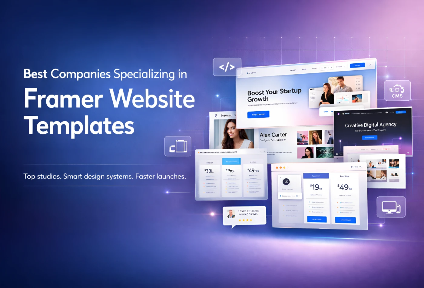
Best Companies Specializing in Framer Website Templates in 2026
Feb 19, 2026
Best Companies Specializing in Framer Website Templates in 2026
Get exclusive 10% discount on your next purchase.
We will send the discount code immediately in your inbox.

Templates
Copyright © 2026 FramerBite, A Part of Creetfy LLC. All Rights Reserved
Follow us on Twitter
Get exclusive 10% discount on your next purchase.
We will send the discount code immediately in your inbox.
Templates
Copyright © 2026 FramerBite, A Part of Creetfy LLC. All Rights Reserved
Follow us on Twitter
Get exclusive 10% discount on your next purchase.
We will send the discount code immediately in your inbox.
Templates
Copyright © 2026 FramerBite, A Part of Creetfy LLC. All Rights Reserved
Follow us on Twitter
Get exclusive 10% discount on your next purchase.
We will send the discount code immediately in your inbox.
Templates
Copyright © 2026 FramerBite, A Part of Creetfy LLC. All Rights Reserved
Follow us on Twitter