25 Modern Blog Website Design Inspiration Examples
Last Updated on:
Author:
Framerbite
Framerbite

Looking to design a beautiful blog website? Don't worry, we are here to assist you with some beautiful blog website design inspiration examples. Your blog’s design is the first thing people notice. Before they read a single word, visitors see the layout, colors, fonts, and images. A great blog design can make your content easier to read, more enjoyable to explore, and more likely to be shared.
Blog website design is very important because it helps people enjoy your content. A clean and easy layout makes your blog look professional. Good design helps readers find what they need quickly. It also makes your posts easier to read. If your blog looks nice and is easy to use, visitors will stay longer and come back more often, a great design builds trust and makes your blog stand out from others.
What Makes a Great Blog Design?
A great blog design is easy to use, enjoyable to read, and memorable for visitors. Here are the key elements that make a blog design stand out:
1. Clean and Simple Layout
An easy layout helps visitors focus on the content. It avoids too many colors, buttons, or pop-ups, and a clean design looks more professional and is easier to explore.
2. Easy Navigation
Readers should be able to find what they’re looking for without confusion. A good blog has a clear menu, organized categories, and a search bar. This helps users move around the site quickly and comfortably.
3. Mobile-Friendly Design
Most people read blogs on their phones or tablets. A great blog design adjusts well to all screen sizes, so it looks and works just as well on a mobile device as it does on a desktop.
4. Readable Typography
The font style, size, and spacing should make reading smooth and easy. Headlines, subheadings, and body text should be clearly different so readers can scan the page quickly and understand the structure.
5. Fast Loading Speed
No one likes a slow website. A well-designed blog is optimized to load quickly, even with images and videos. This improves both user experience and SEO.
6. Consistent Color Scheme and Branding
Using a consistent set of colors, fonts, and design elements helps build a strong identity. Whether it’s playful, minimal, bold, or calming, your design should match the mood and topic of your blog.
7. High-Quality Images
Images help break up text and make blog posts more interesting. Great blog designs use clear, professional-looking photos or illustrations that fit the content and add visual appeal.
8. Strong Visual Structure
Important elements like headlines, call-to-action buttons, or featured posts should stand out. This helps guide the reader’s eyes and makes it easier to navigate the page.
9. Engaging Content Layout
A great design uses different sections like featured posts, latest articles, popular categories, or newsletter sign-up forms to encourage more interaction and deeper browsing.
10. Personal Touch
What makes a blog truly special is the personality behind it. Great blog designs feel authentic and reflect the blogger’s voice, whether through a fun logo, a friendly color palette, or a unique writing style.
1. Cup of Jo
Cup of Jo is a popular lifestyle blog that covers motherhood, relationships, style, food, and culture. Its elegant yet approachable design uses soft tones, high-quality lifestyle imagery, and serif typography to create a warm and personal feel. The homepage features a clean grid layout with intuitive navigation and a calm, inviting color scheme.
Designers are inspired by its perfect blend of editorial polish and human warmth, maintaining a strong emotional connection through thoughtful design choices and subtle sophistication.

2. Brain Pickings (Now The Marginalian)
The Marginalian is a deeply intellectual blog exploring philosophy, science, literature, and art. Despite being highly text-focused, its elegant design makes reading enjoyable through balanced typography, pastel background tones, and an uncluttered layout. With large margins, well-placed pull quotes, and a distraction-free environment, the site emphasizes long-form content without feeling heavy.
Designers love it because of its deep content and beautifully structured interface. This is an inspiration for content-rich blogs.

3. Wait But Why
Wait But Why tackles big topics like AI, relationships, and philosophy with humor, long-form articles, and stick-figure illustrations. Its ultra-minimal design lets content shine, using a white background, sparse layout, and quirky visuals to guide the reader through complex ideas. The site avoids sidebars and excessive menus, focusing on simplicity and linear reading flow.
Designers find it inspiring because it has personality-driven storytelling while proving that humor, visuals, and deep content can coexist in a uniquely user-friendly and minimalist format.

4. Jessica Hische Blog
Jessica Hische’s blog showcases thoughts on design, creativity, and personal growth, wrapped in a layout full of charm and typographic finesse. The design reflects her skills as a type designer, featuring playful custom fonts, illustrated elements, and warm color accents. Each article is carefully formatted for easy reading, with subtle animations and ample spacing.
Designers love this site for its personal yet professional feel, blend of personality and usability, and proving how a blog can double as a portfolio of style and voice.

5. Nomadic Matt
Nomadic Matt is a comprehensive travel blog offering budget tips, destination guides, and travel resources. Its vibrant design uses bold imagery, clear typography, and strong CTAs to guide users toward blogs, courses, and planning tools. The homepage and post layouts are optimized for navigation and readability, with visual hierarchy supporting multiple content types.
With its smart balance of editorial content and marketing, it shows how travel blogs can be both visually appealing and conversion-focused without losing authenticity.

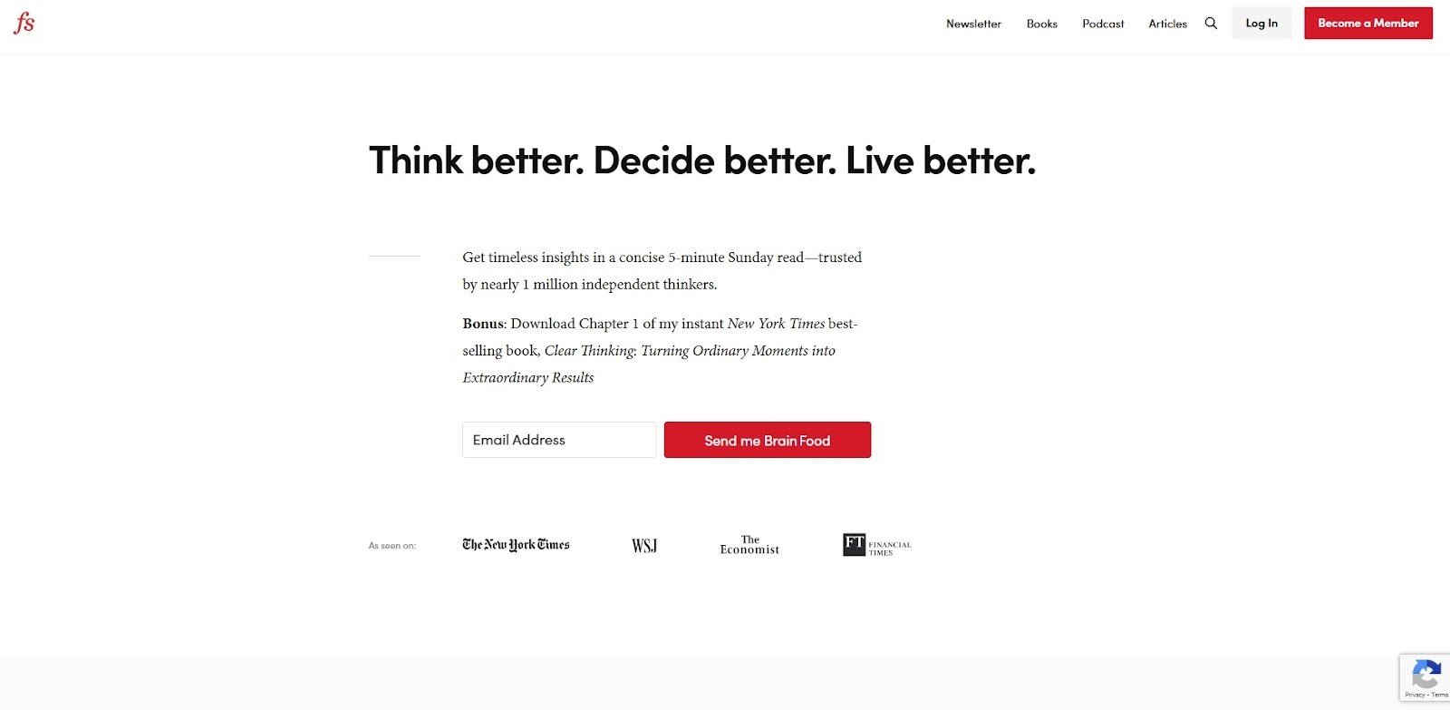
6. Farnam Street
Farnam Street explores mental models, decision-making, and personal development through in-depth articles and podcasts. Its design reflects the clarity of its content, featuring generous whitespace, clean serif fonts, and structured formatting that enhances long-form readability. The calm color palette and absence of clutter allow readers to focus entirely on the ideas.
Designers find it inspiring for its disciplined minimalism and for making complex topics approachable without distraction or visual noise.
7. Zen Habits
Zen Habits is the embodiment of digital minimalism, focusing on mindfulness, simplicity, and intentional living. The site strips away almost all design embellishments, featuring plain black text on a white background, no images, and minimal navigation. This barebones approach creates a deeply peaceful reading environment.
It challenges traditional web design by proving that powerful content doesn't require decoration. Simple words are sometimes better than lots of elements in great design.

8. Humans of New York
Humans of New York is a photography blog that shares intimate portraits and stories of everyday people. The design is intentionally understated, using a monochrome background and simple typography to ensure the photos and narratives take center stage. Full-screen imagery paired with short, heartfelt text blocks creates an emotional and immersive experience.
Designers are inspired by its focus on visual storytelling and the effective use of minimal design to amplify human connection, emotion, and authenticity.

9. The Blonde Abroad
The Blonde Abroad is a travel blog designed specifically for solo female travelers. Its soft color palette dominated by pinks and neutrals, paired with large, vibrant imagery and flowing layouts, gives the site an inviting and stylish feel. Navigation is intuitive, with dropdown menus and travel categories neatly organized. The blog’s use of featured guides, travel resources, and interactive maps creates an immersive user experience.
Designers often cite this blog for its balance between visual beauty and functionality tailored to a niche audience.

10. Tim Ferriss Blog
Tim Ferriss’s blog blends productivity, health, entrepreneurship, and personal performance insights. The design is practical yet polished, featuring legible fonts, clear layout hierarchy, and seamless podcast integration. While content-dense, the site maintains a clean interface with well-placed visuals, CTA buttons, and bold headings.
Bloggers appreciate the blog's ability to cater to multiple content formats, such as articles, videos, and podcasts, without overwhelming users. This is a great example of how multi-format content can be handled cohesively and consistently.

11. Austin Kleon
Austin Kleon’s blog is an artistic mashup of creativity, journaling, and idea-sharing. The site mimics the vibe of a personal sketchbook, using handwritten fonts, sticky note aesthetics, casual formatting, and hand-drawn illustrations. The blog layout is fun, free-flowing, and personal far from corporate polish, yet deeply engaging.
Designers love it because it’s a great source of inspiration for anyone looking to break traditional grid systems and make a blog feel raw, expressive, and truly unique.

12. Seth Godin Blog
Seth Godin’s blog is a daily repository of marketing wisdom and thought-provoking insights, delivered with ultra-minimal design. There's no sidebar, no ads, just plain text on a white background, often without images. The stark simplicity keeps all focus on the ideas, making every post easy to digest.
Designers find this blog inspiring for ''design by subtraction,'' where nothing distracts from the author’s message and every element exists for utility alone.

13. Mark Manson
Mark Manson’s blog delivers hard-hitting personal development content in a bold, immersive design. The site supports dark and light modes, large typefaces, and high-contrast color schemes that highlight calls to action and subscription prompts. Long-form articles are laid out with excellent flow, combining pull quotes, subheadings, and stylized blocks.
A modern, reader-friendly format that combines bold branding and smooth UX is admired by designers for combining education with digital product marketing.

14. Smart Passive Income by Pat Flynn
Smart Passive Income by Pat Flynn is a go-to resource for online entrepreneurs and digital marketers. The blog uses vibrant card-style layouts, filterable categories, and structured CTAs to guide readers through tutorials, case studies, and business tools. It merges content and conversion seamlessly, offering freebies, podcast integration, and interactive courses within an intuitive interface.
Designers often refer to this site when creating educational blogs, it’s a practical example of balancing rich content, visual organization, and monetization.

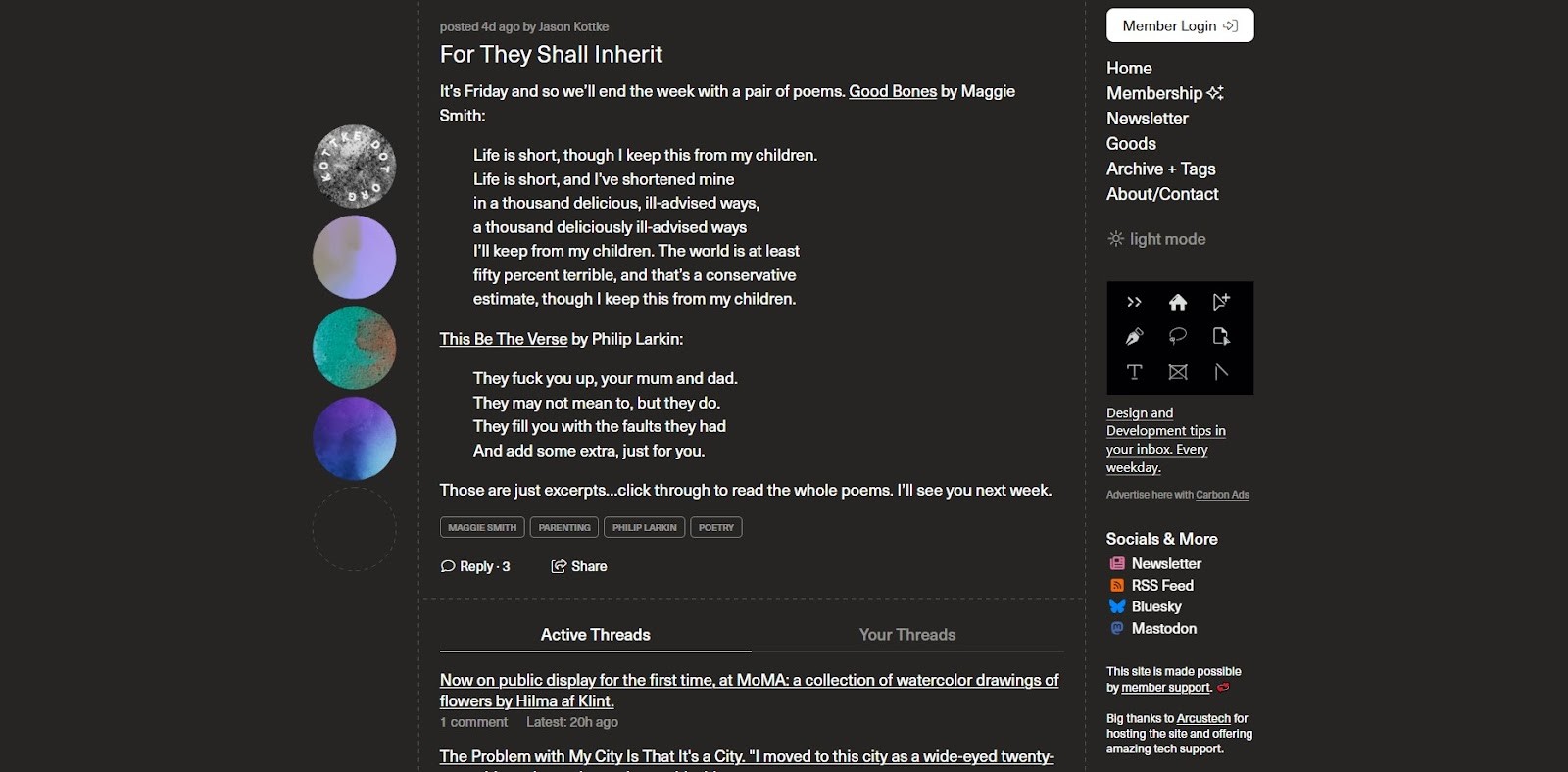
15. Kottke
Kottke is a legendary link blog that curates fascinating finds from the web, tech, design, culture, science posted in a timeless, single-column feed. The design hasn’t changed much over the decades, and that’s part of its charm. With minimal styling, timestamped posts, and clean text formatting, it proves that consistency and good curation trump fancy design.
Designers respect Kottke for its authenticity and focus, showing how a simple structure can support years of quality content while feeling timeless and true to its roots.
16. The Culture Trip
The Culture Trip blurs the line between a travel blog and an online magazine, offering global culture, food, and travel stories with dynamic storytelling. The website features full-width imagery, bold editorial layouts, hover animations, and categorized content blocks that adapt visually by region or theme. Its immersive, media-rich experience and responsive design attract designers looking to build content-heavy blogs that feel like curated journeys.
It’s inspiring for its blend of wanderlust-inducing photography with magazine-style storytelling, offering a model for creating rich visual narratives that remain accessible.

17. Pinch of Yum
Pinch of Yum is a top-tier food blog known for its mouthwatering visuals and functional layout. Each recipe features high-resolution food photography, structured ingredient cards, video embeds, and helpful cooking tips. The color palette feels warm and appetizing, with subtle textures and handwritten font elements that add a personal touch.
Designers find this blog inspiring for form and function, it is an ideal example of how UX and visual branding can elevate recipe blogs.

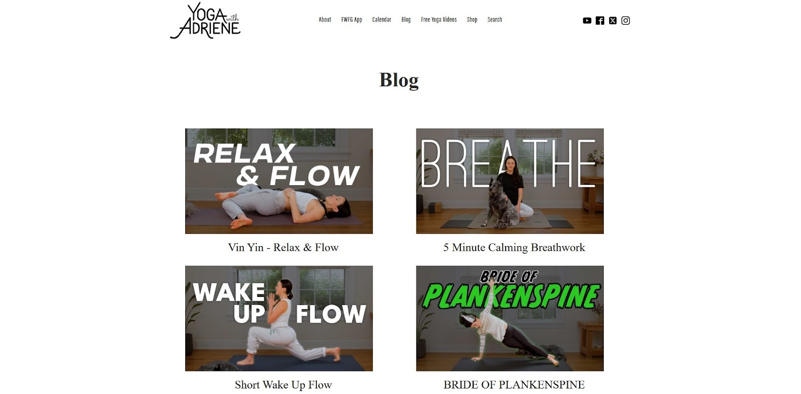
18. Yoga with Adriene
Yoga with Adriene blends calm, inviting design with wellness-focused content. The blog features soft pastels, friendly fonts, and neatly structured post blocks that align perfectly with Adriene’s mindful approach to yoga. Clean navigation, embedded videos, and clear categories support easy discovery of routines, tips, and updates.
Designers appreciate the blog's peaceful, supportive, and approachable tone. By design, it builds emotional connections for content consumption while remaining highly functional.
19. The Verge (Blog Section)
The Verge offers a tech-forward take on blogging, especially in its blog section where journal-style posts meet modern editorial layouts. With dark mode, sharp typography, visual previews, and grid-based structure, the design feels sleek and futuristic. Dynamic filtering and content categorization create a sense of interactivity and control for the user.
Designers look to this site for inspiration when crafting media-rich blog layouts that appeal to modern, tech-savvy audiences. It’s a stellar model for combining news, opinion, and blogging under a unified visual voice.

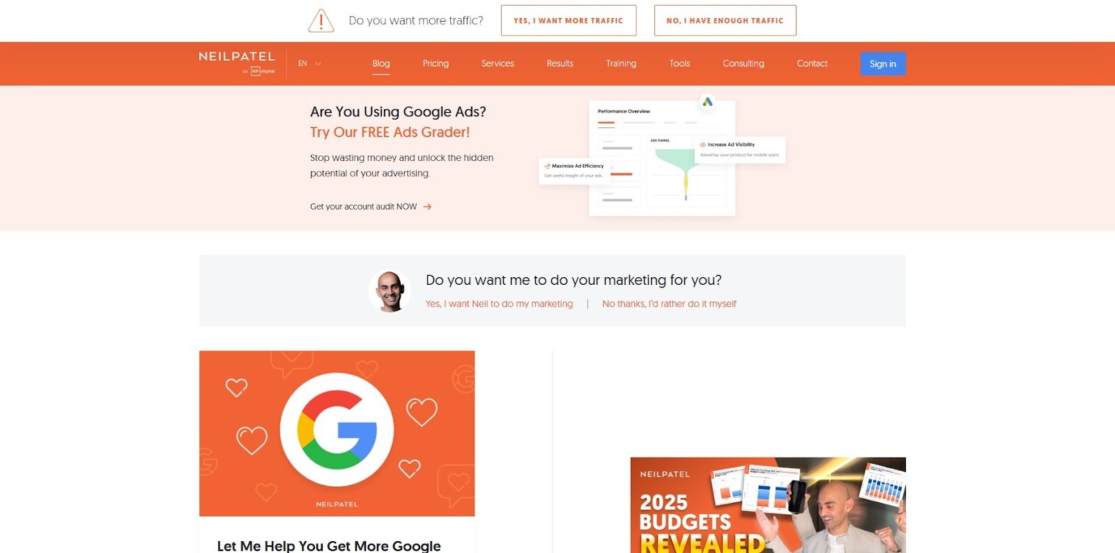
20. Neil Patel Blog
Neil Patel’s blog is a marketing powerhouse, blending blog content with business tools, lead generation, and interactive guides. It features bright, brand-consistent colors, sticky headers, animated CTAs, and infographic-heavy posts that guide the user visually through complex ideas. The content is formatted for easy scanning using bold headings, bullet points, and embedded media.
A high-converting blog design that sacrifices readability or visual appeal is appreciated by designers because it is both educational and a marketing funnel.
21. Design Milk
Design Milk is a sleek, visually driven blog covering modern design, architecture, and art. With a minimalist black-and-white theme, sharp grid layouts, and bold photography, the blog lets visuals lead the way while maintaining an elegant editorial rhythm. Hover effects, clean serif fonts, and modular post cards give the site a polished yet inviting feel.
Designers are especially drawn to its balance between gallery aesthetics and written content. It’s a standout example of how minimalism can amplify artistic storytelling and elevate design-focused blogging.

22. Smashing Magazine
Smashing Magazine is a cornerstone resource for web designers and developers, packed with in-depth articles, tutorials, and industry insights. Despite its dense content structure, the design feels airy and organized thanks to smart use of whitespace, a sticky sidebar, and color-coded categories. The typography is clean, and the navigation is intuitive, making it easy to dive deep into technical topics without feeling overwhelmed.
Designers and developers love the site handle complexity without clutter, offering an educational experience that’s visually approachable and professionally structured.

23. David Perell – Writing Blog
David Perell’s blog focuses on writing, thinking, and learning, and its design reflects that clarity. The layout uses large, readable typography, clean margins, and plenty of spacing to make each long-form essay feel like a relaxing read. There’s a strong personal brand present, but it’s never loud just intentional and refined.
Designers draw inspiration from its simplicity, which avoids any flashy distractions and makes it the perfect blueprint for anyone wanting to build their own thought-leadership blog.

24. Codrops
Codrops is where design meets innovation. It’s a tech-forward blog that explores web design trends, UI experiments, and tutorials. Its modern interface includes animated cards, hover effects, and fluid transitions that make every visit feel dynamic and inspiring. Despite the visual complexity, the site remains highly readable and developer-friendly.
Despite its usability, designers love its interactive demos and experimental design patterns. It's an ideal model for blogs that want to demonstrate design exploration and hands-on functionality.

25. The Good Trade
The Good Trade promotes mindful living and sustainability through a soft, editorial design. The site features pastel color palettes, elegant serif typography, and generous white space, which together evoke a sense of calm and trust. Its layout feels like a lifestyle magazine organized, airy, and visually soothing. Content blocks are structured for easy skimming, while curated imagery reinforces its slow-living ethos.
Designers are inspired by how the blog aligns visual aesthetics with values, proving that design can reinforce emotional connection and ethical branding in a powerful, authentic way.

Common Design Trends for the Best Blogs of 2026
In 2026, blog design has become more refined, user-focused, and visually engaging. The best blogs today don’t just rely on great content, they also follow smart design trends that improve readability, navigation, and the overall user experience. Here are some of the most common design trends seen in top blogs this year:
1. Minimalist Layouts
Many top blogs are embracing clean, minimalist designs. White space, simple fonts, and uncluttered layouts help readers focus on the content without distractions. This style also makes websites load faster and look more modern.
2. Mobile-First Design
With most users browsing blogs on phones, mobile-first design is now a standard. The best blogs look and function perfectly on all screen sizes, offering smooth scrolling, responsive layouts, and touch-friendly navigation.
3. Bold Typography
Large, bold headlines and easy-to-read body text are a major trend. Typography isn’t just for reading, it’s part of the visual identity. Many blogs use unique fonts to express personality while keeping readability top priority.
4. Dark and Light Mode Toggle
Many blogs now include a dark/light mode switch, giving users control over their reading experience. This not only looks stylish but also improves readability in different lighting conditions.
5. Visual Storytelling
Images, illustrations, and even GIFs are used more thoughtfully to support blog posts. High-quality visuals help break up long texts and make the blog feel more dynamic and engaging.
6. Sticky Navigation and Smart Menus
Sticky headers and floating menus are popular in 2026. They help users move through content easily, especially on long-scroll blog pages. Drop downs and mega menus also keep navigation organized.
7. Integrated Multimedia
Top blogs often include videos, audio clips, podcasts, or animations directly in posts. This makes content more interactive and helps cater to different learning and content consumption styles.
8. Personalized Content Blocks
Many blogs are showing recommended posts or dynamic content based on user behavior. This smart design trend helps keep readers engaged longer by offering them more of what they like.
9. Soft Color Palettes and Pastel Themes
Instead of bright and harsh colors, many blogs are using gentle tones, earthy palettes, and pastels to create a calming experience that’s easy on the eyes.
10. Clear CTAs and Lead Capture Elements
The best blogs guide readers with well-placed call-to-action buttons, email sign-ups, or download offers. These elements are designed to blend in with the blog layout while still catching the reader’s attention.
Conclusion
Designing a great blog helps readers enjoy your content, stay longer, and come back again. The design and layout of your blog can influence how your brand is perceived, no matter what type of blog you run. The best blogs of 2026 prove that clean layouts, smart navigation, and a strong visual style can make a big impact. Use these blog design inspirations as a guide to create a site that’s both beautiful and functional.
Need help planning your blog layout or writing content that connects? Let’s chat or explore our design tools like Framer, Webflow and Figma now.
Frequently Asked Questions
1. What are the best blog website design inspirations for beginners?
Answer: Beginners should look for clean, minimalist blog designs with easy navigation, mobile responsiveness, and a focus on content readability. On Framerbite, you’ll find beginner-friendly Framer templates that are beautifully structured and easy to customize.
2. Where can I find creative blog website design ideas?
Answer: You can explore blog design ideas on platforms like Behance, Dribbble, Pinterest, and Framerbite Showcase.
3. What are the key elements of an inspiring blog website design?
Answer: Key elements include a clean layout, engaging typography, high-quality visuals, fast loading speed, mobile optimization, and a strong content hierarchy.
4. Which website builders offer the best templates for blog design inspiration?
Answer: Website builders like Framer, Wix, Squarespace, Webflow, and WordPress offer a wide range of customizable blog templates. These platforms let you choose templates based on style, niche, or function, helping spark inspiration.
5. How do I choose the right design inspiration for my blog niche?
Answer: Choose a design that aligns with your blog’s niche, audience, and goals. For example, fashion blogs benefit from image-heavy, elegant designs, while tech blogs thrive on clean, structured layouts with easy navigation and dark mode options.
Looking to design a beautiful blog website? Don't worry, we are here to assist you with some beautiful blog website design inspiration examples. Your blog’s design is the first thing people notice. Before they read a single word, visitors see the layout, colors, fonts, and images. A great blog design can make your content easier to read, more enjoyable to explore, and more likely to be shared.
Blog website design is very important because it helps people enjoy your content. A clean and easy layout makes your blog look professional. Good design helps readers find what they need quickly. It also makes your posts easier to read. If your blog looks nice and is easy to use, visitors will stay longer and come back more often, a great design builds trust and makes your blog stand out from others.
What Makes a Great Blog Design?
A great blog design is easy to use, enjoyable to read, and memorable for visitors. Here are the key elements that make a blog design stand out:
1. Clean and Simple Layout
An easy layout helps visitors focus on the content. It avoids too many colors, buttons, or pop-ups, and a clean design looks more professional and is easier to explore.
2. Easy Navigation
Readers should be able to find what they’re looking for without confusion. A good blog has a clear menu, organized categories, and a search bar. This helps users move around the site quickly and comfortably.
3. Mobile-Friendly Design
Most people read blogs on their phones or tablets. A great blog design adjusts well to all screen sizes, so it looks and works just as well on a mobile device as it does on a desktop.
4. Readable Typography
The font style, size, and spacing should make reading smooth and easy. Headlines, subheadings, and body text should be clearly different so readers can scan the page quickly and understand the structure.
5. Fast Loading Speed
No one likes a slow website. A well-designed blog is optimized to load quickly, even with images and videos. This improves both user experience and SEO.
6. Consistent Color Scheme and Branding
Using a consistent set of colors, fonts, and design elements helps build a strong identity. Whether it’s playful, minimal, bold, or calming, your design should match the mood and topic of your blog.
7. High-Quality Images
Images help break up text and make blog posts more interesting. Great blog designs use clear, professional-looking photos or illustrations that fit the content and add visual appeal.
8. Strong Visual Structure
Important elements like headlines, call-to-action buttons, or featured posts should stand out. This helps guide the reader’s eyes and makes it easier to navigate the page.
9. Engaging Content Layout
A great design uses different sections like featured posts, latest articles, popular categories, or newsletter sign-up forms to encourage more interaction and deeper browsing.
10. Personal Touch
What makes a blog truly special is the personality behind it. Great blog designs feel authentic and reflect the blogger’s voice, whether through a fun logo, a friendly color palette, or a unique writing style.
1. Cup of Jo
Cup of Jo is a popular lifestyle blog that covers motherhood, relationships, style, food, and culture. Its elegant yet approachable design uses soft tones, high-quality lifestyle imagery, and serif typography to create a warm and personal feel. The homepage features a clean grid layout with intuitive navigation and a calm, inviting color scheme.
Designers are inspired by its perfect blend of editorial polish and human warmth, maintaining a strong emotional connection through thoughtful design choices and subtle sophistication.
2. Brain Pickings (Now The Marginalian)
The Marginalian is a deeply intellectual blog exploring philosophy, science, literature, and art. Despite being highly text-focused, its elegant design makes reading enjoyable through balanced typography, pastel background tones, and an uncluttered layout. With large margins, well-placed pull quotes, and a distraction-free environment, the site emphasizes long-form content without feeling heavy.
Designers love it because of its deep content and beautifully structured interface. This is an inspiration for content-rich blogs.
3. Wait But Why
Wait But Why tackles big topics like AI, relationships, and philosophy with humor, long-form articles, and stick-figure illustrations. Its ultra-minimal design lets content shine, using a white background, sparse layout, and quirky visuals to guide the reader through complex ideas. The site avoids sidebars and excessive menus, focusing on simplicity and linear reading flow.
Designers find it inspiring because it has personality-driven storytelling while proving that humor, visuals, and deep content can coexist in a uniquely user-friendly and minimalist format.
4. Jessica Hische Blog
Jessica Hische’s blog showcases thoughts on design, creativity, and personal growth, wrapped in a layout full of charm and typographic finesse. The design reflects her skills as a type designer, featuring playful custom fonts, illustrated elements, and warm color accents. Each article is carefully formatted for easy reading, with subtle animations and ample spacing.
Designers love this site for its personal yet professional feel, blend of personality and usability, and proving how a blog can double as a portfolio of style and voice.
5. Nomadic Matt
Nomadic Matt is a comprehensive travel blog offering budget tips, destination guides, and travel resources. Its vibrant design uses bold imagery, clear typography, and strong CTAs to guide users toward blogs, courses, and planning tools. The homepage and post layouts are optimized for navigation and readability, with visual hierarchy supporting multiple content types.
With its smart balance of editorial content and marketing, it shows how travel blogs can be both visually appealing and conversion-focused without losing authenticity.
6. Farnam Street
Farnam Street explores mental models, decision-making, and personal development through in-depth articles and podcasts. Its design reflects the clarity of its content, featuring generous whitespace, clean serif fonts, and structured formatting that enhances long-form readability. The calm color palette and absence of clutter allow readers to focus entirely on the ideas.
Designers find it inspiring for its disciplined minimalism and for making complex topics approachable without distraction or visual noise.
7. Zen Habits
Zen Habits is the embodiment of digital minimalism, focusing on mindfulness, simplicity, and intentional living. The site strips away almost all design embellishments, featuring plain black text on a white background, no images, and minimal navigation. This barebones approach creates a deeply peaceful reading environment.
It challenges traditional web design by proving that powerful content doesn't require decoration. Simple words are sometimes better than lots of elements in great design.
8. Humans of New York
Humans of New York is a photography blog that shares intimate portraits and stories of everyday people. The design is intentionally understated, using a monochrome background and simple typography to ensure the photos and narratives take center stage. Full-screen imagery paired with short, heartfelt text blocks creates an emotional and immersive experience.
Designers are inspired by its focus on visual storytelling and the effective use of minimal design to amplify human connection, emotion, and authenticity.
9. The Blonde Abroad
The Blonde Abroad is a travel blog designed specifically for solo female travelers. Its soft color palette dominated by pinks and neutrals, paired with large, vibrant imagery and flowing layouts, gives the site an inviting and stylish feel. Navigation is intuitive, with dropdown menus and travel categories neatly organized. The blog’s use of featured guides, travel resources, and interactive maps creates an immersive user experience.
Designers often cite this blog for its balance between visual beauty and functionality tailored to a niche audience.
10. Tim Ferriss Blog
Tim Ferriss’s blog blends productivity, health, entrepreneurship, and personal performance insights. The design is practical yet polished, featuring legible fonts, clear layout hierarchy, and seamless podcast integration. While content-dense, the site maintains a clean interface with well-placed visuals, CTA buttons, and bold headings.
Bloggers appreciate the blog's ability to cater to multiple content formats, such as articles, videos, and podcasts, without overwhelming users. This is a great example of how multi-format content can be handled cohesively and consistently.
11. Austin Kleon
Austin Kleon’s blog is an artistic mashup of creativity, journaling, and idea-sharing. The site mimics the vibe of a personal sketchbook, using handwritten fonts, sticky note aesthetics, casual formatting, and hand-drawn illustrations. The blog layout is fun, free-flowing, and personal far from corporate polish, yet deeply engaging.
Designers love it because it’s a great source of inspiration for anyone looking to break traditional grid systems and make a blog feel raw, expressive, and truly unique.
12. Seth Godin Blog
Seth Godin’s blog is a daily repository of marketing wisdom and thought-provoking insights, delivered with ultra-minimal design. There's no sidebar, no ads, just plain text on a white background, often without images. The stark simplicity keeps all focus on the ideas, making every post easy to digest.
Designers find this blog inspiring for ''design by subtraction,'' where nothing distracts from the author’s message and every element exists for utility alone.
13. Mark Manson
Mark Manson’s blog delivers hard-hitting personal development content in a bold, immersive design. The site supports dark and light modes, large typefaces, and high-contrast color schemes that highlight calls to action and subscription prompts. Long-form articles are laid out with excellent flow, combining pull quotes, subheadings, and stylized blocks.
A modern, reader-friendly format that combines bold branding and smooth UX is admired by designers for combining education with digital product marketing.
14. Smart Passive Income by Pat Flynn
Smart Passive Income by Pat Flynn is a go-to resource for online entrepreneurs and digital marketers. The blog uses vibrant card-style layouts, filterable categories, and structured CTAs to guide readers through tutorials, case studies, and business tools. It merges content and conversion seamlessly, offering freebies, podcast integration, and interactive courses within an intuitive interface.
Designers often refer to this site when creating educational blogs, it’s a practical example of balancing rich content, visual organization, and monetization.
15. Kottke
Kottke is a legendary link blog that curates fascinating finds from the web, tech, design, culture, science posted in a timeless, single-column feed. The design hasn’t changed much over the decades, and that’s part of its charm. With minimal styling, timestamped posts, and clean text formatting, it proves that consistency and good curation trump fancy design.
Designers respect Kottke for its authenticity and focus, showing how a simple structure can support years of quality content while feeling timeless and true to its roots.
16. The Culture Trip
The Culture Trip blurs the line between a travel blog and an online magazine, offering global culture, food, and travel stories with dynamic storytelling. The website features full-width imagery, bold editorial layouts, hover animations, and categorized content blocks that adapt visually by region or theme. Its immersive, media-rich experience and responsive design attract designers looking to build content-heavy blogs that feel like curated journeys.
It’s inspiring for its blend of wanderlust-inducing photography with magazine-style storytelling, offering a model for creating rich visual narratives that remain accessible.
17. Pinch of Yum
Pinch of Yum is a top-tier food blog known for its mouthwatering visuals and functional layout. Each recipe features high-resolution food photography, structured ingredient cards, video embeds, and helpful cooking tips. The color palette feels warm and appetizing, with subtle textures and handwritten font elements that add a personal touch.
Designers find this blog inspiring for form and function, it is an ideal example of how UX and visual branding can elevate recipe blogs.
18. Yoga with Adriene
Yoga with Adriene blends calm, inviting design with wellness-focused content. The blog features soft pastels, friendly fonts, and neatly structured post blocks that align perfectly with Adriene’s mindful approach to yoga. Clean navigation, embedded videos, and clear categories support easy discovery of routines, tips, and updates.
Designers appreciate the blog's peaceful, supportive, and approachable tone. By design, it builds emotional connections for content consumption while remaining highly functional.
19. The Verge (Blog Section)
The Verge offers a tech-forward take on blogging, especially in its blog section where journal-style posts meet modern editorial layouts. With dark mode, sharp typography, visual previews, and grid-based structure, the design feels sleek and futuristic. Dynamic filtering and content categorization create a sense of interactivity and control for the user.
Designers look to this site for inspiration when crafting media-rich blog layouts that appeal to modern, tech-savvy audiences. It’s a stellar model for combining news, opinion, and blogging under a unified visual voice.
20. Neil Patel Blog
Neil Patel’s blog is a marketing powerhouse, blending blog content with business tools, lead generation, and interactive guides. It features bright, brand-consistent colors, sticky headers, animated CTAs, and infographic-heavy posts that guide the user visually through complex ideas. The content is formatted for easy scanning using bold headings, bullet points, and embedded media.
A high-converting blog design that sacrifices readability or visual appeal is appreciated by designers because it is both educational and a marketing funnel.
21. Design Milk
Design Milk is a sleek, visually driven blog covering modern design, architecture, and art. With a minimalist black-and-white theme, sharp grid layouts, and bold photography, the blog lets visuals lead the way while maintaining an elegant editorial rhythm. Hover effects, clean serif fonts, and modular post cards give the site a polished yet inviting feel.
Designers are especially drawn to its balance between gallery aesthetics and written content. It’s a standout example of how minimalism can amplify artistic storytelling and elevate design-focused blogging.
22. Smashing Magazine
Smashing Magazine is a cornerstone resource for web designers and developers, packed with in-depth articles, tutorials, and industry insights. Despite its dense content structure, the design feels airy and organized thanks to smart use of whitespace, a sticky sidebar, and color-coded categories. The typography is clean, and the navigation is intuitive, making it easy to dive deep into technical topics without feeling overwhelmed.
Designers and developers love the site handle complexity without clutter, offering an educational experience that’s visually approachable and professionally structured.
23. David Perell – Writing Blog
David Perell’s blog focuses on writing, thinking, and learning, and its design reflects that clarity. The layout uses large, readable typography, clean margins, and plenty of spacing to make each long-form essay feel like a relaxing read. There’s a strong personal brand present, but it’s never loud just intentional and refined.
Designers draw inspiration from its simplicity, which avoids any flashy distractions and makes it the perfect blueprint for anyone wanting to build their own thought-leadership blog.
24. Codrops
Codrops is where design meets innovation. It’s a tech-forward blog that explores web design trends, UI experiments, and tutorials. Its modern interface includes animated cards, hover effects, and fluid transitions that make every visit feel dynamic and inspiring. Despite the visual complexity, the site remains highly readable and developer-friendly.
Despite its usability, designers love its interactive demos and experimental design patterns. It's an ideal model for blogs that want to demonstrate design exploration and hands-on functionality.
25. The Good Trade
The Good Trade promotes mindful living and sustainability through a soft, editorial design. The site features pastel color palettes, elegant serif typography, and generous white space, which together evoke a sense of calm and trust. Its layout feels like a lifestyle magazine organized, airy, and visually soothing. Content blocks are structured for easy skimming, while curated imagery reinforces its slow-living ethos.
Designers are inspired by how the blog aligns visual aesthetics with values, proving that design can reinforce emotional connection and ethical branding in a powerful, authentic way.
Common Design Trends for the Best Blogs of 2026
In 2026, blog design has become more refined, user-focused, and visually engaging. The best blogs today don’t just rely on great content, they also follow smart design trends that improve readability, navigation, and the overall user experience. Here are some of the most common design trends seen in top blogs this year:
1. Minimalist Layouts
Many top blogs are embracing clean, minimalist designs. White space, simple fonts, and uncluttered layouts help readers focus on the content without distractions. This style also makes websites load faster and look more modern.
2. Mobile-First Design
With most users browsing blogs on phones, mobile-first design is now a standard. The best blogs look and function perfectly on all screen sizes, offering smooth scrolling, responsive layouts, and touch-friendly navigation.
3. Bold Typography
Large, bold headlines and easy-to-read body text are a major trend. Typography isn’t just for reading, it’s part of the visual identity. Many blogs use unique fonts to express personality while keeping readability top priority.
4. Dark and Light Mode Toggle
Many blogs now include a dark/light mode switch, giving users control over their reading experience. This not only looks stylish but also improves readability in different lighting conditions.
5. Visual Storytelling
Images, illustrations, and even GIFs are used more thoughtfully to support blog posts. High-quality visuals help break up long texts and make the blog feel more dynamic and engaging.
6. Sticky Navigation and Smart Menus
Sticky headers and floating menus are popular in 2026. They help users move through content easily, especially on long-scroll blog pages. Drop downs and mega menus also keep navigation organized.
7. Integrated Multimedia
Top blogs often include videos, audio clips, podcasts, or animations directly in posts. This makes content more interactive and helps cater to different learning and content consumption styles.
8. Personalized Content Blocks
Many blogs are showing recommended posts or dynamic content based on user behavior. This smart design trend helps keep readers engaged longer by offering them more of what they like.
9. Soft Color Palettes and Pastel Themes
Instead of bright and harsh colors, many blogs are using gentle tones, earthy palettes, and pastels to create a calming experience that’s easy on the eyes.
10. Clear CTAs and Lead Capture Elements
The best blogs guide readers with well-placed call-to-action buttons, email sign-ups, or download offers. These elements are designed to blend in with the blog layout while still catching the reader’s attention.
Conclusion
Designing a great blog helps readers enjoy your content, stay longer, and come back again. The design and layout of your blog can influence how your brand is perceived, no matter what type of blog you run. The best blogs of 2026 prove that clean layouts, smart navigation, and a strong visual style can make a big impact. Use these blog design inspirations as a guide to create a site that’s both beautiful and functional.
Need help planning your blog layout or writing content that connects? Let’s chat or explore our design tools like Framer, Webflow and Figma now.
Frequently Asked Questions
1. What are the best blog website design inspirations for beginners?
Answer: Beginners should look for clean, minimalist blog designs with easy navigation, mobile responsiveness, and a focus on content readability. On Framerbite, you’ll find beginner-friendly Framer templates that are beautifully structured and easy to customize.
2. Where can I find creative blog website design ideas?
Answer: You can explore blog design ideas on platforms like Behance, Dribbble, Pinterest, and Framerbite Showcase.
3. What are the key elements of an inspiring blog website design?
Answer: Key elements include a clean layout, engaging typography, high-quality visuals, fast loading speed, mobile optimization, and a strong content hierarchy.
4. Which website builders offer the best templates for blog design inspiration?
Answer: Website builders like Framer, Wix, Squarespace, Webflow, and WordPress offer a wide range of customizable blog templates. These platforms let you choose templates based on style, niche, or function, helping spark inspiration.
5. How do I choose the right design inspiration for my blog niche?
Answer: Choose a design that aligns with your blog’s niche, audience, and goals. For example, fashion blogs benefit from image-heavy, elegant designs, while tech blogs thrive on clean, structured layouts with easy navigation and dark mode options.

Read more articles

Feb 28, 2026
Best Framer Templates with Parallax Scrolling
Feb 28, 2026
Best Framer Templates with Parallax Scrolling

Feb 22, 2026
Framer Canvas: Design Without Limits
Feb 22, 2026
Framer Canvas: Design Without Limits
Feb 19, 2026
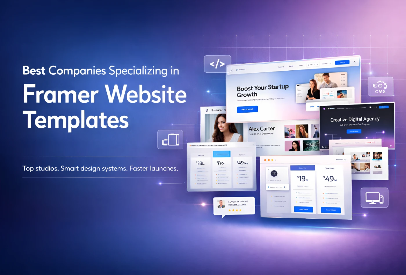
Best Companies Specializing in Framer Website Templates in 2026
Feb 19, 2026
Best Companies Specializing in Framer Website Templates in 2026
Get exclusive 10% discount on your next purchase.
We will send the discount code immediately in your inbox.

Templates
Copyright © 2026 FramerBite, A Part of Creetfy LLC. All Rights Reserved
Follow us on Twitter
Get exclusive 10% discount on your next purchase.
We will send the discount code immediately in your inbox.
Templates
Copyright © 2026 FramerBite, A Part of Creetfy LLC. All Rights Reserved
Follow us on Twitter
Get exclusive 10% discount on your next purchase.
We will send the discount code immediately in your inbox.
Templates
Copyright © 2026 FramerBite, A Part of Creetfy LLC. All Rights Reserved
Follow us on Twitter
Get exclusive 10% discount on your next purchase.
We will send the discount code immediately in your inbox.
Templates
Copyright © 2026 FramerBite, A Part of Creetfy LLC. All Rights Reserved
Follow us on Twitter