Best Corporate Website Design Inspiration for a Modern and Professional Look
Last Updated on:
Author:
Framerbite
Framerbite

Corporate website design defines a brand's digital identity, representing its style, values, and strategy. A company's website is used for various functions, including communicating its mission, showcasing its products, and providing transparency through leadership insights, investor relations, and press releases.
It often highlights career opportunities, partnerships, and sustainability initiatives, making it a valuable resource for clients, investors, job seekers, and media. Corporate websites can be powerful assets that build trust, drive engagement, and support long-term business growth when well designed.
What Makes a High-Performance Corporate Website?
A high-performance corporate website is a strategic business tool that helps brands build trust, support customer acquisition, and reflect their core values through this program. To achieve success, it requires the following essential elements are required a great corporate website design:
1. Clear Brand Messaging
Clarifies the mission statement, tagline, and voice of the company, reinforces brand identity with a logo, colors, and typography.
2. Intuitive Navigation
Easy-to-use menu structure with clear categories, search functionality for quick access to content.
3. Responsive Design
Optimized for mobile, tablet, and desktop, best corporate website design.
4. Fast Load Times
Optimized images, compressed files, and reliable hosting prevent bounce rates due to slow-loading pages.
5. Engaging Visual Design
Uses white space, color, and imagery strategically, supports content hierarchy, and improves readability.
6. High-Quality Content
Well-written, informative, and relevant to target audiences, including case studies, blogs, and whitepapers; keyword-rich, value-driven content that supports SEO.
7. Strong Calls to Action (CTA)
Simple, action-oriented words such as "Contact Us," "Get a Quote," or "Start a Demo," strategically positioned throughout pages.
8. Trust Signals
Establish credibility with client logos, testimonials, case studies, and certifications, as well as clear privacy policies, contact information, and company background.
9. SEO & Analytics Integration
Integrated tools for tracking performance (Meta tags, alt text, structured data), enables continuous improvement with data-driven insights from Google Analytics
10. Accessibility & Compliance
Meets web accessibility standards, meets legal and ethical requirements for global audiences, and meets usability requirements.
Below, you'll find 27 examples of great corporate website design that strike the perfect balance between professionalism and creativity. Each site offers unique insights into layout, branding, content strategy, and user experience.
1. Apple

Apple’s website exemplifies minimalist design with a focus on elegant product presentation. The homepage typically features immersive, high-resolution visuals of their latest devices, often paired with bold, simple typography. Their use of negative space, crisp animation, and subtle transitions reinforces the brand's premium image.
Navigation is intuitive, with a top menu that remains consistent across devices, making it easy to explore products, support, and services.
Why Best for Corporate Design
Large, full-width product imagery
Seamless transitions and animations
Clear CTA buttons with generous spacing
Minimal copywriting focused on clarity and elegance
Consistent global navigation and accessibility features
3. IBM

IBM’s website represents the future-facing nature of enterprise technology. It uses a clean, modular layout with professional photography and interactive storytelling to explain AI, cloud, and quantum computing solutions. The design supports a content-heavy site without overwhelming the user.
Why Best for Corporate Design
Presents technical content in a visually appealing way
Ideal for showcasing long-form content and case studies
Strong focus on thought leadership
Emphasis on client stories and use cases
Humanizes complex technology to build trust
Excellent reference for B2B and tech companies
4. Tesla

Tesla’s website features a sleek, modern, and futuristic design that aligns with its mission of innovation. It uses high-definition videos and immersive product pages to highlight the unique features of their vehicles and energy solutions. The interface is minimalist with bold CTAs and strong visual hierarchy.
Why Best for Corporate Design:
Effectively merges brand identity
Product-focused design with storytelling
Clear CTAs like ''Order Now'' and product configurators
Real-time vehicle customization
5. Amazon

Amazon’s design prioritizes functionality and performance, handling millions of users and products daily. While it lacks the aesthetic minimalism of Apple or Tesla, its layout is strategically designed for conversions, featuring intuitive navigation, dynamic recommendations, and advanced search functionality.
Why Best for Corporate Design
Performance-driven UX design
Personalized content and product recommendations
Data-driven approach for layout optimization
Effective CTA placement
A/B testing to maximize conversion rates
Ideal for high-volume transactions and e-commerce efficiency
6. Deloitte

Deloitte’s corporate website is a refined blend of professionalism and modern design. It communicates the firm’s global scale while maintaining clarity across its consulting, tax, audit, and advisory services. The site features structured navigation, high-contrast visuals, and a content-rich layout that caters to executives and decision-makers.
With an emphasis on thought leadership, users can easily explore whitepapers, industry trends, and research insights. Every element - from color palette to typography- reflects credibility and authority, making it an ideal reference for service-based corporate websites.
Why Best for Corporate Design
Clean, professional layout
Well-structured content
Global design consistency
Strong thought leadership presence
Easy access to insights
7. Airbnb

Airbnb’s website embraces simplicity, warmth, and human connection. Designed to inspire travel, the interface showcases curated listings with large imagery and clean typography. Its user-centric structure emphasizes ease of booking and exploring, whether for stays or experiences.
It's also incorporates personalization, displaying content based on user preferences and search behavior. The visual style is approachable, accessible, and optimized for both mobile and desktop. By highlighting hosts, guest stories, and community initiatives, Airbnb turns the booking process into a personal journey, reinforcing trust and belonging.
Why Best for Corporate Design
Simple and intuitive
Emotionally engaging visuals
Strong personalization
Optimized booking flow
Community-driven storytelling
8. Nike

Nike’s digital presence captures the brand’s dynamic and inspirational ethos. The site leverages bold imagery, high-contrast colors, and energetic motion design to echo athletic excellence. Its homepage and product pages blend marketing with e-commerce, using storytelling through athletes, campaigns, and innovation labs. Nike’s design prioritizes user engagement, offering personalized shopping experiences, account features, and exclusive content.
From browsing the latest drops to customizing sneakers, the site maintains fluid interaction across devices. It successfully combines lifestyle branding with performance-driven UX, creating an immersive retail experience.
Why Best for Corporate Design
Visually energetic
Strong storytelling
Seamless interactions
Personalized shopping
Mobile-first design
9. PepsiCo
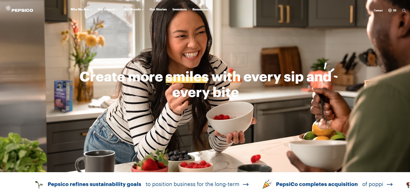
PepsiCo’s corporate site blends business professionalism with brand personality. It introduces visitors to its expansive product portfolio, environmental commitments, and global initiatives. Vibrant photography, interactive sections, and clear brand segmentation make the site easy to explore while reinforcing its position as a responsible market leader.
Whether you're a consumer, investor, or job seeker, the navigation directs you smoothly to relevant content. The visual storytelling and transparency around sustainability and innovation help position PepsiCo as a forward-thinking, socially conscious organization.
Why Best for Corporate Design
Clear brand segmentation
Strong visual storytelling
Investor-friendly navigation
Highlights sustainability
Business and consumer balance
10. Samsung
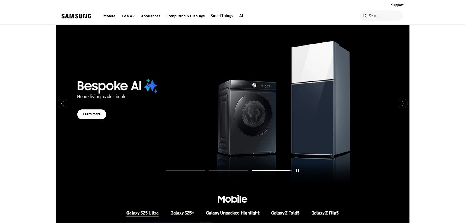
Samsung’s website is a masterclass in product-driven design at a global scale. The interface emphasizes clean structure and engaging visuals that adapt seamlessly to regional markets. Product categories are accessible and detailed, with comparison tools and rich media content to guide purchasing decisions.
It's also dedicates space to innovation stories, service updates, and corporate initiatives, catering to both consumers and enterprise users. The design language is consistent and responsive, reflecting the brand's high-tech image while staying user-friendly.
Why Best for Corporate Design
Clean product layout
Region-specific content
Smooth product discovery
Enterprise and consumer balance
Innovation-focused messaging
11. Google

Google’s homepage is the epitome of minimalism and functionality. With its famous search bar front and center, the interface strips away distractions and keeps the user focused on their core task. Behind the simplicity lies a robust infrastructure that powers personalized suggestions, quick access to tools, and seamless integration with services like Gmail, Maps, and Drive.
Its ultra-clean aesthetic and lightning-fast performance reinforce trust, clarity, and ease of use, setting a benchmark for utility-focused corporate websites.
Why Best for Corporate Design
Minimalistic and focused
Fast and responsive
Instantly familiar layout
Seamless app integration
Global usability
12. Coca-Cola

Coca-Cola’s website blends classic brand identity with engaging, modern storytelling. The site showcases Coca-Cola’s rich history, sustainability efforts, and community projects, all while maintaining a vibrant visual style. Videos, animations, and lifestyle imagery reflect the emotional connection the brand fosters globally.
The navigation is simple, with region-based content and product pages that speak to various markets. Its corporate website design templates section is equally well-developed, emphasizing transparency and social responsibility.
Why Best for Corporate Design
Bright, inviting visuals
Story-driven content
Strong brand heritage
Global localization
Accessible layout
13. Adobe
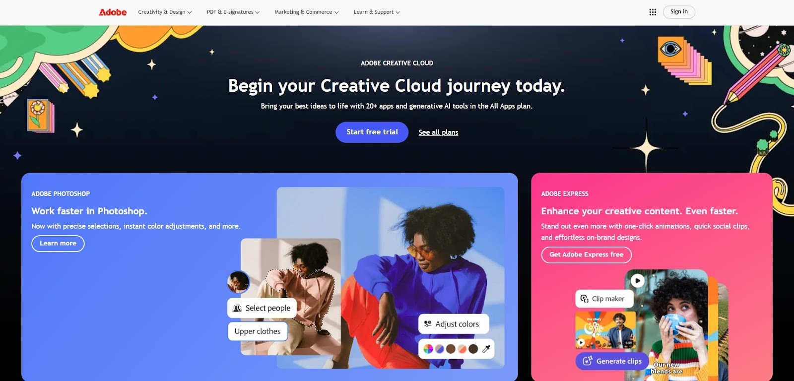
Adobe’s site is a visual showcase of what its products can do. With sharp design, dynamic imagery, and interactive sections, the website reflects the creative power behind Adobe’s tools like Photoshop, Illustrator, and Premiere Pro.
It balances beauty with usability, offering clear product breakdowns, pricing, tutorials, and enterprise solutions. Adobe also includes case studies and inspiration galleries, appealing to creatives and professionals alike.
Why Best for Corporate Design
Design-led interface
Organized product categories
Professional visual assets
Strong educational content
Balanced for B2B and creatives
14. Slack

Slack’s website corporate design exemplifies clarity, utility, and smart messaging. It’s built around the platform’s benefits, showing real-time collaboration, team productivity, and integrations with other tools. Aesthetically, the site uses a bright color palette, clean icons, and animations that enhance understanding without distraction.
It speaks directly to business users and decision-makers, with dedicated sections for enterprise solutions, case studies, and how-to guides.
Why Best for Corporate Design
B2B-focused UX
Clear value propositions
Strong product demos
Polished animations
Enterprise-ready layout
15. Spotify
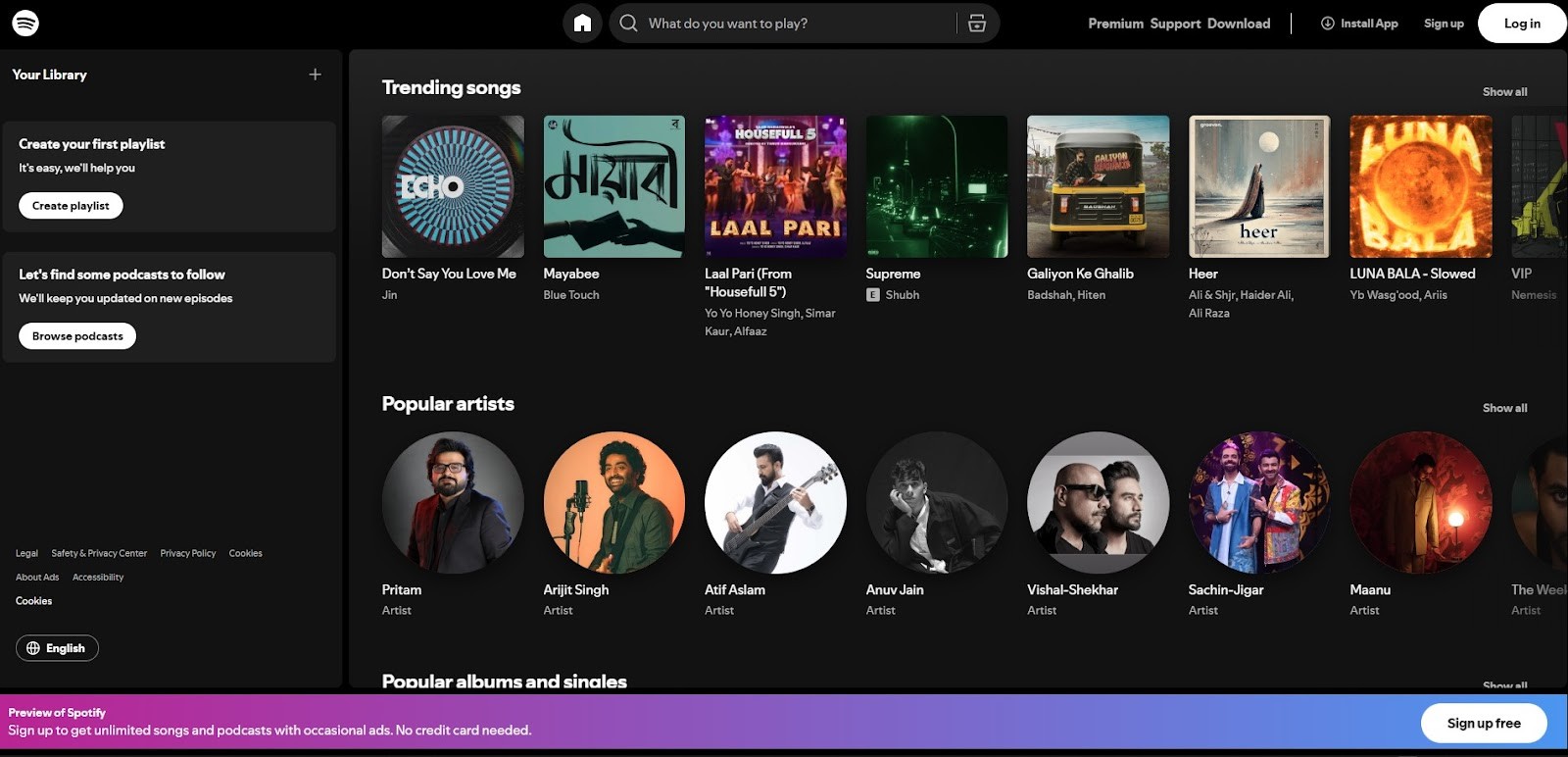
Spotify’s digital-first design puts user experience at the forefront. The site is vibrant and playful, echoing the joy of music discovery. Bold colors, dynamic transitions, and intuitive structure make navigating the platform a breeze, from finding playlists to managing subscriptions.
It's also uses engaging visuals and micro-interactions to promote new features and premium offerings. With seamless integration between mobile and desktop experiences, it captures the essence of a digital media powerhouse with a good corporate website design.
Why Best for Corporate Design
Creative, energetic design
Easy navigation and discovery
Consistent across devices
Strong branding elements
User-focused layout
16. Siemens

Siemens’ website effectively communicates its role as a global leader in industry, infrastructure, and sustainability. The design is elegant and structured, combining clean visuals with deep content. Visitors can explore innovations in energy, mobility, manufacturing, and healthcare through interactive visuals, whitepapers, and news updates.
The site balances its legacy brand strength with a forward-looking tone, using storytelling and visuals to highlight digital transformation and environmental leadership.
Why Best for Corporate Design
Focus on innovation
Strong sustainability messaging
Interactive educational tools
Structured for B2B use
Clear sector breakdowns
17. HubSpot

HubSpot’s website is welcoming, informative, and conversion-driven. Bright colors, illustrations, and friendly copy create a modern, approachable tone that appeals to marketers, sales teams, and businesses. The layout prioritizes product exploration, offering comparison tools, use-case guides, and onboarding support.
Educational resources like blogs, certification courses, and templates are front and center, reinforcing HubSpot’s value as both a tool and a learning platform. The user journey is seamless from top to bottom, with clearly defined CTAs.
Why Best for Corporate Design
Friendly, vibrant design
Strong learning resources
Conversion-focused UX
Effective tool showcasing
Smooth product navigation
18. BMW

BMW’s corporate website design captures the sophistication, precision, and performance associated with its brand. The design is sleek and premium, showcasing its range of luxury vehicles with stunning full-screen visuals, cinematic videos, and detailed specifications. The homepage features an elegant mix of lifestyle imagery and product-focused content, emphasizing innovation and driving experience.
The site is responsive and well-organized, with immersive interactions that reflect BMW’s identity as a high-end automotive leader. It also connects users with tools like car configurators, dealership locators, and BMW news.
Why Best for Corporate Design
Premium visual experience
Strong focus on innovation
Interactive vehicle configurator
Clean, elegant navigation
Lifestyle-brand alignment
19. P&Co

P&Co’s website is a stylish, minimal e-commerce platform for a fashion brand rooted in rugged design and vintage aesthetics. The homepage features a full-width image slider, floating headers, and smooth scrolling. The site is built to drive customer engagement, offering quick access to featured collections, new arrivals, and seasonal promotions.
Integrated live chat and intuitive navigation create a seamless shopping experience. With consistent branding and user-friendly tools, the site balances form and function, delivering a great example of effective lifestyle retail design.
Why Best for Corporate Design
Floating header UI
Live chat for support
Product carousels
Quick-access menus
Strong brand consistency
20. Baubauwerk
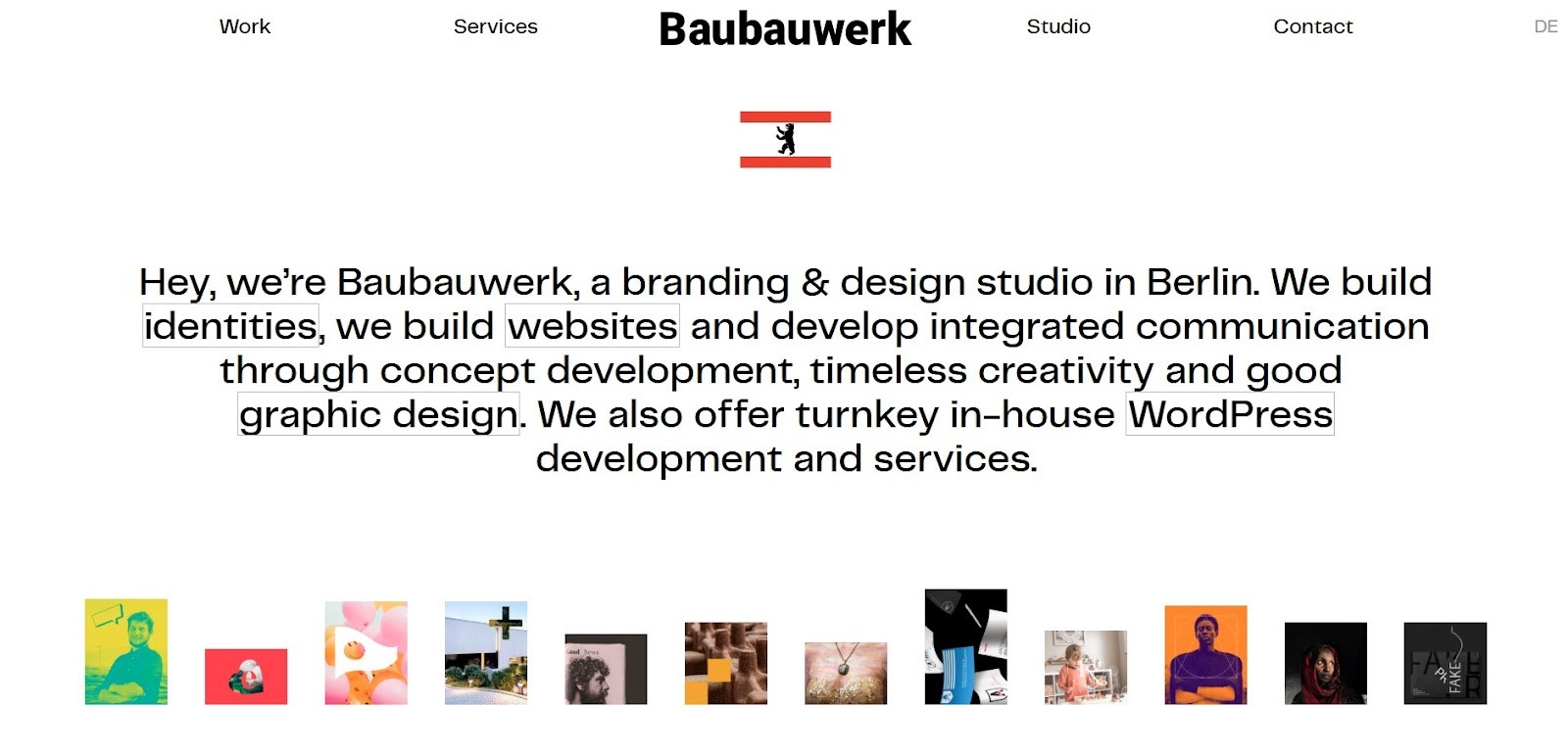
Baubauwerk is a boutique branding and design studio known for its minimal yet high-impact web presence. Its site exemplifies less-is-more through its generous use of white space, elegant typography, and smooth scrolling transitions. Every page is intentional and refined, providing a platform that lets the work speak for itself. The subdued color palette and precise motion graphics highlight the studio’s design sensibility, while carefully selected keywords reinforce their brand focus. It’s a strong example of a creative portfolio that feels both modern and timeless.
Why Best for Corporate Design
Clean and minimal layout
Brand-focused keywords
Smooth page transitions
Elegant typography
Focus on portfolio work
21. Gemfields by DD London

Gemfields, a leader in responsibly sourced colored gemstones, delivers a high-end experience through its website. It blends editorial-style visuals with storytelling and sustainability messaging. Visitors can explore gemstone origins, ethical sourcing processes, and high-resolution imagery that captures the beauty of emeralds and rubies.
The design incorporates modern layout grids, interactive menus, and elegant typography to maintain luxury appeal. It effectively communicates transparency and craftsmanship, key elements for a premium brand in the jewelry and mining sector.
Why best for website corporate design
High-end visual storytelling
Ethical brand positioning
On-brand typography
Interactive navigation
Strong sustainability focus
22. Endeavour Group

Endeavour Group's good corporate website design reflects the warmth and inclusivity of its brand, which is focused on creating community-driven experiences. The site showcases their retail offerings, including liquor, hospitality, and entertainment services, using a color palette that’s warm and inviting.
Engaging storytelling, seamless navigation, and a strong visual identity ensure visitors can quickly explore their extensive range of services. The emphasis is on building connections and sharing the story behind their brands, making it appealing both to consumers and stakeholders.
Why Best for Corporate Design
Engaging storytelling
Welcoming color palette
Clear, user-friendly navigation
Community-oriented content
Strong visual identity
23. Stripe

Stripe’s website is a developer-friendly platform designed to simplify complex financial services. The site features sleek, minimalist design with a strong emphasis on whitespace, helping the content shine without distractions. Clear typography and subtle animations guide users through the technical documentation and API reference materials.
Whether you're a developer or a business owner, Stripe’s site makes the financial tools they offer easy to understand and implement, enhancing user engagement through simplicity and ease of access.
Why Best for Corporate Design
Clean, whitespace-driven layout
Simple yet effective typography
Interactive animations
Easy-to-navigate technical documentation
Developer-focused design
24. Asana

Asana’s website design is a colorful, well-structured representation of their project management software. The homepage clearly explains the platform’s features using vibrant colors, intuitive design elements, and a smooth scrolling experience. Interactive product tours allow users to visualize how Asana will improve their workflow, while client testimonials build trust.
The design prioritizes accessibility and user experience, ensuring that visitors can quickly grasp Asana's core functionality.
Why Best for Corporate Design
Vibrant, user-friendly layout
Interactive product demos
Well-organized feature explanations
Trust-building testimonials
Seamless UX/UI design
25. WeTransfer

WeTransfer’s website exudes creativity through its artistic, minimalistic design. The interface is simple, yet visually striking, providing an elegant space to transfer files. Large immersive backgrounds complement the ease of file sharing, creating a calm and seamless experience.
The site’s artistic elements reflect the brand's creative edge, while the functional aspects remain streamlined, making file transfers feel like a refined and pleasant process.
Why Best for Corporate Design
Minimalistic design
Immersive artistic backgrounds
Intuitive file-sharing process
Simple, user-focused experience
Elegant brand presentation
26. Intercom

Intercom’s website is a polished, user-focused SaaS platform designed for customer communication tools. The site uses smart illustrations and clear value propositions to convey the power of their services. The design is clean, with a straightforward layout that makes it easy to access demos, pricing, and product details.
Their engaging visuals and clear navigation foster trust and build credibility, making it easy for potential customers to understand how Intercom can transform their customer support efforts.
Why Best for Corporate Design
Smart, engaging illustrations
Clear value propositions
Easy demo and pricing access
Polished, user-first interface
Focus on building trust
27. Canva

Canva is one of the great corporate website design that uses a vibrant, dynamic design that mirrors the accessibility and creativity of its platform. The UI is intuitive, with real-time previews allowing users to see designs in progress. The website showcases various templates and design tools through colorful visuals, with clear calls to action encouraging users to start designing.
The clean layout and friendly, approachable aesthetic make Canva’s site not only visually appealing but also highly functional for both novice and professional designers.
Why best for website corporate design
Vibrant, user-friendly interface
Real-time editing previews
Strong product feature showcase
Intuitive design process
Colorful, engaging visuals
Why You Need to Know About Corporate Website Design Inspiration
1. Set the Right First Impression
Your website is often the first interaction someone has with your brand. A polished, professional design immediately builds trust and authority.
2. Stay Competitive in Your Industry
Looking at design inspirations from leading companies (like Apple, Google, or IBM) helps you understand evolving design standards and customer expectations.
3. Understand User Experience (UX) Best Practices
A great website successfully guides users through content, clearly presents complex information, and uses interactive elements to boost engagement.
4. Inspire Creative Ideas
It helps you differentiate your design while maintaining professionalism. It leads to innovative solutions for your unique brand needs.
5. Improve Conversions & Business Goals
The best design supports conversions, whether that means signing up, contacting sales, applying for a job, or exploring your website.
Conclusion
High-performing corporate website design are excellent tools that showcase your brand's credibility and value to the world. These 30 examples reflect the evolving standards of modern design: clean layouts, meaningful content, seamless navigation, and user-centric features. It can be helpful to study successful corporate websites if you're a startup looking to make a bold first impression or an established brand looking to refresh its digital presence.
Each design offers a unique lesson, from Apple's sleek minimalism to Tesla's interactive sophistication to IBM's content-focused authority. Plan or redesign top corporate websites with clarity, usability, and storytelling in mind because great design does more than attract users. It converts them, retains them, and builds long-term loyalty.
Corporate website design defines a brand's digital identity, representing its style, values, and strategy. A company's website is used for various functions, including communicating its mission, showcasing its products, and providing transparency through leadership insights, investor relations, and press releases.
It often highlights career opportunities, partnerships, and sustainability initiatives, making it a valuable resource for clients, investors, job seekers, and media. Corporate websites can be powerful assets that build trust, drive engagement, and support long-term business growth when well designed.
What Makes a High-Performance Corporate Website?
A high-performance corporate website is a strategic business tool that helps brands build trust, support customer acquisition, and reflect their core values through this program. To achieve success, it requires the following essential elements are required a great corporate website design:
1. Clear Brand Messaging
Clarifies the mission statement, tagline, and voice of the company, reinforces brand identity with a logo, colors, and typography.
2. Intuitive Navigation
Easy-to-use menu structure with clear categories, search functionality for quick access to content.
3. Responsive Design
Optimized for mobile, tablet, and desktop, best corporate website design.
4. Fast Load Times
Optimized images, compressed files, and reliable hosting prevent bounce rates due to slow-loading pages.
5. Engaging Visual Design
Uses white space, color, and imagery strategically, supports content hierarchy, and improves readability.
6. High-Quality Content
Well-written, informative, and relevant to target audiences, including case studies, blogs, and whitepapers; keyword-rich, value-driven content that supports SEO.
7. Strong Calls to Action (CTA)
Simple, action-oriented words such as "Contact Us," "Get a Quote," or "Start a Demo," strategically positioned throughout pages.
8. Trust Signals
Establish credibility with client logos, testimonials, case studies, and certifications, as well as clear privacy policies, contact information, and company background.
9. SEO & Analytics Integration
Integrated tools for tracking performance (Meta tags, alt text, structured data), enables continuous improvement with data-driven insights from Google Analytics
10. Accessibility & Compliance
Meets web accessibility standards, meets legal and ethical requirements for global audiences, and meets usability requirements.
Below, you'll find 27 examples of great corporate website design that strike the perfect balance between professionalism and creativity. Each site offers unique insights into layout, branding, content strategy, and user experience.
1. Apple
Apple’s website exemplifies minimalist design with a focus on elegant product presentation. The homepage typically features immersive, high-resolution visuals of their latest devices, often paired with bold, simple typography. Their use of negative space, crisp animation, and subtle transitions reinforces the brand's premium image.
Navigation is intuitive, with a top menu that remains consistent across devices, making it easy to explore products, support, and services.
Why Best for Corporate Design
Large, full-width product imagery
Seamless transitions and animations
Clear CTA buttons with generous spacing
Minimal copywriting focused on clarity and elegance
Consistent global navigation and accessibility features
3. IBM
IBM’s website represents the future-facing nature of enterprise technology. It uses a clean, modular layout with professional photography and interactive storytelling to explain AI, cloud, and quantum computing solutions. The design supports a content-heavy site without overwhelming the user.
Why Best for Corporate Design
Presents technical content in a visually appealing way
Ideal for showcasing long-form content and case studies
Strong focus on thought leadership
Emphasis on client stories and use cases
Humanizes complex technology to build trust
Excellent reference for B2B and tech companies
4. Tesla
Tesla’s website features a sleek, modern, and futuristic design that aligns with its mission of innovation. It uses high-definition videos and immersive product pages to highlight the unique features of their vehicles and energy solutions. The interface is minimalist with bold CTAs and strong visual hierarchy.
Why Best for Corporate Design:
Effectively merges brand identity
Product-focused design with storytelling
Clear CTAs like ''Order Now'' and product configurators
Real-time vehicle customization
5. Amazon
Amazon’s design prioritizes functionality and performance, handling millions of users and products daily. While it lacks the aesthetic minimalism of Apple or Tesla, its layout is strategically designed for conversions, featuring intuitive navigation, dynamic recommendations, and advanced search functionality.
Why Best for Corporate Design
Performance-driven UX design
Personalized content and product recommendations
Data-driven approach for layout optimization
Effective CTA placement
A/B testing to maximize conversion rates
Ideal for high-volume transactions and e-commerce efficiency
6. Deloitte
Deloitte’s corporate website is a refined blend of professionalism and modern design. It communicates the firm’s global scale while maintaining clarity across its consulting, tax, audit, and advisory services. The site features structured navigation, high-contrast visuals, and a content-rich layout that caters to executives and decision-makers.
With an emphasis on thought leadership, users can easily explore whitepapers, industry trends, and research insights. Every element - from color palette to typography- reflects credibility and authority, making it an ideal reference for service-based corporate websites.
Why Best for Corporate Design
Clean, professional layout
Well-structured content
Global design consistency
Strong thought leadership presence
Easy access to insights
7. Airbnb
Airbnb’s website embraces simplicity, warmth, and human connection. Designed to inspire travel, the interface showcases curated listings with large imagery and clean typography. Its user-centric structure emphasizes ease of booking and exploring, whether for stays or experiences.
It's also incorporates personalization, displaying content based on user preferences and search behavior. The visual style is approachable, accessible, and optimized for both mobile and desktop. By highlighting hosts, guest stories, and community initiatives, Airbnb turns the booking process into a personal journey, reinforcing trust and belonging.
Why Best for Corporate Design
Simple and intuitive
Emotionally engaging visuals
Strong personalization
Optimized booking flow
Community-driven storytelling
8. Nike
Nike’s digital presence captures the brand’s dynamic and inspirational ethos. The site leverages bold imagery, high-contrast colors, and energetic motion design to echo athletic excellence. Its homepage and product pages blend marketing with e-commerce, using storytelling through athletes, campaigns, and innovation labs. Nike’s design prioritizes user engagement, offering personalized shopping experiences, account features, and exclusive content.
From browsing the latest drops to customizing sneakers, the site maintains fluid interaction across devices. It successfully combines lifestyle branding with performance-driven UX, creating an immersive retail experience.
Why Best for Corporate Design
Visually energetic
Strong storytelling
Seamless interactions
Personalized shopping
Mobile-first design
9. PepsiCo
PepsiCo’s corporate site blends business professionalism with brand personality. It introduces visitors to its expansive product portfolio, environmental commitments, and global initiatives. Vibrant photography, interactive sections, and clear brand segmentation make the site easy to explore while reinforcing its position as a responsible market leader.
Whether you're a consumer, investor, or job seeker, the navigation directs you smoothly to relevant content. The visual storytelling and transparency around sustainability and innovation help position PepsiCo as a forward-thinking, socially conscious organization.
Why Best for Corporate Design
Clear brand segmentation
Strong visual storytelling
Investor-friendly navigation
Highlights sustainability
Business and consumer balance
10. Samsung
Samsung’s website is a masterclass in product-driven design at a global scale. The interface emphasizes clean structure and engaging visuals that adapt seamlessly to regional markets. Product categories are accessible and detailed, with comparison tools and rich media content to guide purchasing decisions.
It's also dedicates space to innovation stories, service updates, and corporate initiatives, catering to both consumers and enterprise users. The design language is consistent and responsive, reflecting the brand's high-tech image while staying user-friendly.
Why Best for Corporate Design
Clean product layout
Region-specific content
Smooth product discovery
Enterprise and consumer balance
Innovation-focused messaging
11. Google
Google’s homepage is the epitome of minimalism and functionality. With its famous search bar front and center, the interface strips away distractions and keeps the user focused on their core task. Behind the simplicity lies a robust infrastructure that powers personalized suggestions, quick access to tools, and seamless integration with services like Gmail, Maps, and Drive.
Its ultra-clean aesthetic and lightning-fast performance reinforce trust, clarity, and ease of use, setting a benchmark for utility-focused corporate websites.
Why Best for Corporate Design
Minimalistic and focused
Fast and responsive
Instantly familiar layout
Seamless app integration
Global usability
12. Coca-Cola
Coca-Cola’s website blends classic brand identity with engaging, modern storytelling. The site showcases Coca-Cola’s rich history, sustainability efforts, and community projects, all while maintaining a vibrant visual style. Videos, animations, and lifestyle imagery reflect the emotional connection the brand fosters globally.
The navigation is simple, with region-based content and product pages that speak to various markets. Its corporate website design templates section is equally well-developed, emphasizing transparency and social responsibility.
Why Best for Corporate Design
Bright, inviting visuals
Story-driven content
Strong brand heritage
Global localization
Accessible layout
13. Adobe
Adobe’s site is a visual showcase of what its products can do. With sharp design, dynamic imagery, and interactive sections, the website reflects the creative power behind Adobe’s tools like Photoshop, Illustrator, and Premiere Pro.
It balances beauty with usability, offering clear product breakdowns, pricing, tutorials, and enterprise solutions. Adobe also includes case studies and inspiration galleries, appealing to creatives and professionals alike.
Why Best for Corporate Design
Design-led interface
Organized product categories
Professional visual assets
Strong educational content
Balanced for B2B and creatives
14. Slack
Slack’s website corporate design exemplifies clarity, utility, and smart messaging. It’s built around the platform’s benefits, showing real-time collaboration, team productivity, and integrations with other tools. Aesthetically, the site uses a bright color palette, clean icons, and animations that enhance understanding without distraction.
It speaks directly to business users and decision-makers, with dedicated sections for enterprise solutions, case studies, and how-to guides.
Why Best for Corporate Design
B2B-focused UX
Clear value propositions
Strong product demos
Polished animations
Enterprise-ready layout
15. Spotify
Spotify’s digital-first design puts user experience at the forefront. The site is vibrant and playful, echoing the joy of music discovery. Bold colors, dynamic transitions, and intuitive structure make navigating the platform a breeze, from finding playlists to managing subscriptions.
It's also uses engaging visuals and micro-interactions to promote new features and premium offerings. With seamless integration between mobile and desktop experiences, it captures the essence of a digital media powerhouse with a good corporate website design.
Why Best for Corporate Design
Creative, energetic design
Easy navigation and discovery
Consistent across devices
Strong branding elements
User-focused layout
16. Siemens
Siemens’ website effectively communicates its role as a global leader in industry, infrastructure, and sustainability. The design is elegant and structured, combining clean visuals with deep content. Visitors can explore innovations in energy, mobility, manufacturing, and healthcare through interactive visuals, whitepapers, and news updates.
The site balances its legacy brand strength with a forward-looking tone, using storytelling and visuals to highlight digital transformation and environmental leadership.
Why Best for Corporate Design
Focus on innovation
Strong sustainability messaging
Interactive educational tools
Structured for B2B use
Clear sector breakdowns
17. HubSpot
HubSpot’s website is welcoming, informative, and conversion-driven. Bright colors, illustrations, and friendly copy create a modern, approachable tone that appeals to marketers, sales teams, and businesses. The layout prioritizes product exploration, offering comparison tools, use-case guides, and onboarding support.
Educational resources like blogs, certification courses, and templates are front and center, reinforcing HubSpot’s value as both a tool and a learning platform. The user journey is seamless from top to bottom, with clearly defined CTAs.
Why Best for Corporate Design
Friendly, vibrant design
Strong learning resources
Conversion-focused UX
Effective tool showcasing
Smooth product navigation
18. BMW
BMW’s corporate website design captures the sophistication, precision, and performance associated with its brand. The design is sleek and premium, showcasing its range of luxury vehicles with stunning full-screen visuals, cinematic videos, and detailed specifications. The homepage features an elegant mix of lifestyle imagery and product-focused content, emphasizing innovation and driving experience.
The site is responsive and well-organized, with immersive interactions that reflect BMW’s identity as a high-end automotive leader. It also connects users with tools like car configurators, dealership locators, and BMW news.
Why Best for Corporate Design
Premium visual experience
Strong focus on innovation
Interactive vehicle configurator
Clean, elegant navigation
Lifestyle-brand alignment
19. P&Co
P&Co’s website is a stylish, minimal e-commerce platform for a fashion brand rooted in rugged design and vintage aesthetics. The homepage features a full-width image slider, floating headers, and smooth scrolling. The site is built to drive customer engagement, offering quick access to featured collections, new arrivals, and seasonal promotions.
Integrated live chat and intuitive navigation create a seamless shopping experience. With consistent branding and user-friendly tools, the site balances form and function, delivering a great example of effective lifestyle retail design.
Why Best for Corporate Design
Floating header UI
Live chat for support
Product carousels
Quick-access menus
Strong brand consistency
20. Baubauwerk
Baubauwerk is a boutique branding and design studio known for its minimal yet high-impact web presence. Its site exemplifies less-is-more through its generous use of white space, elegant typography, and smooth scrolling transitions. Every page is intentional and refined, providing a platform that lets the work speak for itself. The subdued color palette and precise motion graphics highlight the studio’s design sensibility, while carefully selected keywords reinforce their brand focus. It’s a strong example of a creative portfolio that feels both modern and timeless.
Why Best for Corporate Design
Clean and minimal layout
Brand-focused keywords
Smooth page transitions
Elegant typography
Focus on portfolio work
21. Gemfields by DD London
Gemfields, a leader in responsibly sourced colored gemstones, delivers a high-end experience through its website. It blends editorial-style visuals with storytelling and sustainability messaging. Visitors can explore gemstone origins, ethical sourcing processes, and high-resolution imagery that captures the beauty of emeralds and rubies.
The design incorporates modern layout grids, interactive menus, and elegant typography to maintain luxury appeal. It effectively communicates transparency and craftsmanship, key elements for a premium brand in the jewelry and mining sector.
Why best for website corporate design
High-end visual storytelling
Ethical brand positioning
On-brand typography
Interactive navigation
Strong sustainability focus
22. Endeavour Group
Endeavour Group's good corporate website design reflects the warmth and inclusivity of its brand, which is focused on creating community-driven experiences. The site showcases their retail offerings, including liquor, hospitality, and entertainment services, using a color palette that’s warm and inviting.
Engaging storytelling, seamless navigation, and a strong visual identity ensure visitors can quickly explore their extensive range of services. The emphasis is on building connections and sharing the story behind their brands, making it appealing both to consumers and stakeholders.
Why Best for Corporate Design
Engaging storytelling
Welcoming color palette
Clear, user-friendly navigation
Community-oriented content
Strong visual identity
23. Stripe
Stripe’s website is a developer-friendly platform designed to simplify complex financial services. The site features sleek, minimalist design with a strong emphasis on whitespace, helping the content shine without distractions. Clear typography and subtle animations guide users through the technical documentation and API reference materials.
Whether you're a developer or a business owner, Stripe’s site makes the financial tools they offer easy to understand and implement, enhancing user engagement through simplicity and ease of access.
Why Best for Corporate Design
Clean, whitespace-driven layout
Simple yet effective typography
Interactive animations
Easy-to-navigate technical documentation
Developer-focused design
24. Asana
Asana’s website design is a colorful, well-structured representation of their project management software. The homepage clearly explains the platform’s features using vibrant colors, intuitive design elements, and a smooth scrolling experience. Interactive product tours allow users to visualize how Asana will improve their workflow, while client testimonials build trust.
The design prioritizes accessibility and user experience, ensuring that visitors can quickly grasp Asana's core functionality.
Why Best for Corporate Design
Vibrant, user-friendly layout
Interactive product demos
Well-organized feature explanations
Trust-building testimonials
Seamless UX/UI design
25. WeTransfer
WeTransfer’s website exudes creativity through its artistic, minimalistic design. The interface is simple, yet visually striking, providing an elegant space to transfer files. Large immersive backgrounds complement the ease of file sharing, creating a calm and seamless experience.
The site’s artistic elements reflect the brand's creative edge, while the functional aspects remain streamlined, making file transfers feel like a refined and pleasant process.
Why Best for Corporate Design
Minimalistic design
Immersive artistic backgrounds
Intuitive file-sharing process
Simple, user-focused experience
Elegant brand presentation
26. Intercom
Intercom’s website is a polished, user-focused SaaS platform designed for customer communication tools. The site uses smart illustrations and clear value propositions to convey the power of their services. The design is clean, with a straightforward layout that makes it easy to access demos, pricing, and product details.
Their engaging visuals and clear navigation foster trust and build credibility, making it easy for potential customers to understand how Intercom can transform their customer support efforts.
Why Best for Corporate Design
Smart, engaging illustrations
Clear value propositions
Easy demo and pricing access
Polished, user-first interface
Focus on building trust
27. Canva
Canva is one of the great corporate website design that uses a vibrant, dynamic design that mirrors the accessibility and creativity of its platform. The UI is intuitive, with real-time previews allowing users to see designs in progress. The website showcases various templates and design tools through colorful visuals, with clear calls to action encouraging users to start designing.
The clean layout and friendly, approachable aesthetic make Canva’s site not only visually appealing but also highly functional for both novice and professional designers.
Why best for website corporate design
Vibrant, user-friendly interface
Real-time editing previews
Strong product feature showcase
Intuitive design process
Colorful, engaging visuals
Why You Need to Know About Corporate Website Design Inspiration
1. Set the Right First Impression
Your website is often the first interaction someone has with your brand. A polished, professional design immediately builds trust and authority.
2. Stay Competitive in Your Industry
Looking at design inspirations from leading companies (like Apple, Google, or IBM) helps you understand evolving design standards and customer expectations.
3. Understand User Experience (UX) Best Practices
A great website successfully guides users through content, clearly presents complex information, and uses interactive elements to boost engagement.
4. Inspire Creative Ideas
It helps you differentiate your design while maintaining professionalism. It leads to innovative solutions for your unique brand needs.
5. Improve Conversions & Business Goals
The best design supports conversions, whether that means signing up, contacting sales, applying for a job, or exploring your website.
Conclusion
High-performing corporate website design are excellent tools that showcase your brand's credibility and value to the world. These 30 examples reflect the evolving standards of modern design: clean layouts, meaningful content, seamless navigation, and user-centric features. It can be helpful to study successful corporate websites if you're a startup looking to make a bold first impression or an established brand looking to refresh its digital presence.
Each design offers a unique lesson, from Apple's sleek minimalism to Tesla's interactive sophistication to IBM's content-focused authority. Plan or redesign top corporate websites with clarity, usability, and storytelling in mind because great design does more than attract users. It converts them, retains them, and builds long-term loyalty.

Read more articles

Feb 28, 2026
Best Framer Templates with Parallax Scrolling
Feb 28, 2026
Best Framer Templates with Parallax Scrolling

Feb 22, 2026
Framer Canvas: Design Without Limits
Feb 22, 2026
Framer Canvas: Design Without Limits
Feb 19, 2026
Best Companies Specializing in Framer Website Templates in 2026
Feb 19, 2026
Best Companies Specializing in Framer Website Templates in 2026
Find perfect template for your website & get 50% discount coupon

Templates
Copyright © 2026 FramerBite, A Part of Creetfy LLC. All Rights Reserved
Follow us on Twitter
Find perfect template for your website & get 50% discount coupon
Templates
Copyright © 2026 FramerBite, A Part of Creetfy LLC. All Rights Reserved
Follow us on Twitter
Find perfect template for your website & get 50% discount coupon
Templates
Copyright © 2026 FramerBite, A Part of Creetfy LLC. All Rights Reserved
Follow us on Twitter
Find perfect template for your website & get 50% discount coupon
Templates
Copyright © 2026 FramerBite, A Part of Creetfy LLC. All Rights Reserved
Follow us on Twitter