Homepage Design Inspiration, Ideas and Tips for an Impressive First Impression
Last Updated on:
Author:
Framerbite
Framerbite

Your homepage is your digital front door, the first impression that sets the tone for your entire website. Whether you're launching a new site or refreshing an existing one, crafting an impactful homepage is crucial for capturing attention, driving engagement, and building trust. If you're looking for homepage design inspiration, you’ve come to the right place.
Let’s explore what makes a homepage not just good, but great, and highlight design trends and real-world examples to spark your creativity.
1. Start with a Clear Purpose
Before diving into the design elements of your homepage, pause and define what success looks like for your visitor. Do you want them to sign up, make a purchase, explore your services, or simply learn about your brand? A homepage without purpose is like a map without a destination; it might look nice, but it won’t get anyone anywhere.
Here are 2 inspiring homepage examples that showcase clarity of purpose perfectly:
1. Dropbox
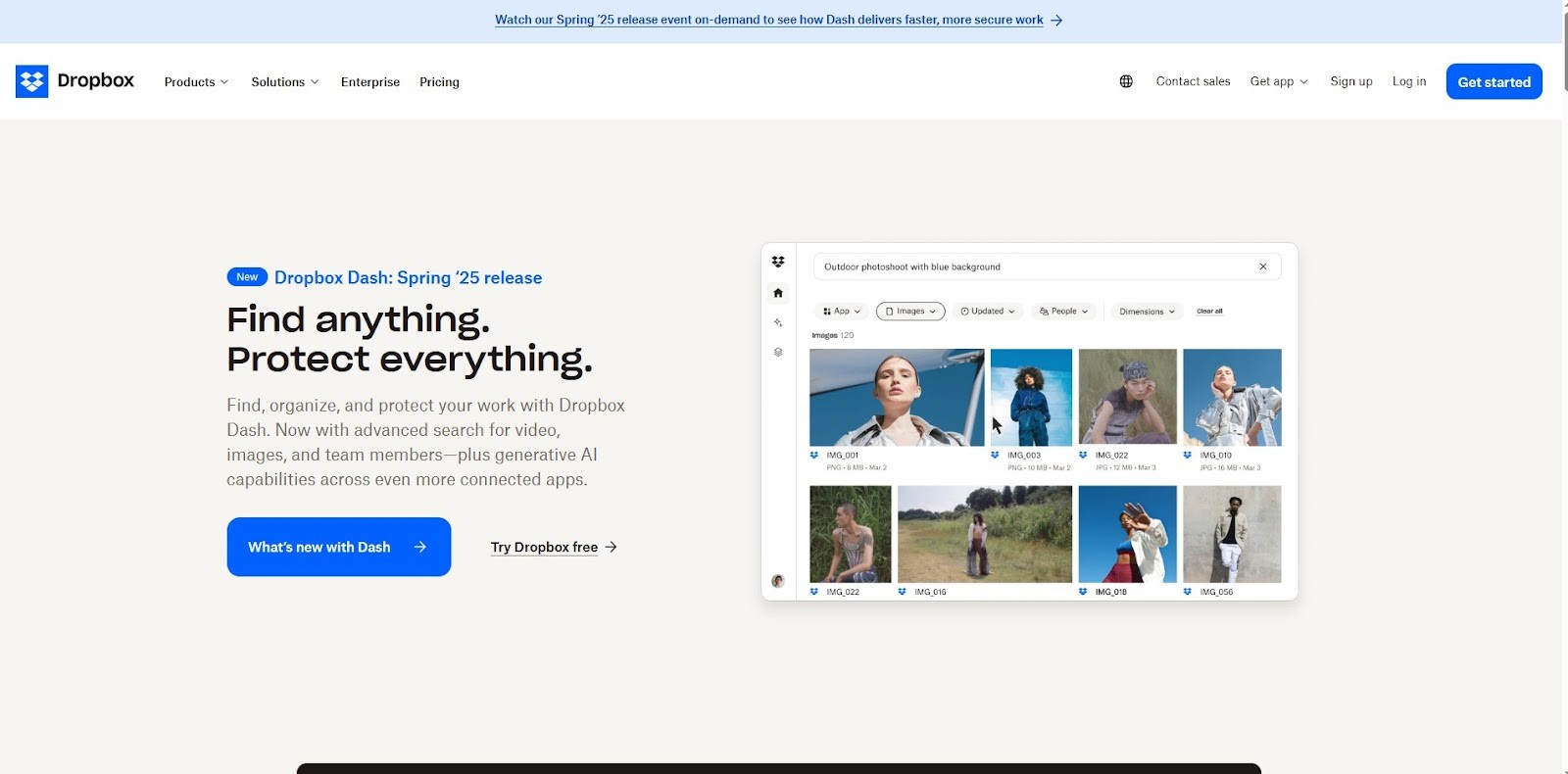
Dropbox’s homepage is a masterclass in simplicity and clarity. It features a minimalist layout with a clear and concise value proposition: “Join over 700 million registered users who trust Dropbox.” There's a single call-to-action (CTA) that invites users to “Get Started,” making the next step obvious and easy.
Why Dropbox is Best for clean purpose design example?
Homepage is laser-focused on trust and credibility.
There's no visual clutter, allowing users to understand.
The design supports one goal: user signup.
Pro Tip for creating a clean, purpose-driven homepage design
Keep your value proposition front and center. Don’t make visitors scroll to understand what you do, deliver your main message within the first 3 seconds.
2. Spotify
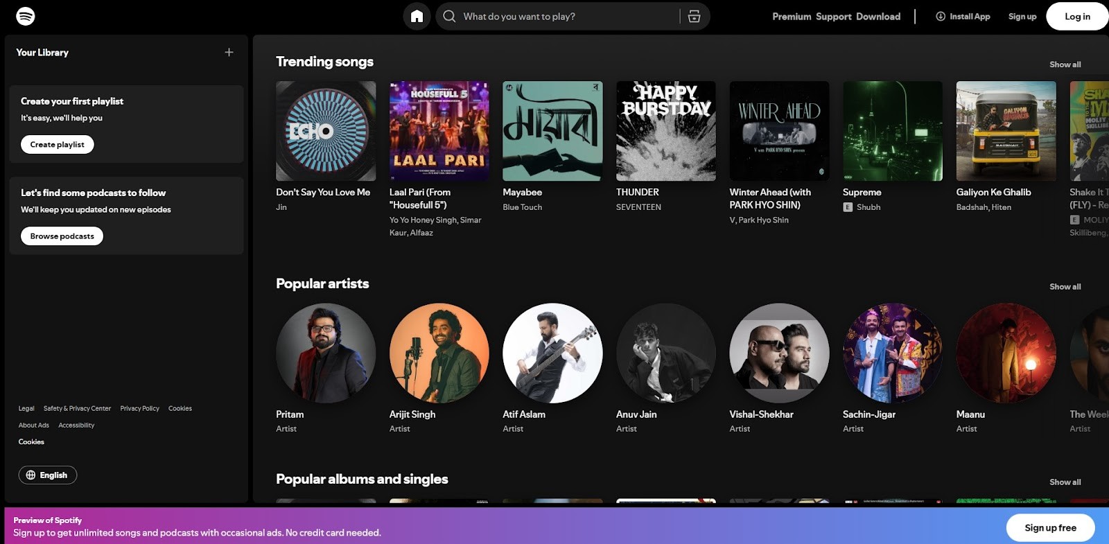
Spotify welcomes users with a bold headline, engaging visuals, and a direct CTA, “Get Premium.” The homepage instantly communicates its core value: uninterrupted music listening without ads. Users are guided toward a clear choice with no distractions.
Why Spotify is Best for a simple design example?
Messaging is strong and emotion-driven ("Music for everyone").
It pairs copy with colorful, vibrant visuals that align with the brand’s energy.
Uses repetition of the CTA across different scroll points, reinforcing purpose.
Pro Tip for creating a clean, purpose-driven landing page
Design your homepage like a landing page. Focus on one conversion goal and reinforce it with compelling visuals, clear copy, and easy navigation.
2. Use Minimalist, Sleek Design
Homepage design is about less is more. A simple, uncluttered layout helps direct attention where it matters most your value proposition, visual storytelling, and calls-to-action. Using white space, neutral color palettes, and consistent typography creates calm, focus, and professionalism.
Let’s look at 2 brands that embody minimalist design to perfection:
1. Apple
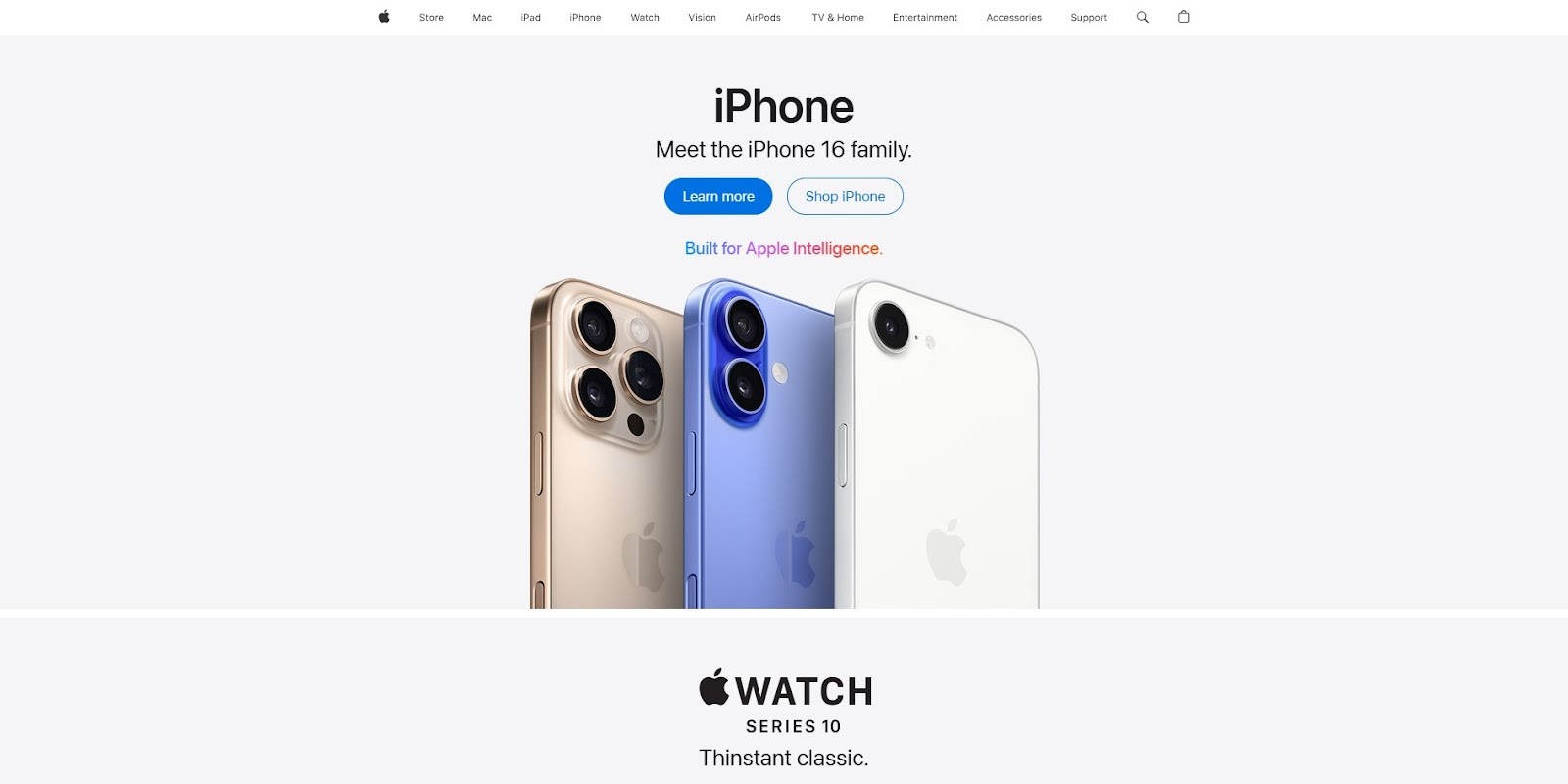
Apple’s homepage is the gold standard in minimalist web design. It uses a spacious layout, high-resolution product imagery, and very little text to deliver a premium user experience. There are no unnecessary elements, just elegant simplicity.
Why It’s Inspiring?
Visual hierarchy is flawlessly executed with large hero images and crisp typography.
White space is used generously to create breathing room between elements.
The design reflects Apple's luxury and quality without overselling.
Pro Tip for Minimalist, Sleek homepage design
Use space strategically empty space isn’t wasted space. It helps important content stand out and enhances readability.
2. Everlane
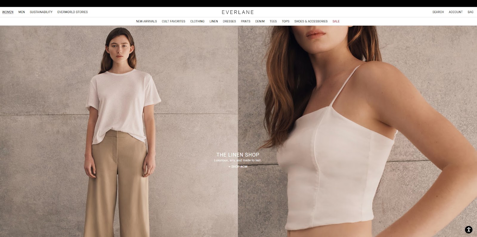
Everlane’s homepage is a serene blend of neutral tones, minimal copy, and well-curated product shots. The focus is on sustainability and transparency, and the clean design supports that message with visual honesty.
Why It’s Inspiring?
The site uses soft color palettes to inspire calm and trust.
Typography and layout are consistent, making it easy to scan.
The minimalist style aligns with Everlane’s ethical fashion philosophy.
Pro Tip for Minimalist, Sleek homepage design
Limit your color palette to two or three shades. Stick to one or two font families to maintain consistency and elegance.
3. Use Bold Visuals
Visuals aren’t just decorative, they’re powerful storytelling tools. Whether it’s a full-screen image, a looping video, or an interactive animation, bold visuals can instantly set the mood, highlight key features, and communicate your brand’s identity sometimes even before a single word is read.
Here are 2 standout examples of brands that use visuals to capture attention and drive engagement:
1. Airbnb

Airbnb’s homepage makes an immediate emotional impact with full-width, immersive images of travel destinations and hosted experiences. These visuals convey a sense of adventure, belonging, and community, core to Airbnb’s brand.
Why Airbnb is Inspiring for Homepage Design?
The homepage features rotating background imagery that reflects real-world experiences.
Clean overlays make it easy to navigate without detracting from the visuals.
Each image feels personal and emotionally resonant, inviting users to imagine themselves in the scene.
Pro Tips for use visuals
Use high-resolution, authentic imagery that tells a story. Choose visuals that resonate with your target audience emotionally, not just aesthetically.
2. Nike

Nike leverages dynamic video backgrounds, slow-motion athlete footage, and bold product close-ups to bring movement and energy to its homepage. The visuals emphasize performance, style, and empowerment.
Why It’s Inspiring?
Videos are used not just for aesthetics, but to demonstrate product benefits in action.
Close-up shots highlight textures, materials, and innovations.
Everything feels in motion, fueling a sense of urgency and action.
Pro Tip for Landing Page Design
Integrate short, silent auto-play videos in your hero section to show your product or service in context. Just be mindful of load speed performance matters.
4. Make Navigation Effortless
Your homepage is the gateway to your entire website it should feel like a well-marked path, not a maze. When users land on your site, they should immediately know where to go and how to get there. An intuitive navigation system improves user experience, reduces bounce rates, and increases conversions.
Here’s how 2 top websites do it right:
1. Asana

Asana’s homepage is an excellent example of clean, intuitive navigation. The top navigation bar is sticky, minimalist, and includes all the essentials: Product, Solutions, Resources, Pricing, and a prominent “Get Started” CTA.
Why It’s Inspiring?
Sticky nav stays visible as users scroll, improving usability.
Dropdown menus are organized with clear hierarchy and icons, aiding quick scanning.
A bold CTA (“Try for free”) appears at the top right and in multiple sections.
Bonus Tip for Home Page Design
Add a CTA near the top, Asana doesn’t wait to pitch the value. Their headline and button looks above the fold, driving immediate action.
2. Squarespace

Squarespace uses a visually minimal but highly functional navigation bar. Its homepage allows users to instantly explore templates, learn how the platform works, or start building with one click.
Why It’s Inspiring?
Navigation is centered around user intent- ''Get Started,'' ''Templates,'' ''Pricing,'' etc.
It uses a hamburger menu for secondary links, keeping the interface uncluttered.
The homepage includes a large ''Get Started'' CTA front and center, offering a smooth path to conversion.
Bonus Tip
Use logical, user-first labels. Avoid jargon. Think from the user’s perspective- would they understand where each link leads.
Best Practices for Effortless Navigation
Sticky Navigation Bars- Keep the menu accessible at all times.
Search Functionality- Help users find what they need quickly.
Logical Menu Structure- Group similar pages and prioritize popular ones.
Include a CTA Near the Top- Give users an obvious action to take without scrolling.
5. Include Microinteractions for Homepage Design
Microinteractions are the small, often delightful animations or visual symbols that enhance user experience without shouting for attention. A hover-changed button, a loading spinner, or a scroll-triggered animation all contribute to a polished, responsive interface. When done right, microinteractions can
Provide feedback
Guide user behavior
Improve usability
Make the interface feel more alive and interactive
Let’s look at 2 top websites that master the art of subtle interactions:
1. Stripe
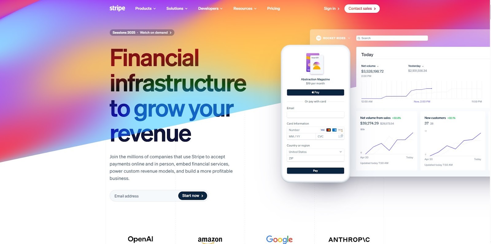
Stripe’s homepage is packed with sleek, purpose-driven microinteractions. As you scroll or hover over sections, you’ll notice animations that highlight functionality, explain processes, and guide your attention seamlessly.
Reasons it's inspiring are as follows
Hover states guide users to clickable elements.
Smooth transitions between content blocks create a seamless experience.
Animations clarify complex product offerings, not just decorate.
Managing microinteractions
Use microinteractions to reinforce clarity, guiding the user, giving feedback, or indicating state changes.
2. Mailchimp
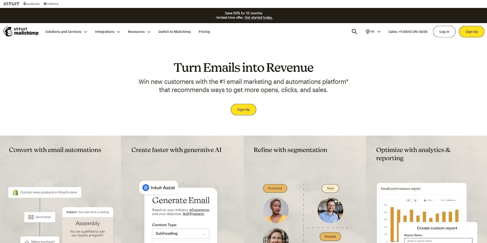
Mailchimp blends charming illustrations with quirky, well-timed animations that match its bold and approachable brand identity. The microinteractions give personality to the user journey, from the homepage to form fills.
Why Mailchimp best for Microinteractions?
Custom illustrations come to life on scroll.
Hover effects and animated CTA buttons make the interface more playful and engaging.
The transitions are smooth, reinforcing a friendly brand voice.
Observation
Microinteractions are a great way to inject personality, but don’t overdo it. Too many can distract or increase page load times.
6. Be Mobile-First: Design for the Pocket
In today’s digital age, over 50% of website traffic comes from mobile devices. If your homepage isn't optimized for smartphones, you're essentially turning away half your potential visitors. A mobile friendly website design approach ensures your design works flawlessly on smaller screens it’s no longer just a ''nice-to-have,'' it’s non-negotiable.
Here are 2 excellent examples of websites that shine on mobile:
1. Shopify

Shopify’s homepage on mobile is sleek, fast, and focused on action. It presents key messages clearly and leads users to take action with prominent CTAs like ''Start free trial''.
Why Shopify is Inspiring for Mobile Freindly Design?
Large text and clear calls-to-action reduce friction.
Mobile-friendly forms and navigation simplify the user journey.
Layout scales fluidly without clutter or message clarity loss.
Some Pro Tip for Mobile-Friendly Homepage Design
Keep primary CTAs visible early on, don’t bury them below endless scrolling. Shopify nails this with buttons right below the headline.
2. Notion

Notion’s homepage on mobile is a masterclass in clarity. It loads fast, uses bold type and icons, and offers a clean vertical scroll that helps users digest content in bite-sized sections.
What makes Notion Inspiring so Unique?
Minimalist design keeps users focused.
Large, tap-able icons and illustrations feel intuitive on small screens.
Stylish transitions and animated effects
Advance Tips to Make Your Website Mobile-friendly
Structure content vertically. Most users scroll, favoring a single-column layout with clear spacing to enhance readability.
7. Highlight Social Proof
First-time visitors to your homepage are silently asking: ''Am I able to trust this brand?'' That’s where social proof comes in. By showcasing customer success stories, recognizable client logos, testimonials, reviews, or press features, you’re saying ''others trust us and you can too.''
Social proof not only increases credibility but also boosts conversion rates, especially for new or skeptical visitors. Whether you're a SaaS company, service provider, or eCommerce brand, showing that real people or brands believe in what you offer can have a powerful impact.
Let’s explore 2 websites that effectively use social proof on their homepage:
1. Zendesk

Zendesk, a leader in customer service software, strategically features customer logos, testimonial quotes, and case studies right on its homepage. These elements create instant credibility without overwhelming the design.
Why It’s Inspiring?
Displays logos from well-known brands like Shopify, Slack, and Uber, establishing trust through association.
Short, high-impact quotes from real clients build emotional connection.
Case studies offer a deeper dive into real-world results, which appeal to decision-makers.
Pro Tip
Place social proof near CTAs. When users are ready to act, seeing others who've already benefited can push them over the edge.
2. Basecamp

Basecamp is known for its bold messaging and transparent communication, and their social proof game is no different. They combine real-time user stats, success stories, and data-backed trust signals on their homepage.
Why It’s Inspiring?
Shares exact numbers like ''over 75,000 companies signed up last year''- making success quantifiable and believable.
Uses authentic user testimonials, often with names and photos.
Case stories are written in relatable language that feels human and personal.
Pro Tip
Use numbers and faces. Combining testimonials with metrics like used by 50,000+ teams and customer photos can dramatically increase perceived trust.
How Framerbite Helps You Design a Homepage That Converts
Framerbite is a curated hub of beautiful, functional website templates and design inspiration designed specifically for Framer, a powerful no-code design tool loved by creatives and devs alike.
You need to consider strategy, usability, and storytelling when designing a standout homepage. We provides inspiration, framer templates, and tools to help startups, designers, and creative agencies craft memorable homepages.
1. Pre-built Framer Templates to Restart Your Design
Framerbite offers a wide range of homepage templates tailored to different niches from SaaS and personal portfolios to agencies and product launches.
2. Design Inspiration for New Ideas
Not sure where to start? Browse through real-world framer template designs on Framerbite to see what works and why. With us, you don't need to stare at a blank canvas.
3. Built for Framer- A No-Code Design Tool
Each template is designed to work with Framer natively. Visually edit scroll effects, animations, and interactions directly in the browser, and publish instantly without any development.
4. Designed to Convert, Not Just Look Good
Framebite templates feature best practices for homepages, clear hero sections, high-converting CTAs, testimonials, and social proof, easy navigation, and mobile-first responsiveness.
A well-desinged homepage does more than look good it works strategically. It sets the tone, tells your story, guides visitors effortlessly, and nudges them toward meaningful action. From clear purpose to bold visuals, from effortless navigation to mobile responsiveness, every element plays a role in turning casual browsers into loyal customers.
Some of the most iconic homepage designs break conventions in smart ways. Innovation often begins when you take these best practices and bend them to fit your unique brand personality.
Your homepage is your digital handshake. Make it strong, clear, and memorable.
Your homepage is your digital front door, the first impression that sets the tone for your entire website. Whether you're launching a new site or refreshing an existing one, crafting an impactful homepage is crucial for capturing attention, driving engagement, and building trust. If you're looking for homepage design inspiration, you’ve come to the right place.
Let’s explore what makes a homepage not just good, but great, and highlight design trends and real-world examples to spark your creativity.
1. Start with a Clear Purpose
Before diving into the design elements of your homepage, pause and define what success looks like for your visitor. Do you want them to sign up, make a purchase, explore your services, or simply learn about your brand? A homepage without purpose is like a map without a destination; it might look nice, but it won’t get anyone anywhere.
Here are 2 inspiring homepage examples that showcase clarity of purpose perfectly:
1. Dropbox
Dropbox’s homepage is a masterclass in simplicity and clarity. It features a minimalist layout with a clear and concise value proposition: “Join over 700 million registered users who trust Dropbox.” There's a single call-to-action (CTA) that invites users to “Get Started,” making the next step obvious and easy.
Why Dropbox is Best for clean purpose design example?
Homepage is laser-focused on trust and credibility.
There's no visual clutter, allowing users to understand.
The design supports one goal: user signup.
Pro Tip for creating a clean, purpose-driven homepage design
Keep your value proposition front and center. Don’t make visitors scroll to understand what you do, deliver your main message within the first 3 seconds.
2. Spotify
Spotify welcomes users with a bold headline, engaging visuals, and a direct CTA, “Get Premium.” The homepage instantly communicates its core value: uninterrupted music listening without ads. Users are guided toward a clear choice with no distractions.
Why Spotify is Best for a simple design example?
Messaging is strong and emotion-driven ("Music for everyone").
It pairs copy with colorful, vibrant visuals that align with the brand’s energy.
Uses repetition of the CTA across different scroll points, reinforcing purpose.
Pro Tip for creating a clean, purpose-driven landing page
Design your homepage like a landing page. Focus on one conversion goal and reinforce it with compelling visuals, clear copy, and easy navigation.
2. Use Minimalist, Sleek Design
Homepage design is about less is more. A simple, uncluttered layout helps direct attention where it matters most your value proposition, visual storytelling, and calls-to-action. Using white space, neutral color palettes, and consistent typography creates calm, focus, and professionalism.
Let’s look at 2 brands that embody minimalist design to perfection:
1. Apple
Apple’s homepage is the gold standard in minimalist web design. It uses a spacious layout, high-resolution product imagery, and very little text to deliver a premium user experience. There are no unnecessary elements, just elegant simplicity.
Why It’s Inspiring?
Visual hierarchy is flawlessly executed with large hero images and crisp typography.
White space is used generously to create breathing room between elements.
The design reflects Apple's luxury and quality without overselling.
Pro Tip for Minimalist, Sleek homepage design
Use space strategically empty space isn’t wasted space. It helps important content stand out and enhances readability.
2. Everlane
Everlane’s homepage is a serene blend of neutral tones, minimal copy, and well-curated product shots. The focus is on sustainability and transparency, and the clean design supports that message with visual honesty.
Why It’s Inspiring?
The site uses soft color palettes to inspire calm and trust.
Typography and layout are consistent, making it easy to scan.
The minimalist style aligns with Everlane’s ethical fashion philosophy.
Pro Tip for Minimalist, Sleek homepage design
Limit your color palette to two or three shades. Stick to one or two font families to maintain consistency and elegance.
3. Use Bold Visuals
Visuals aren’t just decorative, they’re powerful storytelling tools. Whether it’s a full-screen image, a looping video, or an interactive animation, bold visuals can instantly set the mood, highlight key features, and communicate your brand’s identity sometimes even before a single word is read.
Here are 2 standout examples of brands that use visuals to capture attention and drive engagement:
1. Airbnb
Airbnb’s homepage makes an immediate emotional impact with full-width, immersive images of travel destinations and hosted experiences. These visuals convey a sense of adventure, belonging, and community, core to Airbnb’s brand.
Why Airbnb is Inspiring for Homepage Design?
The homepage features rotating background imagery that reflects real-world experiences.
Clean overlays make it easy to navigate without detracting from the visuals.
Each image feels personal and emotionally resonant, inviting users to imagine themselves in the scene.
Pro Tips for use visuals
Use high-resolution, authentic imagery that tells a story. Choose visuals that resonate with your target audience emotionally, not just aesthetically.
2. Nike
Nike leverages dynamic video backgrounds, slow-motion athlete footage, and bold product close-ups to bring movement and energy to its homepage. The visuals emphasize performance, style, and empowerment.
Why It’s Inspiring?
Videos are used not just for aesthetics, but to demonstrate product benefits in action.
Close-up shots highlight textures, materials, and innovations.
Everything feels in motion, fueling a sense of urgency and action.
Pro Tip for Landing Page Design
Integrate short, silent auto-play videos in your hero section to show your product or service in context. Just be mindful of load speed performance matters.
4. Make Navigation Effortless
Your homepage is the gateway to your entire website it should feel like a well-marked path, not a maze. When users land on your site, they should immediately know where to go and how to get there. An intuitive navigation system improves user experience, reduces bounce rates, and increases conversions.
Here’s how 2 top websites do it right:
1. Asana
Asana’s homepage is an excellent example of clean, intuitive navigation. The top navigation bar is sticky, minimalist, and includes all the essentials: Product, Solutions, Resources, Pricing, and a prominent “Get Started” CTA.
Why It’s Inspiring?
Sticky nav stays visible as users scroll, improving usability.
Dropdown menus are organized with clear hierarchy and icons, aiding quick scanning.
A bold CTA (“Try for free”) appears at the top right and in multiple sections.
Bonus Tip for Home Page Design
Add a CTA near the top, Asana doesn’t wait to pitch the value. Their headline and button looks above the fold, driving immediate action.
2. Squarespace
Squarespace uses a visually minimal but highly functional navigation bar. Its homepage allows users to instantly explore templates, learn how the platform works, or start building with one click.
Why It’s Inspiring?
Navigation is centered around user intent- ''Get Started,'' ''Templates,'' ''Pricing,'' etc.
It uses a hamburger menu for secondary links, keeping the interface uncluttered.
The homepage includes a large ''Get Started'' CTA front and center, offering a smooth path to conversion.
Bonus Tip
Use logical, user-first labels. Avoid jargon. Think from the user’s perspective- would they understand where each link leads.
Best Practices for Effortless Navigation
Sticky Navigation Bars- Keep the menu accessible at all times.
Search Functionality- Help users find what they need quickly.
Logical Menu Structure- Group similar pages and prioritize popular ones.
Include a CTA Near the Top- Give users an obvious action to take without scrolling.
5. Include Microinteractions for Homepage Design
Microinteractions are the small, often delightful animations or visual symbols that enhance user experience without shouting for attention. A hover-changed button, a loading spinner, or a scroll-triggered animation all contribute to a polished, responsive interface. When done right, microinteractions can
Provide feedback
Guide user behavior
Improve usability
Make the interface feel more alive and interactive
Let’s look at 2 top websites that master the art of subtle interactions:
1. Stripe
Stripe’s homepage is packed with sleek, purpose-driven microinteractions. As you scroll or hover over sections, you’ll notice animations that highlight functionality, explain processes, and guide your attention seamlessly.
Reasons it's inspiring are as follows
Hover states guide users to clickable elements.
Smooth transitions between content blocks create a seamless experience.
Animations clarify complex product offerings, not just decorate.
Managing microinteractions
Use microinteractions to reinforce clarity, guiding the user, giving feedback, or indicating state changes.
2. Mailchimp
Mailchimp blends charming illustrations with quirky, well-timed animations that match its bold and approachable brand identity. The microinteractions give personality to the user journey, from the homepage to form fills.
Why Mailchimp best for Microinteractions?
Custom illustrations come to life on scroll.
Hover effects and animated CTA buttons make the interface more playful and engaging.
The transitions are smooth, reinforcing a friendly brand voice.
Observation
Microinteractions are a great way to inject personality, but don’t overdo it. Too many can distract or increase page load times.
6. Be Mobile-First: Design for the Pocket
In today’s digital age, over 50% of website traffic comes from mobile devices. If your homepage isn't optimized for smartphones, you're essentially turning away half your potential visitors. A mobile friendly website design approach ensures your design works flawlessly on smaller screens it’s no longer just a ''nice-to-have,'' it’s non-negotiable.
Here are 2 excellent examples of websites that shine on mobile:
1. Shopify
Shopify’s homepage on mobile is sleek, fast, and focused on action. It presents key messages clearly and leads users to take action with prominent CTAs like ''Start free trial''.
Why Shopify is Inspiring for Mobile Freindly Design?
Large text and clear calls-to-action reduce friction.
Mobile-friendly forms and navigation simplify the user journey.
Layout scales fluidly without clutter or message clarity loss.
Some Pro Tip for Mobile-Friendly Homepage Design
Keep primary CTAs visible early on, don’t bury them below endless scrolling. Shopify nails this with buttons right below the headline.
2. Notion
Notion’s homepage on mobile is a masterclass in clarity. It loads fast, uses bold type and icons, and offers a clean vertical scroll that helps users digest content in bite-sized sections.
What makes Notion Inspiring so Unique?
Minimalist design keeps users focused.
Large, tap-able icons and illustrations feel intuitive on small screens.
Stylish transitions and animated effects
Advance Tips to Make Your Website Mobile-friendly
Structure content vertically. Most users scroll, favoring a single-column layout with clear spacing to enhance readability.
7. Highlight Social Proof
First-time visitors to your homepage are silently asking: ''Am I able to trust this brand?'' That’s where social proof comes in. By showcasing customer success stories, recognizable client logos, testimonials, reviews, or press features, you’re saying ''others trust us and you can too.''
Social proof not only increases credibility but also boosts conversion rates, especially for new or skeptical visitors. Whether you're a SaaS company, service provider, or eCommerce brand, showing that real people or brands believe in what you offer can have a powerful impact.
Let’s explore 2 websites that effectively use social proof on their homepage:
1. Zendesk
Zendesk, a leader in customer service software, strategically features customer logos, testimonial quotes, and case studies right on its homepage. These elements create instant credibility without overwhelming the design.
Why It’s Inspiring?
Displays logos from well-known brands like Shopify, Slack, and Uber, establishing trust through association.
Short, high-impact quotes from real clients build emotional connection.
Case studies offer a deeper dive into real-world results, which appeal to decision-makers.
Pro Tip
Place social proof near CTAs. When users are ready to act, seeing others who've already benefited can push them over the edge.
2. Basecamp
Basecamp is known for its bold messaging and transparent communication, and their social proof game is no different. They combine real-time user stats, success stories, and data-backed trust signals on their homepage.
Why It’s Inspiring?
Shares exact numbers like ''over 75,000 companies signed up last year''- making success quantifiable and believable.
Uses authentic user testimonials, often with names and photos.
Case stories are written in relatable language that feels human and personal.
Pro Tip
Use numbers and faces. Combining testimonials with metrics like used by 50,000+ teams and customer photos can dramatically increase perceived trust.
How Framerbite Helps You Design a Homepage That Converts
Framerbite is a curated hub of beautiful, functional website templates and design inspiration designed specifically for Framer, a powerful no-code design tool loved by creatives and devs alike.
You need to consider strategy, usability, and storytelling when designing a standout homepage. We provides inspiration, framer templates, and tools to help startups, designers, and creative agencies craft memorable homepages.
1. Pre-built Framer Templates to Restart Your Design
Framerbite offers a wide range of homepage templates tailored to different niches from SaaS and personal portfolios to agencies and product launches.
2. Design Inspiration for New Ideas
Not sure where to start? Browse through real-world framer template designs on Framerbite to see what works and why. With us, you don't need to stare at a blank canvas.
3. Built for Framer- A No-Code Design Tool
Each template is designed to work with Framer natively. Visually edit scroll effects, animations, and interactions directly in the browser, and publish instantly without any development.
4. Designed to Convert, Not Just Look Good
Framebite templates feature best practices for homepages, clear hero sections, high-converting CTAs, testimonials, and social proof, easy navigation, and mobile-first responsiveness.
A well-desinged homepage does more than look good it works strategically. It sets the tone, tells your story, guides visitors effortlessly, and nudges them toward meaningful action. From clear purpose to bold visuals, from effortless navigation to mobile responsiveness, every element plays a role in turning casual browsers into loyal customers.
Some of the most iconic homepage designs break conventions in smart ways. Innovation often begins when you take these best practices and bend them to fit your unique brand personality.
Your homepage is your digital handshake. Make it strong, clear, and memorable.

Read more articles

Feb 28, 2026
Best Framer Templates with Parallax Scrolling
Feb 28, 2026
Best Framer Templates with Parallax Scrolling

Feb 22, 2026
Framer Canvas: Design Without Limits
Feb 22, 2026
Framer Canvas: Design Without Limits
Feb 19, 2026
Best Companies Specializing in Framer Website Templates in 2026
Feb 19, 2026
Best Companies Specializing in Framer Website Templates in 2026
Find perfect template for your website & get 50% discount coupon

Templates
Copyright © 2026 FramerBite, A Part of Creetfy LLC. All Rights Reserved
Follow us on Twitter
Find perfect template for your website & get 50% discount coupon
Templates
Copyright © 2026 FramerBite, A Part of Creetfy LLC. All Rights Reserved
Follow us on Twitter
Find perfect template for your website & get 50% discount coupon
Templates
Copyright © 2026 FramerBite, A Part of Creetfy LLC. All Rights Reserved
Follow us on Twitter
Find perfect template for your website & get 50% discount coupon
Templates
Copyright © 2026 FramerBite, A Part of Creetfy LLC. All Rights Reserved
Follow us on Twitter