Top 30+ Minimalist Web Design Inspirations
Last Updated on:
Author:
Framerbite
Framerbite

Minimalist web design is a powerful design approach focusing on simplicity, clarity, and purpose. In minimalist design, unnecessary elements are removed, typography is thoughtful, and navigation is intuitive, making for an elegant and seamless user experience. Find inspiration for minimalist web design in this collection of websites showing less is more.
Trends come and go in web design, but one design philosophy remains constant: minimalist design. Minimalist websites are elegant and simple, making it easy for users to concentrate on what matters most. Here are some beautiful examples that will inspire your next modern, functional, and visually compelling website.
Why Minimalism Works
Minimalism works because it focuses on content, functionality, and user experience. A minimalist web design offers a clean, distraction-free environment that guides visitors easily on a site in an age where attention periods are short. Here are a few reasons why minimalist web design continues to be popular:
Improved User Experience (UX): Minimalist designs feature clarity and ease of navigation, making it easier for users to find what they’re looking for.
Faster Load Times: Minimalistic websites load faster because they are free of unnecessary elements and the optimization of assets.
Focus on Content: Minimalism allows your content to take center stage, ensuring that the message or product you are promoting gets the attention it deserves.
Elegance and Timelessness: Clean, simple designs have timeless appeal. Trends may come and go, but a minimalist design stays fresh and relevant for years.
Top 30+ Minimalist Web Design Inspirations:
Minimalist design continues to dominate the web in 2026. Websites that embrace clean lines, white space, and simple navigation create a user-friendly experience while maintaining elegance. Here are 30 websites with minimalist designs that will inspire you to refine your web presence.
1. Apple

Apple website exemplifies minimalist design through large, high-quality product images, a simple color scheme, and clear typography. It allows visitors to focus on the products, delivering a sleek experience. The minimal approach not only highlights the products but also keeps the navigation simple, helping users get what they need quickly.
The website’s layout and user interface make it incredibly easy to navigate, resulting in seamless user experiences. Additionally, the design is highly responsive and mobile-friendly, ensuring a smooth browsing experience across devices.
Minimalist Design Highlights
Large, high-quality product images
Simple, intuitive navigation
Sleek, responsive design
Clear calls to action
Fast loading times
Click to Open
2. Aesop

Aesop website blends minimalist design with captivating visuals. It’s clean, spacious, and visually impactful, placing focus on its products without overwhelming the user. The design highlights Aesop’s skincare products through immersive, full-screen images and elegant typography.
Each page is thoughtfully designed to present information in a clean and digestible format. Aesop also embraces a subtle color palette and responsive design, ensuring the site looks beautiful on both desktop and mobile devices.
Minimalist Design Highlights
Immersive product imagery
Elegant and easy-to-read typography
Clean, structured layout
Subtle color palette
Responsive for mobile and desktop
Click to Open
3. Everlane

Everlane minimalist design reflects its focus on transparency and sustainability. The website is designed to guide users easily through product categories with a clean, simple interface. High-quality images showcase their ethically produced fashion items, and the transparency about prices and processes is front and center.
The site’s use of whitespace helps create a calming, easy-to-navigate environment. Every page is designed with usability in mind, ensuring smooth interactions from browsing to checkout. Minimalistic elements highlight the brand's clean and ethical philosophy.
Minimalist Design Highlights
Transparent pricing and product info
Clean, spacious layout with large visuals
Simple, straightforward navigation
Focus on ethical and sustainable fashion
Mobile-friendly
Click to Open
4. Squarespace

Squarespace website itself is a perfect showcase of its website-building platform, using minimal design to emphasize its elegant templates. Clean typography, smooth transitions, and bold visuals make it both aesthetically pleasing and functional. The homepage uses simple design elements to convey the core features of Squarespace’s platform, making it easy for users to understand how they can build their own websites.
Overall experience is intuitive, with clear calls to action and a design that allows potential customers to focus on what’s important.
Minimalist Design Highlights
Minimal layout with clear visuals
Smooth transitions and animations
Easy-to-understand interface
Intuitive navigation for all users
Fully responsive
Click to Open
5. Muji

Muji website design is the embodiment of its brand ethos- minimalism and functionality. The site offers a seamless experience with simple navigation and an easy-to-browse catalog of products. The clean layout, soft color palette, and effective use of whitespace make browsing a pleasant experience.
High-quality product images are displayed clearly, emphasizing Muji’s emphasis on simple, functional design. The minimal design also reinforces Muji’s no-brand concept, offering a more relaxed, clutter-free online shopping experience. This website is an excellent example of how minimalism can support a brand’s message.
Minimalist Design Highlights
Simple, functional navigation
High-quality product images
Soft color palette
No-distraction, clean layout
Responsive for all devices
Click to Open
6. Minimalissimo

As the name suggests, Minimalissimo is dedicated to minimalist design. The website itself reflects this ethos with stark white space, simple typography, and an organized structure. The content focuses on modern design and minimalism in all aspects, from architecture to fashion. The layout is minimal, offering a fluid and distraction-free reading experience.
Visitors are encouraged to engage with curated content without the overwhelming elements found on most sites. Minimalissimo’s website serves as a perfect model for designers looking to build content-focused, minimalist websites.
Minimalist Design Highlights
Clean, minimalist layout
Focus on content and design
Crisp, modern typography
High-quality visuals and images
Smooth, responsive design
Click to Open
7. Koto

Koto website embodies modern minimalist design with a bold and simple approach. The homepage features large typography and a striking visual aesthetic, while still maintaining a clean and organized layout. The emphasis is on creative content, offering a seamless experience with smooth animations and transitions.
The simple yet effective use of white space helps guide the user’s journey and emphasizes key visuals and text. Koto’s site is a great example of minimalist design in action.
Minimalist Design Highlights
Bold typography and large visuals
Clear, clean layout
Smooth animations and transitions
White space used effectively
Minimal distractions for a focused experience
Click to Open
8. Cereal Magazine

Cereal Magazine’s website reflects the elegance of its print publication with minimalist design principles. Featuring full-screen, high-quality images that transport readers to different parts of the world, the site emphasizes content through clean layout and clear typography.
The use of white space allows for a calm, immersive experience while the design remains user-friendly. Navigation is simple, allowing readers to explore articles without feeling overwhelmed by ads or clutter. The minimalist design ensures the content remains the focal point throughout.
Minimalist Design Highlights
Full-screen, high-quality imagery
Simple, clean typography
Spacious layout with ample white space
Easy-to-navigate without distractions
Mobile-optimized for a seamless experience
Click to Open
9. Google

Google’s homepage is the epitome of minimalism. With nothing but a search bar and a few simple buttons, it provides the fastest and most efficient way for users to get what they need. The clean, uncluttered design puts the emphasis solely on the user’s query.
It's minimalistic approach to web design enhances the experience by removing distractions and offering users exactly what they’re looking for with a straightforward interface.
Minimalist Design Highlights
Simple search bar as the focal point
No distractions or unnecessary elements
Fast and responsive design
Ultra-fast loading times
Clean, intuitive interface
Click to Open
10. Dropbox

Dropbox uses minimalist design to emphasize simplicity and efficiency. The website’s clear layout guides users through the sign-up process and encourages them to explore the platform’s features.
The simple color palette and clean typography create a calm browsing experience, while the responsive design ensures the site looks great on any device. Dropbox’s minimal approach highlights its core offerings without unnecessary distractions.
Minimalist Design Highlights
Simple, clean layout
Intuitive navigation and call-to-action buttons
Use of whitespace to focus attention on key areas
Clear typography and minimal design elements
Fast loading times
Click to Open
11. Framer
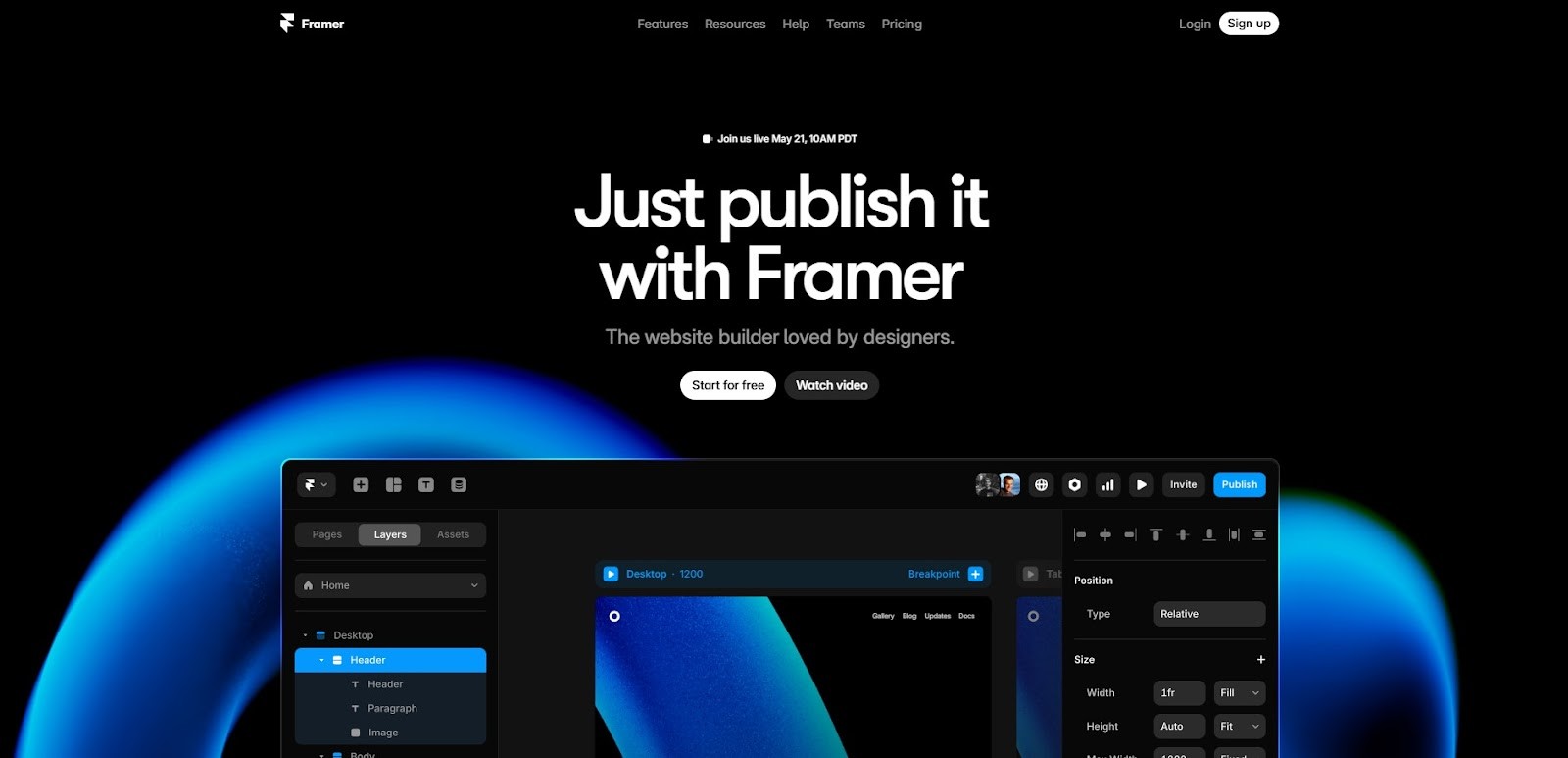
Framer website showcases a minimalist design that allows its design and prototyping tools to take center stage. The clean layout is complemented by bold visuals and typography that guide users through the site.
The interactive design elements provide an engaging experience without feeling overwhelming, and the minimalist approach to navigation ensures visitors can easily find the information they need.
Minimalist Design Highlights
Bold typography and visuals
Interactive design elements
Simple, intuitive navigation
Smooth animations and transitions
Mobile-friendly and responsive
Click to Open
12. The New York Times

The New York Times embraces minimalist design by organizing its vast content into a clean and user-friendly layout. The website prioritizes readability with clear typography and ample white space.
While there is a lot of information to process, the simple navigation and well-structured layout allow users to easily find what they’re looking for. The minimalist design complements the journalistic content without overpowering it.
Minimalist Design Highlights
Clear, readable typography
Well-organized layout for content-heavy sites
Smooth navigation and transitions
Ample whitespace for readability
Mobile-optimized design
Click to Open
13. Bose

Bose website uses minimalist design principles to showcase its audio products. With large visuals and minimal text, the site highlights the quality of the products. The simple, clean navigation ensures users can easily explore different categories and find the information they need.
The layout is organized, and the product pages are easy to navigate, offering a seamless shopping experience.
Minimalist Design Highlights
Large, high-quality product visuals
Simple, user-friendly navigation
Minimal text with clear calls to action
Clean, organized product pages
Mobile-optimized
Click to Open
14. Spotify

Spotify minimalist website puts the focus on music with clean typography and easy navigation. The design is simple, yet impactful, allowing users to explore music and podcasts with ease.
Bold imagery and large buttons make navigating through the site an intuitive experience. The minimalist design reduces distractions, making the music the center of attention.
Minimalist Design Highlights
Simple, intuitive navigation
Clean, bold typography
High-quality imagery to emphasize content
Focus on music and audio content
Mobile-friendly design
Click to Open
15. Trello

Trello website embraces a minimalist approach to task management by using a clean and simple layout. The website’s straightforward design allows users to focus on the product’s features without distraction.
The intuitive navigation, large visuals, and clear typography make it easy for visitors to understand how the platform works. Trello’s design effectively guides users through the onboarding process and emphasizes ease of use.
Minimalist Design Highlights
Simple, clean layout
Easy-to-navigate design
Clear call-to-action buttons
Large visuals showcasing product features
Mobile-friendly interface
Click to Open
16. Invision

Invision website uses minimalist design to highlight its design tools and features. Large, bold visuals and simple typography guide users to explore their prototyping and collaboration platform. Clean layout allows visitors to focus on the features and capabilities, while smooth animations enhance the user experience.
The minimalist design ensures that the content is the focal point and avoids unnecessary distractions.
Minimalist Design Highlights
Bold visuals with large typography
Simple and intuitive navigation
Interactive design elements without clutter
Organized layout with clear calls to action
Responsive design
Click to Open
17. Adobe

Adobe website is a stunning example of how minimalist design can showcase powerful tools. With its clean layout, high-quality visuals, and easy-to-understand typography, the website highlights Adobe’s software offerings in a simple yet compelling way.
Minimalist design encourages users to explore its features while providing quick access to resources, tutorials, and product information. The website also adapts beautifully across devices, ensuring a seamless experience.
Minimalist Design Highlights
Clean layout with high-quality visuals
Simple, easy-to-read typography
Seamless cross-device experience
Smooth navigation and user-friendly interface
Focus on showcasing products effectively
Click to Open
18. Airbnb

Airbnb website is a model of minimalist design, offering users a smooth, distraction-free experience when searching for accommodations. The simple, clean interface makes it easy to search and browse, while large visuals showcase the properties.
The website’s layout is intuitive, and the minimalist design focuses on clear calls to action, helping visitors make quick decisions. The seamless integration of images, typography, and interactive elements ensures a memorable experience.
Minimalist Design Highlights
Clean, intuitive layout
Large visuals with property images
Simple search and filtering options
Clear call-to-action buttons
Fast, responsive design
Click to Open
19. Patagonia
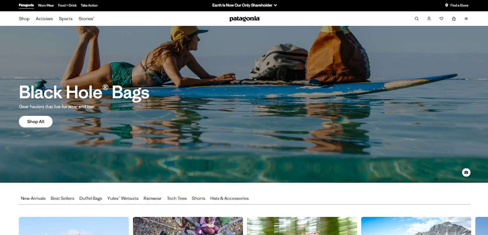
Patagonia website combines minimalist design with eco-conscious branding. The clean, spacious layout lets the products and environmental initiatives take center stage. Large, impactful visuals complement concise product descriptions, allowing visitors to explore the brand’s values and offerings.
Simple design prioritizes clarity and ensures that users can quickly navigate through categories, while highlighting the brand’s commitment to sustainability.
Minimalist Design Highlights
Clean, spacious layout with bold visuals
Concise product descriptions
Focus on sustainability and eco-conscious messaging
Easy-to-navigate design
Mobile-optimized
Click to Open
20. Glossier

Glossier minimalist design captures the brand’s essence- effortless beauty and simplicity. The clean layout features large product images and smooth navigation that keeps visitors focused on the product offerings.
The design emphasizes ease of use, with clear calls to action and intuitive page structure. The website’s minimalist aesthetic allows the brand’s message and products to take the spotlight.
Minimalist Design Highlights
Bold product images with minimalist styling
Clean, organized layout
Intuitive navigation and smooth scrolling
Clear and concise calls to action
Mobile-friendly design
Click to Open
21. Moo

Moo website uses a simple, clean design to highlight its custom printing services. There’s plenty of white space, so visitors can easily focus on the products. The fonts are clear, and the navigation is straightforward, making the design process smooth.
Overall, the minimalist style helps customers explore options, customize their products, and place orders without feeling confused or overwhelmed.
Minimalist Design Highlights
Clean and simple layout
Ample use of whitespace for easy navigation
Clear typography and intuitive structure
Focus on custom print services
Responsive across devices
Click to Open
22. Wix

Wix uses minimalist web design to showcase its website-building platform, allowing users to quickly understand its offerings. The simple layout emphasizes clean visuals, clear calls to action, and easy navigation, leading users toward building their own sites. The minimalist design ensures that visitors are not distracted by unnecessary content, helping them focus on the platform’s features and capabilities.
Minimalist Design Highlights
Clean, simple layout with high-quality visuals
Clear calls to action
Intuitive, user-friendly navigation
Smooth user experience
Mobile-optimized
Click to Open
23. Nudie Jeans

Nudie Jeans uses a simple, clean website design that also reflects its focus on sustainability. The layout is neat, and the subtle typography keeps attention on the products. Easy navigation helps visitors browse the collection without effort, while large, clear images show the style and quality.
The minimalist design supports the brand’s eco-friendly message and matches its values perfectly.
Minimalist Design Highlights
Clean layout with simple typography
Large, high-quality product visuals
Focus on sustainability
Easy-to-use navigation
Mobile-responsive
Click to Open
24. Asana

Asana uses a clean and simple website design that focuses on usability. The soft color scheme, clear fonts, and strong call-to-action buttons make it easy to explore its project management tools. The layout feels intuitive, helping visitors quickly understand the features. The minimalist style keeps attention on the main functions without unnecessary distractions.
Minimalist Design Highlights
Simple and functional layout
Clear, concise typography
Easy-to-navigate design
Clear calls to action for product exploration
Fully responsive design
Click to Open
25. Lush

Lush uses a clean and simple website design to highlight its natural beauty products. The layout is neat, with strong visuals and limited text, so the products stand out. Easy navigation makes shopping smooth and stress free. The simple design also clearly reflects the brand’s focus on natural ingredients and ethical sourcing.
Minimalist Design Highlights
Large product visuals and images
Simple navigation and layout
Minimal text with clear messaging
Mobile-optimized for shopping
Focus on ethical and natural products
Click to Open
26. Tesla

Tesla website is clean and simple, using strong images and clear design to show off its electric cars. The easy-to-use layout helps visitors quickly find information about car models and sustainability efforts. High-quality pictures and short, clear text make it easy to understand Tesla’s features and innovations.
Minimalist Design Highlights
Bold visuals and large car images
Clean, simple layout
Intuitive, user-friendly navigation
Focus on innovation and sustainability
Mobile-responsive design
Click to Open
27. J.Crew

J.Crew website uses minimalist design to put the focus on fashion. The layout is clean, with high-quality images and simple typography that guides users to product categories. The design emphasizes simplicity and usability, ensuring that shoppers can easily find their favorite items and complete their purchases without any hassle. The minimalist design also highlights the brand’s classic, timeless style.
Minimalist Design Highlights
Clean, simple layout
High-quality fashion imagery
Simple navigation with clear categories
Focus on timeless style
Mobile-friendly
Click to Open
28. Bumble

Bumble website is simple and clean, letting users focus on its dating and social features. The layout is easy to follow, with clear visuals and smooth navigation that make signing up and using the platform straightforward. The minimalist design matches Bumble’s simple approach to connecting people.
Minimalist Design Highlights
Simple layout with bold visuals
Intuitive navigation
Clear call-to-action buttons
Emphasis on the app’s core features
Fully responsive design
Click to Open
29. Hermès

Hermès uses minimalist design to highlight its luxury goods with elegance and grace. The website features large product images and subtle animations that draw attention to the craftsmanship and exclusivity of the items. The clean layout and simple typography ensure that the luxury products are the focus, and the minimalist design allows users to explore the brand’s heritage without distractions.
Features
Large, high-quality product images
Subtle animations and transitions
Clean, organized layout
Simple typography and color scheme
Focus on luxury and craftsmanship
Click to Open
30. Hims

Hims website utilizes minimalist design to promote men’s wellness products with clarity and trust. The site features soft color tones, large visuals, and straightforward messaging. Navigation is simple and product pages are decluttered, focusing on health solutions in a clean, modern way that reflects their approachable brand identity.
Minimalist Design Highlights
Soft, approachable color palette
Clean and direct product display
Simplified, conversion-focused layout
Modern, friendly typography
Mobile-optimized experience
Click to Open
31. Area 17
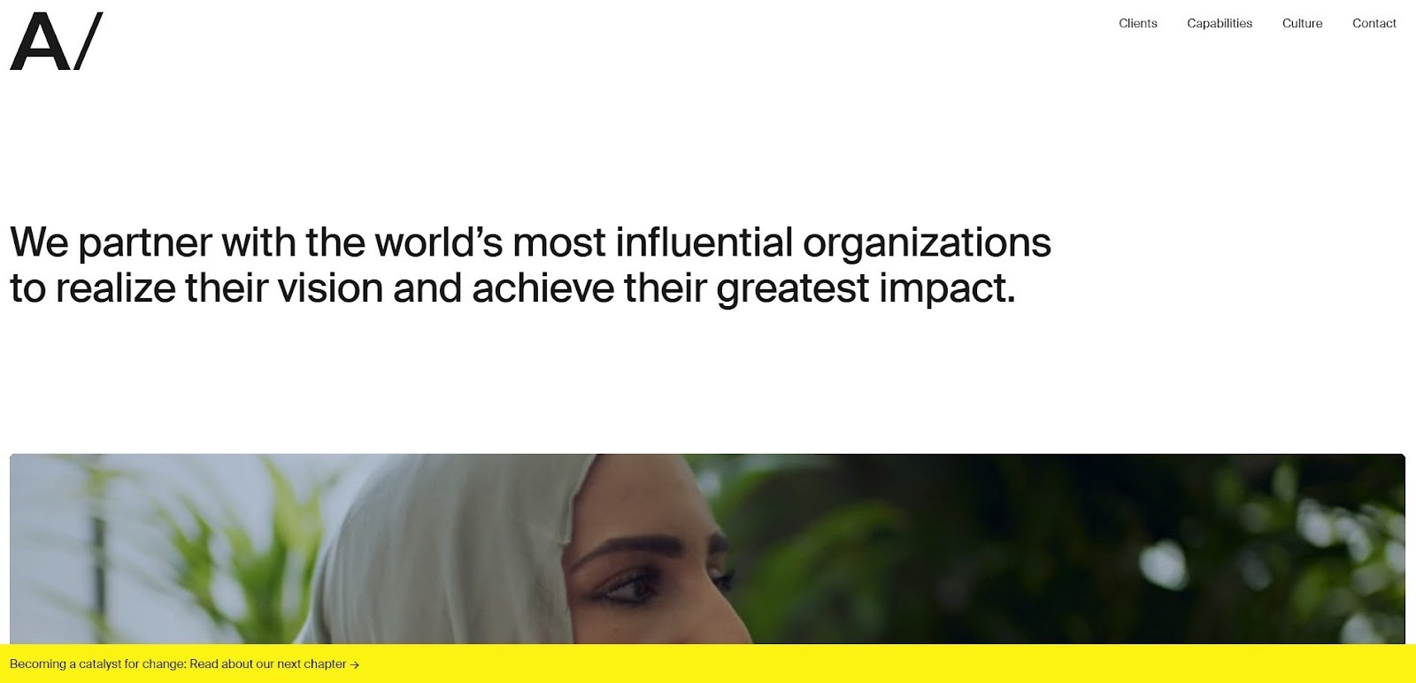
Area 17 is a digital product agency whose site blends minimalism with sophistication. Their homepage features clean layouts, simple typography, and a clear hierarchy of content. It effectively uses space and rhythm to guide the viewer's eye through projects and values. Subtle motion effects enrich the user experience while maintaining simplicity.
Minimalist Design Highlights
Clean visual hierarchy
Strategic use of white space
Subtle interactive elements
Clear, digestible typography
Thoughtful user flow
Click to open
Final Thoughts
Minimalist web design provides an experience in addition to being aesthetically pleasing. In any organization, whether you are an entrepreneur, freelancer, or part of a large organization, implementing minimalist design can help improve user experience. As 2026 progresses, these designs will continue to inspire clean, simple, and functional digital experiences.
Let your website be noticeable in a noisy digital world by following the minimalist movement.
Minimalist web design is a powerful design approach focusing on simplicity, clarity, and purpose. In minimalist design, unnecessary elements are removed, typography is thoughtful, and navigation is intuitive, making for an elegant and seamless user experience. Find inspiration for minimalist web design in this collection of websites showing less is more.
Trends come and go in web design, but one design philosophy remains constant: minimalist design. Minimalist websites are elegant and simple, making it easy for users to concentrate on what matters most. Here are some beautiful examples that will inspire your next modern, functional, and visually compelling website.
Why Minimalism Works
Minimalism works because it focuses on content, functionality, and user experience. A minimalist web design offers a clean, distraction-free environment that guides visitors easily on a site in an age where attention periods are short. Here are a few reasons why minimalist web design continues to be popular:
Improved User Experience (UX): Minimalist designs feature clarity and ease of navigation, making it easier for users to find what they’re looking for.
Faster Load Times: Minimalistic websites load faster because they are free of unnecessary elements and the optimization of assets.
Focus on Content: Minimalism allows your content to take center stage, ensuring that the message or product you are promoting gets the attention it deserves.
Elegance and Timelessness: Clean, simple designs have timeless appeal. Trends may come and go, but a minimalist design stays fresh and relevant for years.
Top 30+ Minimalist Web Design Inspirations:
Minimalist design continues to dominate the web in 2026. Websites that embrace clean lines, white space, and simple navigation create a user-friendly experience while maintaining elegance. Here are 30 websites with minimalist designs that will inspire you to refine your web presence.
1. Apple
Apple website exemplifies minimalist design through large, high-quality product images, a simple color scheme, and clear typography. It allows visitors to focus on the products, delivering a sleek experience. The minimal approach not only highlights the products but also keeps the navigation simple, helping users get what they need quickly.
The website’s layout and user interface make it incredibly easy to navigate, resulting in seamless user experiences. Additionally, the design is highly responsive and mobile-friendly, ensuring a smooth browsing experience across devices.
Minimalist Design Highlights
Large, high-quality product images
Simple, intuitive navigation
Sleek, responsive design
Clear calls to action
Fast loading times
Click to Open
2. Aesop
Aesop website blends minimalist design with captivating visuals. It’s clean, spacious, and visually impactful, placing focus on its products without overwhelming the user. The design highlights Aesop’s skincare products through immersive, full-screen images and elegant typography.
Each page is thoughtfully designed to present information in a clean and digestible format. Aesop also embraces a subtle color palette and responsive design, ensuring the site looks beautiful on both desktop and mobile devices.
Minimalist Design Highlights
Immersive product imagery
Elegant and easy-to-read typography
Clean, structured layout
Subtle color palette
Responsive for mobile and desktop
Click to Open
3. Everlane
Everlane minimalist design reflects its focus on transparency and sustainability. The website is designed to guide users easily through product categories with a clean, simple interface. High-quality images showcase their ethically produced fashion items, and the transparency about prices and processes is front and center.
The site’s use of whitespace helps create a calming, easy-to-navigate environment. Every page is designed with usability in mind, ensuring smooth interactions from browsing to checkout. Minimalistic elements highlight the brand's clean and ethical philosophy.
Minimalist Design Highlights
Transparent pricing and product info
Clean, spacious layout with large visuals
Simple, straightforward navigation
Focus on ethical and sustainable fashion
Mobile-friendly
Click to Open
4. Squarespace
Squarespace website itself is a perfect showcase of its website-building platform, using minimal design to emphasize its elegant templates. Clean typography, smooth transitions, and bold visuals make it both aesthetically pleasing and functional. The homepage uses simple design elements to convey the core features of Squarespace’s platform, making it easy for users to understand how they can build their own websites.
Overall experience is intuitive, with clear calls to action and a design that allows potential customers to focus on what’s important.
Minimalist Design Highlights
Minimal layout with clear visuals
Smooth transitions and animations
Easy-to-understand interface
Intuitive navigation for all users
Fully responsive
Click to Open
5. Muji
Muji website design is the embodiment of its brand ethos- minimalism and functionality. The site offers a seamless experience with simple navigation and an easy-to-browse catalog of products. The clean layout, soft color palette, and effective use of whitespace make browsing a pleasant experience.
High-quality product images are displayed clearly, emphasizing Muji’s emphasis on simple, functional design. The minimal design also reinforces Muji’s no-brand concept, offering a more relaxed, clutter-free online shopping experience. This website is an excellent example of how minimalism can support a brand’s message.
Minimalist Design Highlights
Simple, functional navigation
High-quality product images
Soft color palette
No-distraction, clean layout
Responsive for all devices
Click to Open
6. Minimalissimo
As the name suggests, Minimalissimo is dedicated to minimalist design. The website itself reflects this ethos with stark white space, simple typography, and an organized structure. The content focuses on modern design and minimalism in all aspects, from architecture to fashion. The layout is minimal, offering a fluid and distraction-free reading experience.
Visitors are encouraged to engage with curated content without the overwhelming elements found on most sites. Minimalissimo’s website serves as a perfect model for designers looking to build content-focused, minimalist websites.
Minimalist Design Highlights
Clean, minimalist layout
Focus on content and design
Crisp, modern typography
High-quality visuals and images
Smooth, responsive design
Click to Open
7. Koto
Koto website embodies modern minimalist design with a bold and simple approach. The homepage features large typography and a striking visual aesthetic, while still maintaining a clean and organized layout. The emphasis is on creative content, offering a seamless experience with smooth animations and transitions.
The simple yet effective use of white space helps guide the user’s journey and emphasizes key visuals and text. Koto’s site is a great example of minimalist design in action.
Minimalist Design Highlights
Bold typography and large visuals
Clear, clean layout
Smooth animations and transitions
White space used effectively
Minimal distractions for a focused experience
Click to Open
8. Cereal Magazine
Cereal Magazine’s website reflects the elegance of its print publication with minimalist design principles. Featuring full-screen, high-quality images that transport readers to different parts of the world, the site emphasizes content through clean layout and clear typography.
The use of white space allows for a calm, immersive experience while the design remains user-friendly. Navigation is simple, allowing readers to explore articles without feeling overwhelmed by ads or clutter. The minimalist design ensures the content remains the focal point throughout.
Minimalist Design Highlights
Full-screen, high-quality imagery
Simple, clean typography
Spacious layout with ample white space
Easy-to-navigate without distractions
Mobile-optimized for a seamless experience
Click to Open
9. Google
Google’s homepage is the epitome of minimalism. With nothing but a search bar and a few simple buttons, it provides the fastest and most efficient way for users to get what they need. The clean, uncluttered design puts the emphasis solely on the user’s query.
It's minimalistic approach to web design enhances the experience by removing distractions and offering users exactly what they’re looking for with a straightforward interface.
Minimalist Design Highlights
Simple search bar as the focal point
No distractions or unnecessary elements
Fast and responsive design
Ultra-fast loading times
Clean, intuitive interface
Click to Open
10. Dropbox
Dropbox uses minimalist design to emphasize simplicity and efficiency. The website’s clear layout guides users through the sign-up process and encourages them to explore the platform’s features.
The simple color palette and clean typography create a calm browsing experience, while the responsive design ensures the site looks great on any device. Dropbox’s minimal approach highlights its core offerings without unnecessary distractions.
Minimalist Design Highlights
Simple, clean layout
Intuitive navigation and call-to-action buttons
Use of whitespace to focus attention on key areas
Clear typography and minimal design elements
Fast loading times
Click to Open
11. Framer
Framer website showcases a minimalist design that allows its design and prototyping tools to take center stage. The clean layout is complemented by bold visuals and typography that guide users through the site.
The interactive design elements provide an engaging experience without feeling overwhelming, and the minimalist approach to navigation ensures visitors can easily find the information they need.
Minimalist Design Highlights
Bold typography and visuals
Interactive design elements
Simple, intuitive navigation
Smooth animations and transitions
Mobile-friendly and responsive
Click to Open
12. The New York Times
The New York Times embraces minimalist design by organizing its vast content into a clean and user-friendly layout. The website prioritizes readability with clear typography and ample white space.
While there is a lot of information to process, the simple navigation and well-structured layout allow users to easily find what they’re looking for. The minimalist design complements the journalistic content without overpowering it.
Minimalist Design Highlights
Clear, readable typography
Well-organized layout for content-heavy sites
Smooth navigation and transitions
Ample whitespace for readability
Mobile-optimized design
Click to Open
13. Bose
Bose website uses minimalist design principles to showcase its audio products. With large visuals and minimal text, the site highlights the quality of the products. The simple, clean navigation ensures users can easily explore different categories and find the information they need.
The layout is organized, and the product pages are easy to navigate, offering a seamless shopping experience.
Minimalist Design Highlights
Large, high-quality product visuals
Simple, user-friendly navigation
Minimal text with clear calls to action
Clean, organized product pages
Mobile-optimized
Click to Open
14. Spotify
Spotify minimalist website puts the focus on music with clean typography and easy navigation. The design is simple, yet impactful, allowing users to explore music and podcasts with ease.
Bold imagery and large buttons make navigating through the site an intuitive experience. The minimalist design reduces distractions, making the music the center of attention.
Minimalist Design Highlights
Simple, intuitive navigation
Clean, bold typography
High-quality imagery to emphasize content
Focus on music and audio content
Mobile-friendly design
Click to Open
15. Trello
Trello website embraces a minimalist approach to task management by using a clean and simple layout. The website’s straightforward design allows users to focus on the product’s features without distraction.
The intuitive navigation, large visuals, and clear typography make it easy for visitors to understand how the platform works. Trello’s design effectively guides users through the onboarding process and emphasizes ease of use.
Minimalist Design Highlights
Simple, clean layout
Easy-to-navigate design
Clear call-to-action buttons
Large visuals showcasing product features
Mobile-friendly interface
Click to Open
16. Invision
Invision website uses minimalist design to highlight its design tools and features. Large, bold visuals and simple typography guide users to explore their prototyping and collaboration platform. Clean layout allows visitors to focus on the features and capabilities, while smooth animations enhance the user experience.
The minimalist design ensures that the content is the focal point and avoids unnecessary distractions.
Minimalist Design Highlights
Bold visuals with large typography
Simple and intuitive navigation
Interactive design elements without clutter
Organized layout with clear calls to action
Responsive design
Click to Open
17. Adobe
Adobe website is a stunning example of how minimalist design can showcase powerful tools. With its clean layout, high-quality visuals, and easy-to-understand typography, the website highlights Adobe’s software offerings in a simple yet compelling way.
Minimalist design encourages users to explore its features while providing quick access to resources, tutorials, and product information. The website also adapts beautifully across devices, ensuring a seamless experience.
Minimalist Design Highlights
Clean layout with high-quality visuals
Simple, easy-to-read typography
Seamless cross-device experience
Smooth navigation and user-friendly interface
Focus on showcasing products effectively
Click to Open
18. Airbnb
Airbnb website is a model of minimalist design, offering users a smooth, distraction-free experience when searching for accommodations. The simple, clean interface makes it easy to search and browse, while large visuals showcase the properties.
The website’s layout is intuitive, and the minimalist design focuses on clear calls to action, helping visitors make quick decisions. The seamless integration of images, typography, and interactive elements ensures a memorable experience.
Minimalist Design Highlights
Clean, intuitive layout
Large visuals with property images
Simple search and filtering options
Clear call-to-action buttons
Fast, responsive design
Click to Open
19. Patagonia
Patagonia website combines minimalist design with eco-conscious branding. The clean, spacious layout lets the products and environmental initiatives take center stage. Large, impactful visuals complement concise product descriptions, allowing visitors to explore the brand’s values and offerings.
Simple design prioritizes clarity and ensures that users can quickly navigate through categories, while highlighting the brand’s commitment to sustainability.
Minimalist Design Highlights
Clean, spacious layout with bold visuals
Concise product descriptions
Focus on sustainability and eco-conscious messaging
Easy-to-navigate design
Mobile-optimized
Click to Open
20. Glossier
Glossier minimalist design captures the brand’s essence- effortless beauty and simplicity. The clean layout features large product images and smooth navigation that keeps visitors focused on the product offerings.
The design emphasizes ease of use, with clear calls to action and intuitive page structure. The website’s minimalist aesthetic allows the brand’s message and products to take the spotlight.
Minimalist Design Highlights
Bold product images with minimalist styling
Clean, organized layout
Intuitive navigation and smooth scrolling
Clear and concise calls to action
Mobile-friendly design
Click to Open
21. Moo
Moo website uses a simple, clean design to highlight its custom printing services. There’s plenty of white space, so visitors can easily focus on the products. The fonts are clear, and the navigation is straightforward, making the design process smooth.
Overall, the minimalist style helps customers explore options, customize their products, and place orders without feeling confused or overwhelmed.
Minimalist Design Highlights
Clean and simple layout
Ample use of whitespace for easy navigation
Clear typography and intuitive structure
Focus on custom print services
Responsive across devices
Click to Open
22. Wix
Wix uses minimalist web design to showcase its website-building platform, allowing users to quickly understand its offerings. The simple layout emphasizes clean visuals, clear calls to action, and easy navigation, leading users toward building their own sites. The minimalist design ensures that visitors are not distracted by unnecessary content, helping them focus on the platform’s features and capabilities.
Minimalist Design Highlights
Clean, simple layout with high-quality visuals
Clear calls to action
Intuitive, user-friendly navigation
Smooth user experience
Mobile-optimized
Click to Open
23. Nudie Jeans
Nudie Jeans uses a simple, clean website design that also reflects its focus on sustainability. The layout is neat, and the subtle typography keeps attention on the products. Easy navigation helps visitors browse the collection without effort, while large, clear images show the style and quality.
The minimalist design supports the brand’s eco-friendly message and matches its values perfectly.
Minimalist Design Highlights
Clean layout with simple typography
Large, high-quality product visuals
Focus on sustainability
Easy-to-use navigation
Mobile-responsive
Click to Open
24. Asana
Asana uses a clean and simple website design that focuses on usability. The soft color scheme, clear fonts, and strong call-to-action buttons make it easy to explore its project management tools. The layout feels intuitive, helping visitors quickly understand the features. The minimalist style keeps attention on the main functions without unnecessary distractions.
Minimalist Design Highlights
Simple and functional layout
Clear, concise typography
Easy-to-navigate design
Clear calls to action for product exploration
Fully responsive design
Click to Open
25. Lush
Lush uses a clean and simple website design to highlight its natural beauty products. The layout is neat, with strong visuals and limited text, so the products stand out. Easy navigation makes shopping smooth and stress free. The simple design also clearly reflects the brand’s focus on natural ingredients and ethical sourcing.
Minimalist Design Highlights
Large product visuals and images
Simple navigation and layout
Minimal text with clear messaging
Mobile-optimized for shopping
Focus on ethical and natural products
Click to Open
26. Tesla
Tesla website is clean and simple, using strong images and clear design to show off its electric cars. The easy-to-use layout helps visitors quickly find information about car models and sustainability efforts. High-quality pictures and short, clear text make it easy to understand Tesla’s features and innovations.
Minimalist Design Highlights
Bold visuals and large car images
Clean, simple layout
Intuitive, user-friendly navigation
Focus on innovation and sustainability
Mobile-responsive design
Click to Open
27. J.Crew
J.Crew website uses minimalist design to put the focus on fashion. The layout is clean, with high-quality images and simple typography that guides users to product categories. The design emphasizes simplicity and usability, ensuring that shoppers can easily find their favorite items and complete their purchases without any hassle. The minimalist design also highlights the brand’s classic, timeless style.
Minimalist Design Highlights
Clean, simple layout
High-quality fashion imagery
Simple navigation with clear categories
Focus on timeless style
Mobile-friendly
Click to Open
28. Bumble
Bumble website is simple and clean, letting users focus on its dating and social features. The layout is easy to follow, with clear visuals and smooth navigation that make signing up and using the platform straightforward. The minimalist design matches Bumble’s simple approach to connecting people.
Minimalist Design Highlights
Simple layout with bold visuals
Intuitive navigation
Clear call-to-action buttons
Emphasis on the app’s core features
Fully responsive design
Click to Open
29. Hermès
Hermès uses minimalist design to highlight its luxury goods with elegance and grace. The website features large product images and subtle animations that draw attention to the craftsmanship and exclusivity of the items. The clean layout and simple typography ensure that the luxury products are the focus, and the minimalist design allows users to explore the brand’s heritage without distractions.
Features
Large, high-quality product images
Subtle animations and transitions
Clean, organized layout
Simple typography and color scheme
Focus on luxury and craftsmanship
Click to Open
30. Hims
Hims website utilizes minimalist design to promote men’s wellness products with clarity and trust. The site features soft color tones, large visuals, and straightforward messaging. Navigation is simple and product pages are decluttered, focusing on health solutions in a clean, modern way that reflects their approachable brand identity.
Minimalist Design Highlights
Soft, approachable color palette
Clean and direct product display
Simplified, conversion-focused layout
Modern, friendly typography
Mobile-optimized experience
Click to Open
31. Area 17
Area 17 is a digital product agency whose site blends minimalism with sophistication. Their homepage features clean layouts, simple typography, and a clear hierarchy of content. It effectively uses space and rhythm to guide the viewer's eye through projects and values. Subtle motion effects enrich the user experience while maintaining simplicity.
Minimalist Design Highlights
Clean visual hierarchy
Strategic use of white space
Subtle interactive elements
Clear, digestible typography
Thoughtful user flow
Click to open
Final Thoughts
Minimalist web design provides an experience in addition to being aesthetically pleasing. In any organization, whether you are an entrepreneur, freelancer, or part of a large organization, implementing minimalist design can help improve user experience. As 2026 progresses, these designs will continue to inspire clean, simple, and functional digital experiences.
Let your website be noticeable in a noisy digital world by following the minimalist movement.

Read more articles

Feb 28, 2026
Best Framer Templates with Parallax Scrolling
Feb 28, 2026
Best Framer Templates with Parallax Scrolling

Feb 22, 2026
Framer Canvas: Design Without Limits
Feb 22, 2026
Framer Canvas: Design Without Limits
Feb 19, 2026
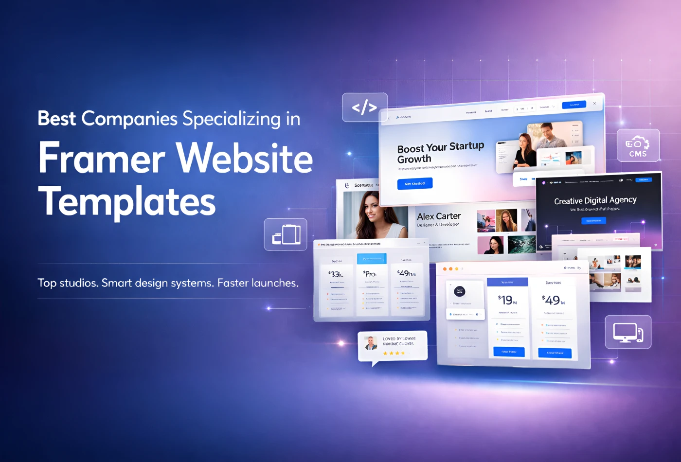
Best Companies Specializing in Framer Website Templates in 2026
Feb 19, 2026
Best Companies Specializing in Framer Website Templates in 2026
Get exclusive 10% discount on your next purchase.
We will send the discount code immediately in your inbox.

Templates
Copyright © 2026 FramerBite, A Part of Creetfy LLC. All Rights Reserved
Follow us on Twitter
Get exclusive 10% discount on your next purchase.
We will send the discount code immediately in your inbox.
Templates
Copyright © 2026 FramerBite, A Part of Creetfy LLC. All Rights Reserved
Follow us on Twitter
Get exclusive 10% discount on your next purchase.
We will send the discount code immediately in your inbox.
Templates
Copyright © 2026 FramerBite, A Part of Creetfy LLC. All Rights Reserved
Follow us on Twitter
Get exclusive 10% discount on your next purchase.
We will send the discount code immediately in your inbox.
Templates
Copyright © 2026 FramerBite, A Part of Creetfy LLC. All Rights Reserved
Follow us on Twitter