UI Design Inspiration: Fresh Ideas and Best Practices for 2026
Last Updated on:
Author:
Framerbite
Framerbite

In the ultra-modern 21st century, a well-crafted user interface (UI) is essential. By designing a user interface thoughtfully, you can create an engaging experience that keeps your customers engaged and drives conversions. To stay on top of the curve, having fresh UI inspiration is key, whether you're designing cutting-edge apps, sleek websites, or interactive dashboards.
This blog post will explore latest trends of UI design, real-world inspirations, and practical tips to elevate your UI practice.
Key Principles of Effective UI Design
Before we get into the latest trends and inspirations, let’s revisit some timeless principles of UI design:
Consistency and Clarity: Stick to a consistent visual language, from buttons to typography, to help users navigate effortlessly.
Visual Hierarchy: Use size, color, and layout to guide the user’s attention.
Typography and Contrast: Choose legible fonts and maintain contrast for readability.
Microinteractions: Small animations like button feedback or hover effects make interfaces feel more alive.
Accessibility: Design for everyone, including users with disabilities. Color contrast, readable fonts, and clear navigation go a long way.
Inspiring UI Design Trends for 2026
Let’s explore some exciting UI trends shaping the digital landscape in 2026:
Neumorphism and Soft UI: A style that blends flat design with subtle 3D effects, creating soft shadows and tactile depth.
Bold Typography: Oversized, expressive fonts add personality and make a strong statement.
Minimalism with Personality: Clean layouts with pops of vibrant color and playful animations.
Dark Mode and High-Contrast Themes: More apps and sites are offering dark themes for both aesthetics and eye comfort.
3D and Immersive Design: Subtle 3D effects, parallax scrolling, and layered visuals bring depth to the experience.
Top UI Design Inspirations from Around the Web
Ready to get inspired? The web is a treasure trove of incredible designs, and staying attuned to the best examples out there can push your creativity to new heights. From sleek corporate websites that ooze professionalism to quirky, playful interfaces that surprise and delight, these standout examples of modern UI design show what’s possible when creativity meets functionality.
1. Stripe
Stripe’s website is a masterclass in modern, minimalist UI design. It features clean typography, a well-balanced color palette, and subtle animations that create a refined digital experience. Every section is crafted with precision, allowing users to quickly find information about payments, integrations, and developer tools.
This website manages to make complex financial technology approachable and easy to understand. Its UI is straightforward but doesn’t compromise on visual elegance. By using subtle animations and intuitive microinteractions, Stripe keeps the user engaged without overwhelming them. It’s proof that minimalism, when done right, can deliver a powerful and sophisticated user experience.
Website: https://stripe.com

2. Framer
Framer’s website is bold, dynamic, and interactive just like the design tool it promotes. The homepage immediately captures attention with oversized typography, slick transitions, and interactive demos that showcase the software’s capabilities. Each section flows seamlessly into the next, guiding users on a journey through Framer’s features.
Framer shows how motion can elevate a UI experience. Transitions and animations aren’t just decorative here, they’re functional, reinforcing the product’s identity as a cutting-edge design tool. It’s a perfect balance of style and substance that feels modern and inspiring.
Website: https://framer.com

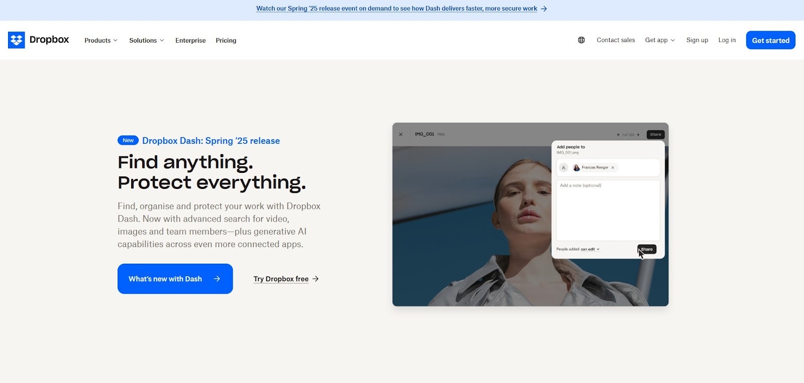
3. Dropbox
Dropbox’s website focuses on clarity and user-friendliness. It uses soft, approachable colors, a crisp sans-serif typeface, and playful illustrations that convey a friendly and welcoming feel. The UI emphasizes simplicity, reflecting the product’s mission to make file storage effortless.
The UI demonstrates that simplicity doesn’t have to be boring. Dropbox’s visuals and typography feel fresh and modern, making it easy for users to understand the service’s value without heavy text. This website strikes a perfect balance between professional reliability and a touch of whimsy.
Website: https://www.dropbox.com
4. Apple
Apple’s website is as polished and elegant as its products. Large, high-quality visuals highlight devices with stunning detail. Typography is bold and confident, while the layout uses ample white space to guide attention to what matters most. Smooth scrolling transitions create a luxurious browsing experience.
Why It’s Inspiring: Apple’s UI showcases the power of brand consistency. From typography to imagery, every element aligns with their product identity. The seamless transitions between product sections create an almost cinematic experience, reinforcing Apple’s image as a premium brand.
Website: https://www.apple.com

5. Pitch
Pitch reimagines the presentation software website with playful animations, bold colors, and dynamic typography. The interface feels fresh and full of personality, reflecting the energy of a modern, collaborative workspace.
The UI breaks free from the traditional corporate look of productivity tools. It’s vibrant and lively, making presentations feel like a creative endeavor rather than a chore. Pitch’s approach proves that professional design can be colorful, inviting, and fun.
Website: https://pitch.com

6. Awwwards
Awwwards is a digital playground that showcases the world’s best website designs. Its own website uses bold typography, high-contrast visuals, and a modern grid layout to highlight award-winning work. Subtle hover effects and microinteractions invite users to explore further.
It demonstrates how curation and editorial design can inspire creativity. Each project showcased feels like a mini-case study in UI innovation. The site’s own design is so compelling that it elevates the showcased content even further.
Website: https://www.awwwards.com

7. Superlist
Superlist’s website combines minimal typography with neon accents and clever animations that highlight its productivity app. The futuristic aesthetic is balanced with a clear, functional layout that makes it easy to understand how Superlist works.
The UI feels cutting-edge yet familiar. The use of motion design from neon highlights to animated transitions, breathes life into the content, making productivity feel exciting. It’s a reminder that even simple interfaces can be visually stunning.
Website: https://superlist.com

8. Figma
Figma’s website reflects the tool’s focus on collaboration and creativity. Bright illustrations, modular layouts, and a clean color scheme make it inviting for designers. Interactive demos highlight how Figma’s features can transform workflows.
The UI design emphasizes community and openness. Everything feels approachable, from the copy to the visuals. Figma’s site is a great example of how to build excitement for a tool by focusing on the user’s needs and aspirations.
Website: https://www.figma.com

9. Evernote
Evernote’s website has a streamlined, modern layout that focuses on guiding new users through the product’s core features. Subtle animations and smooth transitions add a sense of sophistication without cluttering the experience.
The UI shows how simplicity and thoughtful design can make a potentially overwhelming product feel accessible. Every section is crafted to build trust and confidence, showing that onboarding can be both beautiful and functional.
Website: https://evernote.com

10. Readymag
Readymag’s website blends editorial-style layouts, layered typography, and interactive demos that make you want to keep scrolling. The design feels like a digital magazine, inviting users to explore rather than rush.
Readymag proves that storytelling can be at the heart of UI. It’s not just about features, it’s about creating an immersive experience. The creative use of typography and interactive visuals shows that UI can be a canvas for experimentation.
Website: https://readymag.com

Why It’s a Top Resource for UI Designers
Framer’s toolkit is designed to simplify the UI design process. It uses dynamic visuals and smooth animations to highlight what’s possible with the tool. The clear hierarchy, spacious layout, and bold typography demonstrate how good UI design guides users effortlessly. It offers:
Interactive Prototyping: Build realistic user interactions without writing a single line of code.
Design Systems: Create reusable components and maintain consistency across projects.
Collaboration Features: Real-time collaboration with your team ensures designs stay cohesive and efficient.
How Framerbite Helps with UI Design
Framerbite is a platform that collects the best Framer-based websites and components, making it an invaluable resource for UI designers looking for inspiration, practical templates, and up-to-date trends.
Showcase of Real-World Designs
Framerbite features a gallery of real websites and web apps built in Framer. This helps you see how design concepts translate into actual projects from typography and layout to animations and interactivity.
Component Library & Templates
Framerbite’s library includes ready-to-use components, such as navigation bars, footers, and interactive cards. These can be a starting point for your own projects, speeding up your workflow.
Maintain UI Trend
Framerbite keeps you up to date with what’s hot in UI design. Whether it’s a new trend in minimal layouts or the latest color schemes, you’ll find practical examples and real-world applications.
Save Time, Get Inspired
Instead of starting from scratch, you can explore Framerbite’s examples and adapt them to your project’s unique needs. This saves hours of brainstorming and research, helping you move from concept to prototype faster.
Learning by Example
Seeing how others use Framer’s features, from motion effects to layout grids gives you practical insights and creative ideas. Framerbite is like having a mentor for modern, effective UI design.
Common Mistakes to Avoid in UI Design
While seeking inspiration, steer clear of these common UI mistakes:
Complicated layout: Don’t overload users with too many features or visuals.
Ignoring Accessibility: Ensure your designs are inclusive for everyone.
Copy-Pasting Designs: It’s okay to be inspired by others, but avoid blindly copying.
Conclusion
UI design inspiration is everywhere - from smartphones to the natural world. In 2026, the possibilities will be unlimited for creating beautiful, functional, and engaging user interfaces. This is a great opportunity to refine your skills and elevate your work.
FAQs about UI Design Inspiration
What is UI design inspiration, and why is it important?
UI design inspiration is the process of exploring examples of great interface design to spark new ideas and make your work better. It’s important because it helps you stay current with design trends, discover creative techniques, and avoid repetitive or uninspired interfaces.
How do I find good sources of UI design inspiration?
Some great sources include curated design platforms like Dribbble, Behance, and Awwwards, as well as UI-focused blogs and showcases like Framerbite or Mobbin. Social media platforms like Pinterest and Instagram can also be goldmines for fresh design ideas.
How can I use UI inspiration without copying someone else’s work?
It’s all about understanding the underlying principles behind great designs, not directly replicating them. Look for color schemes, typography choices, layout strategies, or interaction patterns that resonate with your project.
What are some common UI design trends to watch in 2026?
Some of the biggest trends include dark mode and muted color palettes, immersive 3D graphics, AI-assisted customization, micro-interactions and animations, and bold typography.
Can UI design inspiration help if I’m just starting out?
You can learn what makes an interface effective by studying examples of great design - even if you're a beginner. It can teach you best practices, show you how to use color and layout, and give you a head start on building your own visual style.
In the ultra-modern 21st century, a well-crafted user interface (UI) is essential. By designing a user interface thoughtfully, you can create an engaging experience that keeps your customers engaged and drives conversions. To stay on top of the curve, having fresh UI inspiration is key, whether you're designing cutting-edge apps, sleek websites, or interactive dashboards.
This blog post will explore latest trends of UI design, real-world inspirations, and practical tips to elevate your UI practice.
Key Principles of Effective UI Design
Before we get into the latest trends and inspirations, let’s revisit some timeless principles of UI design:
Consistency and Clarity: Stick to a consistent visual language, from buttons to typography, to help users navigate effortlessly.
Visual Hierarchy: Use size, color, and layout to guide the user’s attention.
Typography and Contrast: Choose legible fonts and maintain contrast for readability.
Microinteractions: Small animations like button feedback or hover effects make interfaces feel more alive.
Accessibility: Design for everyone, including users with disabilities. Color contrast, readable fonts, and clear navigation go a long way.
Inspiring UI Design Trends for 2026
Let’s explore some exciting UI trends shaping the digital landscape in 2026:
Neumorphism and Soft UI: A style that blends flat design with subtle 3D effects, creating soft shadows and tactile depth.
Bold Typography: Oversized, expressive fonts add personality and make a strong statement.
Minimalism with Personality: Clean layouts with pops of vibrant color and playful animations.
Dark Mode and High-Contrast Themes: More apps and sites are offering dark themes for both aesthetics and eye comfort.
3D and Immersive Design: Subtle 3D effects, parallax scrolling, and layered visuals bring depth to the experience.
Top UI Design Inspirations from Around the Web
Ready to get inspired? The web is a treasure trove of incredible designs, and staying attuned to the best examples out there can push your creativity to new heights. From sleek corporate websites that ooze professionalism to quirky, playful interfaces that surprise and delight, these standout examples of modern UI design show what’s possible when creativity meets functionality.
1. Stripe
Stripe’s website is a masterclass in modern, minimalist UI design. It features clean typography, a well-balanced color palette, and subtle animations that create a refined digital experience. Every section is crafted with precision, allowing users to quickly find information about payments, integrations, and developer tools.
This website manages to make complex financial technology approachable and easy to understand. Its UI is straightforward but doesn’t compromise on visual elegance. By using subtle animations and intuitive microinteractions, Stripe keeps the user engaged without overwhelming them. It’s proof that minimalism, when done right, can deliver a powerful and sophisticated user experience.
Website: https://stripe.com
2. Framer
Framer’s website is bold, dynamic, and interactive just like the design tool it promotes. The homepage immediately captures attention with oversized typography, slick transitions, and interactive demos that showcase the software’s capabilities. Each section flows seamlessly into the next, guiding users on a journey through Framer’s features.
Framer shows how motion can elevate a UI experience. Transitions and animations aren’t just decorative here, they’re functional, reinforcing the product’s identity as a cutting-edge design tool. It’s a perfect balance of style and substance that feels modern and inspiring.
Website: https://framer.com
3. Dropbox
Dropbox’s website focuses on clarity and user-friendliness. It uses soft, approachable colors, a crisp sans-serif typeface, and playful illustrations that convey a friendly and welcoming feel. The UI emphasizes simplicity, reflecting the product’s mission to make file storage effortless.
The UI demonstrates that simplicity doesn’t have to be boring. Dropbox’s visuals and typography feel fresh and modern, making it easy for users to understand the service’s value without heavy text. This website strikes a perfect balance between professional reliability and a touch of whimsy.
Website: https://www.dropbox.com
4. Apple
Apple’s website is as polished and elegant as its products. Large, high-quality visuals highlight devices with stunning detail. Typography is bold and confident, while the layout uses ample white space to guide attention to what matters most. Smooth scrolling transitions create a luxurious browsing experience.
Why It’s Inspiring: Apple’s UI showcases the power of brand consistency. From typography to imagery, every element aligns with their product identity. The seamless transitions between product sections create an almost cinematic experience, reinforcing Apple’s image as a premium brand.
Website: https://www.apple.com
5. Pitch
Pitch reimagines the presentation software website with playful animations, bold colors, and dynamic typography. The interface feels fresh and full of personality, reflecting the energy of a modern, collaborative workspace.
The UI breaks free from the traditional corporate look of productivity tools. It’s vibrant and lively, making presentations feel like a creative endeavor rather than a chore. Pitch’s approach proves that professional design can be colorful, inviting, and fun.
Website: https://pitch.com
6. Awwwards
Awwwards is a digital playground that showcases the world’s best website designs. Its own website uses bold typography, high-contrast visuals, and a modern grid layout to highlight award-winning work. Subtle hover effects and microinteractions invite users to explore further.
It demonstrates how curation and editorial design can inspire creativity. Each project showcased feels like a mini-case study in UI innovation. The site’s own design is so compelling that it elevates the showcased content even further.
Website: https://www.awwwards.com
7. Superlist
Superlist’s website combines minimal typography with neon accents and clever animations that highlight its productivity app. The futuristic aesthetic is balanced with a clear, functional layout that makes it easy to understand how Superlist works.
The UI feels cutting-edge yet familiar. The use of motion design from neon highlights to animated transitions, breathes life into the content, making productivity feel exciting. It’s a reminder that even simple interfaces can be visually stunning.
Website: https://superlist.com
8. Figma
Figma’s website reflects the tool’s focus on collaboration and creativity. Bright illustrations, modular layouts, and a clean color scheme make it inviting for designers. Interactive demos highlight how Figma’s features can transform workflows.
The UI design emphasizes community and openness. Everything feels approachable, from the copy to the visuals. Figma’s site is a great example of how to build excitement for a tool by focusing on the user’s needs and aspirations.
Website: https://www.figma.com
9. Evernote
Evernote’s website has a streamlined, modern layout that focuses on guiding new users through the product’s core features. Subtle animations and smooth transitions add a sense of sophistication without cluttering the experience.
The UI shows how simplicity and thoughtful design can make a potentially overwhelming product feel accessible. Every section is crafted to build trust and confidence, showing that onboarding can be both beautiful and functional.
Website: https://evernote.com
10. Readymag
Readymag’s website blends editorial-style layouts, layered typography, and interactive demos that make you want to keep scrolling. The design feels like a digital magazine, inviting users to explore rather than rush.
Readymag proves that storytelling can be at the heart of UI. It’s not just about features, it’s about creating an immersive experience. The creative use of typography and interactive visuals shows that UI can be a canvas for experimentation.
Website: https://readymag.com
Why It’s a Top Resource for UI Designers
Framer’s toolkit is designed to simplify the UI design process. It uses dynamic visuals and smooth animations to highlight what’s possible with the tool. The clear hierarchy, spacious layout, and bold typography demonstrate how good UI design guides users effortlessly. It offers:
Interactive Prototyping: Build realistic user interactions without writing a single line of code.
Design Systems: Create reusable components and maintain consistency across projects.
Collaboration Features: Real-time collaboration with your team ensures designs stay cohesive and efficient.
How Framerbite Helps with UI Design
Framerbite is a platform that collects the best Framer-based websites and components, making it an invaluable resource for UI designers looking for inspiration, practical templates, and up-to-date trends.
Showcase of Real-World Designs
Framerbite features a gallery of real websites and web apps built in Framer. This helps you see how design concepts translate into actual projects from typography and layout to animations and interactivity.
Component Library & Templates
Framerbite’s library includes ready-to-use components, such as navigation bars, footers, and interactive cards. These can be a starting point for your own projects, speeding up your workflow.
Maintain UI Trend
Framerbite keeps you up to date with what’s hot in UI design. Whether it’s a new trend in minimal layouts or the latest color schemes, you’ll find practical examples and real-world applications.
Save Time, Get Inspired
Instead of starting from scratch, you can explore Framerbite’s examples and adapt them to your project’s unique needs. This saves hours of brainstorming and research, helping you move from concept to prototype faster.
Learning by Example
Seeing how others use Framer’s features, from motion effects to layout grids gives you practical insights and creative ideas. Framerbite is like having a mentor for modern, effective UI design.
Common Mistakes to Avoid in UI Design
While seeking inspiration, steer clear of these common UI mistakes:
Complicated layout: Don’t overload users with too many features or visuals.
Ignoring Accessibility: Ensure your designs are inclusive for everyone.
Copy-Pasting Designs: It’s okay to be inspired by others, but avoid blindly copying.
Conclusion
UI design inspiration is everywhere - from smartphones to the natural world. In 2026, the possibilities will be unlimited for creating beautiful, functional, and engaging user interfaces. This is a great opportunity to refine your skills and elevate your work.
FAQs about UI Design Inspiration
What is UI design inspiration, and why is it important?
UI design inspiration is the process of exploring examples of great interface design to spark new ideas and make your work better. It’s important because it helps you stay current with design trends, discover creative techniques, and avoid repetitive or uninspired interfaces.
How do I find good sources of UI design inspiration?
Some great sources include curated design platforms like Dribbble, Behance, and Awwwards, as well as UI-focused blogs and showcases like Framerbite or Mobbin. Social media platforms like Pinterest and Instagram can also be goldmines for fresh design ideas.
How can I use UI inspiration without copying someone else’s work?
It’s all about understanding the underlying principles behind great designs, not directly replicating them. Look for color schemes, typography choices, layout strategies, or interaction patterns that resonate with your project.
What are some common UI design trends to watch in 2026?
Some of the biggest trends include dark mode and muted color palettes, immersive 3D graphics, AI-assisted customization, micro-interactions and animations, and bold typography.
Can UI design inspiration help if I’m just starting out?
You can learn what makes an interface effective by studying examples of great design - even if you're a beginner. It can teach you best practices, show you how to use color and layout, and give you a head start on building your own visual style.

Read more articles

Feb 28, 2026
Best Framer Templates with Parallax Scrolling
Feb 28, 2026
Best Framer Templates with Parallax Scrolling

Feb 22, 2026
Framer Canvas: Design Without Limits
Feb 22, 2026
Framer Canvas: Design Without Limits
Feb 19, 2026
Best Companies Specializing in Framer Website Templates in 2026
Feb 19, 2026
Best Companies Specializing in Framer Website Templates in 2026
Find perfect template for your website & get 50% discount coupon

Templates
Copyright © 2026 FramerBite, A Part of Creetfy LLC. All Rights Reserved
Follow us on Twitter
Find perfect template for your website & get 50% discount coupon
Templates
Copyright © 2026 FramerBite, A Part of Creetfy LLC. All Rights Reserved
Follow us on Twitter
Find perfect template for your website & get 50% discount coupon
Templates
Copyright © 2026 FramerBite, A Part of Creetfy LLC. All Rights Reserved
Follow us on Twitter
Find perfect template for your website & get 50% discount coupon
Templates
Copyright © 2026 FramerBite, A Part of Creetfy LLC. All Rights Reserved
Follow us on Twitter