Best Website Menu Design Inspiration
Last Updated on:
Author:
Framerbite
Framerbite

When visitors land on your website, the menu is often their first tool to explore your content. It’s the roadmap guiding users through your pages, products, or services, making it one of the most important parts of your site design. A great website menu not only helps users find what they want quickly but also strengthens your brand identity and boosts overall user satisfaction.
In this post, we’ll dive deep into website menu design inspiration, covering popular styles, key principles, emerging trends, and tips for crafting menus that look great and work seamlessly.
What Is a Website Menu?
A website menu is a navigational element that helps users explore the content and structure of a website. It typically appears as a list of links pointing to different pages or sections, such as Home, About, Services, Contact, and more. Menus act as a roadmap, guiding visitors to find the information they need quickly and efficiently.
Without a clear menu, visitors may get lost or frustrated, increasing the chances they’ll leave your site. Therefore, the menu plays a critical role in user experience (UX) by providing intuitive pathways and improving the overall flow of interaction on a website.
Key Principles of Effective Website Menu Design
Before jumping into inspiration, here are some design fundamentals that every website menu should follow:
Clarity & Simplicity: Menu items should be easy to read and understand at a glance. Avoid jargon or overly long labels.
Consistency: The menu design should match your site’s branding, colors, fonts, and style.
Accessibility: Ensure keyboard navigation and screen reader support for all users.
Visual Hierarchy: Highlight the current page or important sections clearly.
Responsive Design: Menus must work flawlessly on both desktop and mobile devices.
Performance: Menus should load quickly and use smooth animations without lag.
Popular Website Menu Design Styles & Inspirations
1. Classic Horizontal Navigation
A clean horizontal menu across the top is timeless and user-friendly. It works well for sites with a moderate number of menu items, offering familiarity and quick access. Here are 2 websites with classic horizontal navigation, designers can be inspired by these:
Apple
Apple is known for horizontal navigation menu. Their top navigation is simple, elegant, and easy to scan, with clear categories and dropdowns.

Dropbox
Dropbox website uses a straightforward horizontal menu with well-defined links and CTA buttons.

2. Hamburger Menus
Hamburger menu is common in mobile design, the hamburger icon reveals a hidden menu when clicked or tapped. This minimalist style saves space and creates a clean look, especially on smaller screens. Website with hamburger menu inspiration:
Airbnb
Airbnb site uses a hamburger menu on mobile for a clean interface, hiding navigation until needed.

Spotify
Spotify homepage features a bold headline, engaging visuals, and a clear call-to-action. Distraction-free guidance leads users to a clear choice. Minimalist menu hidden behind the hamburger icon, simplifying navigation on small screens.

3. Mega Menus
Perfect for ecommerce or content-heavy websites, mega menus display multiple columns of links and categories in a dropdown panel. They help users see all options at once without clutter. Ecommerce site for mega menu inspiration:
Amazon
The Amazon e-commerce platform is the world's largest e-commerce platform, offering a tremendous selection of products. With its pagination, users can quickly browse through millions of listings. Classic mega menu with extensive product categories organized neatly for easy browsing.

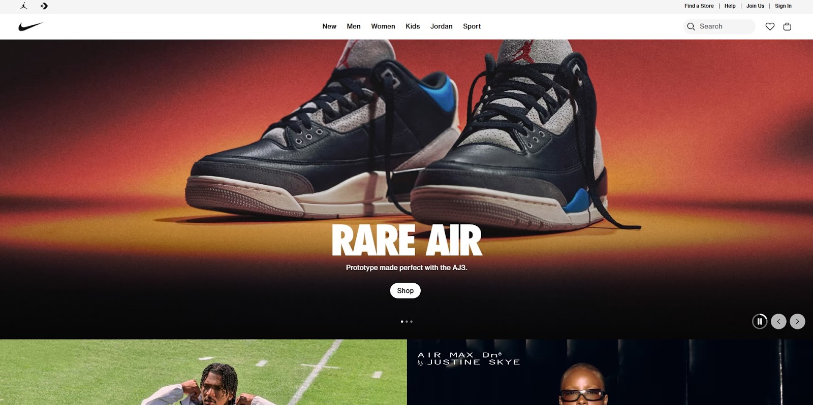
Nike
A dynamic video background, slow-motion athlete footage, and bold product close-ups animate Nike's homepage. Uses mega menus to display product collections, allowing users to quickly navigate between sports and styles.
4. Sticky/Floating Menus
Sticky menus stay visible as you scroll down the page, ensuring navigation is always accessible. They improve user experience on long pages or blogs. Floating menus design inspiration:
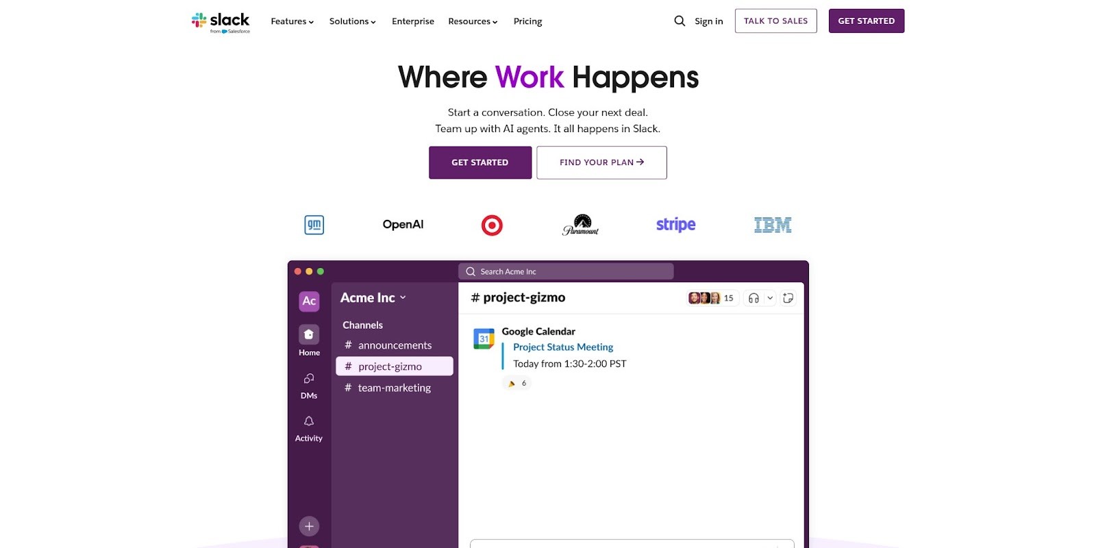
Slack
Their sticky menu stays on top for quick access to key links and CTAs.
Medium
Medium is one of the best content platform is Medium. They uses a floating navigation bar that remains visible as readers scroll through articles.

5. Full-Screen Overlay Menus
These menus cover the entire screen when activated, offering an immersive navigation experience. They’re popular with creative agencies and portfolio sites. Full screen overlay menus design inspiration:
Awwwards
An Awwwards competition showcases the best in web design, judged by global experts. A site's design, creativity, usability, and development are examined. Their full-screen overlay menu creates a bold and modern navigation experience.

Fubiz
Fubiz is a creative site using an overlay menu that reveals visually rich navigation options.

6. Sidebar/Vertical Menus
Vertical menus positioned on the left or right work well for dashboards, blogs, and sites with many categories. They allow more space for sub-menus and detailed navigation. Vertical menus are more popular menu navigation, inspirational website are here:
Trello
Trello's mobile app mimics its desktop board-style interface. Card drag-and-drop is supported via touch, with smooth animations. Dashboard-style sidebar menu for easy project navigation.

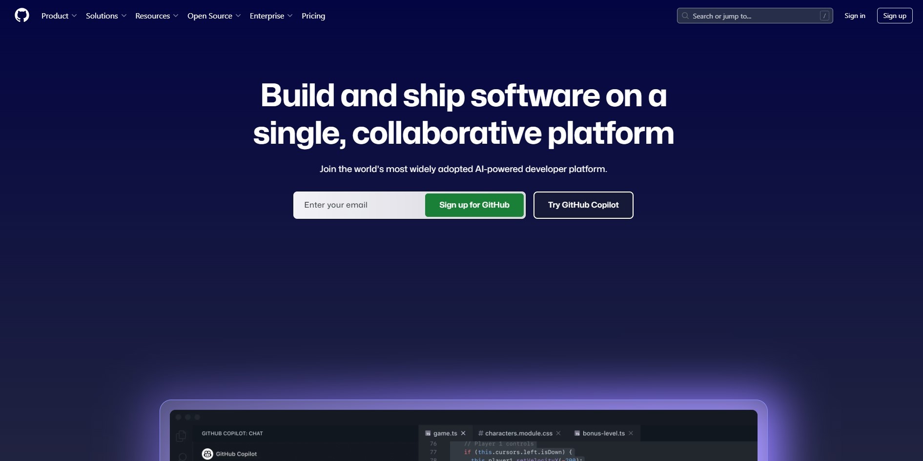
GitHub
GitHub's page layout offers developers concise navigation tools for repositories, issues, and search results. Uses a vertical menu in user dashboards for detailed navigation of repositories and settings.
7. Animated & Interactive Menus
Menus with hover effects, smooth transitions, and subtle animations engage users and add a modern touch. Micro-interactions can improve usability by providing feedback. In today's digital web design, animated menus take place an outstanding.
Stripe
Smooth animated menus with subtle hover transitions enhance user engagement.

Spotify Design
Spotify's mobile design is an example of dark mode elegance and navigation clarity. Black highlights album artwork and accent colors. They interactive hover effects and transitions that enrich navigation.

8. Minimalist Menus
Using just simple text links with subtle styling, minimalist menus rely on typography and spacing. This style fits brands that want to keep their site uncluttered and elegant. Minimal menus it too simple; there is a hassle-free navigation.
Squarespace
Squarespace have clean, minimal menu that focuses on typography and spacing.

Everlane
Simple text-based menu with elegant spacing and no distractions.

Updated Trends in Website Menu Design
Website menus continue to change as websites grow and develop. Modern menu designs blend functionality and aesthetics to create better user experiences. Today's most exciting website menu trends are as follows:
1. Micro-Interactions
Micro-interactions bring menus to life through small, subtle animations. When users hover over or click on menu items, they might see smooth fades, gentle slides, or color changes. Feedback from these effects makes navigation more engaging and easier.
2. Integrated Search Bars
Menus that integrate a search bar allow visitors to quickly find what they're looking for, which is especially useful for content-rich websites and online stores. The search bar should be located within the main navigation for easy accessibility and to reduce clutter elsewhere.
3. Voice-Activated Menus
With voice technology advancing, some cutting-edge sites are experimenting with voice-activated menus. This allows users to navigate by speaking, rather than tapping or clicking, which is perfect for hands-free browsing or accessibility.
4. Custom Icons
Adding custom icons to menu items enhances both usability and style. Icons help visitors quickly recognize the purpose of each link, like a shopping cart for an ecommerce checkout or a magnifying glass for search.
5. Dark Mode Menus
With dark mode gaining popularity across apps and websites, menus are also embracing this sleek look. Dark mode menus reduce glare and eye strain, offering a more comfortable experience for users browsing at night or in low-light environments.
Tips for Designing Your Website Menu
It is essential to design your menu well in order to improve the user experience and search engine results of your website. For beautiful and functional menus, follow these tips:
1. Create a Site Map
You should map out the structure of your site before designing your menu. Identify the main pages and how they connect to each other. Your menu should reflect your site's hierarchy, making it easier for users to navigate.
2. Limit the Number of Primary Menu Items
Choose 5 to 7 main menu items that are focused and concise. As a result, users are not overwhelmed with too many choices and are able to find what they are looking for quickly.
3. Group Related Links
Use dropdowns or mega menus to organize related links on your site if it has a lot of content. It is easier for visitors to navigate deeper sections of your website if you group them logically.
4. Use Clear, Action-Oriented Labels
Choose words for your menu items that are clear, descriptive, and action-oriented. Avoid jargon or clever phrases, stick to plain language that visitors instantly understand.
5. Test on Multiple Devices and Browsers
Menus must work seamlessly across devices (desktop, tablet, mobile) and browsers (Chrome, Firefox, Safari, Edge, etc.). Test your menu’s performance to ensure it loads quickly, displays properly, and remains fully functional everywhere.
6. Consider SEO with Unique Link Texts
Menu links should be informative and keyword-relevant. Search engines use these link texts to understand your site structure and relevance, helping your pages rank better.
Conclusion
User experience and brand identity are closely tied to your website menu. Your menu guides visitors, sets the tone, and shapes how they interact with your content. Keep your users at the center of every decision as you explore these Website Menu Design Inspirations and trends.
Take your brand's personality and combine it with clarity and creativity. Navigation is made easier with well-crafted menus, but they also create a memorable, enjoyable journey that keeps visitors coming back.
When visitors land on your website, the menu is often their first tool to explore your content. It’s the roadmap guiding users through your pages, products, or services, making it one of the most important parts of your site design. A great website menu not only helps users find what they want quickly but also strengthens your brand identity and boosts overall user satisfaction.
In this post, we’ll dive deep into website menu design inspiration, covering popular styles, key principles, emerging trends, and tips for crafting menus that look great and work seamlessly.
What Is a Website Menu?
A website menu is a navigational element that helps users explore the content and structure of a website. It typically appears as a list of links pointing to different pages or sections, such as Home, About, Services, Contact, and more. Menus act as a roadmap, guiding visitors to find the information they need quickly and efficiently.
Without a clear menu, visitors may get lost or frustrated, increasing the chances they’ll leave your site. Therefore, the menu plays a critical role in user experience (UX) by providing intuitive pathways and improving the overall flow of interaction on a website.
Key Principles of Effective Website Menu Design
Before jumping into inspiration, here are some design fundamentals that every website menu should follow:
Clarity & Simplicity: Menu items should be easy to read and understand at a glance. Avoid jargon or overly long labels.
Consistency: The menu design should match your site’s branding, colors, fonts, and style.
Accessibility: Ensure keyboard navigation and screen reader support for all users.
Visual Hierarchy: Highlight the current page or important sections clearly.
Responsive Design: Menus must work flawlessly on both desktop and mobile devices.
Performance: Menus should load quickly and use smooth animations without lag.
Popular Website Menu Design Styles & Inspirations
1. Classic Horizontal Navigation
A clean horizontal menu across the top is timeless and user-friendly. It works well for sites with a moderate number of menu items, offering familiarity and quick access. Here are 2 websites with classic horizontal navigation, designers can be inspired by these:
Apple
Apple is known for horizontal navigation menu. Their top navigation is simple, elegant, and easy to scan, with clear categories and dropdowns.
Dropbox
Dropbox website uses a straightforward horizontal menu with well-defined links and CTA buttons.
2. Hamburger Menus
Hamburger menu is common in mobile design, the hamburger icon reveals a hidden menu when clicked or tapped. This minimalist style saves space and creates a clean look, especially on smaller screens. Website with hamburger menu inspiration:
Airbnb
Airbnb site uses a hamburger menu on mobile for a clean interface, hiding navigation until needed.
Spotify
Spotify homepage features a bold headline, engaging visuals, and a clear call-to-action. Distraction-free guidance leads users to a clear choice. Minimalist menu hidden behind the hamburger icon, simplifying navigation on small screens.
3. Mega Menus
Perfect for ecommerce or content-heavy websites, mega menus display multiple columns of links and categories in a dropdown panel. They help users see all options at once without clutter. Ecommerce site for mega menu inspiration:
Amazon
The Amazon e-commerce platform is the world's largest e-commerce platform, offering a tremendous selection of products. With its pagination, users can quickly browse through millions of listings. Classic mega menu with extensive product categories organized neatly for easy browsing.
Nike
A dynamic video background, slow-motion athlete footage, and bold product close-ups animate Nike's homepage. Uses mega menus to display product collections, allowing users to quickly navigate between sports and styles.
4. Sticky/Floating Menus
Sticky menus stay visible as you scroll down the page, ensuring navigation is always accessible. They improve user experience on long pages or blogs. Floating menus design inspiration:
Slack
Their sticky menu stays on top for quick access to key links and CTAs.
Medium
Medium is one of the best content platform is Medium. They uses a floating navigation bar that remains visible as readers scroll through articles.
5. Full-Screen Overlay Menus
These menus cover the entire screen when activated, offering an immersive navigation experience. They’re popular with creative agencies and portfolio sites. Full screen overlay menus design inspiration:
Awwwards
An Awwwards competition showcases the best in web design, judged by global experts. A site's design, creativity, usability, and development are examined. Their full-screen overlay menu creates a bold and modern navigation experience.
Fubiz
Fubiz is a creative site using an overlay menu that reveals visually rich navigation options.
6. Sidebar/Vertical Menus
Vertical menus positioned on the left or right work well for dashboards, blogs, and sites with many categories. They allow more space for sub-menus and detailed navigation. Vertical menus are more popular menu navigation, inspirational website are here:
Trello
Trello's mobile app mimics its desktop board-style interface. Card drag-and-drop is supported via touch, with smooth animations. Dashboard-style sidebar menu for easy project navigation.
GitHub
GitHub's page layout offers developers concise navigation tools for repositories, issues, and search results. Uses a vertical menu in user dashboards for detailed navigation of repositories and settings.
7. Animated & Interactive Menus
Menus with hover effects, smooth transitions, and subtle animations engage users and add a modern touch. Micro-interactions can improve usability by providing feedback. In today's digital web design, animated menus take place an outstanding.
Stripe
Smooth animated menus with subtle hover transitions enhance user engagement.
Spotify Design
Spotify's mobile design is an example of dark mode elegance and navigation clarity. Black highlights album artwork and accent colors. They interactive hover effects and transitions that enrich navigation.
8. Minimalist Menus
Using just simple text links with subtle styling, minimalist menus rely on typography and spacing. This style fits brands that want to keep their site uncluttered and elegant. Minimal menus it too simple; there is a hassle-free navigation.
Squarespace
Squarespace have clean, minimal menu that focuses on typography and spacing.
Everlane
Simple text-based menu with elegant spacing and no distractions.
Updated Trends in Website Menu Design
Website menus continue to change as websites grow and develop. Modern menu designs blend functionality and aesthetics to create better user experiences. Today's most exciting website menu trends are as follows:
1. Micro-Interactions
Micro-interactions bring menus to life through small, subtle animations. When users hover over or click on menu items, they might see smooth fades, gentle slides, or color changes. Feedback from these effects makes navigation more engaging and easier.
2. Integrated Search Bars
Menus that integrate a search bar allow visitors to quickly find what they're looking for, which is especially useful for content-rich websites and online stores. The search bar should be located within the main navigation for easy accessibility and to reduce clutter elsewhere.
3. Voice-Activated Menus
With voice technology advancing, some cutting-edge sites are experimenting with voice-activated menus. This allows users to navigate by speaking, rather than tapping or clicking, which is perfect for hands-free browsing or accessibility.
4. Custom Icons
Adding custom icons to menu items enhances both usability and style. Icons help visitors quickly recognize the purpose of each link, like a shopping cart for an ecommerce checkout or a magnifying glass for search.
5. Dark Mode Menus
With dark mode gaining popularity across apps and websites, menus are also embracing this sleek look. Dark mode menus reduce glare and eye strain, offering a more comfortable experience for users browsing at night or in low-light environments.
Tips for Designing Your Website Menu
It is essential to design your menu well in order to improve the user experience and search engine results of your website. For beautiful and functional menus, follow these tips:
1. Create a Site Map
You should map out the structure of your site before designing your menu. Identify the main pages and how they connect to each other. Your menu should reflect your site's hierarchy, making it easier for users to navigate.
2. Limit the Number of Primary Menu Items
Choose 5 to 7 main menu items that are focused and concise. As a result, users are not overwhelmed with too many choices and are able to find what they are looking for quickly.
3. Group Related Links
Use dropdowns or mega menus to organize related links on your site if it has a lot of content. It is easier for visitors to navigate deeper sections of your website if you group them logically.
4. Use Clear, Action-Oriented Labels
Choose words for your menu items that are clear, descriptive, and action-oriented. Avoid jargon or clever phrases, stick to plain language that visitors instantly understand.
5. Test on Multiple Devices and Browsers
Menus must work seamlessly across devices (desktop, tablet, mobile) and browsers (Chrome, Firefox, Safari, Edge, etc.). Test your menu’s performance to ensure it loads quickly, displays properly, and remains fully functional everywhere.
6. Consider SEO with Unique Link Texts
Menu links should be informative and keyword-relevant. Search engines use these link texts to understand your site structure and relevance, helping your pages rank better.
Conclusion
User experience and brand identity are closely tied to your website menu. Your menu guides visitors, sets the tone, and shapes how they interact with your content. Keep your users at the center of every decision as you explore these Website Menu Design Inspirations and trends.
Take your brand's personality and combine it with clarity and creativity. Navigation is made easier with well-crafted menus, but they also create a memorable, enjoyable journey that keeps visitors coming back.

Read more articles

Feb 28, 2026
Best Framer Templates with Parallax Scrolling
Feb 28, 2026
Best Framer Templates with Parallax Scrolling

Feb 22, 2026
Framer Canvas: Design Without Limits
Feb 22, 2026
Framer Canvas: Design Without Limits

Feb 19, 2026
Best Companies Specializing in Framer Website Templates in 2026
Feb 19, 2026
Best Companies Specializing in Framer Website Templates in 2026
Find perfect template for your website & get 50% discount coupon

Templates
Copyright © 2026 FramerBite, A Part of Creetfy LLC. All Rights Reserved
Follow us on Twitter
Find perfect template for your website & get 50% discount coupon
Templates
Copyright © 2026 FramerBite, A Part of Creetfy LLC. All Rights Reserved
Follow us on Twitter
Find perfect template for your website & get 50% discount coupon
Templates
Copyright © 2026 FramerBite, A Part of Creetfy LLC. All Rights Reserved
Follow us on Twitter
Find perfect template for your website & get 50% discount coupon
Templates
Copyright © 2026 FramerBite, A Part of Creetfy LLC. All Rights Reserved
Follow us on Twitter