Why Framer Is the Best No Code Tool for Building Responsive Websites
Last Updated on:
Author:
Framerbite
Framerbite

Every business needs a website which looks equally good whether you view them on phones, tablets or desktop computers. Readers are accustomed to seamless navigation and browsing smoothness in their own surfing habits. And If you venture to have that up in your responsive design, the same requirement applies.
But not every website builder can cope properly with this. Some require custom adjustments. Others leave your layout totally out of kilter when you look on smaller screens. Lucky for you-there is one single platform to change all that: Framer. Framer empowers everyone to create modern and sleek websites for business which will look just as good on a mobile phone as they did on the computer screen without writing a line of code.
In this blog, you will learn why Framer got to this level, how it's responsive tools work and how businesses that want to look professional on every device are increasingly choosing
What Is Responsive Web Design and Why It Matters for Businesses?
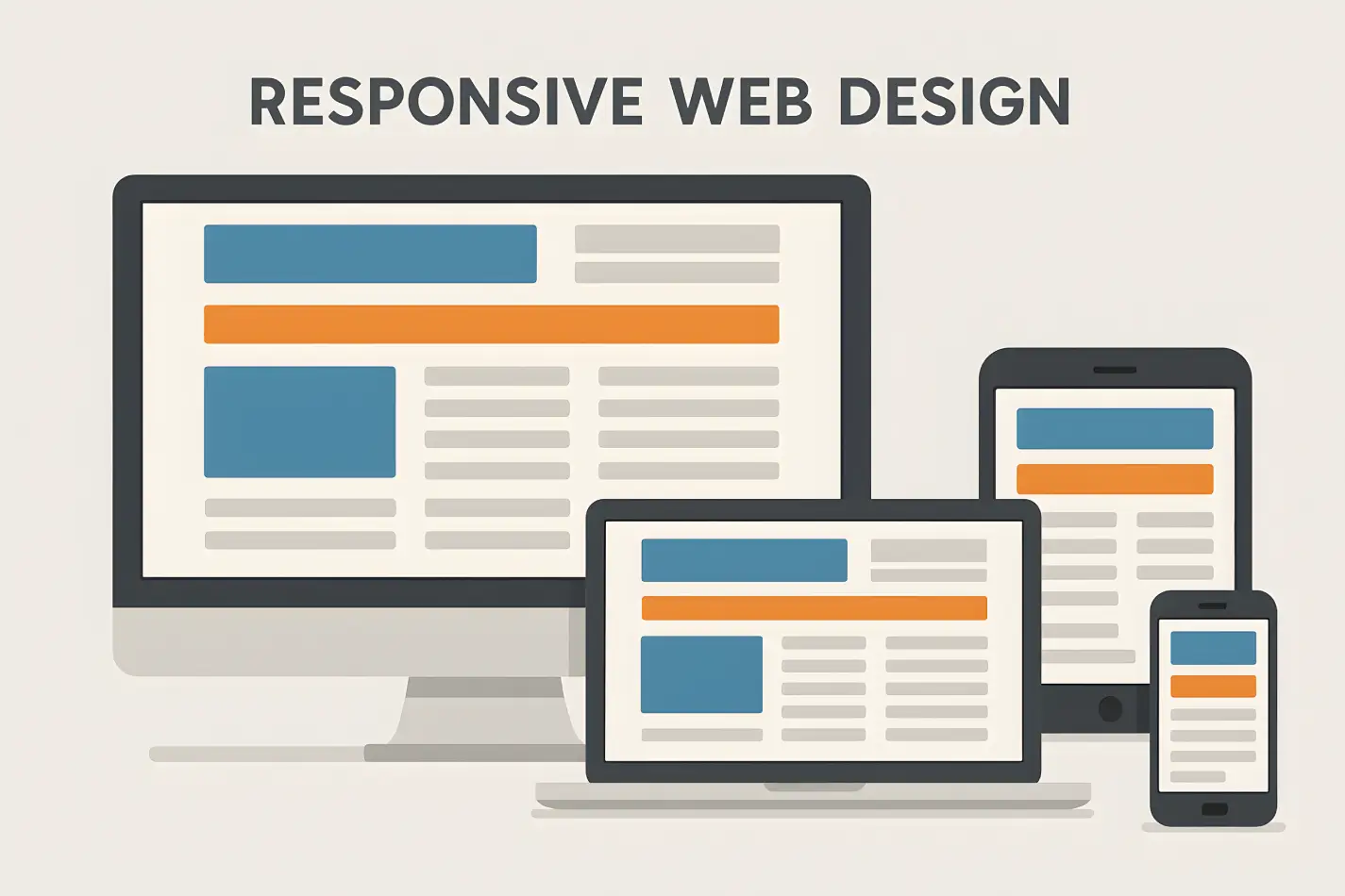
Responsive web design means your website automatically adjusts to fit any screen size, from a big desktop monitor to a small smartphone. Instead of building separate versions of your website, a responsive site uses flexible layouts and smart scaling so everything fits perfectly.
Imagine someone visits your website from their phone, and the layout looks messy, text overlaps, buttons are too small, and images don’t fit. They’ll likely leave in seconds. A responsive website keeps that from happening and makes your business look modern and reliable.
For a business, website responsiveness is about success. Here’s why:
Better User Experience: Visitors can read and navigate your site easily, no matter their device.
Higher SEO Rankings: Google favors responsive websites in search results.
Increased Conversions: When your site looks and feels right, more people stay and take action.
Professional Branding: A consistent design across all screens builds trust with customers.
Why Framer Builder Best for Responsive Websites?
There are different types of no code web design tools, But Framer is smart way to designner who are non coder. It helps you design visually, adjust layouts easily, and publish instantly. Let’s see why Framer is the best tool for building responsive business websites.
No-Code Design Freedom
Framer gives you full creative freedom without needing to write code. You can drag and drop text, images, buttons, and sections exactly where you want them.
For business owners or marketers, this is a huge advantage. You can launch or edit your site anytime without waiting for a developer. Framer’s visual editor is intuitive and fast, meaning you can design a page, preview it on mobile, and publish it in minutes. It’s perfect for:
Small business owners who want a professional site quickly.
Agencies that need to deliver multiple projects fast.
Entrepreneurs who love flexibility without complexity.
Smart Adaptive Layouts
One of Framer’s best features is auto layout. It automatically adjusts your design for different screen sizes, desktop, tablet, and mobile, without breaking the layout.
You can set flexible containers, define spacing, and control how elements behave as the screen changes. For example:
Buttons resize automatically on smaller devices.
Images scale without losing proportion.
Text blocks reflow for easier reading.
This makes your site feel naturally responsive. You don’t have to guess or rebuild, Framer handles the hard part behind the scenes.
Pixel-Perfect Control
Even though Framer automates responsiveness, it still gives you pixel-level control when you need it. You can fine-tune padding, margins, and breakpoints for each device view.
That means your hero section, headlines, and product images will always look sharp and balanced, not squeezed or stretched. For design-focused businesses, this level of precision is priceless.
Fast Loading and Optimized Performance
A responsive site also needs to load fast. Framer’s code output is clean and optimized for speed. It compresses images automatically, uses smart caching, and serves assets efficiently.
Faster websites mean happier visitors and better SEO rankings. And since performance directly affects user experience, your responsive design won’t just look good, it will also feel good to browse.
SEO-Friendly Foundation
Search engines love responsive websites, and Framer is by build SEO-friendly and simple navigate. You can edit meta titles, descriptions, alt tags, and URLs directly inside the platform.
Framer’s responsive layouts also improve mobile usability, which Google uses as a ranking factor. So, when you build your business website on Framer, you’re not just creating a design, you’re setting it up to rank better too.
Top Responsive Framer Templates by FramerBite
FramerBite has designed dozens of professional templates that already come with responsive layouts. These templates automatically adapt to any screen size, making them perfect for modern business websites.
Here are five of the most responsive and beautifully built Framer templates you can explore right now.
1. Taskhub – Multi-Layout SaaS & Startup Template
Taskhub is a flexible and modern template made for SaaS startups and growing businesses. It features a clean layout, adaptive grids, and smooth auto-spacing that keeps your content perfectly aligned on all screen sizes. Whether your visitors are browsing from their desktop or phone, Taskhub keeps everything neat and easy to navigate.
Its sections for hero banners, pricing tables, and testimonials adjust automatically, giving your website a professional and consistent design everywhere. You can launch a fully responsive site in hours without needing to code Taskhub does all the layout work for you.
Preview Taskhub Template on FramerBite
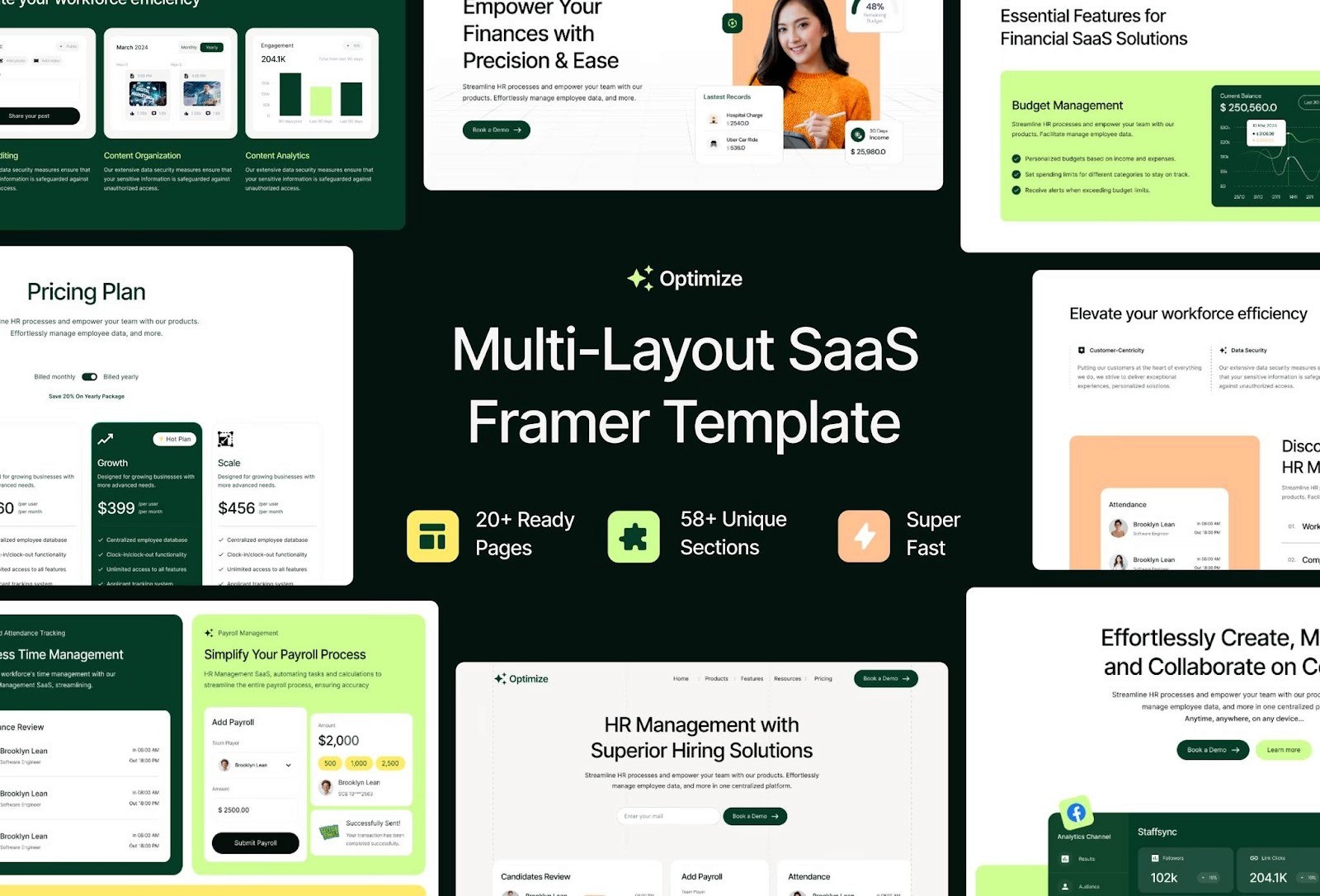
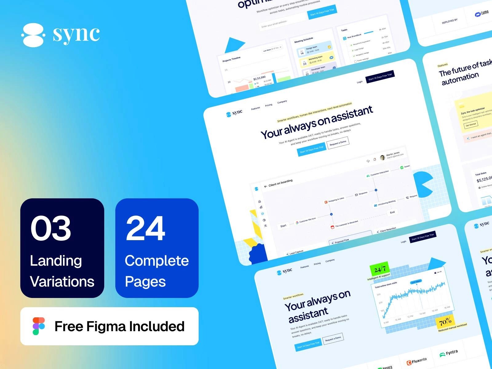
2. Sync – Multi-Layout SaaS & Startup Template
Sync is designed for SaaS brands and modern digital businesses that want both beauty and balance. Every part of this template from the hero section to the call-to-action buttons has been built with responsiveness in mind. The flexible content blocks adjust to any screen, and the navigation system transforms smoothly for mobile users.
No matter what device your audience uses, Sync keeps your message clear and your visuals perfectly arranged. It’s ideal for startups that want a premium online presence without worrying about technical design issues.
Preview Sync Template on FramerBite
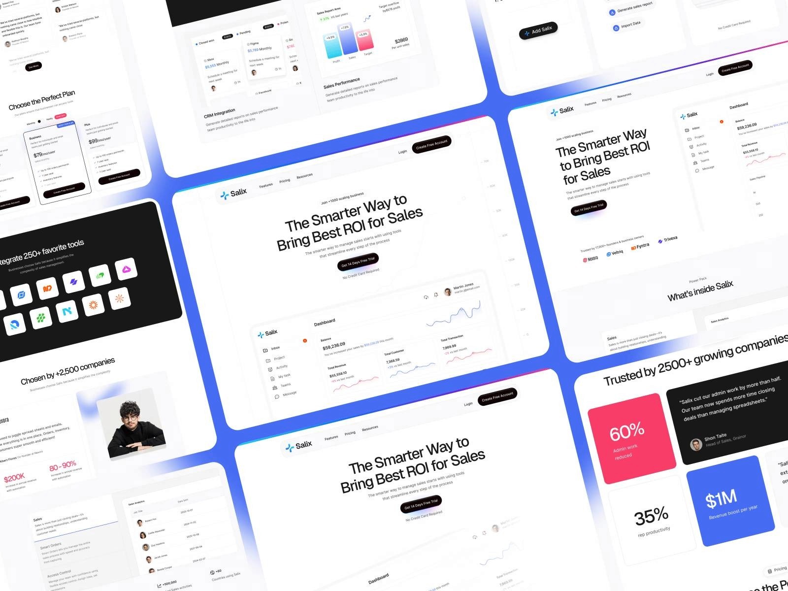
3. Salix – Modern SaaS & Business Template
Salix brings a professional and stylish look to SaaS and tech businesses. It uses Framer’s smart auto-layout system, which means every component from images to text automatically resizes and stays in balance. The spacing between elements adjusts naturally, keeping the content readable and visually clean.
This template is also optimized for mobile users, ensuring your videos, demos, and call-to-action sections load quickly and look great on smaller screens. It’s the perfect blend of responsive performance and modern aesthetics.
Preview Salix Template on FramerBite
4. Revento – Modern Digital Agency Template
Revento is built for digital agencies, design studios, and creative professionals who want a bold and flexible website. This template uses mobile-first design principles, ensuring that every page flows smoothly from desktop to mobile. The portfolio and service sections automatically reorganize themselves, keeping your visuals strong and text easy to read. Even the navigation menu adapts seamlessly for smaller screens.
This template’s responsiveness guarantees that your brand looks polished and consistent across all devices, a must for agencies that care about first impressions.
Preview Revento Template on FramerBite

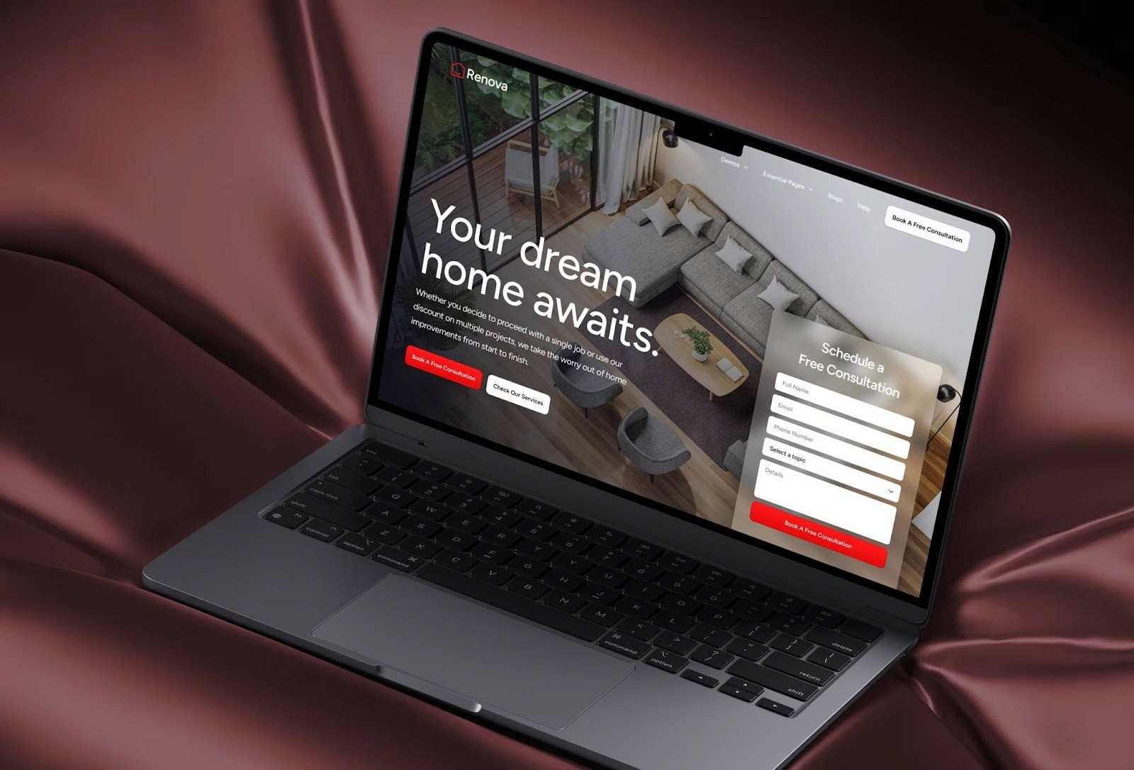
5. Renova – Small Business Construction & Renovation Template
Renova is a stylish and professional template crafted specifically for construction, renovation, and service-based small businesses. It blends modern design with practical layout features to ensure your site looks great on every screen size. With 11 ready-to-use pages home, about, services, projects, blog and more, a full set of building blocks. It supports CMS for dynamic content, includes an advanced form builder to capture leads, and is optimized for speed and SEO out of the box.
Best of all, it’s built on the responsive power of Framer, so from large desktop monitors down to mobile phones, your content stays clean, readable, and visually strong. Whether you’re showcasing past projects or service offerings, Renova delivers a polished experience across all devices.
Preview Renova Template on FramerBite
Tips to Make Your Framer Business Website Even More Responsive
Framer already makes responsiveness simple, but you can go a step further with these quick tips. By following these practices, your Framer website will not only look beautiful but also feel effortless to use on any device.
1. Keep Text Readable on Mobile
Use larger font sizes and enough line spacing. Avoid long paragraphs, break them into short, easy-to-read sections.
2. Adjust Grids and Stacks
Use Framer’s stack or grid layouts for flexible alignment. They automatically handle spacing and resizing as the screen changes.
3. Preview Across Devices
Always test your site using Framer’s device preview. It helps you catch small layout issues before publishing.
4. Optimize Images and Animations
Use compressed images and simple motion effects. Too many heavy visuals can slow down your site on mobile networks.
5. Keep Buttons and CTAs Finger-Friendly
Ensure buttons are large enough to tap easily on smaller screens. Keep enough space around interactive elements to prevent accidental clicks.
How FramerBite Helps You Build a Fully Responsive Business Website
If you want your business website to look world-class and perform flawlessly across devices, you don’t have to do it alone. That’s where FramerBite comes in. At FramerBite Studio, our team specializes in designing and customizing responsive websites using Framer. We’ve built hundreds of Framer projects for startups, agencies, and online businesses, all focused on speed, design quality, and mobile performance.
Here’s how FramerBite helps:
We pick or design the best responsive layout for your business goals.
We customize templates with your branding, colors, and content.
We make sure every page looks stunning and works smoothly across devices.
We optimize for SEO and conversions, so your site doesn’t just look good, it grows your business.
Whether you’re launching a new site or redesigning your current one, FramerBite can help you build a fast, mobile-friendly, and modern website that stands out from your competitors.
Ready to get started? Visit framerbite.studio and let our experts create your perfect responsive Framer website.
Summary
A great business website isn’t just about visuals, it’s about experience. Your visitors come from all kinds of devices, and your site needs to meet them wherever they are.
Framer makes that easy. Its responsive features, no-code design freedom, and smooth performance make it one of the most powerful tools for modern web design. You can launch a business website that looks professional, loads fast, and works perfectly across all devices, without hiring a full development team.
If you want a site that reflects your brand and performs beautifully, start with a Framer template or connect with the FramerBite team for a custom build. With Framer, your business website will always be ready, responsive, reliable, and remarkable.
FAQs
1. What is responsive web design?
Users want a clear definition and explanation of how responsive design works.
2. How to make a website mobile-friendly?
A common query for beginners or business owners who want their site to work well on smartphones and tablets.
3. Where I found Best responsive website templates for business?
Searches for ready-made templates that automatically adapt to all devices, like the FramerBite templates.
4. Why responsive design is important for SEO?
People want to understand the connection between responsive layouts, user experience, and search engine rankings.
5. How to optimize a responsive website for speed and performance?
Advanced queries focused on improving mobile load times, images, and layout efficiency.
Every business needs a website which looks equally good whether you view them on phones, tablets or desktop computers. Readers are accustomed to seamless navigation and browsing smoothness in their own surfing habits. And If you venture to have that up in your responsive design, the same requirement applies.
But not every website builder can cope properly with this. Some require custom adjustments. Others leave your layout totally out of kilter when you look on smaller screens. Lucky for you-there is one single platform to change all that: Framer. Framer empowers everyone to create modern and sleek websites for business which will look just as good on a mobile phone as they did on the computer screen without writing a line of code.
In this blog, you will learn why Framer got to this level, how it's responsive tools work and how businesses that want to look professional on every device are increasingly choosing
What Is Responsive Web Design and Why It Matters for Businesses?
Responsive web design means your website automatically adjusts to fit any screen size, from a big desktop monitor to a small smartphone. Instead of building separate versions of your website, a responsive site uses flexible layouts and smart scaling so everything fits perfectly.
Imagine someone visits your website from their phone, and the layout looks messy, text overlaps, buttons are too small, and images don’t fit. They’ll likely leave in seconds. A responsive website keeps that from happening and makes your business look modern and reliable.
For a business, website responsiveness is about success. Here’s why:
Better User Experience: Visitors can read and navigate your site easily, no matter their device.
Higher SEO Rankings: Google favors responsive websites in search results.
Increased Conversions: When your site looks and feels right, more people stay and take action.
Professional Branding: A consistent design across all screens builds trust with customers.
Why Framer Builder Best for Responsive Websites?
There are different types of no code web design tools, But Framer is smart way to designner who are non coder. It helps you design visually, adjust layouts easily, and publish instantly. Let’s see why Framer is the best tool for building responsive business websites.
No-Code Design Freedom
Framer gives you full creative freedom without needing to write code. You can drag and drop text, images, buttons, and sections exactly where you want them.
For business owners or marketers, this is a huge advantage. You can launch or edit your site anytime without waiting for a developer. Framer’s visual editor is intuitive and fast, meaning you can design a page, preview it on mobile, and publish it in minutes. It’s perfect for:
Small business owners who want a professional site quickly.
Agencies that need to deliver multiple projects fast.
Entrepreneurs who love flexibility without complexity.
Smart Adaptive Layouts
One of Framer’s best features is auto layout. It automatically adjusts your design for different screen sizes, desktop, tablet, and mobile, without breaking the layout.
You can set flexible containers, define spacing, and control how elements behave as the screen changes. For example:
Buttons resize automatically on smaller devices.
Images scale without losing proportion.
Text blocks reflow for easier reading.
This makes your site feel naturally responsive. You don’t have to guess or rebuild, Framer handles the hard part behind the scenes.
Pixel-Perfect Control
Even though Framer automates responsiveness, it still gives you pixel-level control when you need it. You can fine-tune padding, margins, and breakpoints for each device view.
That means your hero section, headlines, and product images will always look sharp and balanced, not squeezed or stretched. For design-focused businesses, this level of precision is priceless.
Fast Loading and Optimized Performance
A responsive site also needs to load fast. Framer’s code output is clean and optimized for speed. It compresses images automatically, uses smart caching, and serves assets efficiently.
Faster websites mean happier visitors and better SEO rankings. And since performance directly affects user experience, your responsive design won’t just look good, it will also feel good to browse.
SEO-Friendly Foundation
Search engines love responsive websites, and Framer is by build SEO-friendly and simple navigate. You can edit meta titles, descriptions, alt tags, and URLs directly inside the platform.
Framer’s responsive layouts also improve mobile usability, which Google uses as a ranking factor. So, when you build your business website on Framer, you’re not just creating a design, you’re setting it up to rank better too.
Top Responsive Framer Templates by FramerBite
FramerBite has designed dozens of professional templates that already come with responsive layouts. These templates automatically adapt to any screen size, making them perfect for modern business websites.
Here are five of the most responsive and beautifully built Framer templates you can explore right now.
1. Taskhub – Multi-Layout SaaS & Startup Template
Taskhub is a flexible and modern template made for SaaS startups and growing businesses. It features a clean layout, adaptive grids, and smooth auto-spacing that keeps your content perfectly aligned on all screen sizes. Whether your visitors are browsing from their desktop or phone, Taskhub keeps everything neat and easy to navigate.
Its sections for hero banners, pricing tables, and testimonials adjust automatically, giving your website a professional and consistent design everywhere. You can launch a fully responsive site in hours without needing to code Taskhub does all the layout work for you.
Preview Taskhub Template on FramerBite
2. Sync – Multi-Layout SaaS & Startup Template
Sync is designed for SaaS brands and modern digital businesses that want both beauty and balance. Every part of this template from the hero section to the call-to-action buttons has been built with responsiveness in mind. The flexible content blocks adjust to any screen, and the navigation system transforms smoothly for mobile users.
No matter what device your audience uses, Sync keeps your message clear and your visuals perfectly arranged. It’s ideal for startups that want a premium online presence without worrying about technical design issues.
Preview Sync Template on FramerBite
3. Salix – Modern SaaS & Business Template
Salix brings a professional and stylish look to SaaS and tech businesses. It uses Framer’s smart auto-layout system, which means every component from images to text automatically resizes and stays in balance. The spacing between elements adjusts naturally, keeping the content readable and visually clean.
This template is also optimized for mobile users, ensuring your videos, demos, and call-to-action sections load quickly and look great on smaller screens. It’s the perfect blend of responsive performance and modern aesthetics.
Preview Salix Template on FramerBite
4. Revento – Modern Digital Agency Template
Revento is built for digital agencies, design studios, and creative professionals who want a bold and flexible website. This template uses mobile-first design principles, ensuring that every page flows smoothly from desktop to mobile. The portfolio and service sections automatically reorganize themselves, keeping your visuals strong and text easy to read. Even the navigation menu adapts seamlessly for smaller screens.
This template’s responsiveness guarantees that your brand looks polished and consistent across all devices, a must for agencies that care about first impressions.
Preview Revento Template on FramerBite
5. Renova – Small Business Construction & Renovation Template
Renova is a stylish and professional template crafted specifically for construction, renovation, and service-based small businesses. It blends modern design with practical layout features to ensure your site looks great on every screen size. With 11 ready-to-use pages home, about, services, projects, blog and more, a full set of building blocks. It supports CMS for dynamic content, includes an advanced form builder to capture leads, and is optimized for speed and SEO out of the box.
Best of all, it’s built on the responsive power of Framer, so from large desktop monitors down to mobile phones, your content stays clean, readable, and visually strong. Whether you’re showcasing past projects or service offerings, Renova delivers a polished experience across all devices.
Preview Renova Template on FramerBite
Tips to Make Your Framer Business Website Even More Responsive
Framer already makes responsiveness simple, but you can go a step further with these quick tips. By following these practices, your Framer website will not only look beautiful but also feel effortless to use on any device.
1. Keep Text Readable on Mobile
Use larger font sizes and enough line spacing. Avoid long paragraphs, break them into short, easy-to-read sections.
2. Adjust Grids and Stacks
Use Framer’s stack or grid layouts for flexible alignment. They automatically handle spacing and resizing as the screen changes.
3. Preview Across Devices
Always test your site using Framer’s device preview. It helps you catch small layout issues before publishing.
4. Optimize Images and Animations
Use compressed images and simple motion effects. Too many heavy visuals can slow down your site on mobile networks.
5. Keep Buttons and CTAs Finger-Friendly
Ensure buttons are large enough to tap easily on smaller screens. Keep enough space around interactive elements to prevent accidental clicks.
How FramerBite Helps You Build a Fully Responsive Business Website
If you want your business website to look world-class and perform flawlessly across devices, you don’t have to do it alone. That’s where FramerBite comes in. At FramerBite Studio, our team specializes in designing and customizing responsive websites using Framer. We’ve built hundreds of Framer projects for startups, agencies, and online businesses, all focused on speed, design quality, and mobile performance.
Here’s how FramerBite helps:
We pick or design the best responsive layout for your business goals.
We customize templates with your branding, colors, and content.
We make sure every page looks stunning and works smoothly across devices.
We optimize for SEO and conversions, so your site doesn’t just look good, it grows your business.
Whether you’re launching a new site or redesigning your current one, FramerBite can help you build a fast, mobile-friendly, and modern website that stands out from your competitors.
Ready to get started? Visit framerbite.studio and let our experts create your perfect responsive Framer website.
Summary
A great business website isn’t just about visuals, it’s about experience. Your visitors come from all kinds of devices, and your site needs to meet them wherever they are.
Framer makes that easy. Its responsive features, no-code design freedom, and smooth performance make it one of the most powerful tools for modern web design. You can launch a business website that looks professional, loads fast, and works perfectly across all devices, without hiring a full development team.
If you want a site that reflects your brand and performs beautifully, start with a Framer template or connect with the FramerBite team for a custom build. With Framer, your business website will always be ready, responsive, reliable, and remarkable.
FAQs
1. What is responsive web design?
Users want a clear definition and explanation of how responsive design works.
2. How to make a website mobile-friendly?
A common query for beginners or business owners who want their site to work well on smartphones and tablets.
3. Where I found Best responsive website templates for business?
Searches for ready-made templates that automatically adapt to all devices, like the FramerBite templates.
4. Why responsive design is important for SEO?
People want to understand the connection between responsive layouts, user experience, and search engine rankings.
5. How to optimize a responsive website for speed and performance?
Advanced queries focused on improving mobile load times, images, and layout efficiency.

Read more articles

Feb 28, 2026
Best Framer Templates with Parallax Scrolling
Feb 28, 2026
Best Framer Templates with Parallax Scrolling

Feb 22, 2026
Framer Canvas: Design Without Limits
Feb 22, 2026
Framer Canvas: Design Without Limits
Feb 19, 2026
Best Companies Specializing in Framer Website Templates in 2026
Feb 19, 2026
Best Companies Specializing in Framer Website Templates in 2026
Get exclusive 10% discount on your next purchase.
We will send the discount code immediately in your inbox.

Templates
Copyright © 2026 FramerBite, A Part of Creetfy LLC. All Rights Reserved
Follow us on Twitter
Get exclusive 10% discount on your next purchase.
We will send the discount code immediately in your inbox.
Templates
Copyright © 2026 FramerBite, A Part of Creetfy LLC. All Rights Reserved
Follow us on Twitter
Get exclusive 10% discount on your next purchase.
We will send the discount code immediately in your inbox.
Templates
Copyright © 2026 FramerBite, A Part of Creetfy LLC. All Rights Reserved
Follow us on Twitter
Get exclusive 10% discount on your next purchase.
We will send the discount code immediately in your inbox.
Templates
Copyright © 2026 FramerBite, A Part of Creetfy LLC. All Rights Reserved
Follow us on Twitter