Framer Template Design Trends in 2026
Last Updated on:
Author:
Framerbite
Framerbite

The world of web design is constantly growing, just as it will in 2026 as well. Framer templates offer designers and developers powerful tools to launch beautiful, interactive websites quickly. This year, we’re seeing some bold trends that combine aesthetics, functionality, and user experience like never before.
Framer continues to streamline how we design. 2026 templates offer faster load times, intuitive motion, and responsive flexibility, vital for both usability and Google’s Core Web Vitals.
Modern templates come packed with dynamic elements: micro-animations, scroll-triggered effects, and smooth transitions without hardcore coding. If you’re a beginner looking to craft modern, effective web experiences, this guide illuminates the most essential trends for the year.
Trend 1 – Neon & Dark-Mode Futurism
Neon with dark mode is one of the boldest design styles of 2026. When you mix bright neon colors with deep black or charcoal backgrounds, the result feels futuristic, energetic, and modern. This style instantly grabs attention because the glowing effect makes elements pop on the screen. It works especially well for creative industries like design portfolios, tech startups, and digital agencies that want to stand out from the crowd.

How to Use Neon & Dark-Mode in Your Framer Templates
Start with a dark base: Use true black, deep gray, or dark charcoal as your background color.
Add neon accents: Pick one or two bright colors like electric blue, neon pink, or lime green. Use them for buttons, icons, or highlights to create contrast.
Highlight with glow effects: Add glowing edges or hover effects on buttons and headings. This creates the “lit-up” neon look.
Keep text clear: Always check that your text has enough contrast against the dark background so visitors can read it easily.
Beginner-Friendly Tips For Neon & Dark-Mode:
In Framer, you can create a neon glow by adding a colored shadow or blur behind an element. For example, place a hot pink shadow behind a button, increase the blur, and lower the opacity slightly. This trick makes the button look like it’s glowing with light.
SEO Advantage of this Trend
Neon & Dark-Mode is not only a trend, it’s a style. It also helps with performance. Dark backgrounds with neon highlights improve readability, which keeps visitors on your site longer. As more people read and explore your content, Google gets more positive signals. This reduces bounce rates and improves your chances of ranking higher in search results.
Neon accents on dark backgrounds reflect energy and modernity. For portfolios, tech startups, and creative agencies, they're eye-catching and excellent for high-contrast clarity.
Also Read: Is Framer Good for SEO? An Honest Review
Real-World Examples for Neon & Dark-Mode Futurism Framer Template:
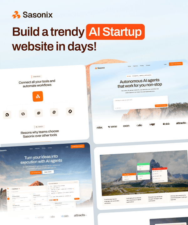
DarkRise – SaaS Framer Template

DarkRise is a modern multi-layout SaaS template that fits perfectly with the Neon & Dark-Mode Futurism trend. Its dark foundations set the stage for bold, glowing visuals, while its colorful accents can easily be swapped for neon gradients and cyberpunk-inspired highlights. By adding glowing hover effects, neon borders, and bold typography, this template can transform into a sleek, tech-forward experience that instantly grabs attention.
Trend 2 – Natural Shapes and Light Textures
In 2026, designers are moving away from clean lines and rigid layouts. It is more common for them to use natural curves, flowing forms that feel softer, warmer, and more human compared to strict grids. They make websites feel approachable, calming, and creative.
This trend is especially popular with lifestyle brands, wellness companies, and personal blogs focused on comfort and balance. It is perfect for businesses who want to connect emotionally with their customers.

How to Use Natural Shapes and Light Textures in Your Framer Templates
Blog-shaped dividers: Use smooth, wavy, or blob-shaped transition colors like pastel blues and greens.
Rounded containers: Round the corners of cards and boxes for a more inviting feel.
Animated motion: Allow shapes to slowly adjust or hover as the user scrolls without affecting the main content.
Beginner-Friendly Tip for Natural Shapes
Framer makes it easy to experiment with these styles. Use the vector tool to draw your own blobs or curves. Once you create one, duplicate it and adjust the control points slightly to make variations. You can even animate them to change shape or move naturally on scroll.
SEO Advantage of this Trend
Your site will attract more attention if you use organic visuals. When people find your design unique, they’re more likely to share it on social media or link to it in design inspiration posts. These extra shares and backlinks boost your site’s authority.
Real-World Examples for Natural Shapes and Light Textures Framer Template:
Feminine – Life Coach Template

Feminine is a Framer Premium template by FramerBite crafted specifically for female influencers and life coaches. It immediately feels warm, elegant, and personal that align beautifully with the Natural Shapes & Light Textures design trend.
This template is a perfect match for your brand when you want a calming, nature-inspired online presence, a design that feels human, friendly, and grounded, and quick setup with templates that embody softness and simplicity.
Trend 3 – Accessibility-First Design
Accessibility has become a necessity, not a must-have. Web designs are developing into inclusive experiences that everyone can use, regardless of their abilities. This means templates are now being built with features like clear color contrast, keyboard-friendly navigation, and structures that work well with screen readers.
Your audiences deserve respect, not just compliance with the law. A website that’s accessible feels more welcoming, professional, and user-friendly for all visitors. Plus, search engines love accessible design. When your site is easy to use and well-structured, Google rewards it with better rankings.

How to Use It in Your Framer Templates
Check color contrast: Make sure text stands out against its background. Follow WCAG 2.1 guidelines, which recommend a minimum contrast ratio of 4.5:1 for normal text.
Use semantic HTML tags: Organize your site with proper headings H1 for titles, H2 for sections, H3 for subsections. Add alt text to images and use alternate labels for animations.
Enable keyboard navigation: Make your site easy to navigate with just a keyboard.
Add skip links: Include a simple link so users can skip lengthy menus and jump straight into the main section.
Beginner-Friendly Tip
Framer has built-in accessibility tools that make this process easier. You can preview how focus states look, check heading structures, and add alt-text or aria-labels directly in your design. A good starting point is to test your site by navigating with just your keyboard. If you can easily move through it, you’re on the right track.
SEO Advantage
Accessibility directly supports SEO. A site that is easy to read, navigate, and understand gives users a better experience and Google notices. Clear headings help search engines understand your content, while alt text improves your visibility in image search. Accessibility increases your site's reach and helps you rank higher.
Real-World Examples for Accessibility-First Design Framer Template:
Glaze – Clean & Accessible SaaS Template

Glaze is a Framer template built for modern SaaS sites. Its design focuses on clarity, readability, and ease of navigation and key ingredients for accessibility-first design. The template features a minimal layout, strong visual hierarchy, and fast performance. It’s a perfect baseline for building an inclusive site: add proper contrast, semantic structure, and keyboard-friendly navigation to make your UX accessible and welcoming for everyone.
Trend 4 – Minimalism with Microtype
Minimalism never really goes out of style, but in 2026, it's getting a fresh update with microtypography. Designers are focusing on bold typefaces and clean layouts instead of heavy graphics.
There is a typography art that lies in the small details. There are many ways to identify a heading, including oversized serifs, subtle changes in letter spacing, or animated underlines. These little touches bring elegance, sophistication, and personality without cluttering the page. Minimal designs also load faster and feel more professional, this trend is popular among startups, personal portfolios, and modern brands.

How to Use Minimalism with Microtype in Your Framer Templates
Mix typefaces smartly: Make headings bold and large with serif fonts, and make body text clean and simple with sans serif fonts.
Add minimal animations: Underlines, color changes, and smooth transitions make links and titles more engaging.
Choose simple palettes: Start with white, light gray, or black, then highlight key details with one accent color like cobalt blue or terracotta orange.
Focus on spacing: Keep generous white space around text. This improves readability and makes each element feel more important.
Beginner-Friendly Tip for Minimalist Design Trends
Framer has text style settings for experimenting with different font combinations. You can also add hover effects by adjusting text decoration, line height, or letter spacing. Try small changes, like animate underlines on links or headings, to see how they impact your design.
SEO Advantage
Minimal, clean layouts look beautiful and powerful for SEO. Pages with clear text and simple design are easier for both users and search engines to read. Visitor engagement is higher when they can scan your content quickly and comfortably. A great user experience improves browsing time, reduces bounce rates, and signals to Google that your site offers a great browsing experience.
Real-World Examples for Minimalism with Microtype Framer Template:
Sonata – Minimalist Framer Template

Sonata is a beautifully minimalist Framer template that puts typography and clarity at the center of design. Its simple structure is the perfect backdrop for experimenting with micro-typography. From tiny hover accents to subtle font shifts, it allows designers to add personality in the smallest details while keeping the overall look calm and minimal.
Trend 5 – Voice & Conversational UIs
People love natural and easy to use interfaces. Chat-style layouts and voice commands will become more common on websites and apps in 2026. Quick answers and smooth conversations are more important to users than browsing menus.
That’s why many Framer templates now include chat bubbles or digital assistants. These conversational layouts make information easier to understand and create a friendly, interactive experience. Voice & Conversational UIs work especially well for SaaS companies, customer support pages, and online learning platforms.

How to Use Voice & Conversational UIs in Your Framer Templates
Q&A as chat messages: You can list questions and answers in blocks to give your FAQ section the feel of a chat room.
Voice interaction guideline: Add microphone icons or ''voice-to-text'' prototypes so users feel natural.
Animate your conversation flow: Make messages ''pop in'' or slide up one by one to to feel alive and users engaged longer.
Beginner-Friendly Tip for Voice UI
Framer helps you design chat-like experiences with layers. Create each chat bubble as a separate layer and trigger it after a short delay or when the user clicks a button. This creates the natural rhythm of a real conversation without code.
SEO Advantage of Voice & Conversational UIs
Voice UI's one of the best SEO advantages is keeping people on your site. When visitors spend more time browsing chat-style FAQs or interacting with animated flows, your website becomes more engaging. At the same time, bounce rates drop because users are actively engaging and not leaving as quickly. It is important to receive positive signals from search engines for rankings.
Real-World Examples for Voice & Conversational UIs Framer Template:
Devgent – AI Agent Landing Template

Devgent is a Framer template designed for AI agent startups, automation tools, and AI-based assistants. Its clean and powerful layout helps you launch your AI product in minutes without touching code. Its responsive layouts ensure a seamless experience across devices, making it an excellent choice for presenting voice-enabled applications.
Trend 6 – 3D Effects and Illusions
Until 2026, websites favored flat design, but now they're adopting lightweight 3D effects to create depth and realism. Designers are using smarter tricks with soft shadows, parallax scrolling, and layered elements to generate the illusion of space instead of heavy 3D models that slow down pages.
This trend makes websites feel more engaging and interactive without sacrificing speed. It’s especially popular with creative portfolios, product showcases, and tech companies that want their designs to feel modern and high-end. A touch of depth can instantly make a page feel more dynamic and engaging.

How to Use It in Your Framer Templates
Add soft shadows for layers: Apply subtle shadows under cards, images, or buttons so they look slightly lifted off the background.
Use lightweight 3D models: If you want actual 3D, embed models using tools like WebGL or Sketchfab.
Create parallax effects: Make background images move at a different speed than the foreground when users scroll.
Combine elevation with motion: Add small rotations or hover animations to make objects look in 3D space.
Beginner-Friendly Tip
Framer makes 3D Effects and Illusions simple to play with depth. Try experimenting with blur, opacity, and distance until it feels natural. You can also try Framer’s parallax options to make background sections shift gently as users scroll. Small effects like rotating buttons or cards a few degrees can give the illusion of 3D.
SEO Advantage
3D-inspired visuals are eye candy and increase engagement. Visitors tend to stay longer on websites that feel modern and interactive, and they’re more likely to share them. This trend improve search engine rankings, better engagement metrics, and more backlinks.
Real-World Examples for 3D Effects and Illusions Framer Template:
Blocks – Free 3D Website Template by Framer

Blocks is a comprehensive SaaS website kit designed to help you build a fully functional, responsive, no-code website in minutes. It offers a set of free components, sections, 3D assets, and page templates for Framer.
Trend 7 – Sustainable and Ethical Design
The internet design of 2026 will reflect a more ethical and sustainable mindset. Brands want their websites to reflect eco-friendliness, transparency, and responsibility. In response, designers are using natural colors, earthy textures, and eco-inspired imagery.
This style feels calm, grounded, and authentic, qualities that appeal to audiences who value trust and sustainability. It works especially well for wellness brands, eco-friendly products, local businesses, and nonprofits. Beyond looking good, this trend tells a story about values and purpose, which helps brands connect more deeply with their audience.

How to Use It in Your Framer Templates
Earth-tone palettes: Choose warm, muted colors like sage green, sandy beige, terracotta orange, or soft browns. These shades instantly create a natural, grounded vibe.
Eco-inspired visuals: Add textures that look like recycled paper, or use hand-drawn icons like leaves, trees, or water drops. These little details reinforce the eco-friendly message.
Gentle motion: Use subtle parallax effects to animate natural elements, like foliage swaying slightly or clouds drifting, so the site feels alive but still calm.
Simple and clean layouts: Avoid clutter and flashy effects. A clean design reflects the simplicity and honesty that sustainability represents.
Beginner-Friendly Tip
In Framer, you can easily add eco textures by importing PNG or SVG assets. Add low-opacity overlays to your backgrounds to add depth without distracting. If you’re not sure where to start, try placing a soft paper texture behind your main content area. It instantly adds warmth and character.
SEO Advantage of Sustainable and Ethical Design
Websites that highlight sustainability often attract attention in niche communities, blogs, and design showcases. This can lead to natural backlinks and brand mentions, which boost your authority in Google’s eyes. On top of that, designs that clearly communicate brand values are more likely to earn shares on social media, giving you extra exposure and engagement.
Real-World Examples for Sustainable and Ethical Framer Template:
CharityX – Purpose-Driven Nonprofit Template

CharityX is a thoughtfully designed Framer template tailored for nonprofits, NGOs, and charitable organizations. Its clean and user-friendly design ensures that your mission and values take center stage, fostering trust and engagement with your audience.
Trend 8 – Highly Personalized Templates
People in 2026 do not want a pretty website; they want one that feels like it was made just for them. Big tech companies aren't the only ones offering personalization. It is possible for small businesses and freelancers to use templates that welcome visitors by name, display local information, and adjust the layout based on user behavior. This extra touch makes a website feel more human and keeps people engaged for longer.

How to use it:
Add live updates: Show greetings like ''Good morning'' or ''Good evening'' depending on the time of day. You can also display the visitor’s city or weather in real-time.
Use conditional visibility: Framer lets you show or hide sections based on how people interact with your site. For example, you could show a discount banner only after a visitor scrolls halfway down the page.
Create audience-based pages: Create landing pages specific to different target audiences. For example, a SaaS company could show one layout for startups and a different one for freelancers.
Beginner tip:
If this feels overwhelming, start small. A simple greeting that changes with the visitor’s time zone already makes your website feel more personal and welcoming.
SEO Angle for Personalized Templates
Search engines notice when people spend more time on a website. Personalized experiences keep visitors exploring, clicking, and coming back. This extra engagement sends positive signals to Google, helping your site rank higher.
Real-World Examples for Highly Personalized Templates Framer Template:
Agento – Highly Personalized Framer Template

Agento is a modern Framer template designed for AI startups, SaaS platforms, and automation tools. Its flexible structure makes it perfect for creating highly personalized experiences. You can build landing pages that adapt to different audiences, highlight dynamic content, and make each visitor feel like the website was designed just for them.
How FramerBite Makes 2026’s Top Trends Simple
With FramerBite, you can keep up with the latest web design trends effortlessly. The templates they offer don't just look good, but actually optimize your website for better performance. Here’s why designers and business owners love them:
Eye-Catching Neon & Dark Modes: FramerBite’s dark-themed templates with neon highlights grab attention instantly. It's perfect for tech startups and creative portfolios.
Friendly, Flowing Shapes: Say goodbye to boring blocks. Smooth curves, blobs, and natural textures make sites feel approachable, warm, and human. Your visitors will stay longer because the site feels alive.
Interactive & Conversational Features: Some templates mimic chat interactions or voice UIs. It's natural for visitors to interact, and explore your content.
Built-In Accessibility: Clear text, high contrast, and keyboard-friendly navigation aren’t optional, they’re standard. Everyone can use your site easily, and Google rewards it too.
Minimalism with style: Clean layouts with micro-typography details like subtle animations or elegant spacing.
Personalization Made Simple: Templates show different content to different audiences. Specify the time zone for users, display relevant sections, or highlight key features for different segments - all without writing a line of code.
Depth & Subtle 3D Effects: Layers, shadows, and parallax scrolling add dimension, making your site feel immersive without slowing it down.
With FramerBite, you don’t just follow trends, you apply them in a smart, practical way that makes your website modern, engaging, and ready to convert visitors into customers.
Conclusion
Framer template design trends in 2026 are shaping websites that are bold, human, and highly engaging. From futuristic neon visuals to sustainable, ethical layouts, these styles prove that modern design goes hand-in-hand with usability and SEO.
With FramerBite templates, you don’t just follow trends, you can apply them instantly. Each template is optimized for performance, accessibility, and conversion, giving your site the modern edge it needs.
Ready to refresh your website? Try out one of these 2026 trends with FramerBite and watch your site stand out from the competition.
FAQs
1. Are these 2026 Framer design trends beginner-friendly?
Most trends-like neon dark mode, natural shapes, and microtypography, can be applied with simple settings in Framer.
2. How do Framer template trends help with SEO?
Trends improve user experience, which directly impacts SEO. For example, accessibility-first design improves readability, dark-mode boosts engagement, and lightweight 3D effects reduce bounce rates.
3. Which Framer design trend should I start with in 2026?
If you’re new, start with Minimalism with Microtype because it’s clean, fast, and easy to customize. As you get comfortable, experiment with Neon Dark Mode for bold visuals or 3D effects for interactive layouts.
The world of web design is constantly growing, just as it will in 2026 as well. Framer templates offer designers and developers powerful tools to launch beautiful, interactive websites quickly. This year, we’re seeing some bold trends that combine aesthetics, functionality, and user experience like never before.
Framer continues to streamline how we design. 2026 templates offer faster load times, intuitive motion, and responsive flexibility, vital for both usability and Google’s Core Web Vitals.
Modern templates come packed with dynamic elements: micro-animations, scroll-triggered effects, and smooth transitions without hardcore coding. If you’re a beginner looking to craft modern, effective web experiences, this guide illuminates the most essential trends for the year.
Trend 1 – Neon & Dark-Mode Futurism
Neon with dark mode is one of the boldest design styles of 2026. When you mix bright neon colors with deep black or charcoal backgrounds, the result feels futuristic, energetic, and modern. This style instantly grabs attention because the glowing effect makes elements pop on the screen. It works especially well for creative industries like design portfolios, tech startups, and digital agencies that want to stand out from the crowd.
How to Use Neon & Dark-Mode in Your Framer Templates
Start with a dark base: Use true black, deep gray, or dark charcoal as your background color.
Add neon accents: Pick one or two bright colors like electric blue, neon pink, or lime green. Use them for buttons, icons, or highlights to create contrast.
Highlight with glow effects: Add glowing edges or hover effects on buttons and headings. This creates the “lit-up” neon look.
Keep text clear: Always check that your text has enough contrast against the dark background so visitors can read it easily.
Beginner-Friendly Tips For Neon & Dark-Mode:
In Framer, you can create a neon glow by adding a colored shadow or blur behind an element. For example, place a hot pink shadow behind a button, increase the blur, and lower the opacity slightly. This trick makes the button look like it’s glowing with light.
SEO Advantage of this Trend
Neon & Dark-Mode is not only a trend, it’s a style. It also helps with performance. Dark backgrounds with neon highlights improve readability, which keeps visitors on your site longer. As more people read and explore your content, Google gets more positive signals. This reduces bounce rates and improves your chances of ranking higher in search results.
Neon accents on dark backgrounds reflect energy and modernity. For portfolios, tech startups, and creative agencies, they're eye-catching and excellent for high-contrast clarity.
Also Read: Is Framer Good for SEO? An Honest Review
Real-World Examples for Neon & Dark-Mode Futurism Framer Template:
DarkRise – SaaS Framer Template
DarkRise is a modern multi-layout SaaS template that fits perfectly with the Neon & Dark-Mode Futurism trend. Its dark foundations set the stage for bold, glowing visuals, while its colorful accents can easily be swapped for neon gradients and cyberpunk-inspired highlights. By adding glowing hover effects, neon borders, and bold typography, this template can transform into a sleek, tech-forward experience that instantly grabs attention.
Trend 2 – Natural Shapes and Light Textures
In 2026, designers are moving away from clean lines and rigid layouts. It is more common for them to use natural curves, flowing forms that feel softer, warmer, and more human compared to strict grids. They make websites feel approachable, calming, and creative.
This trend is especially popular with lifestyle brands, wellness companies, and personal blogs focused on comfort and balance. It is perfect for businesses who want to connect emotionally with their customers.
How to Use Natural Shapes and Light Textures in Your Framer Templates
Blog-shaped dividers: Use smooth, wavy, or blob-shaped transition colors like pastel blues and greens.
Rounded containers: Round the corners of cards and boxes for a more inviting feel.
Animated motion: Allow shapes to slowly adjust or hover as the user scrolls without affecting the main content.
Beginner-Friendly Tip for Natural Shapes
Framer makes it easy to experiment with these styles. Use the vector tool to draw your own blobs or curves. Once you create one, duplicate it and adjust the control points slightly to make variations. You can even animate them to change shape or move naturally on scroll.
SEO Advantage of this Trend
Your site will attract more attention if you use organic visuals. When people find your design unique, they’re more likely to share it on social media or link to it in design inspiration posts. These extra shares and backlinks boost your site’s authority.
Real-World Examples for Natural Shapes and Light Textures Framer Template:
Feminine – Life Coach Template
Feminine is a Framer Premium template by FramerBite crafted specifically for female influencers and life coaches. It immediately feels warm, elegant, and personal that align beautifully with the Natural Shapes & Light Textures design trend.
This template is a perfect match for your brand when you want a calming, nature-inspired online presence, a design that feels human, friendly, and grounded, and quick setup with templates that embody softness and simplicity.
Trend 3 – Accessibility-First Design
Accessibility has become a necessity, not a must-have. Web designs are developing into inclusive experiences that everyone can use, regardless of their abilities. This means templates are now being built with features like clear color contrast, keyboard-friendly navigation, and structures that work well with screen readers.
Your audiences deserve respect, not just compliance with the law. A website that’s accessible feels more welcoming, professional, and user-friendly for all visitors. Plus, search engines love accessible design. When your site is easy to use and well-structured, Google rewards it with better rankings.
How to Use It in Your Framer Templates
Check color contrast: Make sure text stands out against its background. Follow WCAG 2.1 guidelines, which recommend a minimum contrast ratio of 4.5:1 for normal text.
Use semantic HTML tags: Organize your site with proper headings H1 for titles, H2 for sections, H3 for subsections. Add alt text to images and use alternate labels for animations.
Enable keyboard navigation: Make your site easy to navigate with just a keyboard.
Add skip links: Include a simple link so users can skip lengthy menus and jump straight into the main section.
Beginner-Friendly Tip
Framer has built-in accessibility tools that make this process easier. You can preview how focus states look, check heading structures, and add alt-text or aria-labels directly in your design. A good starting point is to test your site by navigating with just your keyboard. If you can easily move through it, you’re on the right track.
SEO Advantage
Accessibility directly supports SEO. A site that is easy to read, navigate, and understand gives users a better experience and Google notices. Clear headings help search engines understand your content, while alt text improves your visibility in image search. Accessibility increases your site's reach and helps you rank higher.
Real-World Examples for Accessibility-First Design Framer Template:
Glaze – Clean & Accessible SaaS Template
Glaze is a Framer template built for modern SaaS sites. Its design focuses on clarity, readability, and ease of navigation and key ingredients for accessibility-first design. The template features a minimal layout, strong visual hierarchy, and fast performance. It’s a perfect baseline for building an inclusive site: add proper contrast, semantic structure, and keyboard-friendly navigation to make your UX accessible and welcoming for everyone.
Trend 4 – Minimalism with Microtype
Minimalism never really goes out of style, but in 2026, it's getting a fresh update with microtypography. Designers are focusing on bold typefaces and clean layouts instead of heavy graphics.
There is a typography art that lies in the small details. There are many ways to identify a heading, including oversized serifs, subtle changes in letter spacing, or animated underlines. These little touches bring elegance, sophistication, and personality without cluttering the page. Minimal designs also load faster and feel more professional, this trend is popular among startups, personal portfolios, and modern brands.
How to Use Minimalism with Microtype in Your Framer Templates
Mix typefaces smartly: Make headings bold and large with serif fonts, and make body text clean and simple with sans serif fonts.
Add minimal animations: Underlines, color changes, and smooth transitions make links and titles more engaging.
Choose simple palettes: Start with white, light gray, or black, then highlight key details with one accent color like cobalt blue or terracotta orange.
Focus on spacing: Keep generous white space around text. This improves readability and makes each element feel more important.
Beginner-Friendly Tip for Minimalist Design Trends
Framer has text style settings for experimenting with different font combinations. You can also add hover effects by adjusting text decoration, line height, or letter spacing. Try small changes, like animate underlines on links or headings, to see how they impact your design.
SEO Advantage
Minimal, clean layouts look beautiful and powerful for SEO. Pages with clear text and simple design are easier for both users and search engines to read. Visitor engagement is higher when they can scan your content quickly and comfortably. A great user experience improves browsing time, reduces bounce rates, and signals to Google that your site offers a great browsing experience.
Real-World Examples for Minimalism with Microtype Framer Template:
Sonata – Minimalist Framer Template
Sonata is a beautifully minimalist Framer template that puts typography and clarity at the center of design. Its simple structure is the perfect backdrop for experimenting with micro-typography. From tiny hover accents to subtle font shifts, it allows designers to add personality in the smallest details while keeping the overall look calm and minimal.
Trend 5 – Voice & Conversational UIs
People love natural and easy to use interfaces. Chat-style layouts and voice commands will become more common on websites and apps in 2026. Quick answers and smooth conversations are more important to users than browsing menus.
That’s why many Framer templates now include chat bubbles or digital assistants. These conversational layouts make information easier to understand and create a friendly, interactive experience. Voice & Conversational UIs work especially well for SaaS companies, customer support pages, and online learning platforms.
How to Use Voice & Conversational UIs in Your Framer Templates
Q&A as chat messages: You can list questions and answers in blocks to give your FAQ section the feel of a chat room.
Voice interaction guideline: Add microphone icons or ''voice-to-text'' prototypes so users feel natural.
Animate your conversation flow: Make messages ''pop in'' or slide up one by one to to feel alive and users engaged longer.
Beginner-Friendly Tip for Voice UI
Framer helps you design chat-like experiences with layers. Create each chat bubble as a separate layer and trigger it after a short delay or when the user clicks a button. This creates the natural rhythm of a real conversation without code.
SEO Advantage of Voice & Conversational UIs
Voice UI's one of the best SEO advantages is keeping people on your site. When visitors spend more time browsing chat-style FAQs or interacting with animated flows, your website becomes more engaging. At the same time, bounce rates drop because users are actively engaging and not leaving as quickly. It is important to receive positive signals from search engines for rankings.
Real-World Examples for Voice & Conversational UIs Framer Template:
Devgent – AI Agent Landing Template
Devgent is a Framer template designed for AI agent startups, automation tools, and AI-based assistants. Its clean and powerful layout helps you launch your AI product in minutes without touching code. Its responsive layouts ensure a seamless experience across devices, making it an excellent choice for presenting voice-enabled applications.
Trend 6 – 3D Effects and Illusions
Until 2026, websites favored flat design, but now they're adopting lightweight 3D effects to create depth and realism. Designers are using smarter tricks with soft shadows, parallax scrolling, and layered elements to generate the illusion of space instead of heavy 3D models that slow down pages.
This trend makes websites feel more engaging and interactive without sacrificing speed. It’s especially popular with creative portfolios, product showcases, and tech companies that want their designs to feel modern and high-end. A touch of depth can instantly make a page feel more dynamic and engaging.
How to Use It in Your Framer Templates
Add soft shadows for layers: Apply subtle shadows under cards, images, or buttons so they look slightly lifted off the background.
Use lightweight 3D models: If you want actual 3D, embed models using tools like WebGL or Sketchfab.
Create parallax effects: Make background images move at a different speed than the foreground when users scroll.
Combine elevation with motion: Add small rotations or hover animations to make objects look in 3D space.
Beginner-Friendly Tip
Framer makes 3D Effects and Illusions simple to play with depth. Try experimenting with blur, opacity, and distance until it feels natural. You can also try Framer’s parallax options to make background sections shift gently as users scroll. Small effects like rotating buttons or cards a few degrees can give the illusion of 3D.
SEO Advantage
3D-inspired visuals are eye candy and increase engagement. Visitors tend to stay longer on websites that feel modern and interactive, and they’re more likely to share them. This trend improve search engine rankings, better engagement metrics, and more backlinks.
Real-World Examples for 3D Effects and Illusions Framer Template:
Blocks – Free 3D Website Template by Framer
Blocks is a comprehensive SaaS website kit designed to help you build a fully functional, responsive, no-code website in minutes. It offers a set of free components, sections, 3D assets, and page templates for Framer.
Trend 7 – Sustainable and Ethical Design
The internet design of 2026 will reflect a more ethical and sustainable mindset. Brands want their websites to reflect eco-friendliness, transparency, and responsibility. In response, designers are using natural colors, earthy textures, and eco-inspired imagery.
This style feels calm, grounded, and authentic, qualities that appeal to audiences who value trust and sustainability. It works especially well for wellness brands, eco-friendly products, local businesses, and nonprofits. Beyond looking good, this trend tells a story about values and purpose, which helps brands connect more deeply with their audience.
How to Use It in Your Framer Templates
Earth-tone palettes: Choose warm, muted colors like sage green, sandy beige, terracotta orange, or soft browns. These shades instantly create a natural, grounded vibe.
Eco-inspired visuals: Add textures that look like recycled paper, or use hand-drawn icons like leaves, trees, or water drops. These little details reinforce the eco-friendly message.
Gentle motion: Use subtle parallax effects to animate natural elements, like foliage swaying slightly or clouds drifting, so the site feels alive but still calm.
Simple and clean layouts: Avoid clutter and flashy effects. A clean design reflects the simplicity and honesty that sustainability represents.
Beginner-Friendly Tip
In Framer, you can easily add eco textures by importing PNG or SVG assets. Add low-opacity overlays to your backgrounds to add depth without distracting. If you’re not sure where to start, try placing a soft paper texture behind your main content area. It instantly adds warmth and character.
SEO Advantage of Sustainable and Ethical Design
Websites that highlight sustainability often attract attention in niche communities, blogs, and design showcases. This can lead to natural backlinks and brand mentions, which boost your authority in Google’s eyes. On top of that, designs that clearly communicate brand values are more likely to earn shares on social media, giving you extra exposure and engagement.
Real-World Examples for Sustainable and Ethical Framer Template:
CharityX – Purpose-Driven Nonprofit Template
CharityX is a thoughtfully designed Framer template tailored for nonprofits, NGOs, and charitable organizations. Its clean and user-friendly design ensures that your mission and values take center stage, fostering trust and engagement with your audience.
Trend 8 – Highly Personalized Templates
People in 2026 do not want a pretty website; they want one that feels like it was made just for them. Big tech companies aren't the only ones offering personalization. It is possible for small businesses and freelancers to use templates that welcome visitors by name, display local information, and adjust the layout based on user behavior. This extra touch makes a website feel more human and keeps people engaged for longer.
How to use it:
Add live updates: Show greetings like ''Good morning'' or ''Good evening'' depending on the time of day. You can also display the visitor’s city or weather in real-time.
Use conditional visibility: Framer lets you show or hide sections based on how people interact with your site. For example, you could show a discount banner only after a visitor scrolls halfway down the page.
Create audience-based pages: Create landing pages specific to different target audiences. For example, a SaaS company could show one layout for startups and a different one for freelancers.
Beginner tip:
If this feels overwhelming, start small. A simple greeting that changes with the visitor’s time zone already makes your website feel more personal and welcoming.
SEO Angle for Personalized Templates
Search engines notice when people spend more time on a website. Personalized experiences keep visitors exploring, clicking, and coming back. This extra engagement sends positive signals to Google, helping your site rank higher.
Real-World Examples for Highly Personalized Templates Framer Template:
Agento – Highly Personalized Framer Template
Agento is a modern Framer template designed for AI startups, SaaS platforms, and automation tools. Its flexible structure makes it perfect for creating highly personalized experiences. You can build landing pages that adapt to different audiences, highlight dynamic content, and make each visitor feel like the website was designed just for them.
How FramerBite Makes 2026’s Top Trends Simple
With FramerBite, you can keep up with the latest web design trends effortlessly. The templates they offer don't just look good, but actually optimize your website for better performance. Here’s why designers and business owners love them:
Eye-Catching Neon & Dark Modes: FramerBite’s dark-themed templates with neon highlights grab attention instantly. It's perfect for tech startups and creative portfolios.
Friendly, Flowing Shapes: Say goodbye to boring blocks. Smooth curves, blobs, and natural textures make sites feel approachable, warm, and human. Your visitors will stay longer because the site feels alive.
Interactive & Conversational Features: Some templates mimic chat interactions or voice UIs. It's natural for visitors to interact, and explore your content.
Built-In Accessibility: Clear text, high contrast, and keyboard-friendly navigation aren’t optional, they’re standard. Everyone can use your site easily, and Google rewards it too.
Minimalism with style: Clean layouts with micro-typography details like subtle animations or elegant spacing.
Personalization Made Simple: Templates show different content to different audiences. Specify the time zone for users, display relevant sections, or highlight key features for different segments - all without writing a line of code.
Depth & Subtle 3D Effects: Layers, shadows, and parallax scrolling add dimension, making your site feel immersive without slowing it down.
With FramerBite, you don’t just follow trends, you apply them in a smart, practical way that makes your website modern, engaging, and ready to convert visitors into customers.
Conclusion
Framer template design trends in 2026 are shaping websites that are bold, human, and highly engaging. From futuristic neon visuals to sustainable, ethical layouts, these styles prove that modern design goes hand-in-hand with usability and SEO.
With FramerBite templates, you don’t just follow trends, you can apply them instantly. Each template is optimized for performance, accessibility, and conversion, giving your site the modern edge it needs.
Ready to refresh your website? Try out one of these 2026 trends with FramerBite and watch your site stand out from the competition.
FAQs
1. Are these 2026 Framer design trends beginner-friendly?
Most trends-like neon dark mode, natural shapes, and microtypography, can be applied with simple settings in Framer.
2. How do Framer template trends help with SEO?
Trends improve user experience, which directly impacts SEO. For example, accessibility-first design improves readability, dark-mode boosts engagement, and lightweight 3D effects reduce bounce rates.
3. Which Framer design trend should I start with in 2026?
If you’re new, start with Minimalism with Microtype because it’s clean, fast, and easy to customize. As you get comfortable, experiment with Neon Dark Mode for bold visuals or 3D effects for interactive layouts.

Read more articles

Feb 28, 2026
Best Framer Templates with Parallax Scrolling
Feb 28, 2026
Best Framer Templates with Parallax Scrolling

Feb 22, 2026
Framer Canvas: Design Without Limits
Feb 22, 2026
Framer Canvas: Design Without Limits
Feb 19, 2026
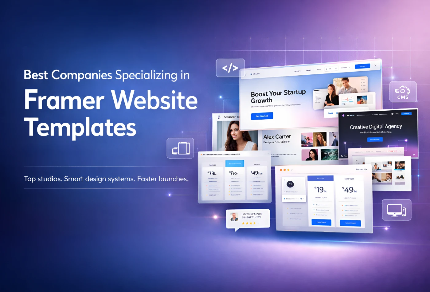
Best Companies Specializing in Framer Website Templates in 2026
Feb 19, 2026
Best Companies Specializing in Framer Website Templates in 2026
Find perfect template for your website & get 50% discount coupon

Templates
Copyright © 2026 FramerBite, A Part of Creetfy LLC. All Rights Reserved
Follow us on Twitter
Find perfect template for your website & get 50% discount coupon
Templates
Copyright © 2026 FramerBite, A Part of Creetfy LLC. All Rights Reserved
Follow us on Twitter
Find perfect template for your website & get 50% discount coupon
Templates
Copyright © 2026 FramerBite, A Part of Creetfy LLC. All Rights Reserved
Follow us on Twitter
Find perfect template for your website & get 50% discount coupon
Templates
Copyright © 2026 FramerBite, A Part of Creetfy LLC. All Rights Reserved
Follow us on Twitter