Framer Layout Tips to Organize Your Pages in 2026
Last Updated on:
Author:
Framerbite
Framerbite

A beautiful layout means nothing if your pages break the moment someone edits content, adds new sections, or publishes from the CMS. This happens when Framer projects grow without structure. Pages become messy, layouts lose consistency, spacing shifts, and the team wastes hours fixing small mistakes.
This guide gives you clear, battle-tested layout tips to organize your Framer layouts in 2026. You will learn how to structure layouts, use templates, build components, apply consistent spacing, and set up CMS so your site stays clean.
Whether you build templates, client websites, or large multi-page projects, these tips will help you keep things simple, scalable, and stable.
10 Framer Layout Tips
Here, we will go through 10 easy Framer layout tips and Framerbite experts tips that anyone can follow. These tips will help you keep your Framer pages neat, responsive, and stress-free, even when you add new content or build more pages.
1. Start With a Simple SiteMap

A site map is a basic list of all pages your website needs. It acts like a blueprint before you start designing. Many designers start designing Framer with no plan, and this creates messy pages later. A simple site map helps you know which pages will be static, which will be CMS-powered, and which share the same layout.
Before you touch the canvas, spend 10 minutes planning your page structure. This saves you hours of rework later.
Make a basic list like this:
Home
About
Services
Service Single
Projects
Project Single
Blog
Blog Post
Contact
If your site uses CMS, group pages into collections like:
Blog Collection
Projects Collection
Team Members Collection
2. Use a Layout Template for Global Structure

A layout template is a master page in Framer that controls your header, footer, nav, and global styles across the entire website. When you edit this template, every connected page updates automatically. This keeps your site consistent and saves a huge time.
Why this matters:
Avoid editing 20 pages one by one
Design stays consistent across the entire site
New pages load with the correct structure instantly
SEO elements like meta tags stay standardized
What to include in your Layout Template:
Header
Footer
Global Navigation
Sitewide spacing rules
Cookie banner or legal links
SEO defaults like meta, OG, favicon
Pro tips:
Use two layout templates if your project needs different global structures. This makes your system flexible and scalable.
Main Layout: For all regular pages
Minimal Layout: For blogs or landing pages
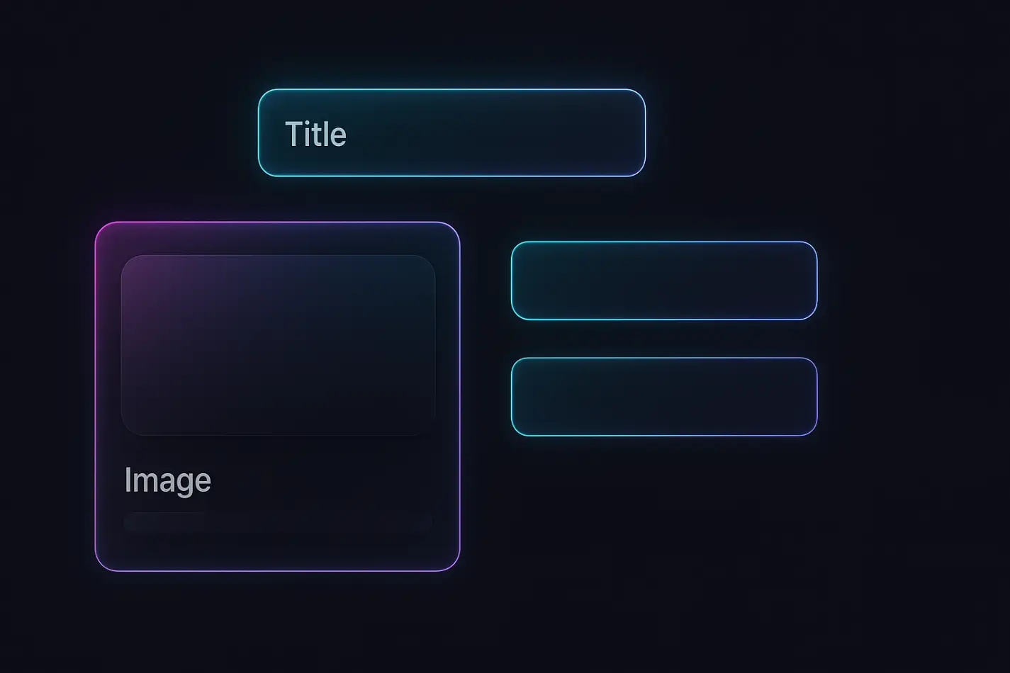
3. Build Components & Use Clear Naming Conventions
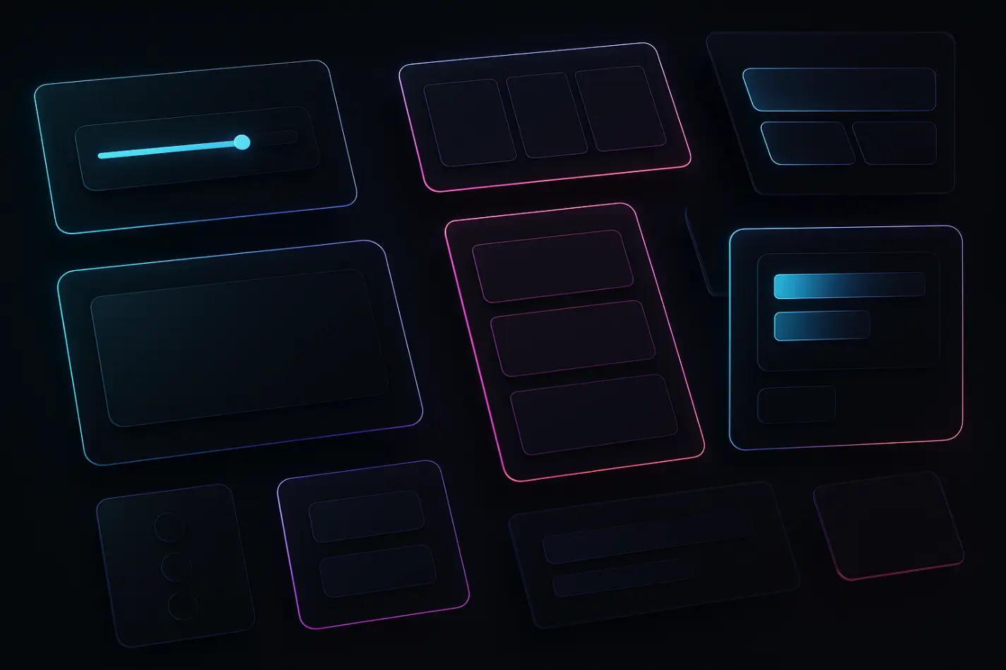
Your layout becomes flexible when your sections become components. Components are reusable blocks like hero sections, pricing tables, features, cards, buttons, and testimonials that you can use across your site. Instead of building the same layout 10 times, you build it once as a component and reuse it everywhere.
Make components for:
Hero
Features
Pricing
Blog cards
Testimonials
Footer
CTAs
Also, you can use simple naming rules:
cmp-button-primary
sec-hero-default
card-service
sec-testimonials-grid
Use variants
Create variations inside one component instead of duplicating it. This keeps your file clean and easy to manage. Example of variants, for Testimonials- Grid/Slider/Simple, for Hero: Centered/Left-aligned, for Pricing: 2-column/3-column.
4. Use Stacks, Grids & Absolute Positioning Correctly
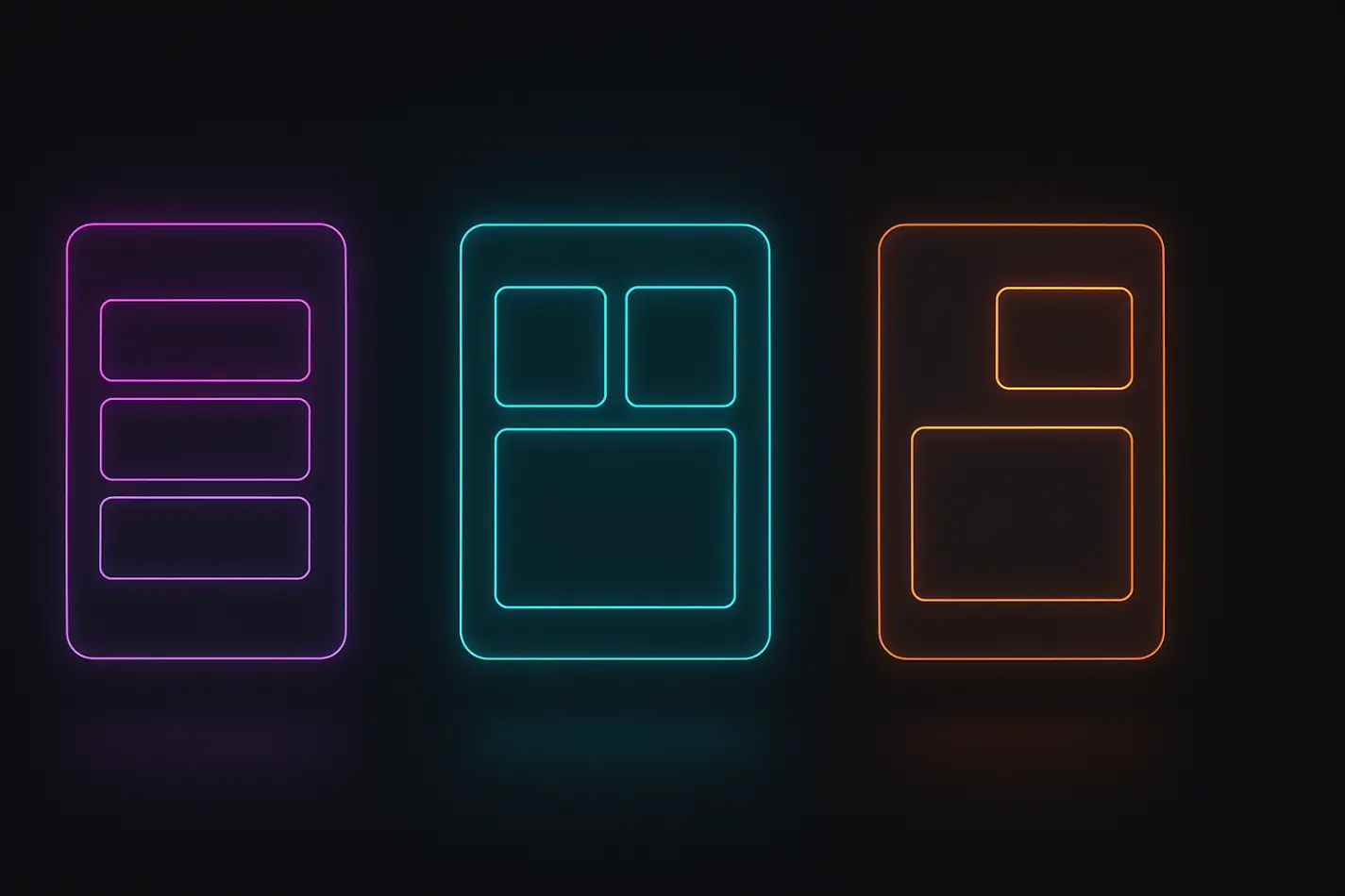
Stacks, Grids & Absolute Positioning are the three main layout tools in Framer. Each one serves a different purpose, and choosing the wrong one causes alignment issues on different screen sizes.
A Stack arranges elements in a vertical or horizontal flow. It automatically handles spacing and responsiveness. Stacks keep layouts predictable and easy to edit. A Grid creates evenly aligned rows and columns. It keeps everything structured, especially in multi-column sections. Grids create clean, consistent layouts on all breakpoints.
Absolute places an element in a fixed position on the canvas. It is useful for decorative or overlapping elements, but not for main content. Stacks is best for flow layouts; it keeps things responsive and predictable. Use stacks when elements should follow each other naturally for
Hero content
Blog content
Pricing sections
Forms
Vertical or horizontal lists
Grids are best for even, structured layouts; they ensure your spacing stays equal, even on different breakpoints. Use grids when you want clean alignment for:
Card layouts
Galleries
Team photos
Feature lists
Multi-column content
Absolute positioning should be used with caution. Never use it for text or main content. It breaks responsiveness easily. Use absolute only for:
Decorative shapes
Floating backgrounds
Overlaps that do not affect content
5. Organize Your CMS Structure Properly
Framer CMS is a built-in content system that lets you create dynamic pages like blog posts, projects, testimonials, and team pages. Instead of designing every page manually, you design one CMS template, and Framer automatically creates new pages based on the content you add. This makes publishing faster, keeps layouts consistent, and avoids repetitive work.
Create one collection per content type:
Blog Posts
Case Studies
Testimonials
Team Members
Services
Important fields to add for CMS structure properly:
Title
Slug
Description
Hero Image
Category
SEO Meta Title
SEO Meta Description
OG Image
Rich Content
Use CMS templates for faster publishing, consistent layouts, stronger SEO, and easy global updates. CMS templates allow you to reuse one layout for 50+ articles or projects.
6. Use Global Styles, Tokens & Spacing Systems
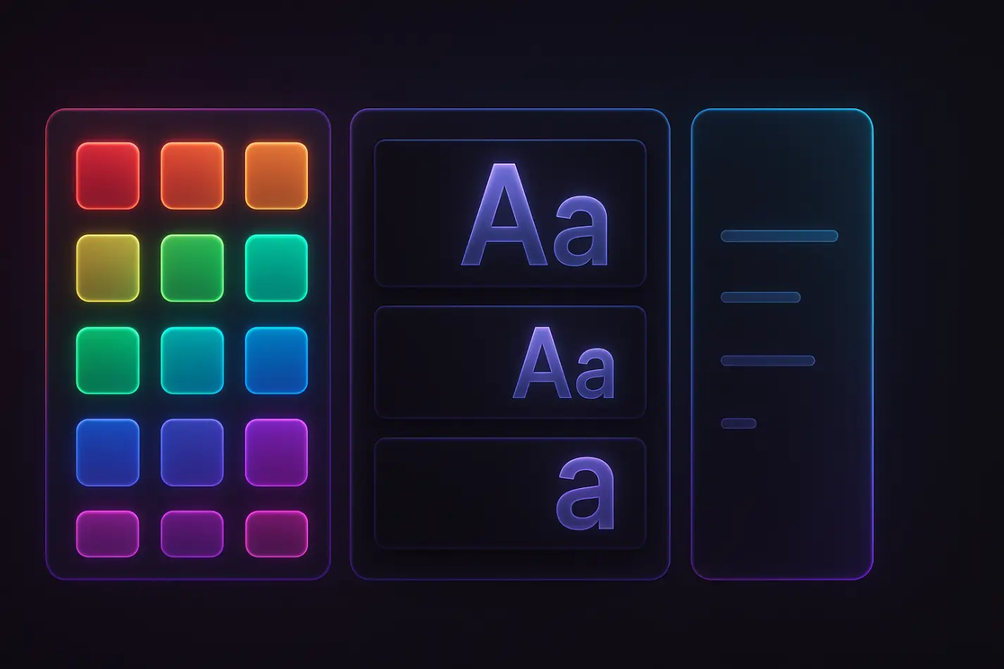
Tokens are reusable values for color, spacing, typography, borders, and shadows. They keep your design consistent across all pages. Tokens help you avoid layout elements. Use a simple spacing system 4/8/16/24/32/48/64. This keeps every page neat and balanced.
Create tokens for:
Colors
Fonts
Spacing
Shadows
Radiuses
7. Improve SEO With Clean Layout Structure
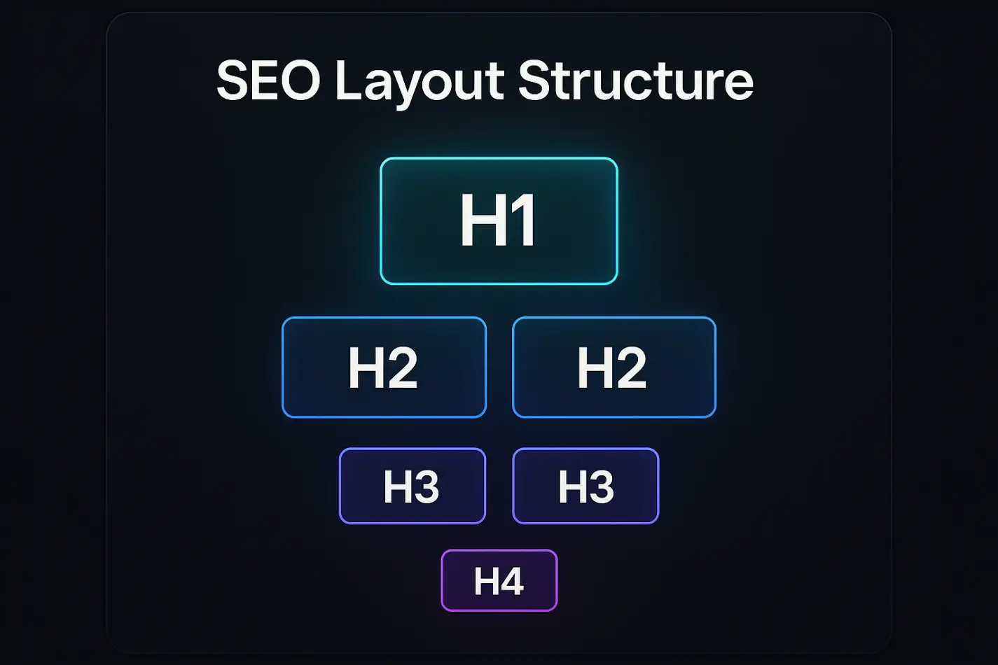
Framer SEO includes all the tools you need to make your website easy for Google to understand. You can set meta titles, descriptions, open graph images, alt text, clean URLs, canonical links, and proper heading structure. When your layout is organized, these SEO settings work smoothly, helping your pages rank higher and load correctly when shared on social media. A strong layout supports strong SEO.
Basic layout-level SEO tips:
Only one H1 per page
Follow heading order (H1, H2, H3)
Add meta title & description
Add OG title, OG image, and OG description
Use alt text for all images
Use clean section names like ''features'' or ''pricing'' for semantic structure
SEO inside CMS adds field mappings for Title tag, Description tag, Slug, and Canonical URL. This helps Google understand your content faster.
8. Keep Your Page Fast & Clean

Website performance is how fast your page loads and how smoothly it feels when someone scrolls or interacts with it. In Framer, performance depends on how you manage images, videos, animations, and scripts inside your layout. A slow site can hurt user experience, increase bounce rate, and lower your SEO ranking, even if your design looks beautiful.
Fast-loading pages keep visitors engaged, improve conversions, and help Google crawl your site more easily. If you want a full step-by-step guide, read how to improve page speed in Framer.
This is why optimizing performance is a key part of building a clean layout. When your structure is simple, lightweight, and well-organized, you naturally avoid heavy files, layout shifts, and unnecessary elements that slow down the page.
Do this to keep your pages fast:
Compress hero images
Use WebP or AVIF formats
Lazy-load images below the fold
Avoid huge auto-play videos
Reduce heavy embed scripts
Keep Lottie animations lightweight
9. Create an Editor Guide for Clients or Team Members
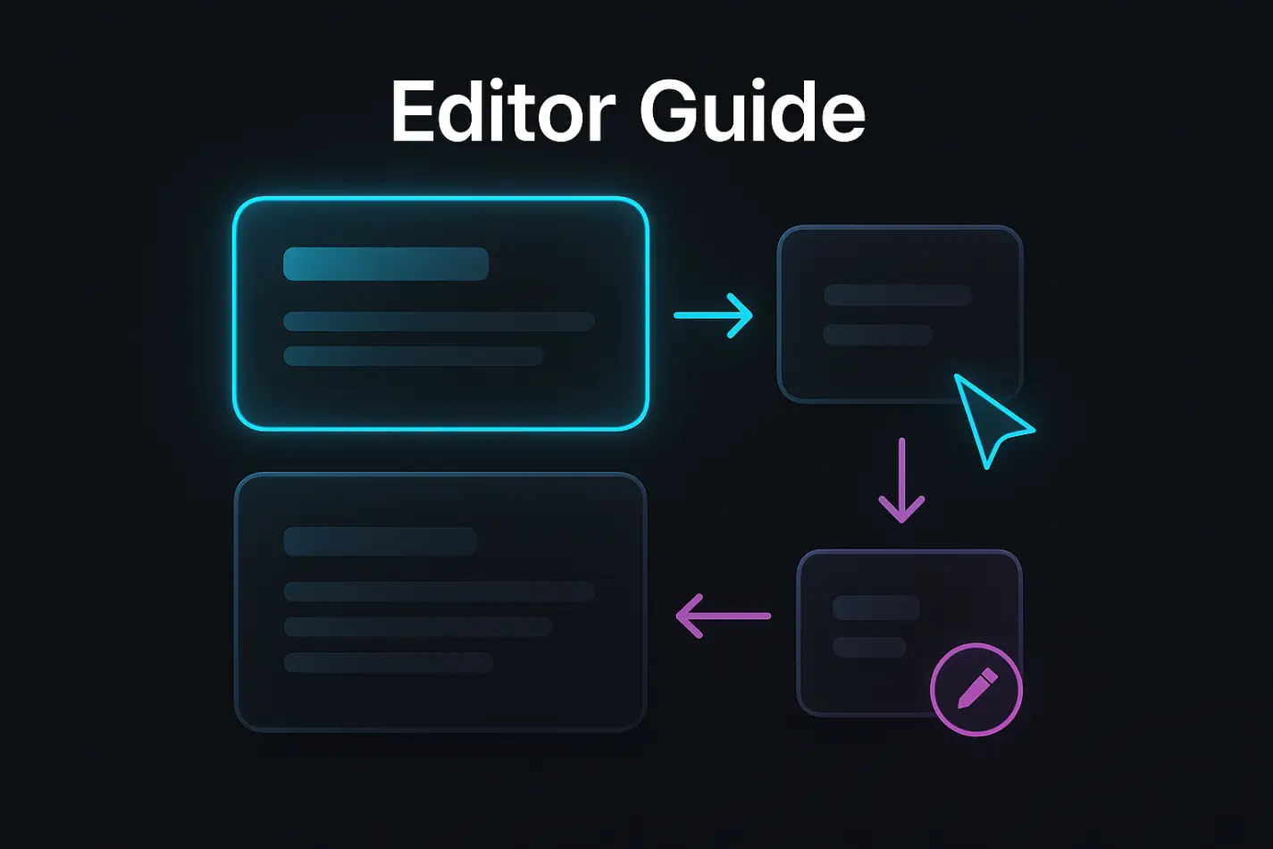
An editor guide is one of the most important but often ignored parts of a Framer project. It’s a simple instruction page that teaches clients, teammates, or template buyers how to edit the website without breaking the layout. Many people who edit a site are not designers, so they often move sections, delete components, or change spacing by mistake. This leads to messy pages, broken layouts, and extra support work.
Create a simple editor guide page inside the project. Add a short video tutorial if possible. This prevents broken layouts and reduces support messages. Include:
How to edit text
How to edit images
How to change CMS content
How to use components
What NOT to touch
10. Review Your Layout With a Checklist Before Publishing

A layout review checklist is a simple end-of-project step where you go through each page and confirm everything is clean, aligned, responsive, and consistent. It prevents last-minute mistakes and ensures the whole site feels professional before publishing.
This step helps you catch design mistakes early, maintain visual consistency, and make sure every page follows the same rules. It also gives you confidence that the layout system you created works across all breakpoints and page types. A clean layout review makes the entire website feel more polished and trustworthy to users.
Checklist You Should Use:
All pages use the correct Layout Template
Spacing follows your spacing tokens
Components are not accidentally un grouped
Heading order is clean (H1,H2, H3)
No random absolute-positioned items
CMS pages display the correct fields
Mobile and tablet versions look consistent
No unused components or empty layers
All images are optimized
Footer and header look the same on every page
Why review matters before publishing:
A quick 5–10 minute layout review saves hours of debugging later. It ensures the entire site stays clean, organized, and ready for your client or your template customers.
Expert Advice from FramerBite: Layout Tips Every Designer Should Know
In addition to the 10 main tips above, our FramerBite team has a few insider tricks and best practices that can make your layouts even cleaner, faster, and more professional. These tips are based on real projects and common challenges we face while building Framer websites.
Keep Layers Organized: Name and group layers clearly to avoid accidental edits and make your project easier to manage.
Use Component Variants: Create multiple versions of a component without duplicating it keeps designs consistent and updates fast.
Preview on Multiple Devices: Check your layout on desktop, tablet, and mobile early to catch responsive issues.
Use Color & Typography Tokens: Apply consistent colors, fonts, and spacing with tokens to maintain a cohesive design.
Add a Mini Editor Guide: Include a simple ''how-to'' note for clients or teammates to prevent mistakes and keep layouts stable.
Stop Designing Blind: Always Validate With Real Content
Designing with ''Lorem Ipsum'' may feel convenient, but it doesn’t reflect the complexity of real-world content. Once your sections are ready, fill them with real product descriptions, real client testimonials, and real images. This step reveals how your layout truly behaves under pressure. Your design becomes stronger, more predictable, and ready for any future updates.
Summary: A Clean Framer Layout Saves Hours
Organizing your Framer pages doesn’t have to be complicated. By following these 10 tips, you can create layouts that are clean, consistent, and easy to manage fo client website, a template, or your own project. Start with a site map, use Layout Templates, build reusable components, and apply stacks, grids, and spacing tokens properly. Add a clean CMS structure, optimize for SEO and performance, and provide an Editor Guide for safe edits. Finally, always review your layout with real content before publishing.
When your layouts are organized, your workflow becomes smoother, your pages stay consistent, and your designs look professional no matter how much content you add. These steps save time, reduce mistakes, and help you build websites that impress clients and users alike.
Want faster, smoother, and more professional websites? Implement these layout tips and browse our FramerBite templates and save hours of work.
A beautiful layout means nothing if your pages break the moment someone edits content, adds new sections, or publishes from the CMS. This happens when Framer projects grow without structure. Pages become messy, layouts lose consistency, spacing shifts, and the team wastes hours fixing small mistakes.
This guide gives you clear, battle-tested layout tips to organize your Framer layouts in 2026. You will learn how to structure layouts, use templates, build components, apply consistent spacing, and set up CMS so your site stays clean.
Whether you build templates, client websites, or large multi-page projects, these tips will help you keep things simple, scalable, and stable.
10 Framer Layout Tips
Here, we will go through 10 easy Framer layout tips and Framerbite experts tips that anyone can follow. These tips will help you keep your Framer pages neat, responsive, and stress-free, even when you add new content or build more pages.
1. Start With a Simple SiteMap
A site map is a basic list of all pages your website needs. It acts like a blueprint before you start designing. Many designers start designing Framer with no plan, and this creates messy pages later. A simple site map helps you know which pages will be static, which will be CMS-powered, and which share the same layout.
Before you touch the canvas, spend 10 minutes planning your page structure. This saves you hours of rework later.
Make a basic list like this:
Home
About
Services
Service Single
Projects
Project Single
Blog
Blog Post
Contact
If your site uses CMS, group pages into collections like:
Blog Collection
Projects Collection
Team Members Collection
2. Use a Layout Template for Global Structure
A layout template is a master page in Framer that controls your header, footer, nav, and global styles across the entire website. When you edit this template, every connected page updates automatically. This keeps your site consistent and saves a huge time.
Why this matters:
Avoid editing 20 pages one by one
Design stays consistent across the entire site
New pages load with the correct structure instantly
SEO elements like meta tags stay standardized
What to include in your Layout Template:
Header
Footer
Global Navigation
Sitewide spacing rules
Cookie banner or legal links
SEO defaults like meta, OG, favicon
Pro tips:
Use two layout templates if your project needs different global structures. This makes your system flexible and scalable.
Main Layout: For all regular pages
Minimal Layout: For blogs or landing pages
3. Build Components & Use Clear Naming Conventions
Your layout becomes flexible when your sections become components. Components are reusable blocks like hero sections, pricing tables, features, cards, buttons, and testimonials that you can use across your site. Instead of building the same layout 10 times, you build it once as a component and reuse it everywhere.
Make components for:
Hero
Features
Pricing
Blog cards
Testimonials
Footer
CTAs
Also, you can use simple naming rules:
cmp-button-primary
sec-hero-default
card-service
sec-testimonials-grid
Use variants
Create variations inside one component instead of duplicating it. This keeps your file clean and easy to manage. Example of variants, for Testimonials- Grid/Slider/Simple, for Hero: Centered/Left-aligned, for Pricing: 2-column/3-column.
4. Use Stacks, Grids & Absolute Positioning Correctly
Stacks, Grids & Absolute Positioning are the three main layout tools in Framer. Each one serves a different purpose, and choosing the wrong one causes alignment issues on different screen sizes.
A Stack arranges elements in a vertical or horizontal flow. It automatically handles spacing and responsiveness. Stacks keep layouts predictable and easy to edit. A Grid creates evenly aligned rows and columns. It keeps everything structured, especially in multi-column sections. Grids create clean, consistent layouts on all breakpoints.
Absolute places an element in a fixed position on the canvas. It is useful for decorative or overlapping elements, but not for main content. Stacks is best for flow layouts; it keeps things responsive and predictable. Use stacks when elements should follow each other naturally for
Hero content
Blog content
Pricing sections
Forms
Vertical or horizontal lists
Grids are best for even, structured layouts; they ensure your spacing stays equal, even on different breakpoints. Use grids when you want clean alignment for:
Card layouts
Galleries
Team photos
Feature lists
Multi-column content
Absolute positioning should be used with caution. Never use it for text or main content. It breaks responsiveness easily. Use absolute only for:
Decorative shapes
Floating backgrounds
Overlaps that do not affect content
5. Organize Your CMS Structure Properly
Framer CMS is a built-in content system that lets you create dynamic pages like blog posts, projects, testimonials, and team pages. Instead of designing every page manually, you design one CMS template, and Framer automatically creates new pages based on the content you add. This makes publishing faster, keeps layouts consistent, and avoids repetitive work.
Create one collection per content type:
Blog Posts
Case Studies
Testimonials
Team Members
Services
Important fields to add for CMS structure properly:
Title
Slug
Description
Hero Image
Category
SEO Meta Title
SEO Meta Description
OG Image
Rich Content
Use CMS templates for faster publishing, consistent layouts, stronger SEO, and easy global updates. CMS templates allow you to reuse one layout for 50+ articles or projects.
6. Use Global Styles, Tokens & Spacing Systems
Tokens are reusable values for color, spacing, typography, borders, and shadows. They keep your design consistent across all pages. Tokens help you avoid layout elements. Use a simple spacing system 4/8/16/24/32/48/64. This keeps every page neat and balanced.
Create tokens for:
Colors
Fonts
Spacing
Shadows
Radiuses
7. Improve SEO With Clean Layout Structure
Framer SEO includes all the tools you need to make your website easy for Google to understand. You can set meta titles, descriptions, open graph images, alt text, clean URLs, canonical links, and proper heading structure. When your layout is organized, these SEO settings work smoothly, helping your pages rank higher and load correctly when shared on social media. A strong layout supports strong SEO.
Basic layout-level SEO tips:
Only one H1 per page
Follow heading order (H1, H2, H3)
Add meta title & description
Add OG title, OG image, and OG description
Use alt text for all images
Use clean section names like ''features'' or ''pricing'' for semantic structure
SEO inside CMS adds field mappings for Title tag, Description tag, Slug, and Canonical URL. This helps Google understand your content faster.
8. Keep Your Page Fast & Clean
Website performance is how fast your page loads and how smoothly it feels when someone scrolls or interacts with it. In Framer, performance depends on how you manage images, videos, animations, and scripts inside your layout. A slow site can hurt user experience, increase bounce rate, and lower your SEO ranking, even if your design looks beautiful.
Fast-loading pages keep visitors engaged, improve conversions, and help Google crawl your site more easily. If you want a full step-by-step guide, read how to improve page speed in Framer.
This is why optimizing performance is a key part of building a clean layout. When your structure is simple, lightweight, and well-organized, you naturally avoid heavy files, layout shifts, and unnecessary elements that slow down the page.
Do this to keep your pages fast:
Compress hero images
Use WebP or AVIF formats
Lazy-load images below the fold
Avoid huge auto-play videos
Reduce heavy embed scripts
Keep Lottie animations lightweight
9. Create an Editor Guide for Clients or Team Members
An editor guide is one of the most important but often ignored parts of a Framer project. It’s a simple instruction page that teaches clients, teammates, or template buyers how to edit the website without breaking the layout. Many people who edit a site are not designers, so they often move sections, delete components, or change spacing by mistake. This leads to messy pages, broken layouts, and extra support work.
Create a simple editor guide page inside the project. Add a short video tutorial if possible. This prevents broken layouts and reduces support messages. Include:
How to edit text
How to edit images
How to change CMS content
How to use components
What NOT to touch
10. Review Your Layout With a Checklist Before Publishing
A layout review checklist is a simple end-of-project step where you go through each page and confirm everything is clean, aligned, responsive, and consistent. It prevents last-minute mistakes and ensures the whole site feels professional before publishing.
This step helps you catch design mistakes early, maintain visual consistency, and make sure every page follows the same rules. It also gives you confidence that the layout system you created works across all breakpoints and page types. A clean layout review makes the entire website feel more polished and trustworthy to users.
Checklist You Should Use:
All pages use the correct Layout Template
Spacing follows your spacing tokens
Components are not accidentally un grouped
Heading order is clean (H1,H2, H3)
No random absolute-positioned items
CMS pages display the correct fields
Mobile and tablet versions look consistent
No unused components or empty layers
All images are optimized
Footer and header look the same on every page
Why review matters before publishing:
A quick 5–10 minute layout review saves hours of debugging later. It ensures the entire site stays clean, organized, and ready for your client or your template customers.
Expert Advice from FramerBite: Layout Tips Every Designer Should Know
In addition to the 10 main tips above, our FramerBite team has a few insider tricks and best practices that can make your layouts even cleaner, faster, and more professional. These tips are based on real projects and common challenges we face while building Framer websites.
Keep Layers Organized: Name and group layers clearly to avoid accidental edits and make your project easier to manage.
Use Component Variants: Create multiple versions of a component without duplicating it keeps designs consistent and updates fast.
Preview on Multiple Devices: Check your layout on desktop, tablet, and mobile early to catch responsive issues.
Use Color & Typography Tokens: Apply consistent colors, fonts, and spacing with tokens to maintain a cohesive design.
Add a Mini Editor Guide: Include a simple ''how-to'' note for clients or teammates to prevent mistakes and keep layouts stable.
Stop Designing Blind: Always Validate With Real Content
Designing with ''Lorem Ipsum'' may feel convenient, but it doesn’t reflect the complexity of real-world content. Once your sections are ready, fill them with real product descriptions, real client testimonials, and real images. This step reveals how your layout truly behaves under pressure. Your design becomes stronger, more predictable, and ready for any future updates.
Summary: A Clean Framer Layout Saves Hours
Organizing your Framer pages doesn’t have to be complicated. By following these 10 tips, you can create layouts that are clean, consistent, and easy to manage fo client website, a template, or your own project. Start with a site map, use Layout Templates, build reusable components, and apply stacks, grids, and spacing tokens properly. Add a clean CMS structure, optimize for SEO and performance, and provide an Editor Guide for safe edits. Finally, always review your layout with real content before publishing.
When your layouts are organized, your workflow becomes smoother, your pages stay consistent, and your designs look professional no matter how much content you add. These steps save time, reduce mistakes, and help you build websites that impress clients and users alike.
Want faster, smoother, and more professional websites? Implement these layout tips and browse our FramerBite templates and save hours of work.


Read more articles

Feb 28, 2026
Best Framer Templates with Parallax Scrolling
Feb 28, 2026
Best Framer Templates with Parallax Scrolling

Feb 22, 2026
Framer Canvas: Design Without Limits
Feb 22, 2026
Framer Canvas: Design Without Limits

Feb 19, 2026
Best Companies Specializing in Framer Website Templates in 2026
Feb 19, 2026
Best Companies Specializing in Framer Website Templates in 2026
Get exclusive 10% discount on your next purchase.
We will send the discount code immediately in your inbox.

Templates
Copyright © 2026 FramerBite, A Part of Creetfy LLC. All Rights Reserved
Follow us on Twitter
Get exclusive 10% discount on your next purchase.
We will send the discount code immediately in your inbox.
Templates
Copyright © 2026 FramerBite, A Part of Creetfy LLC. All Rights Reserved
Follow us on Twitter
Get exclusive 10% discount on your next purchase.
We will send the discount code immediately in your inbox.
Templates
Copyright © 2026 FramerBite, A Part of Creetfy LLC. All Rights Reserved
Follow us on Twitter
Get exclusive 10% discount on your next purchase.
We will send the discount code immediately in your inbox.
Templates
Copyright © 2026 FramerBite, A Part of Creetfy LLC. All Rights Reserved
Follow us on Twitter